The first time I fell hard for mid century bedroom ideas, it wasn’t a magazine spread. It was a friend’s apartment with a walnut bed, one brass lamp, and walls the color of pine needles. Nothing was expensive. But nothing looked random either.
That’s the thing about MCM done right. It’s collected, not decorated. These 11 rooms show exactly how.
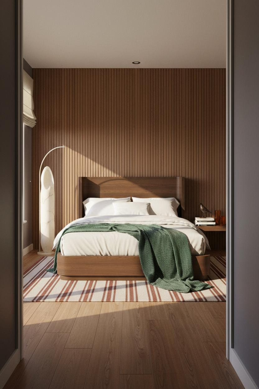
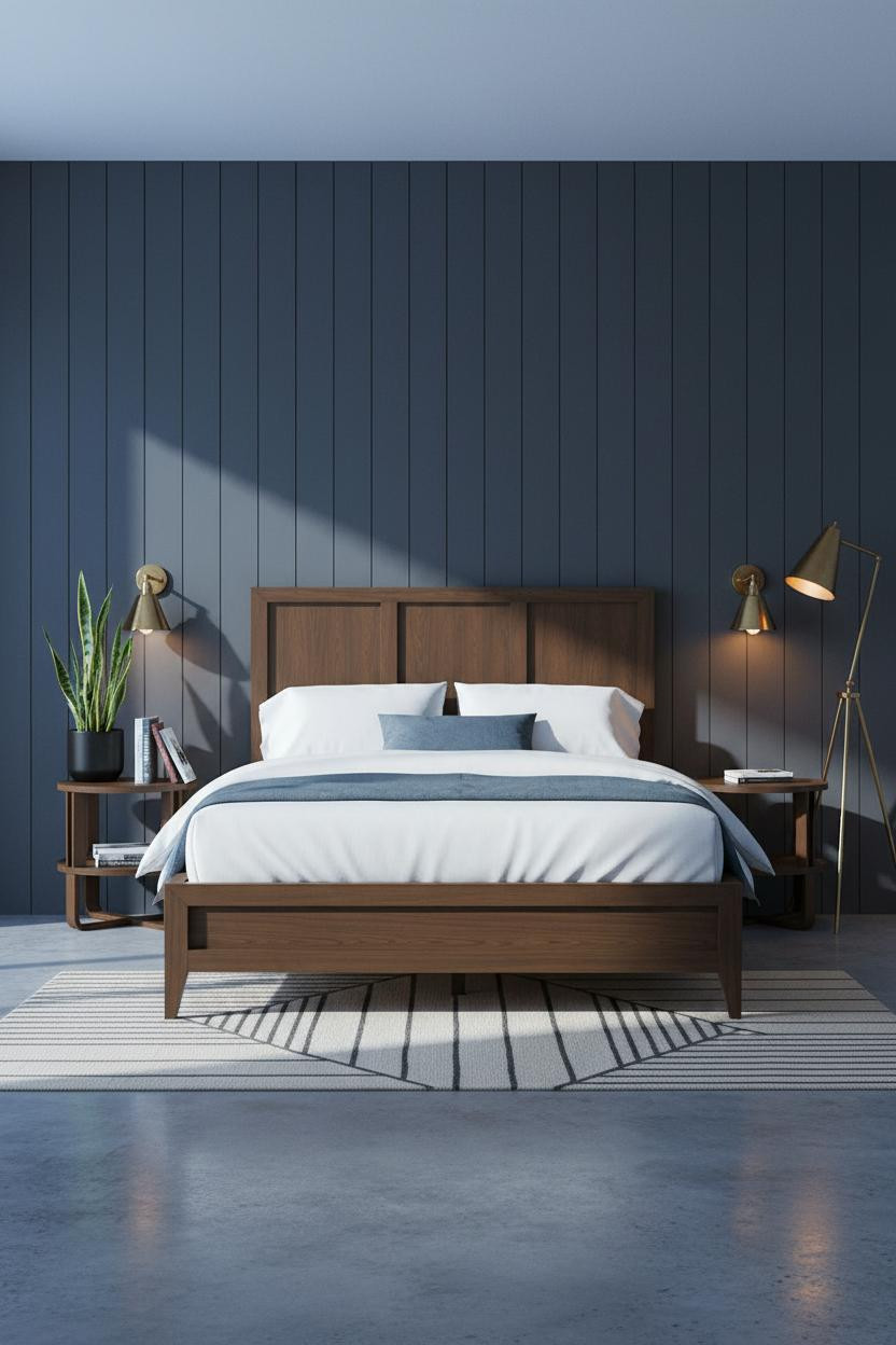
The Walnut Slat Wall That Does All the Work
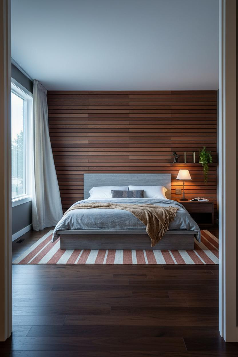

This is the kind of room that makes you want to slow down before you even sit on the bed.
Why it anchors the room: The walnut slat wall behind the bed creates horizontal rhythm across the entire feature wall, which keeps the charcoal flanking walls from feeling heavy. It’s a graphic move, not a decorative one.
Steal this move: Pair the slat wall with a brass lamp that throws warm, pooled light. The contrast between the cool charcoal and the amber glow is what makes the room feel expensive.
Exposed Beams and Boho Layering That Actually Work Together
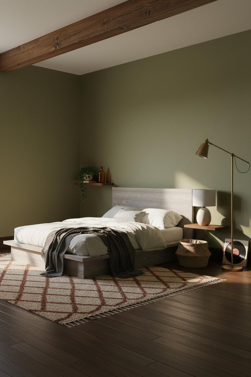
Boho and mid-century shouldn’t be this easy to mix. But somehow this room makes it look obvious.
What makes it work: The aged walnut ceiling beam supplies the architectural weight that grounds all the loose, layered boho textures below. Without that structural anchor overhead, the moss green walls and Moroccan rug would just be a mood board, not a room.
What to borrow: A brass tripod floor lamp in the far corner. It ties the warm wood tones together while still feeling like a collected piece, not a matched set.
The Arched Alcove Move I Keep Coming Back To
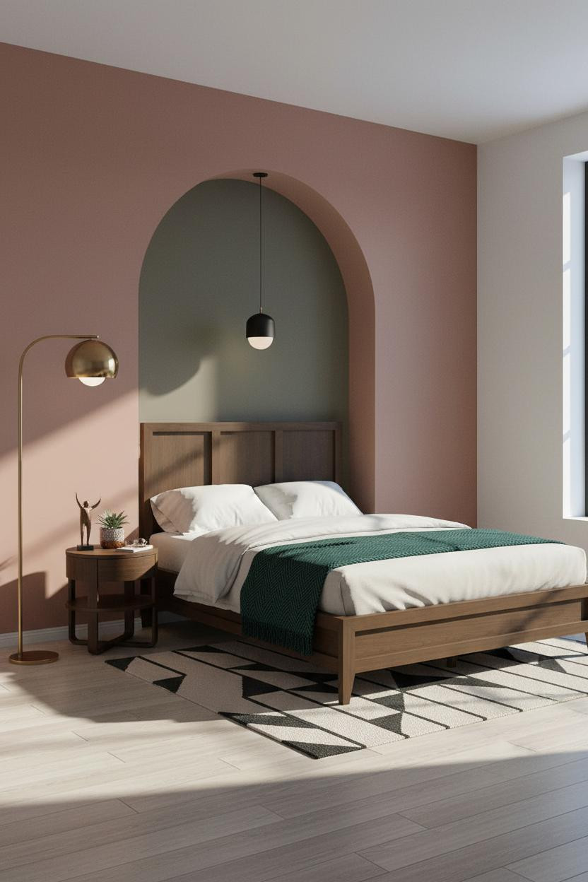


I keep coming back to this one. The arched alcove is such a specific architectural gesture, and in a mid-century room it just lands.
Built-in recesses like this frame the bed the way a headboard alone never can. The dusty rose plaster surround against the khaki interior is the kind of color pairing that looks considered without looking overdone.
The smarter choice: Use the alcove depth to hang a matte black sculptural pendant inside rather than a wall sconce. It reads more custom, and it keeps the nightstand surface clear.
When Steel Frame Windows Become the Whole Design
This one is divisive. The Crittall-style window wall is a serious commitment, and it won’t work everywhere.
Why it holds together: The slim black steel grid throws shadow lines across the warm maple floor all morning, which means the geometry is built-in and dynamic rather than relying on art or decor to carry the room.
Pull cream linen curtains to one side and leave the grid mostly exposed. That’s the whole move. The contrast between soft fabric and hard steel is what keeps it from feeling industrial.
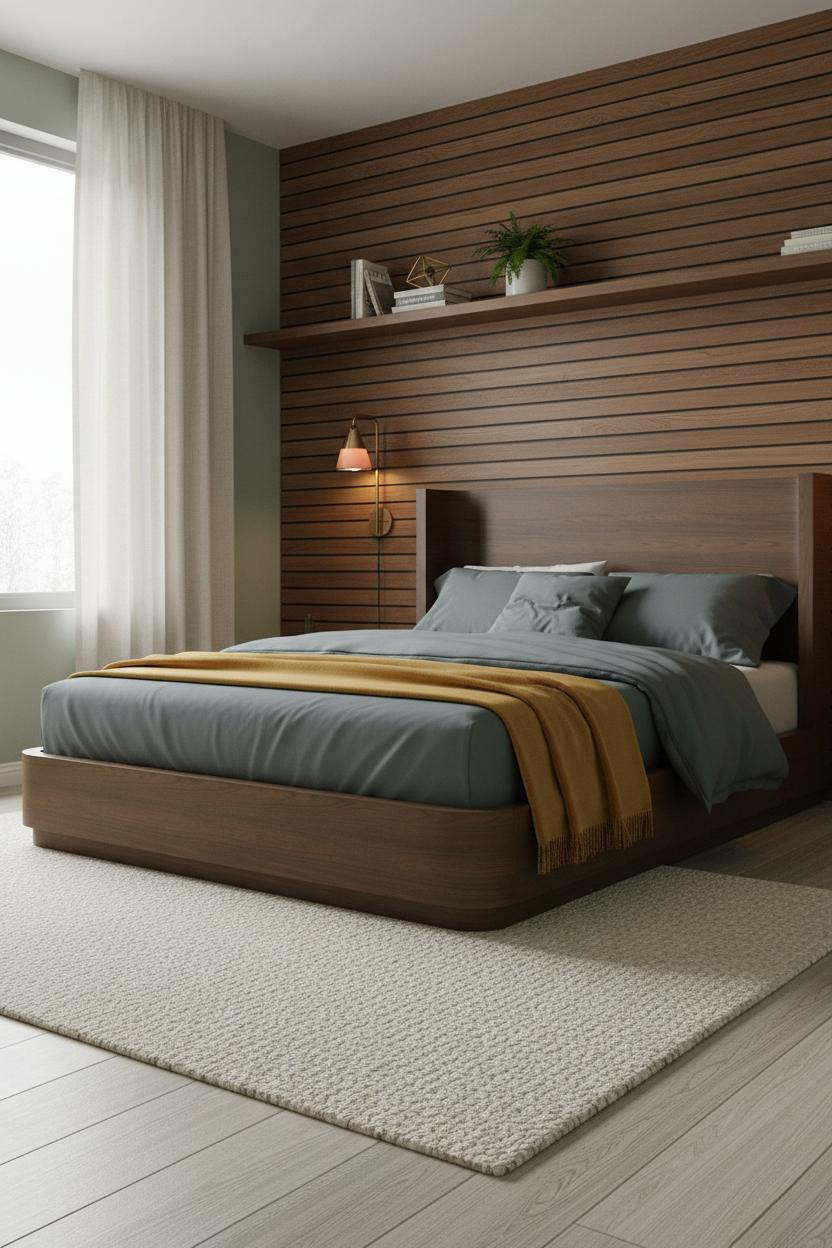
Vertical Slat Wall With a Warmer, Quieter Energy

Same idea as a horizontal slat wall, but running vertical changes the whole feeling. Taller. More grounded.
The real strength: Full-height walnut vertical planks make a low-ceilinged room read taller without adding a single architectural element. The indigo-grey walls flanking it keep the warmth from tipping into rustic.
The finishing layer: A sculptural ceramic arc lamp in matte white in the far corner. It’s a soft counterpoint to all that dark grain, in a way that feels deliberate rather than matchy.
Charcoal Shiplap Is Bolder Than It Sounds
I thought the charcoal shiplap might be too much. It isn’t.
The reason the room feels Palm Springs instead of heavy is the cream walls on either side. Those flanking walls do real work. Charcoal shiplap paired with cream is the kind of contrast that doesn’t need any more layers to land.
Don’t ruin it with: Too many accessories on the nightstand. A snake plant in a matte black ceramic and a slim stack of paperbacks is enough. The drama is already in the wall.
Rust Board-and-Batten Is the Coziest MCM Move Right Now
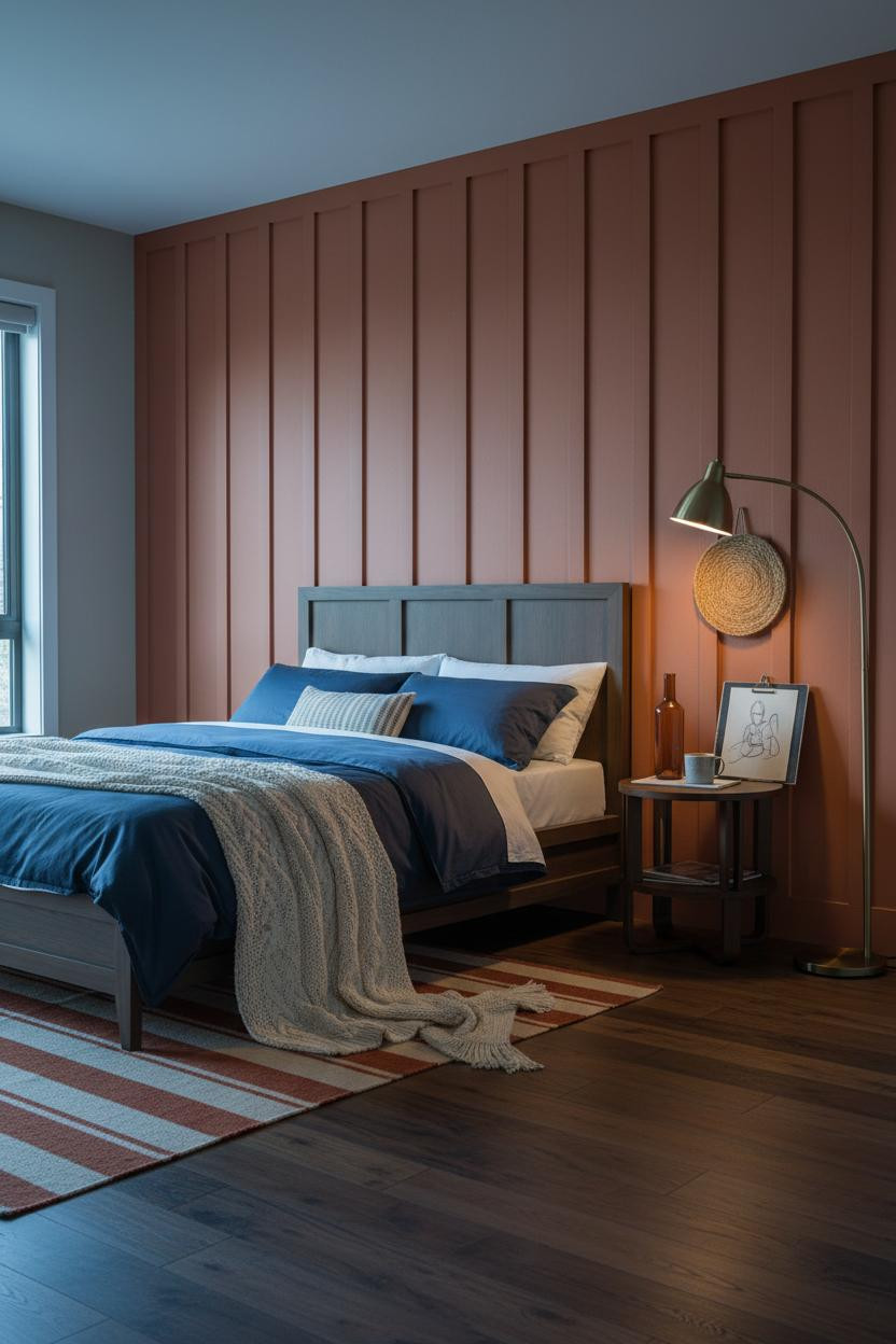
Nothing fancy here. That’s genuinely the point.
What gives it presence: The rust-clay board-and-batten surface is all texture and no pattern, so the room feels warm and intentional while still leaving room for the layered boho pieces to breathe. Navy sateen bedding against that warm wall is one of those combinations that just clicks.
Worth copying: A jute wall hanging above the nightstand corner instead of framed art. Looser, more collected, and honestly more interesting at this scale.
Why a Low Credenza Changes the Whole Proportion
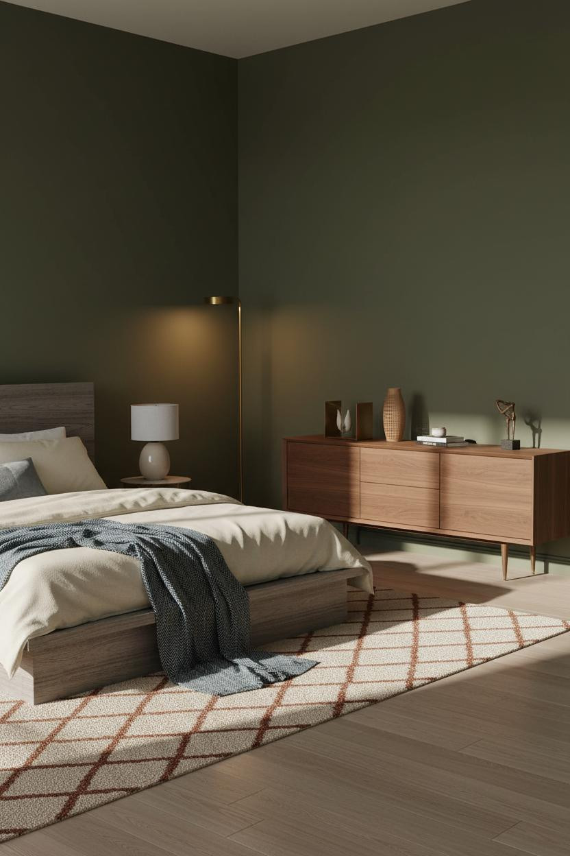
In a room this proportioned, keeping furniture low is not a style choice. It’s a structural one.
Design logic: A floating walnut credenza on tapered brass legs preserves visual floor space on the wall opposite the bed, which keeps the deep olive walls from closing in. The horizontal grain running across the full width ties the wall together better than a gallery arrangement would.
Style the surface sparsely. Brass bookends, one rattan vase. The credenza carries the look on its own.
Teal Walls With Floating Walnut Shelving
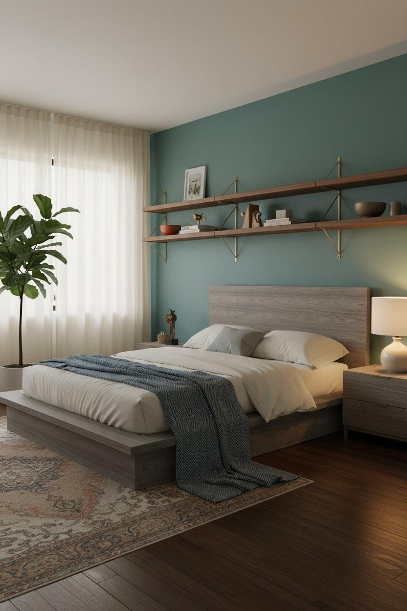
Teal walls are a commitment. But paired with warm walnut shelving, the room feels balanced rather than loud.
Why the palette works: Warm wood floating shelves on a teal matte wall create enough contrast to draw the eye upward, which makes the ceiling feel higher than it is. The vintage Persian runner below ties the two temperature zones together without forcing them to match.
The easy win: A fiddle-leaf fig in the far corner. Large-scale greenery against teal is one of those bedroom plant combinations that looks like you planned it even when you didn’t.
The Japandi Slat Wall for People Who Want Calm
Quiet. That’s the word that comes to mind. This is a Japandi-influenced take on MCM that I find harder to execute than it looks.
The room feels calm and cohesive because the horizontal walnut slat wall and sage green side walls are close enough in warmth to read as one palette, while still giving the feature wall its own identity.
What not to do: Don’t break the calm with a patterned rug. A chunky cream wool rug at floor level keeps the restraint going all the way down. Paired sconces flanking the bed do the rest.
Mustard Plaster and a Sunburst Mirror for Maximum Warmth
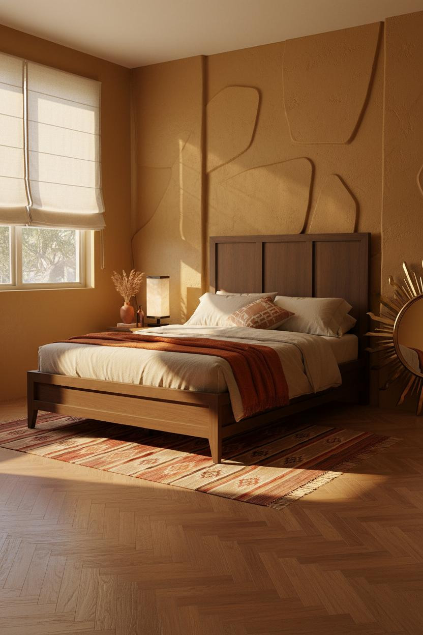

This is the most Palm Springs room in the whole list. And I mean that in the best possible way.
Where the luxury comes from: The textured mustard plaster wall catches afternoon raking light in a way that flat paint simply can’t. The organic surface depth means the wall is doing decorative work all day without a single object on it.
Lean an oversized vintage brass sunburst mirror against the side wall rather than hanging it. Leaned feels collected. Hung feels expected. That’s the whole difference.

Our #1 Pick
Saatva Classic Mattress
America’s best-selling online luxury innerspring. 365-night trial, lifetime warranty, free white glove delivery.
Shop Saatva Classic
The Foundation Of Every Beautiful Bedroom
Every room in this list has its own identity. Walnut grain, plaster texture, teal walls, brass that catches afternoon light. But all of it falls apart if what you sleep on isn’t right.
The Saatva Classic is the mattress I’d put in any of these rooms. Dual-coil support that holds its shape over years, a breathable organic cotton cover that doesn’t trap heat, and a Euro pillow top that’s genuinely soft without losing structure underneath. It feels like the good hotel kind. Not the business hotel kind.
Walls get repainted. Linen gets swapped out. The mattress is what stays. Start with the bed. The rest figures itself out.

The rooms people actually save are the ones where nothing looks accidental. Good design ages well because it’s made well.