Think your bedroom is too small to feel intentional? Small bedroom ideas that actually work aren’t about cramming in more. They’re about choosing less, and choosing better.
These 15 rooms prove it. Tight footprints, calm palettes, and furniture that earns every inch.
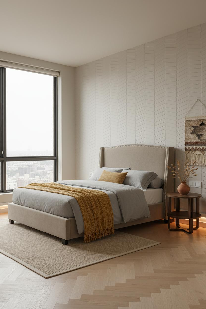
The Built-In Seat That Makes A 9×11 Feel Designed

A compact room can feel architected, not just decorated. This one does.
Why it holds together: The full-width window seat in pale oak creates one strong horizontal line that grounds the entire layout. It replaces two or three smaller pieces of furniture while giving the eye somewhere deliberate to land.
The smarter choice: Build storage into the seat base with flush drawers, and you recover square footage that a dresser would have eaten.
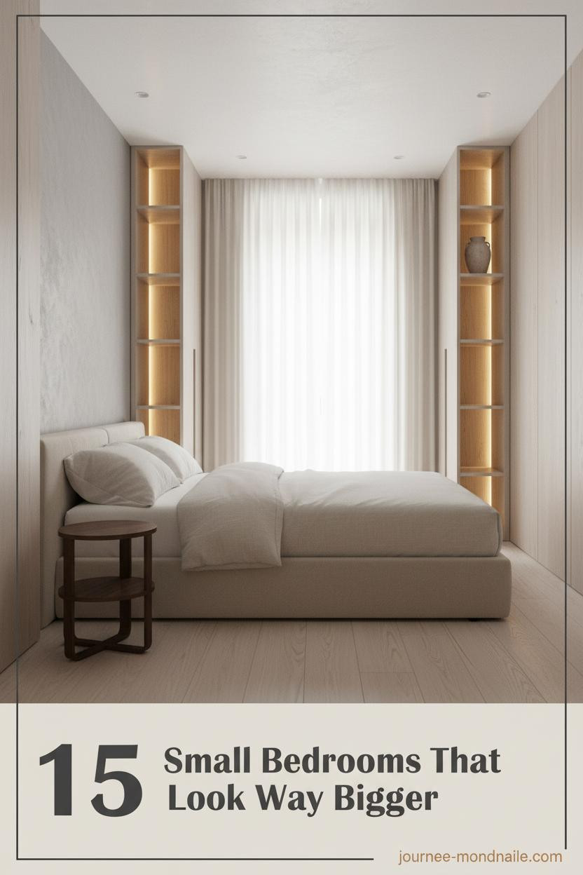
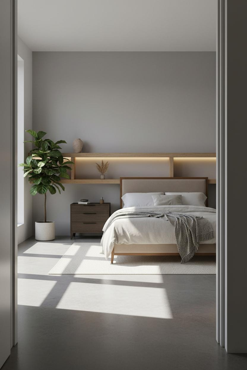
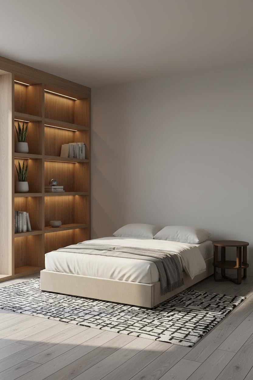
Floor-To-Ceiling Shelving Changes The Whole Equation
Vertical storage is the real trick here. Most people go wide. This room goes tall.
The pale ash shelving unit runs the full height of the room, and the integrated LED strips do two things at once: they light the shelves and they make the ceiling feel higher. It’s a small move with a surprisingly large effect on how open the room reads.
Try this: Keep each shelf to one or two objects. The restraint is the point.
Textured Plaster Walls Cost Less Than You Think

Honestly, this approach gets skipped because people assume it’s complicated. It’s not.
What gives it presence: A herringbone-relief plaster wall catches diffused light in shallow ridges, adding depth that flat paint simply can’t replicate. The room feels quieter and more considered, while still being easy to live with.
Where to start: Limit the textured finish to the headboard zone. Full room is too much.
One Floating Shelf Can Anchor A Whole Room
I keep coming back to this approach. Nothing flashy. That’s exactly the point.
What creates the mood: A full-width shelf in pale birch runs wall to wall above the bed, with LED strips tucked underneath that pool warm light downward. The horizontal line visually stretches the room, and the glow keeps the whole thing from feeling stark.
Avoid this mistake: Don’t overcrowd the shelf. Two objects per section, maximum. Negative space is doing half the work.
Sage Walls With A Built-In Bench: Better Than It Sounds

The combination of soft sage walls and a low window bench is one of those pairings that shouldn’t need explaining. But it does work, and here’s why.
In a small room, the smarter choice is going lower with furniture to preserve the sense of open wall above. The pale ash bench along the window wall keeps the floor plan clear and the room feels collected rather than crowded. Add integrated drawers below and you’ve solved storage too.
White Oak Vertical Slats: A Texture Play That Adds Height
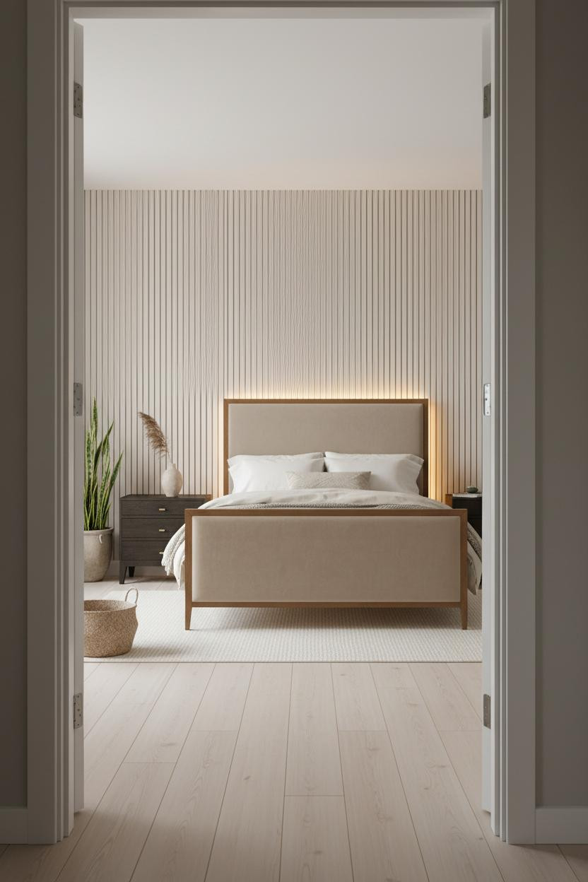

This one is divisive. But I think it’s one of the most underused moves in a minimalist bedroom.
Why it looks custom: Floor-to-ceiling white oak vertical slats draw the eye upward, which makes a compact room feel taller in a way that paint color alone never manages. The amber glow from baseboard LEDs catches the grain texture and adds warmth without another lamp taking up floor space.
The easy win: Limit the slatted panel to one accent wall. The contrast with smooth walls on either side is what makes it read as architectural.
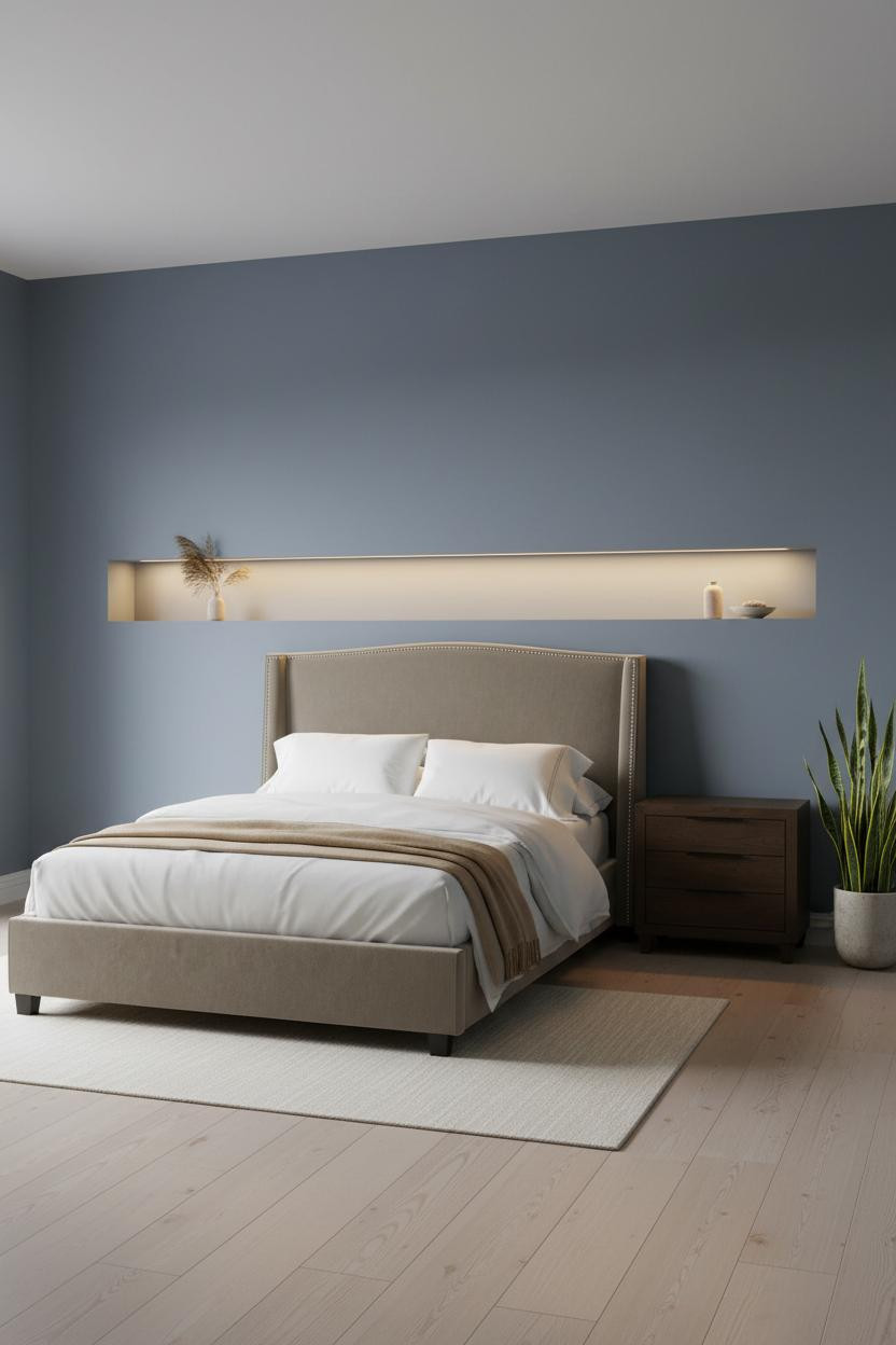
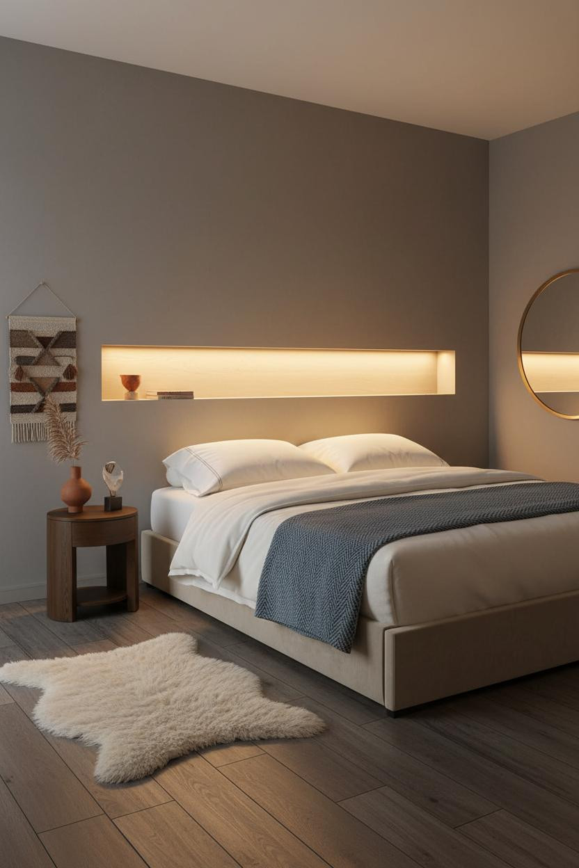
The Recessed Shelf Niche That Makes Blue-Grey Walls Work
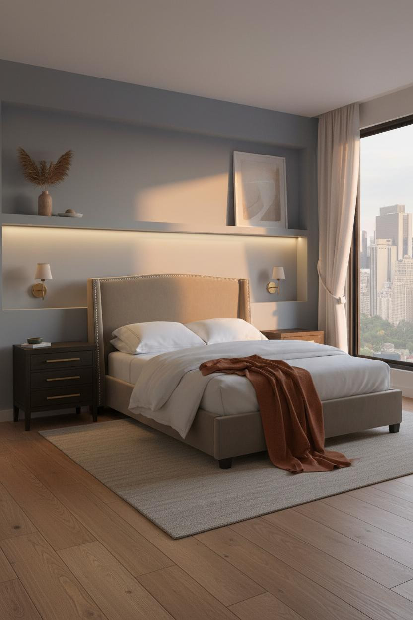

Cool-toned walls are tricky in small rooms. Too grey and the room feels cold. This layout gets it right.
Design logic: A shallow recessed niche running the full width of the bed wall gives the muted blue-grey surface something architectural to do. The integrated LED strip beneath it casts warm downward light that counteracts any chill the wall color brings. The room feels calm and cohesive, not clinical.
Worth copying: Pair cool walls with warm light sources, not cool ones. The contrast is what keeps it inviting.
Dove Grey And Birch Shelving: Quiet, But Not Boring
Nothing too precious here. That restraint is what makes it work.
What makes this one different: The natural birch shelving beside the bed stays shallow and sparse. One raw clay vessel. One dried grass bundle. That’s it. The room feels lived-in and intimate rather than staged, which is harder to pull off than it looks.
And honestly, dove grey walls make almost any warm wood tone look better. Simple pairing. Big return.
A Nordic Plaster Niche That Reframes The Whole Bed Wall
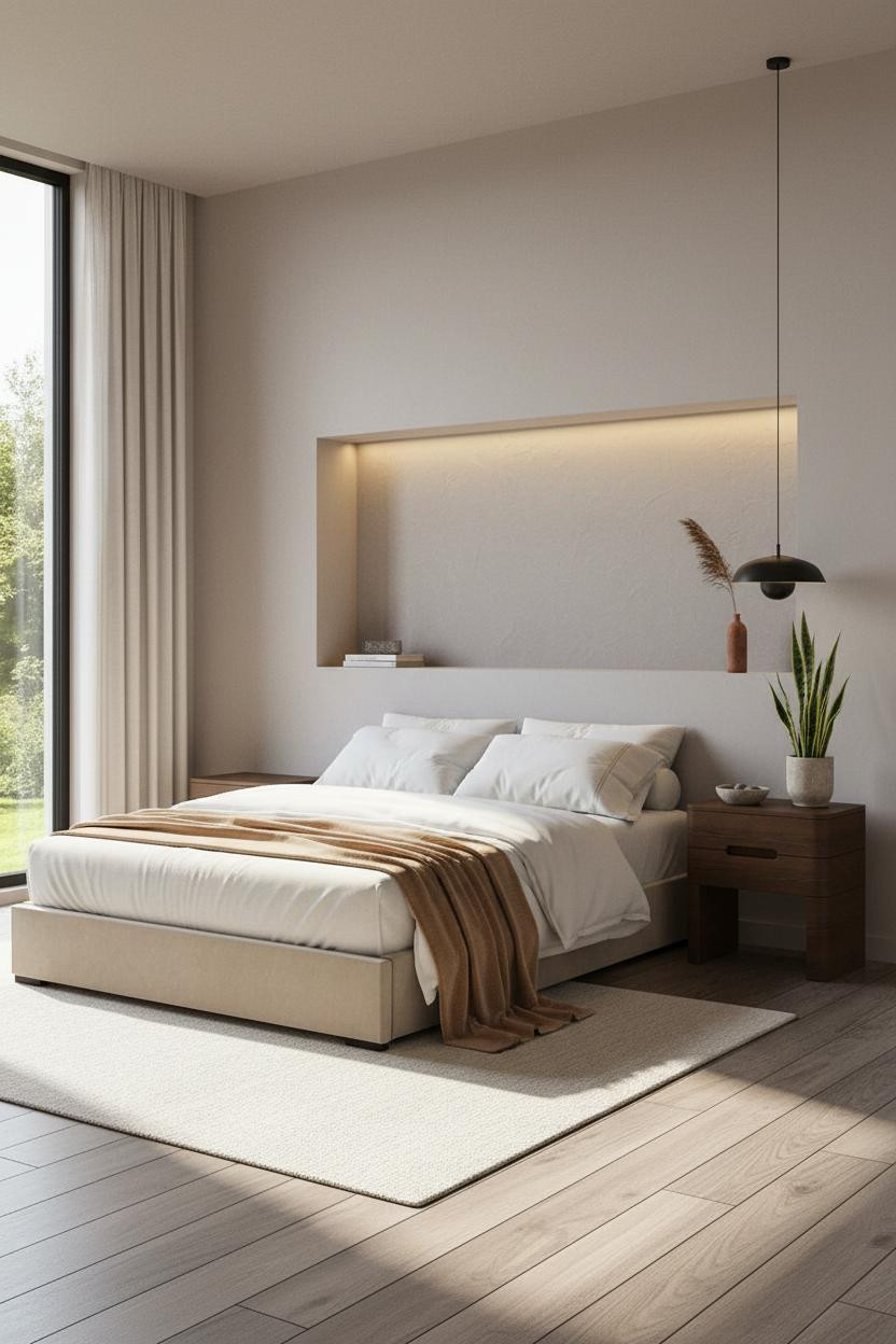
I almost overlooked this one. The proportions look simple at first glance.
Why it feels intentional: A floor-to-ceiling recessed niche in smooth dove grey plaster frames the sleeping zone with the kind of architectural clarity you’d usually pay a contractor for. The LED strip at the base washes warm light upward across the matte surface, making the recess feel like a feature rather than a structural accident.
What to copy first: The niche doesn’t need to be deep. Eight inches is enough to create the shadow line and the sense of enclosure.
The Arched Niche That Turns Warm Clay Walls Into A Design Move
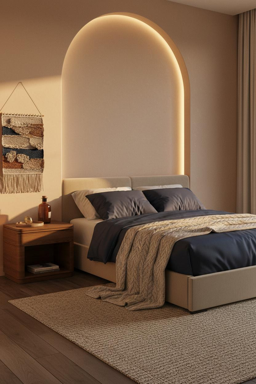

Fair warning: warm clay walls can tip into rustic fast. This room threads that needle.
Why the palette works: The slim arched plaster niche breaks the flatness of the clay wall while keeping everything in one warm family. Navy bedding against that much warmth creates just enough contrast to feel intentional, in a way that feels grounded rather than forced.
Don’t ruin it with overhead lighting here. The recessed niche strip and a single bedside source is all this palette needs.
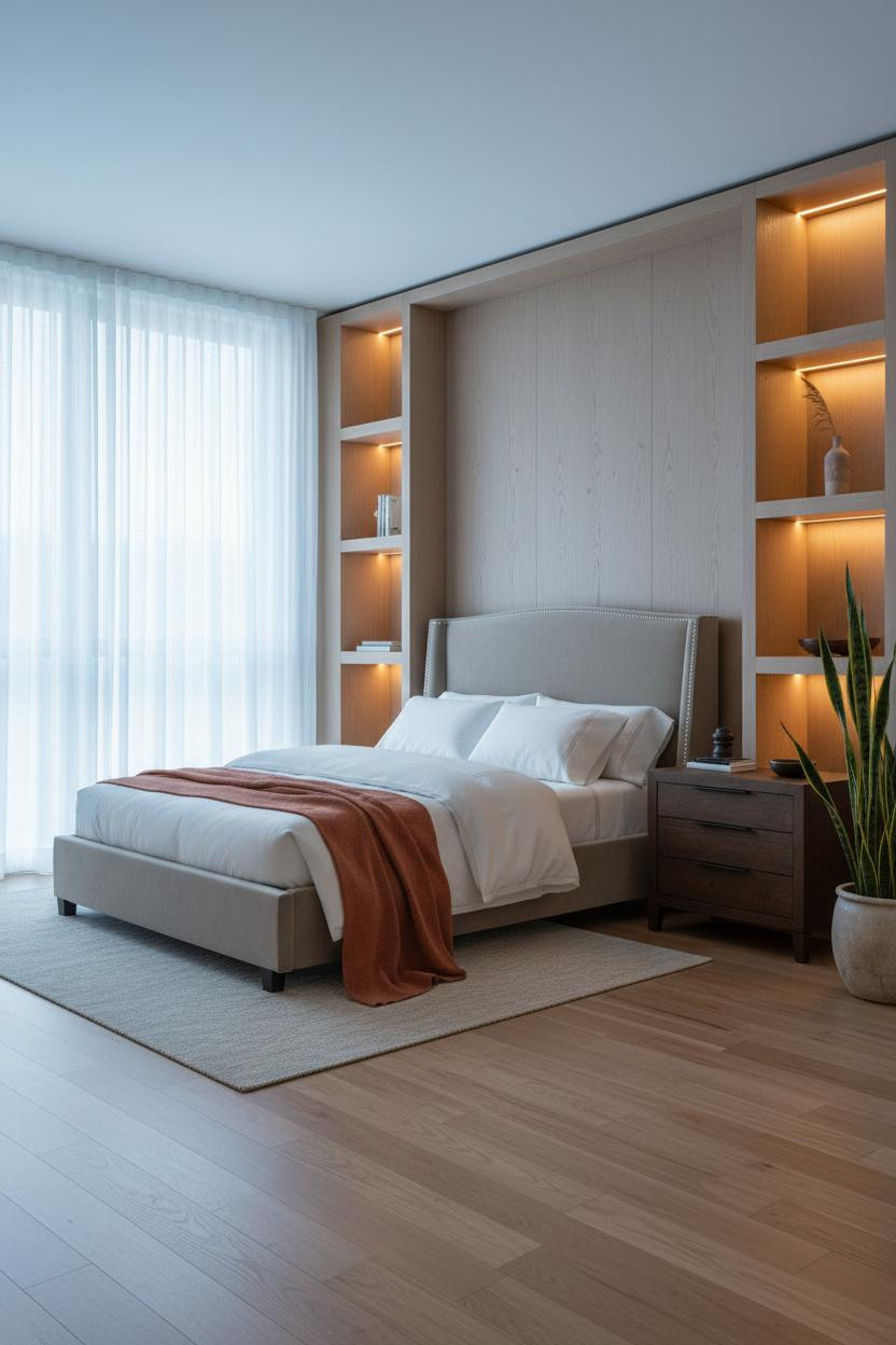
A Warm Oak Shelf Above The Bed Changes Scale Immediately

This one surprised me. It shouldn’t feel as generous as it does.
What carries the look: A full-width shelf in warm white oak spans the entire bed wall, and the underlighting catches the grain in a way that reads as custom joinery. It anchors the sleeping zone without hanging anything above the bed (which I find looks better anyway, for what it’s worth).
The stone grey walls keep the oak from feeling too heavy. Pro move: Add a round mirror leaning against the far wall to bounce the ambient light back into the room.
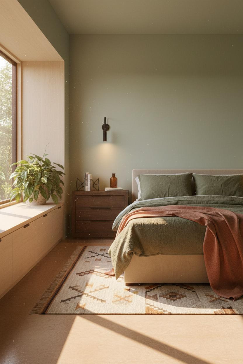
Olive Walls With Wainscoting: The Width Trick That Actually Works
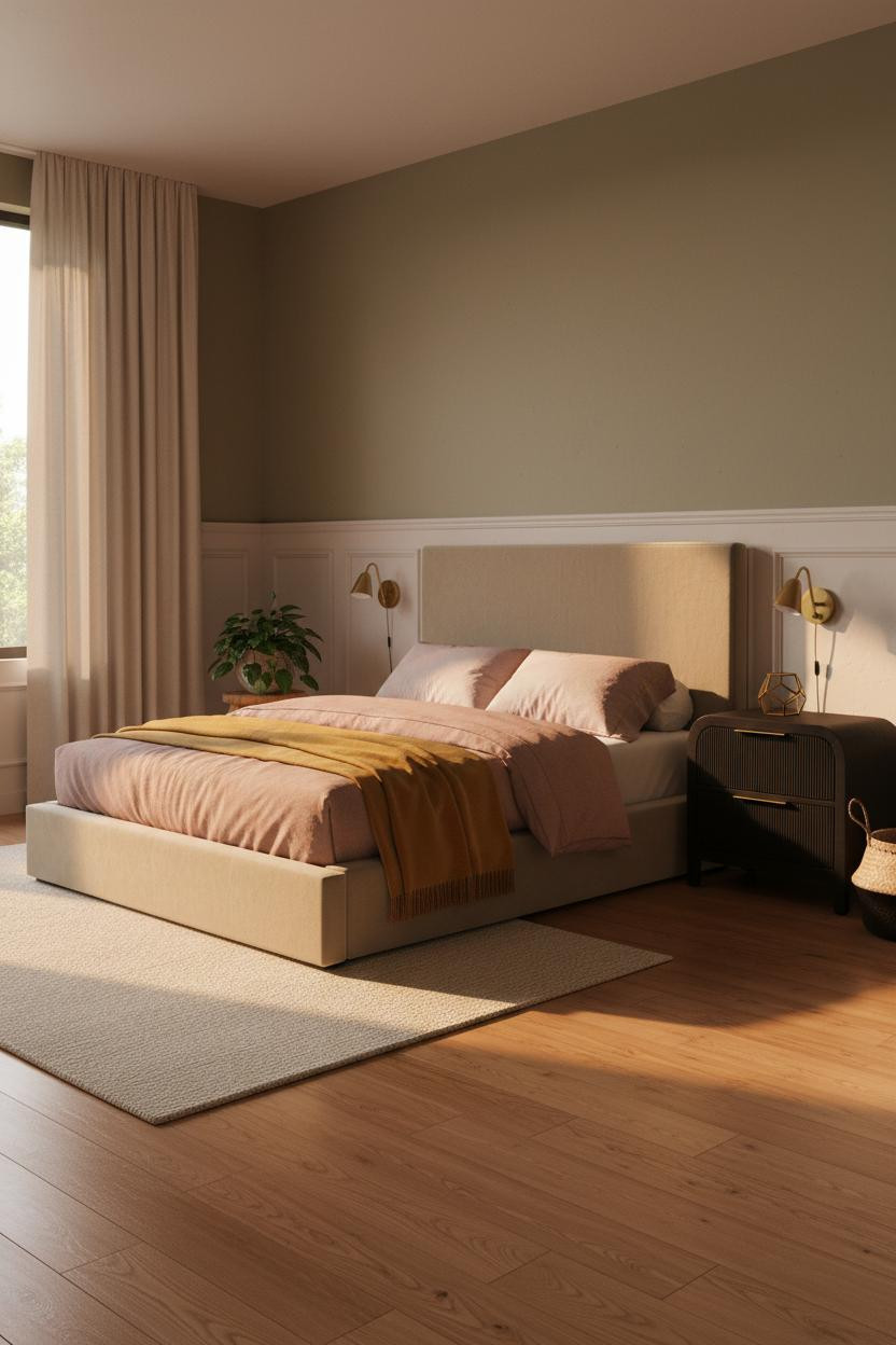

Two-tone walls get dismissed as dated. But this is different, and it’s worth understanding why.
The real strength: Textured plaster wainscoting on the lower half of the wall creates a strong horizontal line that stretches perceived width in a tight footprint. The mossy olive above it stays matte, so the two halves feel like a decision rather than an accident. Floor-to-ceiling linen curtains in dusty sand tie both zones together.
Ideal if your room runs narrow: horizontal divides read wider than they do tall.
Mushroom Walls And A Deep Niche: Japandi Done Right

This is the kind of Japandi bedroom I’d actually want to sleep in. Not just photograph.
Why it feels balanced: The full-width recessed niche in deep mushroom matte plaster wraps the sleeping zone like a frame. Dark walnut flooring below, oatmeal bedding above, burnt orange throw at the foot. The palette is warm without being heavy, and the niche keeps the room from feeling flat.
What to borrow: The graphic flat-weave rug grounds the whole composition. Don’t skip it.
Board-And-Batten Done Simply Is Still The Right Call
Not every small bedroom needs a dramatic architectural move. Sometimes simple is the right call.
Why it works: A cream board-and-batten wall in a 10×12 room adds vertical rhythm through shadow lines rather than color or material contrast. The battens draw the eye upward, which helps the ceiling feel higher, while the pale cream keeps everything open and soft. Slate bedding against that backdrop is just enough contrast.
Where people go wrong: Painting the board-and-batten a dark tone in a room this size. Keep it light. Let the shadow lines do the work.
Built-In Oak Shelving With A Platform Bed: The Full Package
And this is the one I’d save if I were starting a small bedroom layout from scratch.
Why it feels expensive: Floor-to-ceiling natural oak built-in shelving with recessed strip lighting at each tier creates graphic vertical rhythm that makes a compact room read taller. The bleached oak floor and pale dove grey accent wall behind the bed keep everything coherent while the graphic black-and-white rug on the floor stops it from drifting into bland.
The finishing layer: A low platform bed in this context is key. Higher frames compete with the shelving. Lower frames let it lead.

Our #1 Pick
Saatva Classic Mattress
America’s best-selling online luxury innerspring. 365-night trial, lifetime warranty, free white glove delivery.
Shop Saatva Classic
The Foundation Of Every Beautiful Bedroom
Every small bedroom in this roundup is doing something smart with walls, light, or storage. But none of it matters much if the bed itself isn’t right. And I mean what’s inside the bed, not just how it looks.
The Saatva Classic is the one I’d put under all of it. Dual-coil support that holds its shape over years (not months), a breathable organic cotton cover that doesn’t trap heat, and a Euro pillow top that’s soft without losing structure. It’s the kind of mattress you stop thinking about. Which is exactly what you want.
Walls get repainted. Linen gets swapped out. The mattress stays. Start with the bed. The rest figures itself out.

The rooms that look intentional usually come down to two things: editing out what doesn’t belong, and getting the foundation right. Good design ages well because it’s made well.