
Funky gallery walls turn boring blank spaces into personality-packed showstoppers. You’re about to see how mixing colors, frames, and art styles creates walls that actually feel like you.
These 21 ideas prove that gallery walls work best when you ditch the rules and pile on what you love. Thrifted finds, bold colors, weird frames – it all comes together.
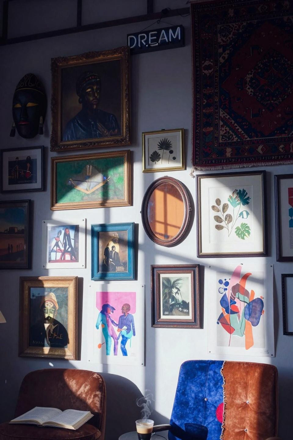
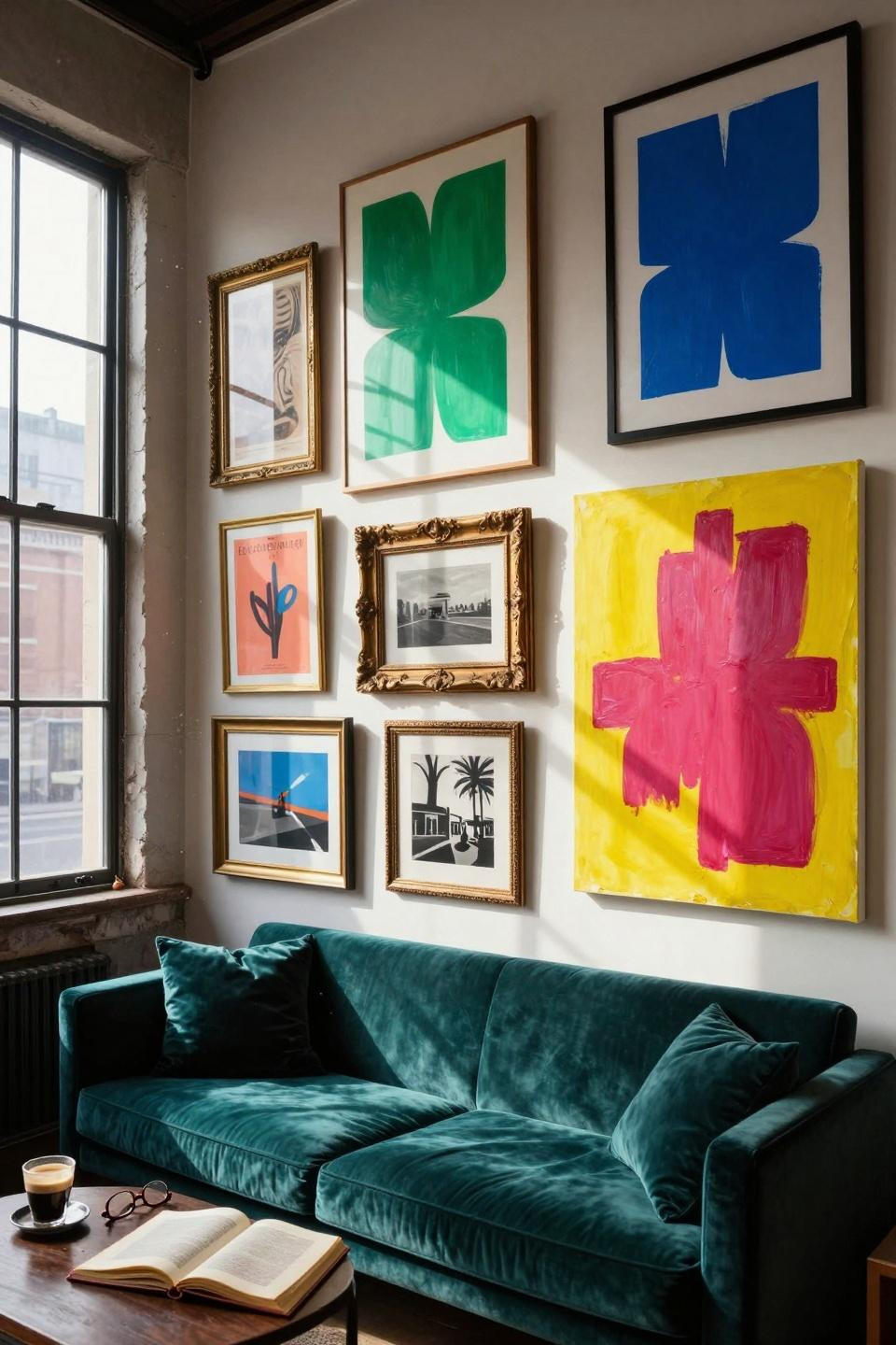
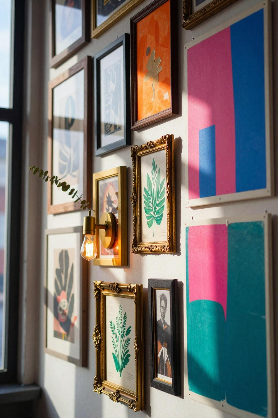
Bold Colors That Pop Off Your Wall
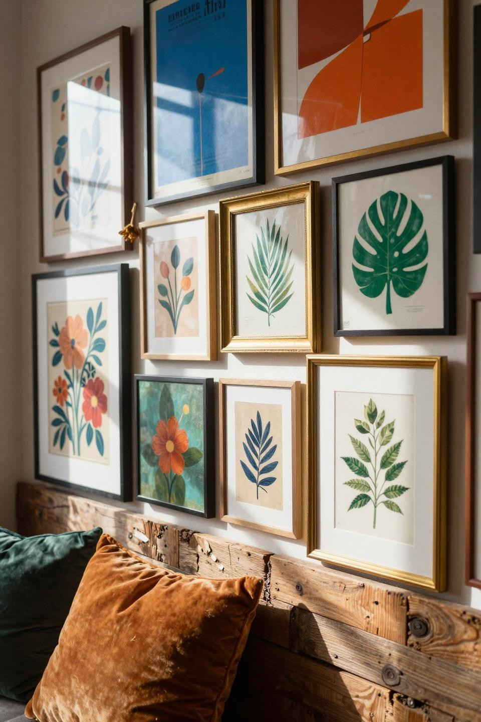
This setup hits you with cobalt blue, burnt orange, and emerald green all at once. The colors clash on purpose, and that’s exactly what makes it work.
Perfect if you’re tired of playing it safe with neutrals. Mix vintage posters with modern prints and let the colors do the talking.
The brass frames add shine without looking too polished. You get that collected-over-time vibe even if you bought everything last weekend.
One slightly crooked frame makes the whole thing feel less staged. Real people adjust their art and sometimes don’t fix it right away.
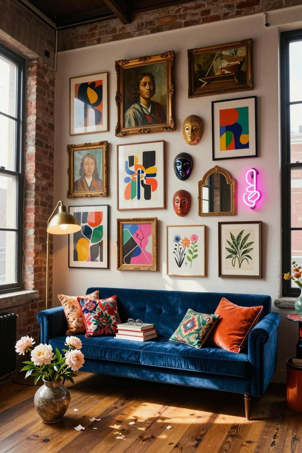
Maximalist Mix With Industrial Edge
Raw metal frames meet painted wood and brass in this chaotic layered look. The warehouse vibe gives you permission to go bigger and bolder.
This works in small apartments too – you just need one big statement wall. The mix of frame styles costs way less than buying a matching set.
Hang some pieces lower than you think they should go. Breaking that invisible grid line makes everything feel more organic and less matchy.
Floating Shelves Add Dimension
Adding shelves between your frames lets you layer art and swap things out without making new holes. The depth makes your wall feel alive instead of flat.
Perfect for renters who can’t drill a million holes. You can lean prints and move them around until something clicks.
Pile on small objects like candles or books to fill gaps. The mix of 2D and 3D keeps your eye moving around instead of getting bored.
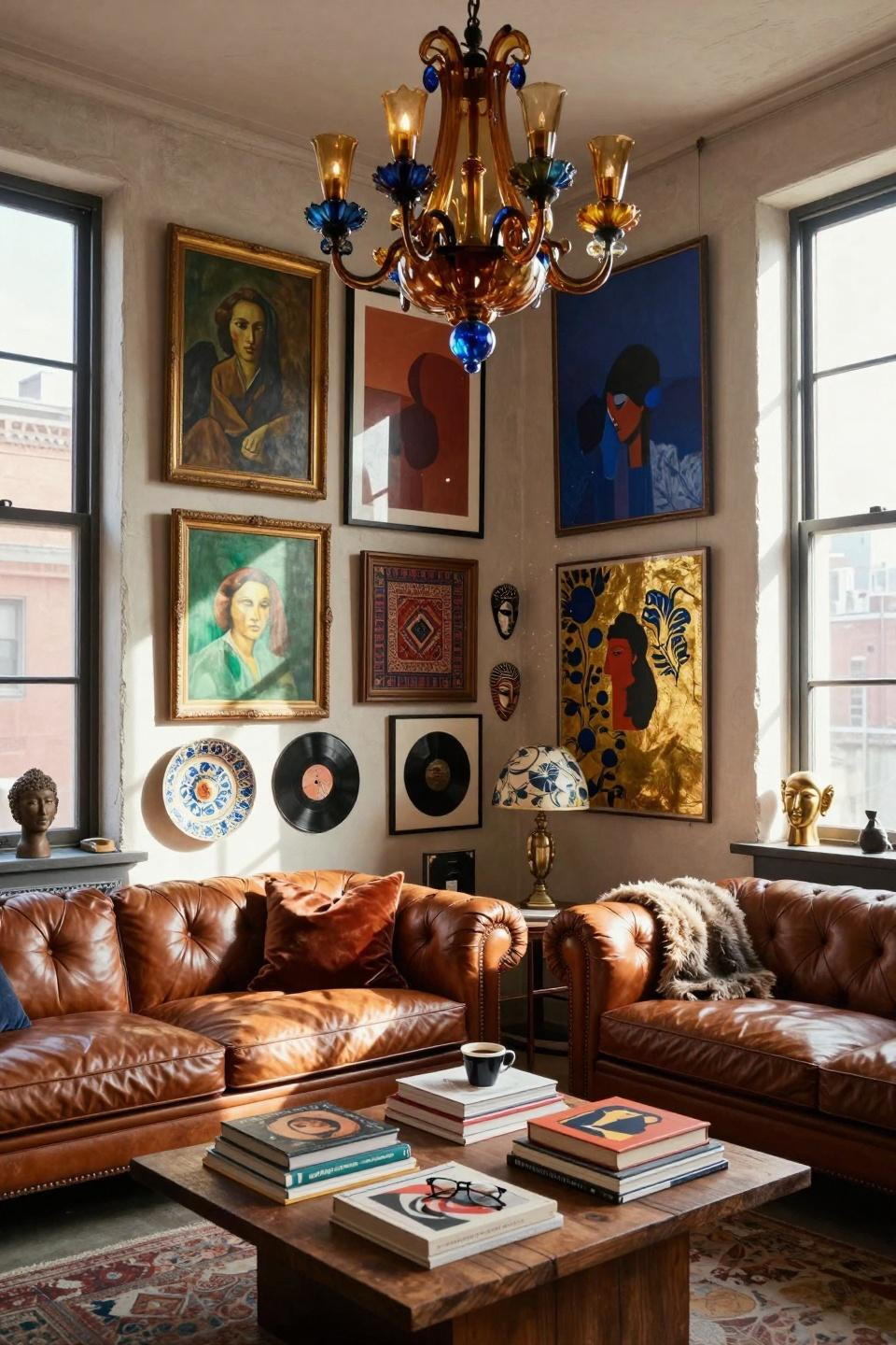
Overhead View Shows The Furniture Connection
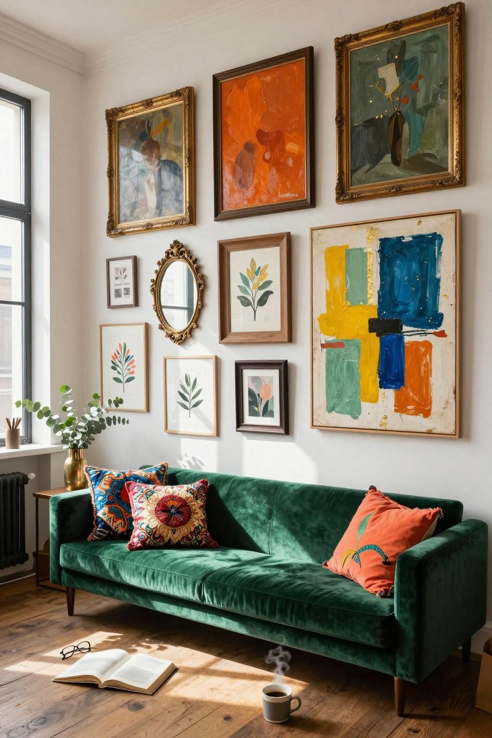
Your gallery wall needs furniture below it to anchor the whole scene. That velvet chair or settee makes the wall feel like part of a real room, not just decoration.
Choose furniture colors that either match or completely clash with your art. Both ways work as long as you commit.
Stack books and toss pillows nearby to make it look lived-in. Nobody wants a wall that screams “don’t touch anything.”
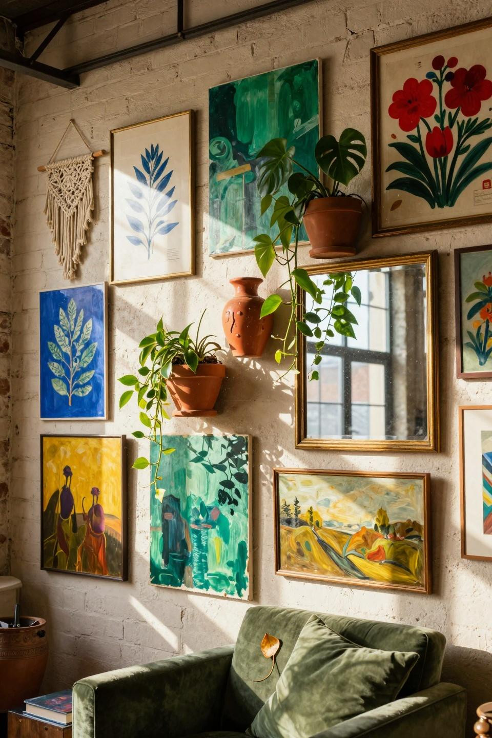
Plants Growing Into Your Art
Ceramic planters mounted between frames bring actual life to your wall. Trailing plants soften all those hard frame edges.
Great if you want an organic feel without going full earthy vibes. The green pops against colorful art way better than against plain white walls.
Water carefully so you don’t drip on your art. Or embrace the imperfect and let some water spots happen – adds character anyway.
Floor To Ceiling Maximalism
When you’ve got tall ceilings, use every inch. This all-in approach makes small art collections look way more impressive than they actually are.
You’ll need a ladder but it’s worth it. The high-up pieces don’t need to be your best stuff since nobody sees them up close anyway.
The chandelier pulling double duty as wall lighting is genius. Functional and decorative in one shot.
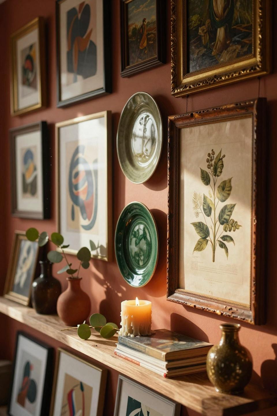
Ceramic Wall Planters For Texture
Ceramic pieces mounted as art give you shape and color without needing perfect framing skills. The mix of flat art and 3D objects keeps things interesting.
Hunt thrift stores for weird ceramic finds. Plates, masks, sculptures – if it has a hanger or you can rig one, it goes up.
Layer plants in front of frames so they slightly overlap. That intentional messiness looks collected, not planned.
Vintage Posters And Concert Prints
Old concert posters and vintage ads bring instant personality. Even reproductions work if the colors and design are strong.
This style screams “I’ve been to places and collected things.” Nobody needs to know you bought it all online last month.
Let one corner curl slightly or skip the glass on a few frames. Too perfect kills the vintage vibe you’re going for.
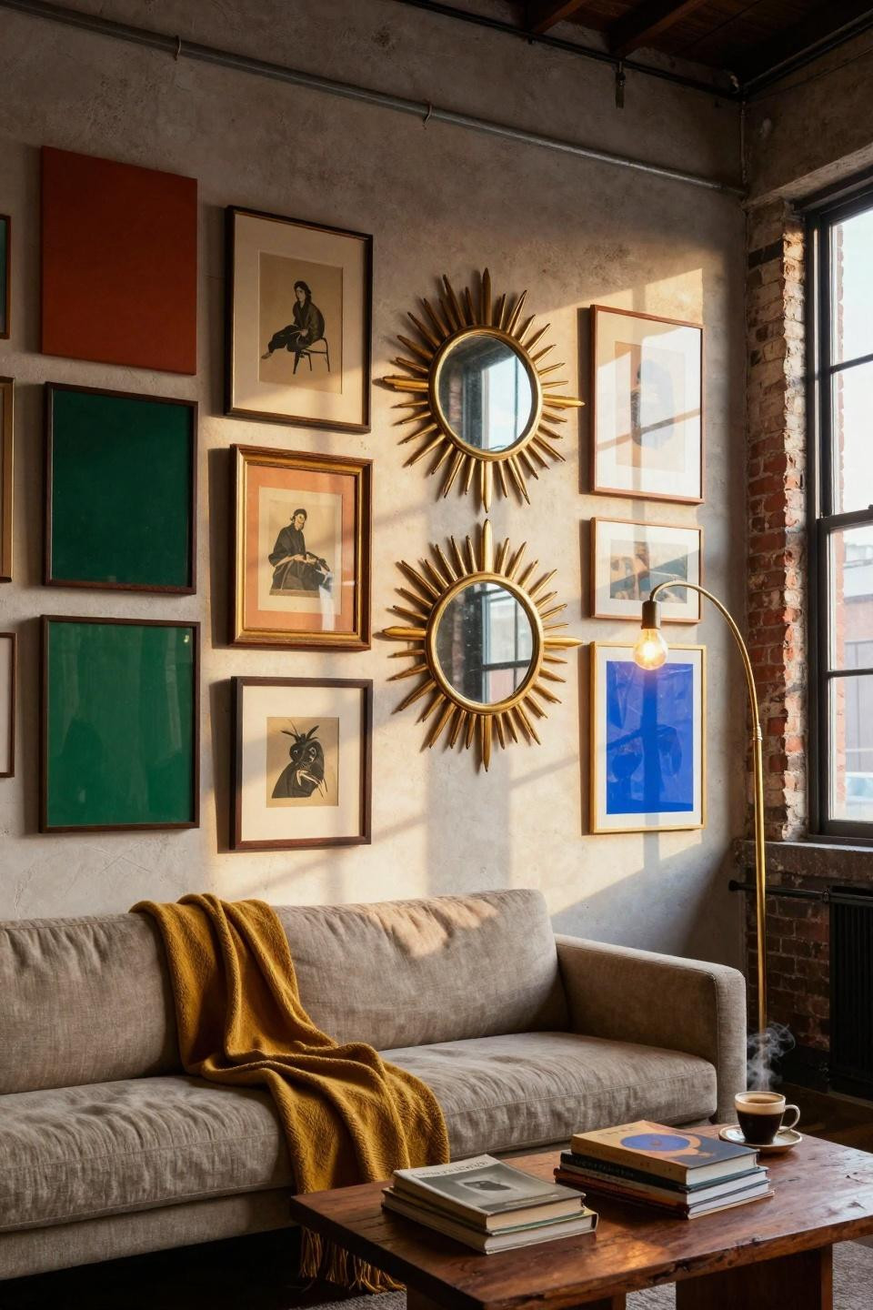
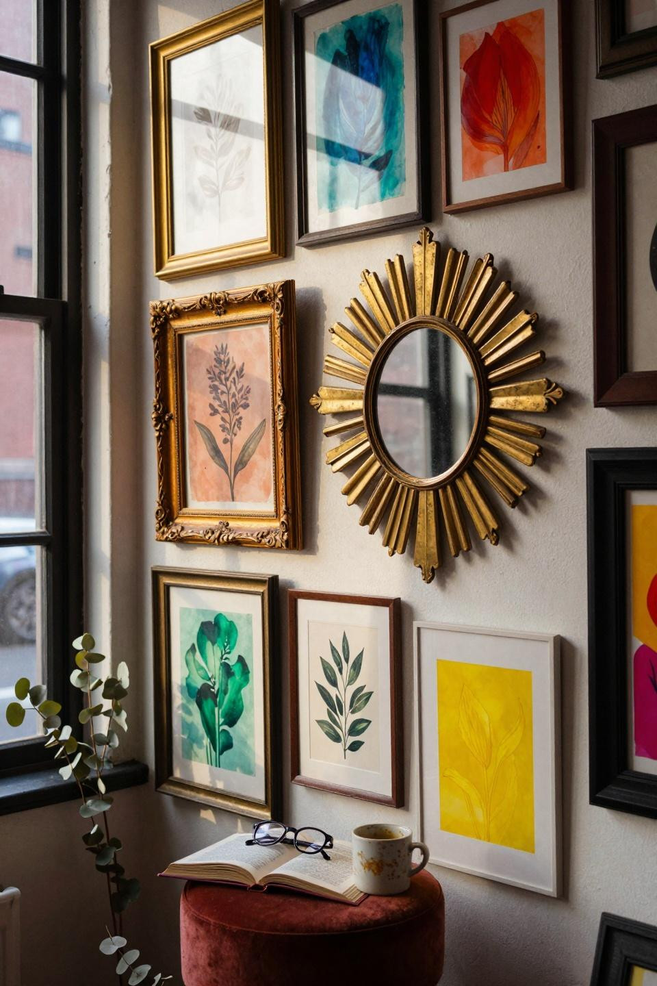
Mirror Reflections That Bounce Light
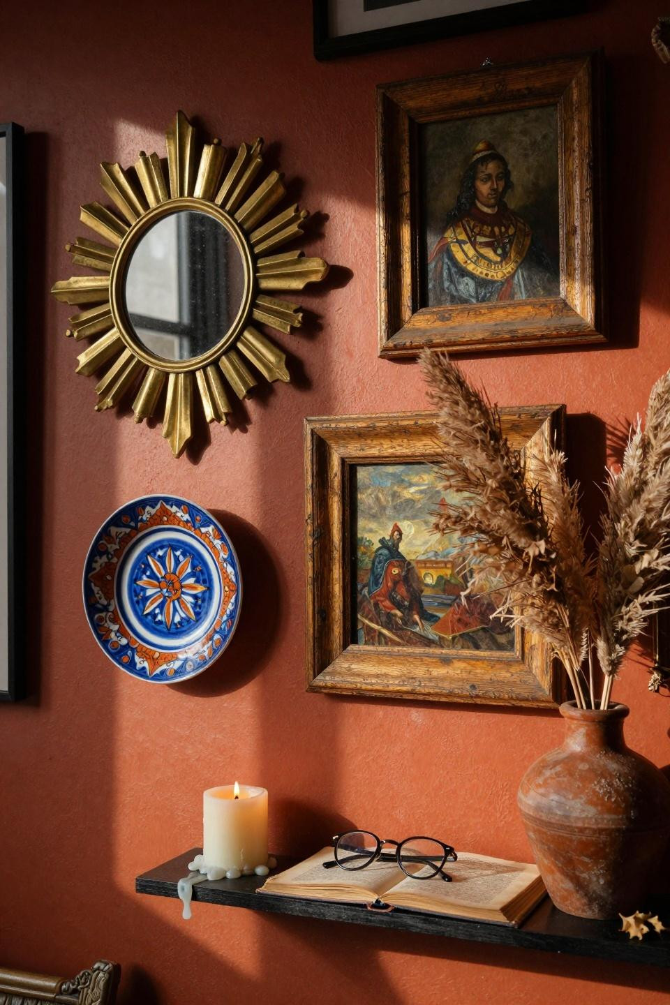
Mirrors mixed into your art make small spaces feel bigger and bounce light around. The brass frames catch sunlight and create little glow spots.
Position mirrors to reflect windows or lamps, not blank walls. You want light movement, not dead reflection.
Small mirrors work better than one big one. You’re building a collage, not making a vanity wall.
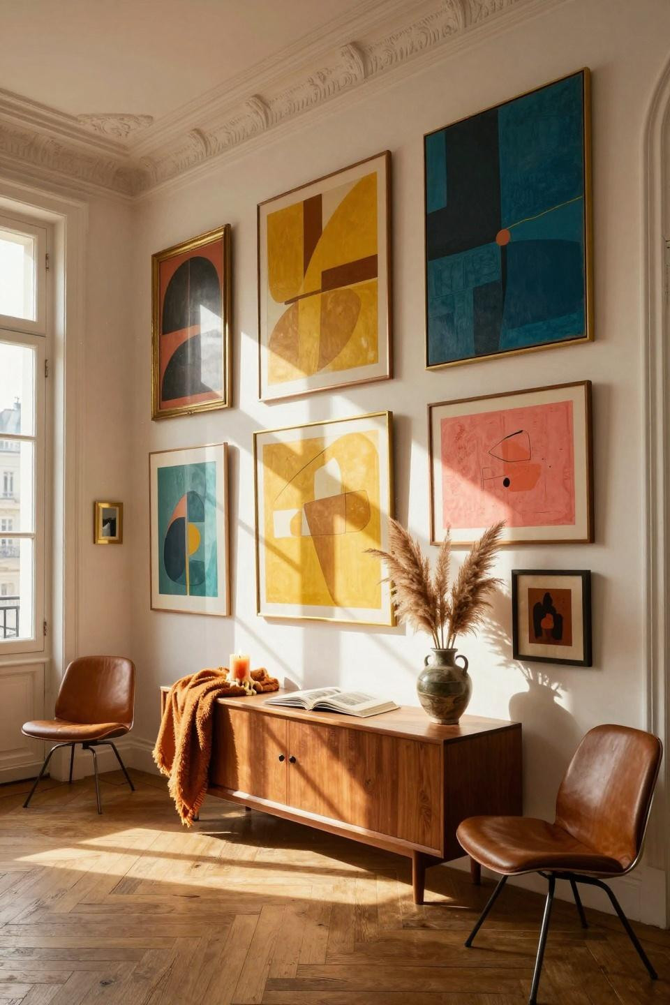
Jewel Tones On White Walls
Deep emerald, rich coral, and electric blue pop hard against plain white. The contrast makes even simple prints look expensive and intentional.
This approach saves money because you don’t need fancy frames. The art colors do all the heavy lifting.
Group similar tones together in sections rather than scattering them. Your eye needs some pattern to follow through the chaos.
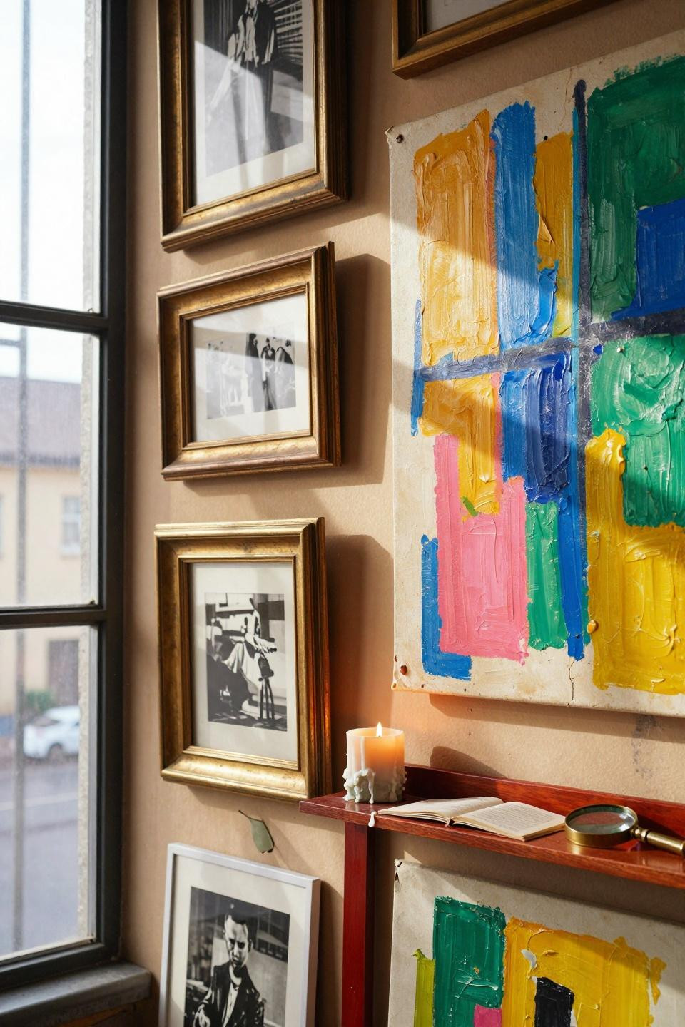
Mismatched Frames Tell Your Story
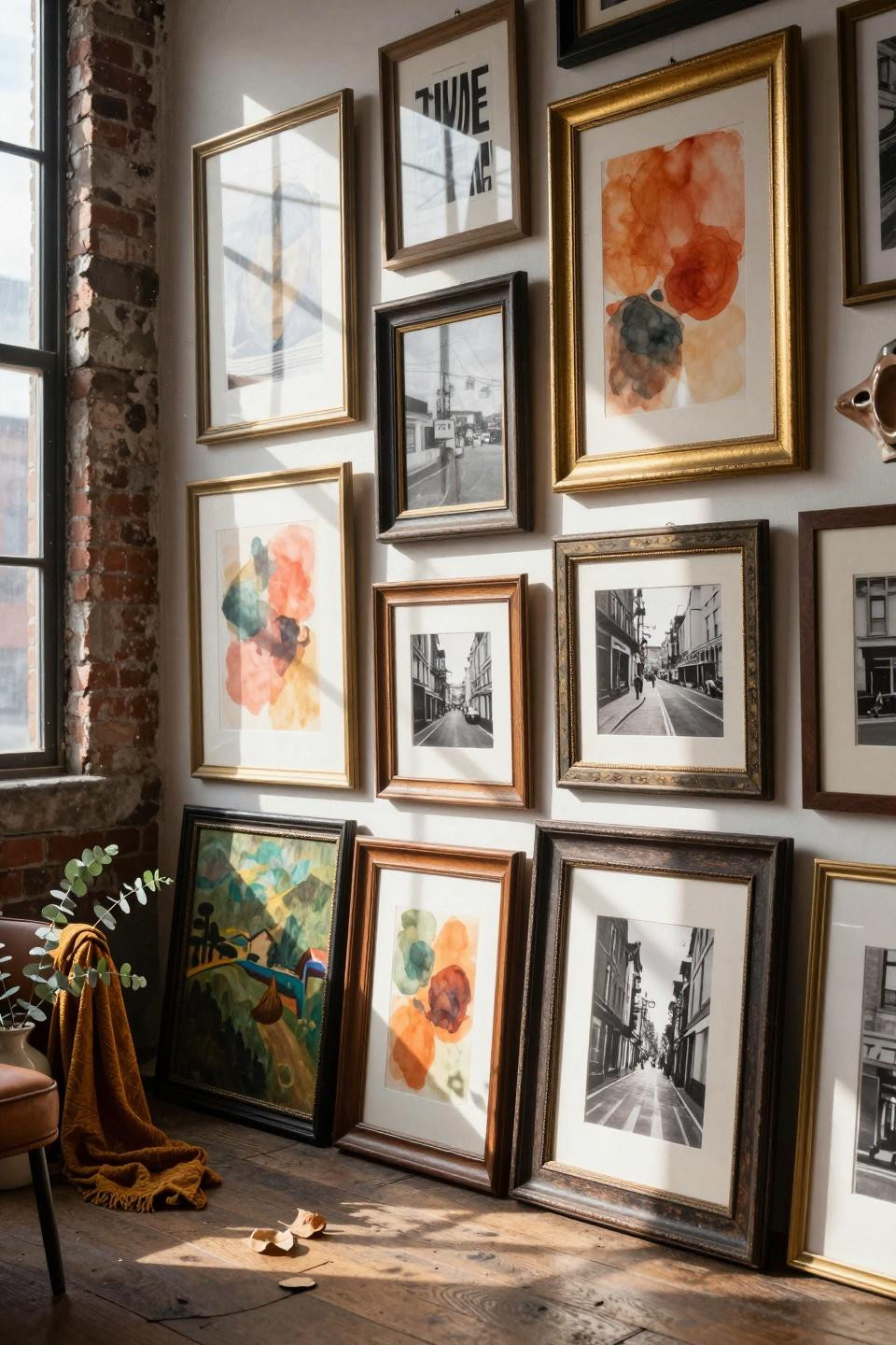
Every frame looking different is the whole point. Brass, wood, painted, gilded – mix them all and stop worrying about matching.
Thrift stores sell frames for a few bucks each. Grab whatever speaks to you and paint the ugly ones if you need to.
The random frame mix makes your wall look collected over years. Way more interesting than a matching set from a big box store.
Bold Statement Pieces As Anchors
One big piece grounds the whole wall and gives your eye somewhere to land first. Build everything else around that anchor.
Your statement piece can be DIY or thrifted. Size matters more than price tag when you’re creating visual weight.
Let smaller pieces orbit around the big one like planets. The size contrast makes both look better than they would alone.
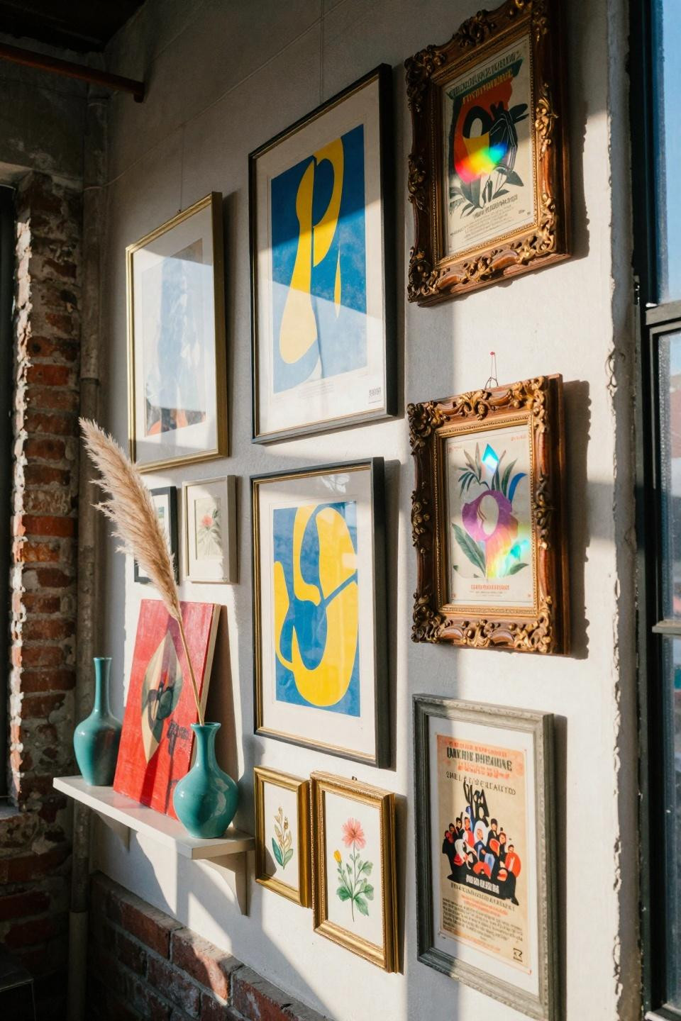
Gilded Frames For Old School Glam
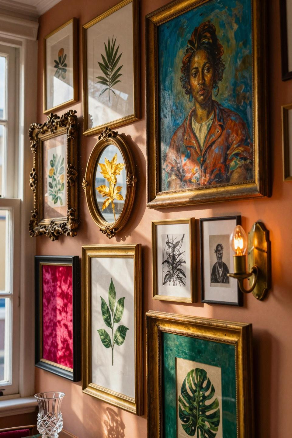
Gold and brass frames bring fancy vibes without trying too hard. The shine breaks up flat wall space and catches light all day.
Mix shiny new brass with tarnished vintage gold. The patina differences add another layer of texture and history.
You don’t need real gold – spray paint works great on thrifted plastic frames. Nobody’s checking that closely anyway.
Asymmetric Layout That Actually Works
Forget the grid. This scattered approach feels more natural and gives you room to keep adding pieces over time.
Start in the middle and work outward in whatever direction feels right. You can’t mess this up because there’s no wrong way.
Leave some empty wall showing through. The breathing room keeps it from looking like visual overload.
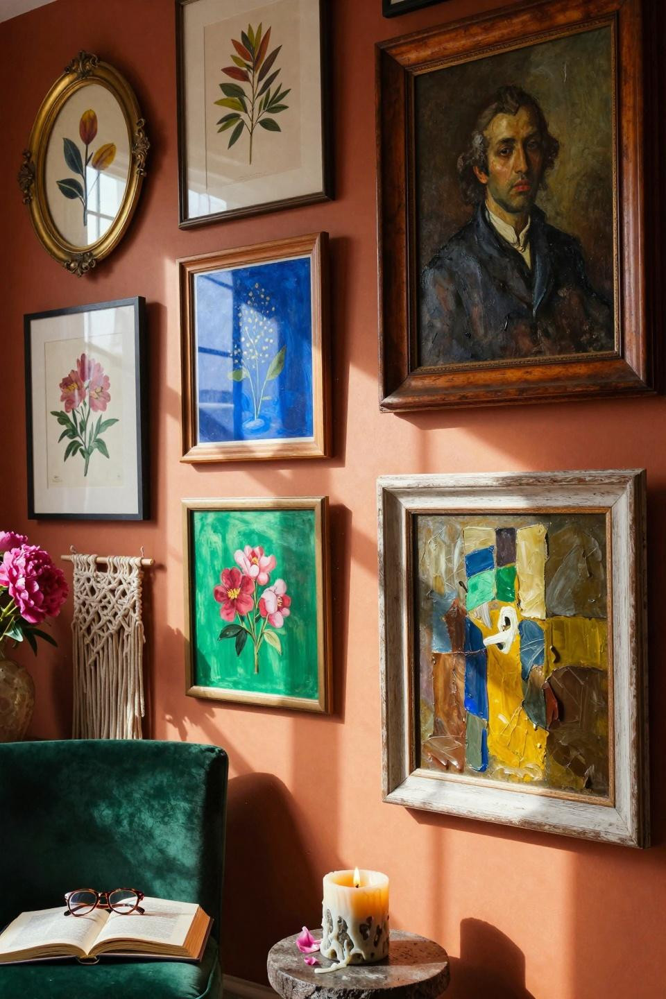
Warm Terracotta And Earth Tones
Rust, terracotta, and burnt orange create a cozy vibe that still feels bold. These colors work in any season and make rooms feel instantly warmer.
Pair warm tones with wood frames in honey or walnut. The natural materials amplify that organic collected feel.
This palette hides dirt and fading better than bright whites. Perfect for high-traffic areas or sunny walls.
Corner Gallery That Wraps Around
Don’t stop at one wall – turn the corner and keep going. This moves your eye through the space and makes small rooms feel more connected.
Corner arrangements hide awkward architecture and make weird spaces work. That random indent or beam becomes part of your design.
The wraparound effect doubles your display space without taking up any floor room. Clutch for tiny apartments.
Cobalt Blue And Jewel Tone Pop
Deep blue makes everything around it look richer and more intentional. Pair it with emerald green or ruby red for serious color drama.
These saturated colors photograph amazing, so your wall looks good in real life and on social media. Double win.
Balance the intensity with some black and white prints. Gives your eye places to rest between the color explosions.
Thrifted Finds And Flea Market Scores
The best gallery walls happen over time as you collect random pieces that speak to you. Thrift stores and flea markets stock all the good weird stuff.
Don’t match on purpose. The randomness proves these pieces have history and meaning, not just catalog coordination.
Leave price tags or stamps visible if they’re interesting. Those little details make each piece more story than decoration.
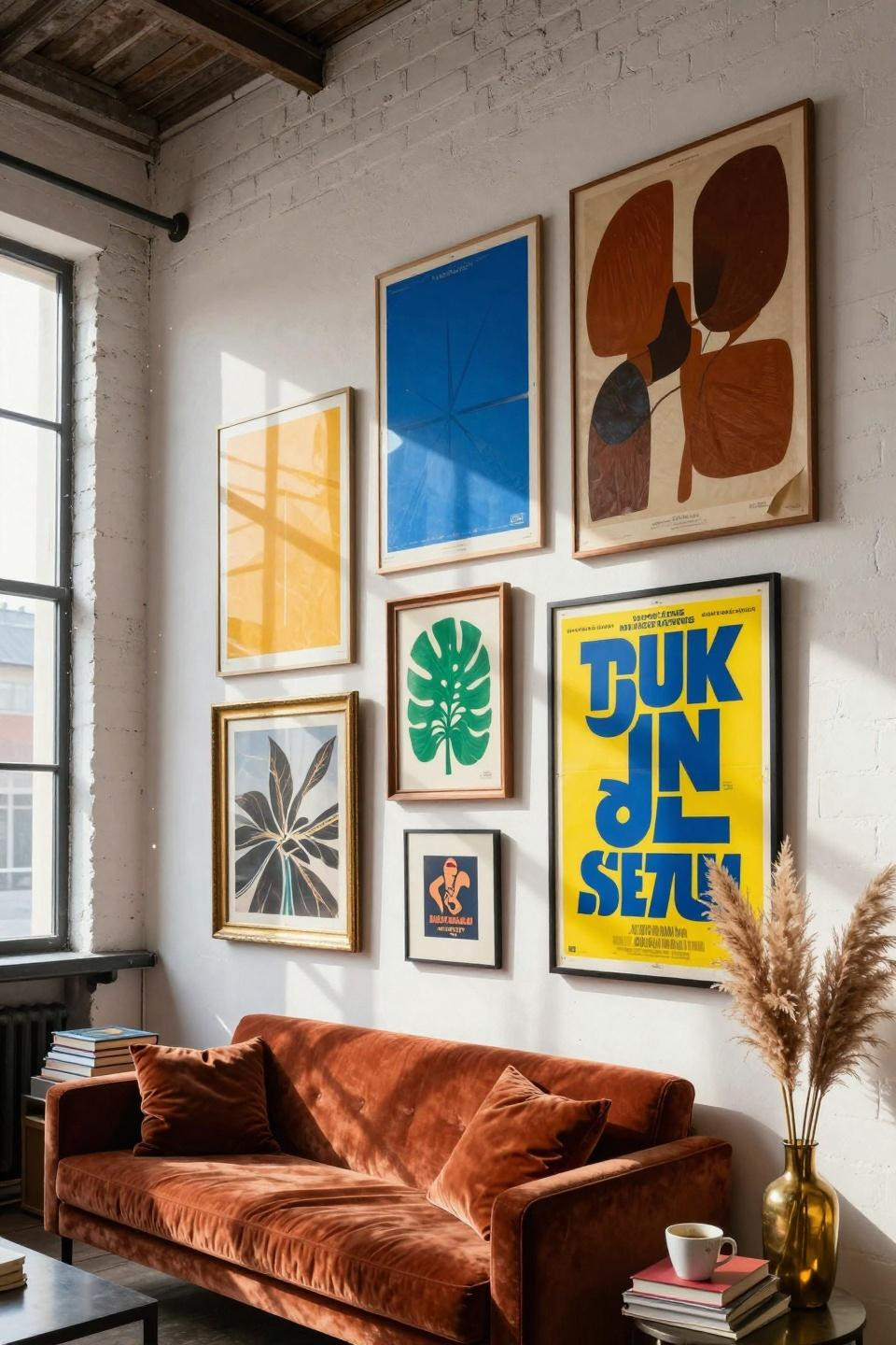
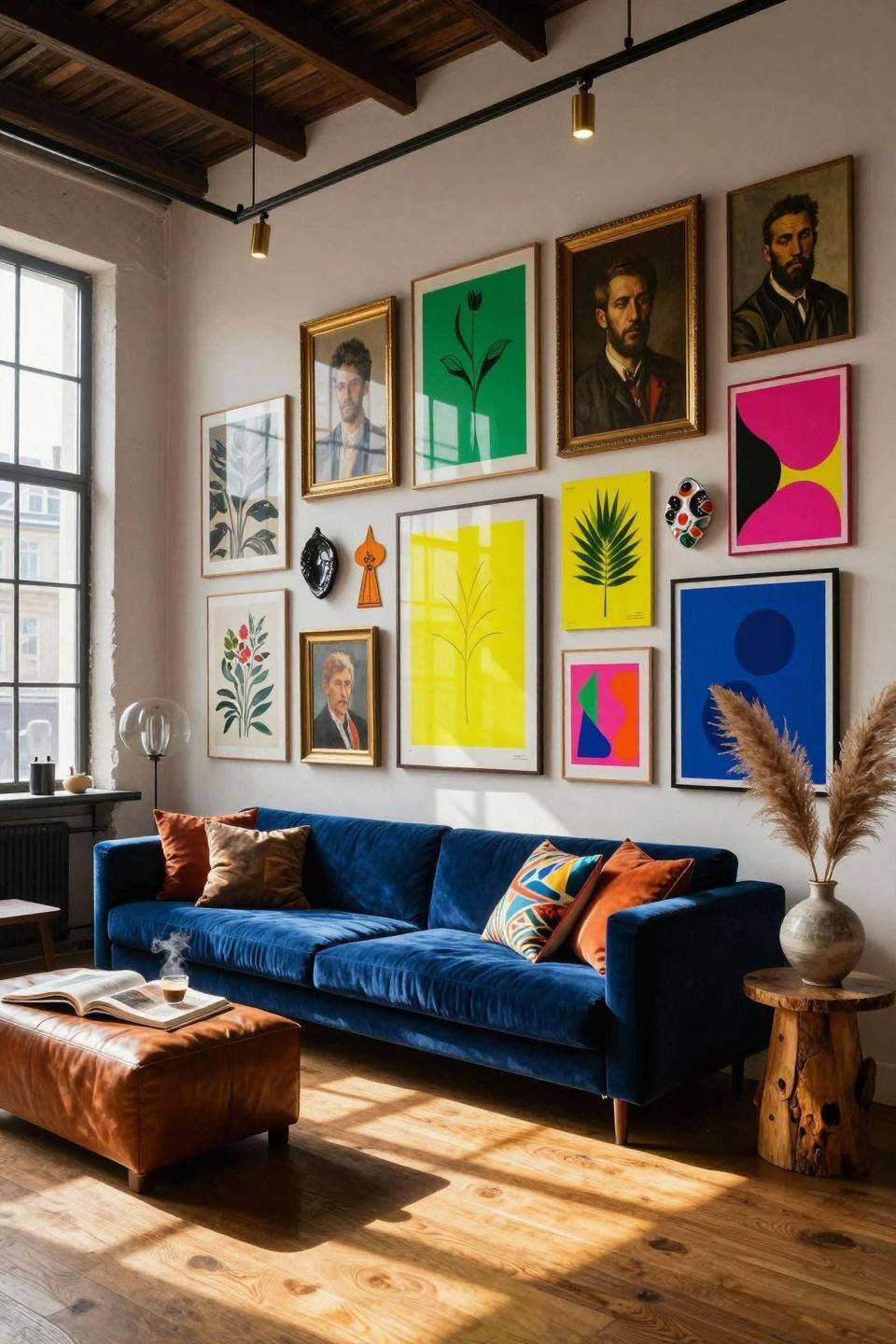
Living Room Gallery Above The Sofa
The wall above your couch is prime real estate for going big with your gallery. Everyone who sits down gets a personal art show.
Keep the bottom edge at least 6 inches above the sofa back so you don’t knock frames when you lean back. Learned that one the hard way.
Match or contrast with your throw pillows – both approaches work depending on how much chaos you can handle. I vote maximum chaos.
Warehouse Loft With Sky High Walls
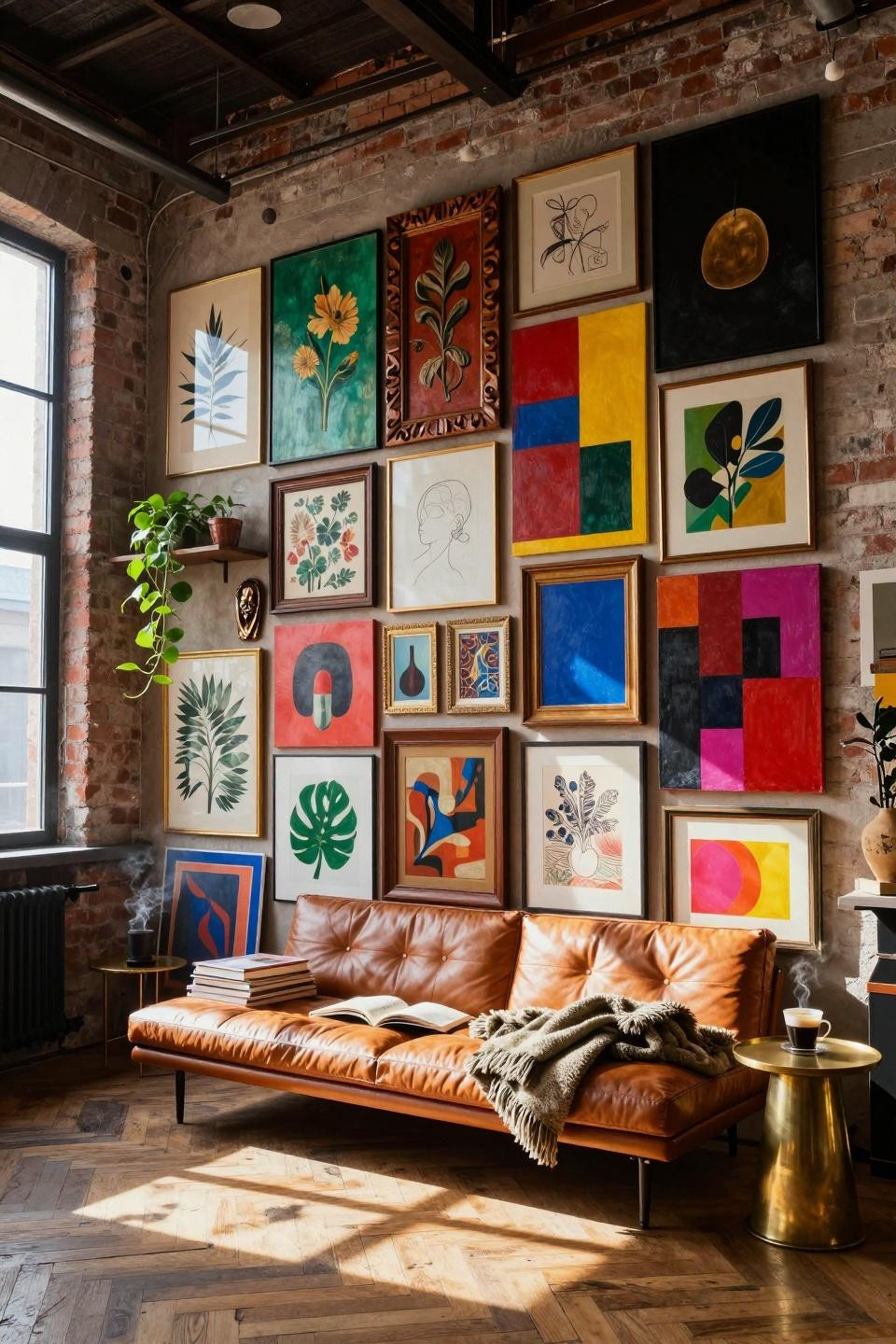
Tall ceilings demand tall galleries. This floor-to-ceiling approach fills vertical space and makes your collection look museum-level impressive.
Use the high spots for pieces you love but don’t need to see detail on. Save eye-level space for art you want to really look at.
The layered depth here – art overlapping, different frame thicknesses – creates shadows and dimension that flat grids never achieve.
Complete The Look With Clashing Patterns
This maxed-out wall proves you can combine absolutely everything if you commit to the chaos. Geometric prints, portraits, abstracts, neon colors – all of it works together.
The secret is having enough pieces that no single one dominates. When everything fights for attention equally, somehow nothing does.
Scale matters more than style. Mix big and small, wide and tall, so your eye bounces around finding new details every time.
Make Your Walls Worth Looking At
Your walls should make you happy every time you walk past them. These funky gallery setups prove that breaking the rules creates way more personality than following them ever could.
Start collecting pieces you actually love and figure out the arrangement later. Pin these ideas and grab your hammer – your blank walls are waiting for some personality. Check Pinterest for even more color combos and frame styles that’ll inspire your next thrift store run.