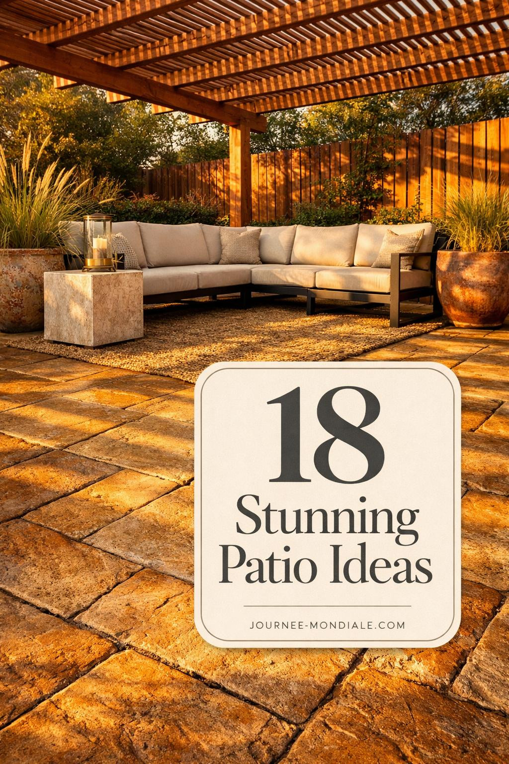
Stamped concrete patios have come a long way from those orange-y disasters of the early 2000s. Now? They’re fooling actual stonemasons.
The Quatrefoil Move That Broke Pinterest
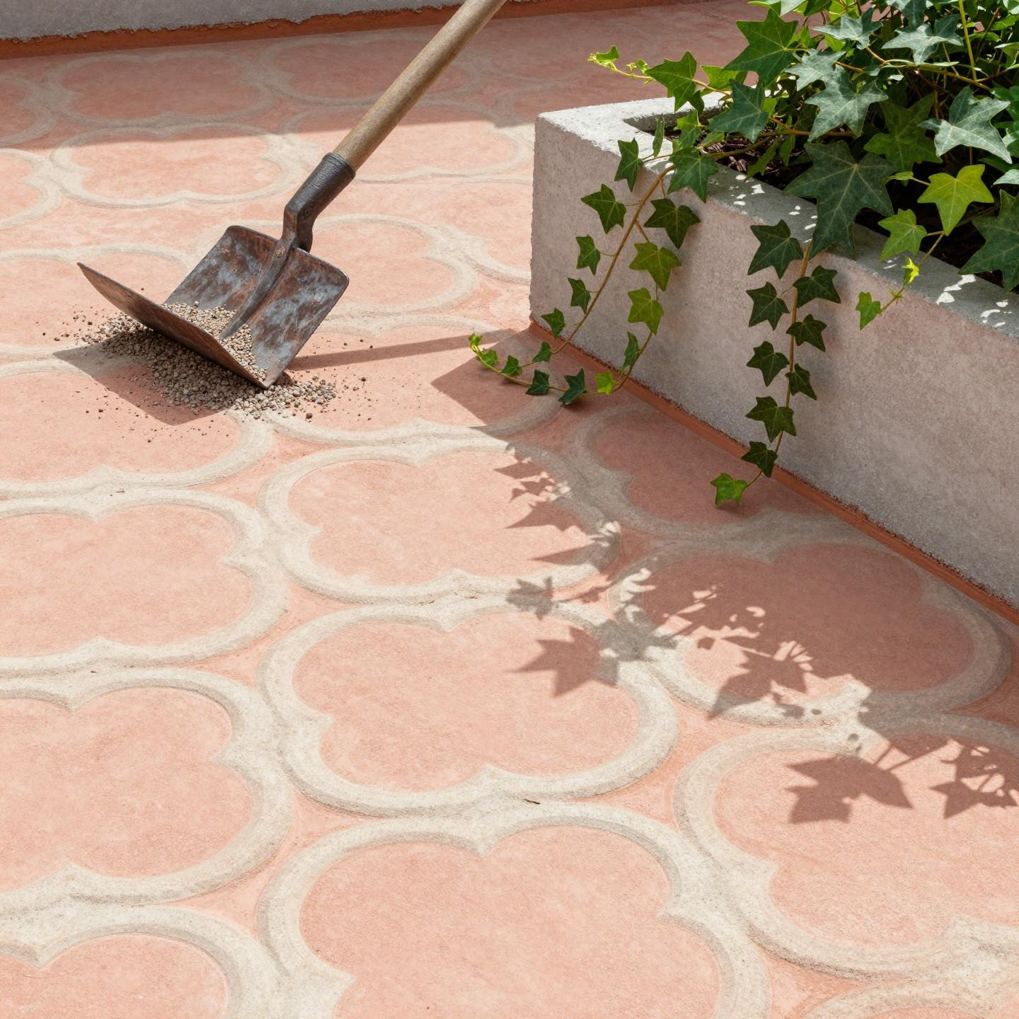
Peachy-pink concrete with a clover pattern sounds risky. But look at how that side-light hits the relief. The dimensional depth is what sells it—you can actually see where the trowel scored each edge. That brutalist planter anchoring the corner? Genius move. It gives your eye somewhere to land instead of just floating across pattern repeats. And honestly, the ivy spillage softens what could read too geometric.
Why This Water Feature Actually Works
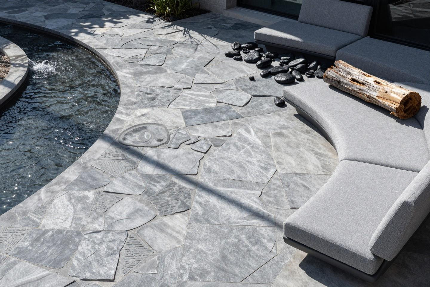
Random stone-bridge patterns can look busy. This one doesn’t because of that cool silver-grey base—it reads calm even with the recirculating stream cutting through. The lippage at the control joint (that slight height difference) is actually intentional here. Gives it that “naturally settled stone” vibe. I’d pick this if you want movement without maintaining an actual pond.
Teal Concrete That Doesn’t Scream 2019
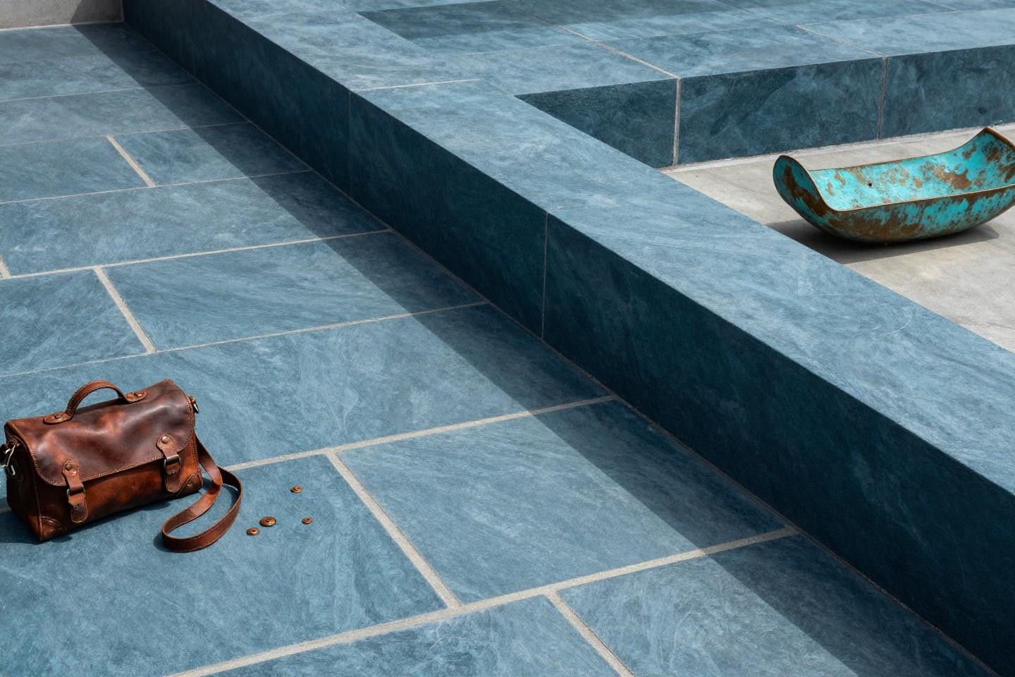
Deep teal with ivory grout joints. Bold, but the ashlar slate pattern keeps it grounded (literally). That copper water feature staining the surface with turquoise patina? Not a mistake—that’s the whole point. Real stone does this. The morning light raking across shows you every trowel mark, which separates expensive-looking from flat. This works when you’re ready to commit to color.
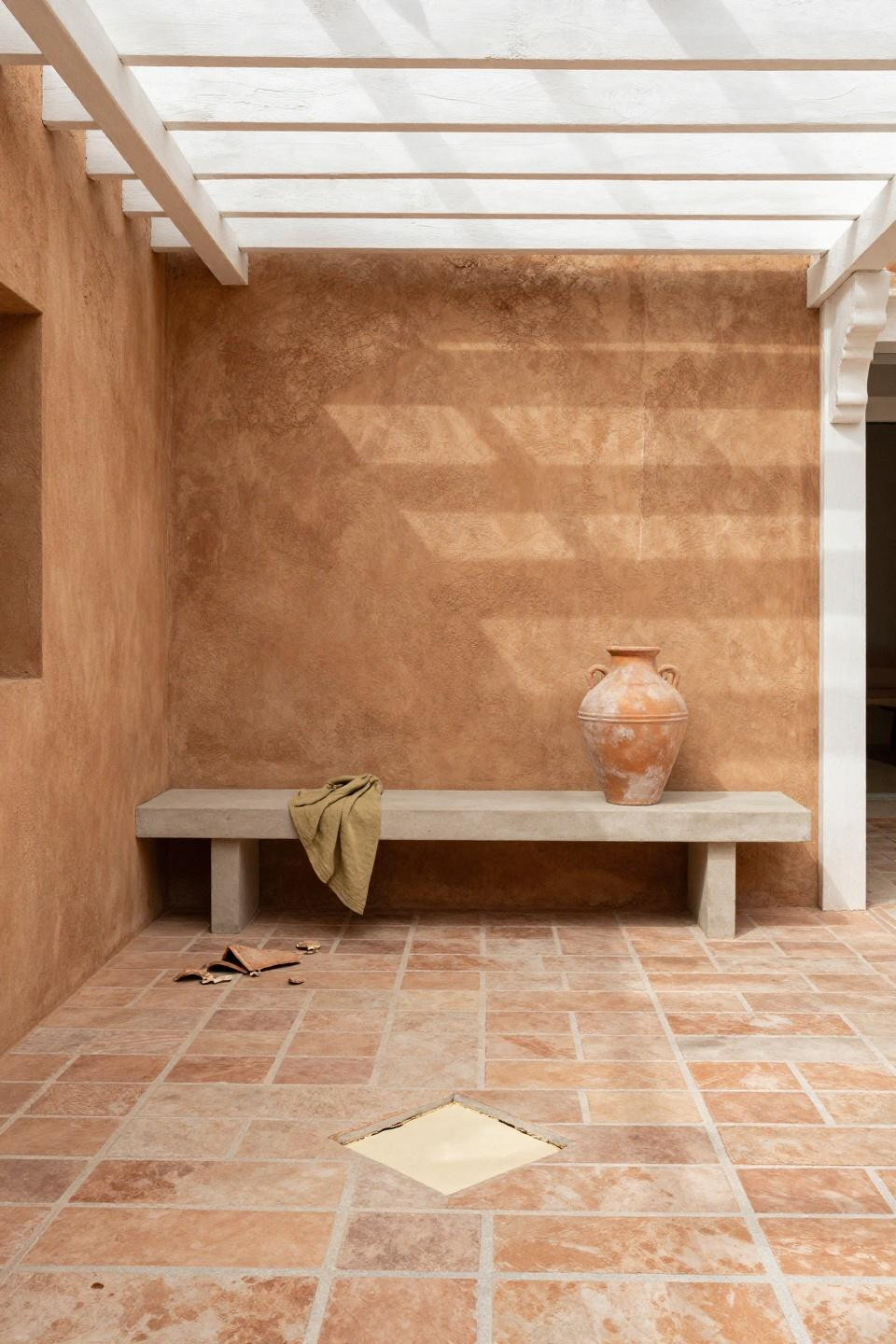
Caramel Flagstone Without the Weight
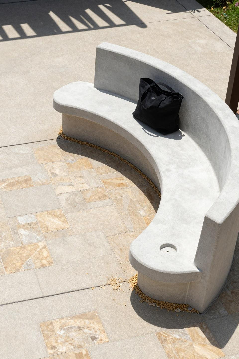
Flagstone weighs a ton and settles unevenly. Stamped concrete mimics the random cuts but stays level. That integrated bench with the planter pocket is doing double duty—seating plus greenery without eating your floor space. The pergola shadows at midday create this graphic stripe effect across the warm caramel. One vertical edge chip near the control joint? Adds character, not concern.
Burnt Sienna That Feels Like Tuscany
Running-bond brick texture in burnt sienna and cream just works. That timber pergola casting striped shadows during late afternoon? You can’t fake that warmth. The quarter-inch heave at the far control joint is normal settlement—concrete moves with seasons. But look how the sedge spills from that cedar planter bed. Softness against geometry. That’s the trick.
Graphite Grey for Fire Feature Zones
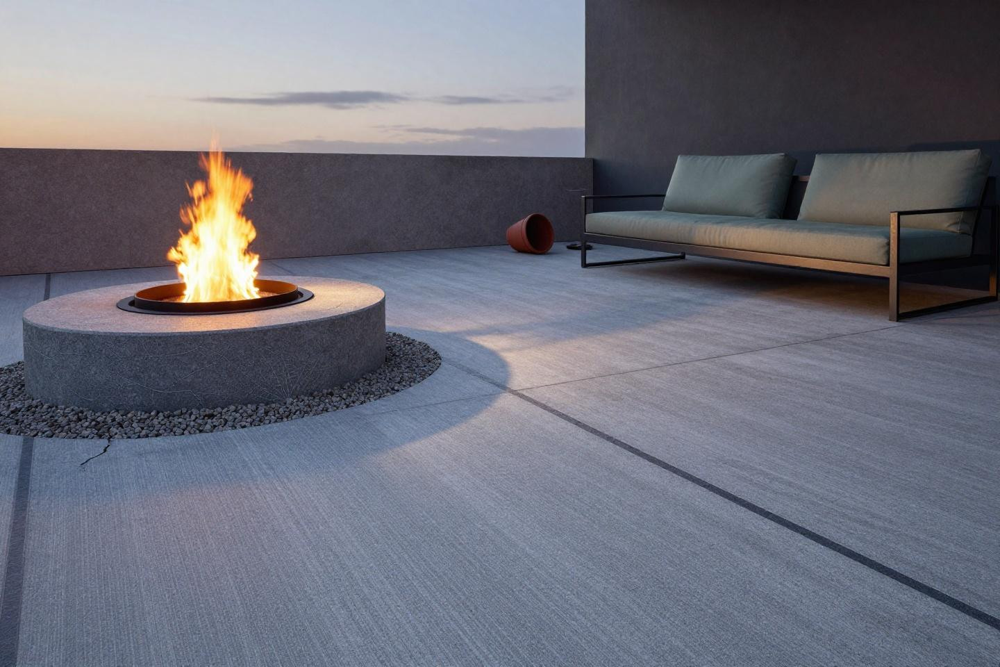
Cool graphite with charcoal joints reads sophisticated, not cold. The running ashlar pattern has enough variation to feel organic. And that blackened steel fire ring? The radial cracks spiderwebbing from the base aren’t flaws—high heat does that to concrete. Embrace it. The sage canvas cushion on that steel-frame lounge brings just enough warmth without fighting the grey palette.
Herringbone Weave That Changed Everything
Dove grey and sand tones in a herringbone weave. The pattern’s directional, which makes spaces feel longer. That cantilevered planter bench floating on the left? It’s anchored with rebar inside, but reads weightless. Afternoon side-light raking horizontally shows off every dimensional ridge. The quarter-inch heave stress crack is just concrete being concrete—it expands and contracts.
Blue-Grey Ashlar for Woodland Settings
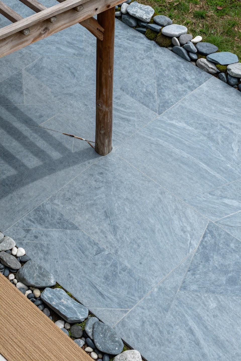
Random ashlar in blue-grey with charcoal veining mimics real slate without the price tag. That weathered timber pergola beam crossing diagonally creates organic shadow geometry you can’t plan. The moss-filled joints at the native stone border? That takes time to develop. Best for shaded yards where you want that cool, damp forest floor vibe.
Clay-Amber Running Ashlar with Cedar Islands
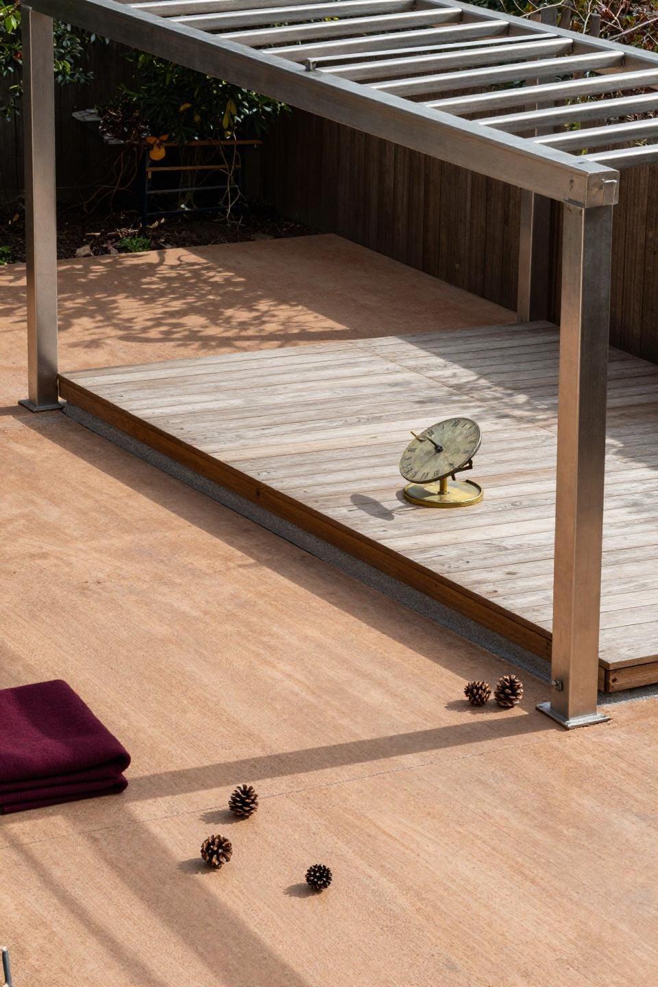
Warm clay-amber concrete with a floating cedar deck island in the center. The contrast in materials keeps it interesting—smooth stamped concrete against raw wood grain. That brass sundial on the deck corner? Old-school charm. The 3-inch settlement ridge near the perimeter is noticeable but not structural. Winter light creates those sharp pergola shadows that make the whole thing pop.
The Sunken Conversation Nook Trick
Dropping a section 18 inches below grade instantly creates zones. The warm taupe stamped slate stays consistent across both levels, so it reads unified. That curved wooden pergola casting organic shadows? It softens all the right angles. The 2-inch settlement differential along the eastern joint is typical where elevation changes—nothing to lose sleep over.
Sand and Grey Herringbone Minimalism
Large-format herringbone in soft sand and pale grey. The black steel pergola frame keeps it from reading too beachy. That low brushed concrete retaining wall defining the boundary? Clean line. The 2-inch horizontal offset where two pours meet is visible under overcast light, but it’s part of the process. This works when you want quiet sophistication.
Basketweave Clay Brick for Mediterranean Vibes
Warm rust and cream in a basketweave pattern. It’s traditional without feeling dated. That white-painted pergola diffusing morning light creates gentle, consistent shadows—no harsh contrast. The 45-degree hairline shrinkage crack through one diamond is normal concrete behavior. That pale ochre terracotta oil jar on the matching clay bench? Chef’s kiss.
Slate Ashlar Under Oak Canopy
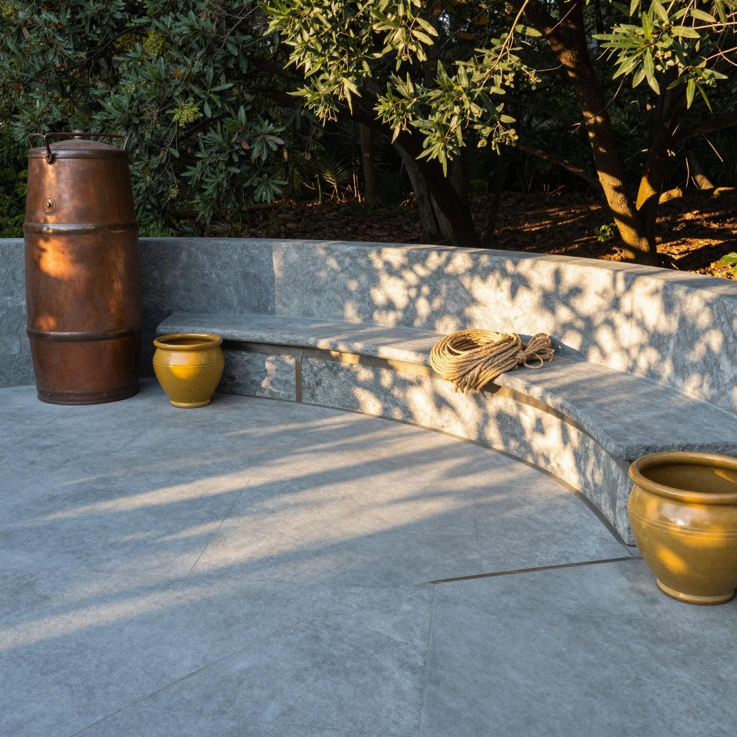
Cool grey-blue slate ashlar with a curved travertine bench carved right into the perimeter. The pattern continuity is key—stamp doesn’t break where the bench starts. Warm amber evening light filtering through dense oak creates dappled shadows you can’t replicate with artificial structures. Great when you’re working with existing tree cover instead of fighting it.
Honey-Gold Flagstone Up Close
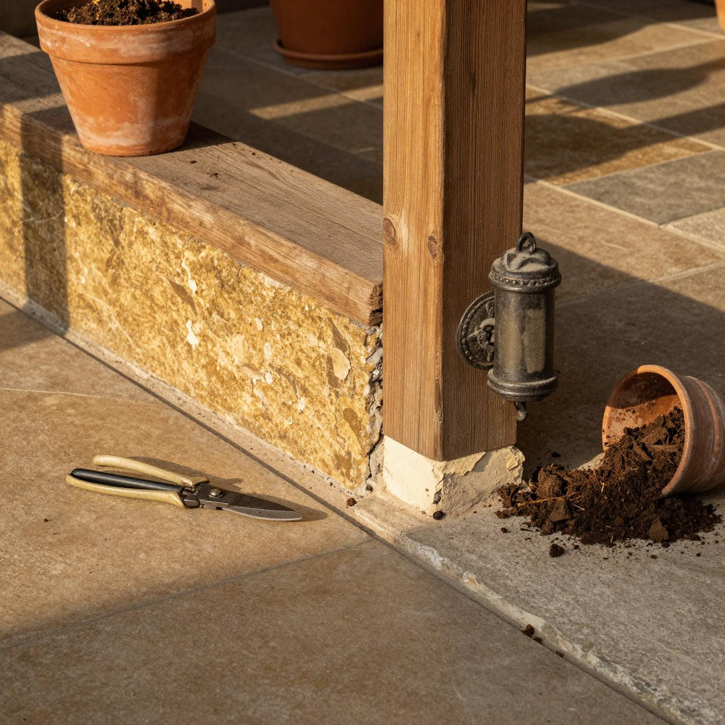
Warm honey-gold with deep shadow-filled joints. That vintage cast-iron sconce on the fence post creates raking afternoon side-light that shows off every dimensional detail. The fine hairline spalling at the corner (where the top layer flaked slightly) reveals cream aggregate underneath—totally normal wear. This color works if your yard has warm undertones or terracotta accents already happening.
Charcoal Ashlar with Terraced Planters
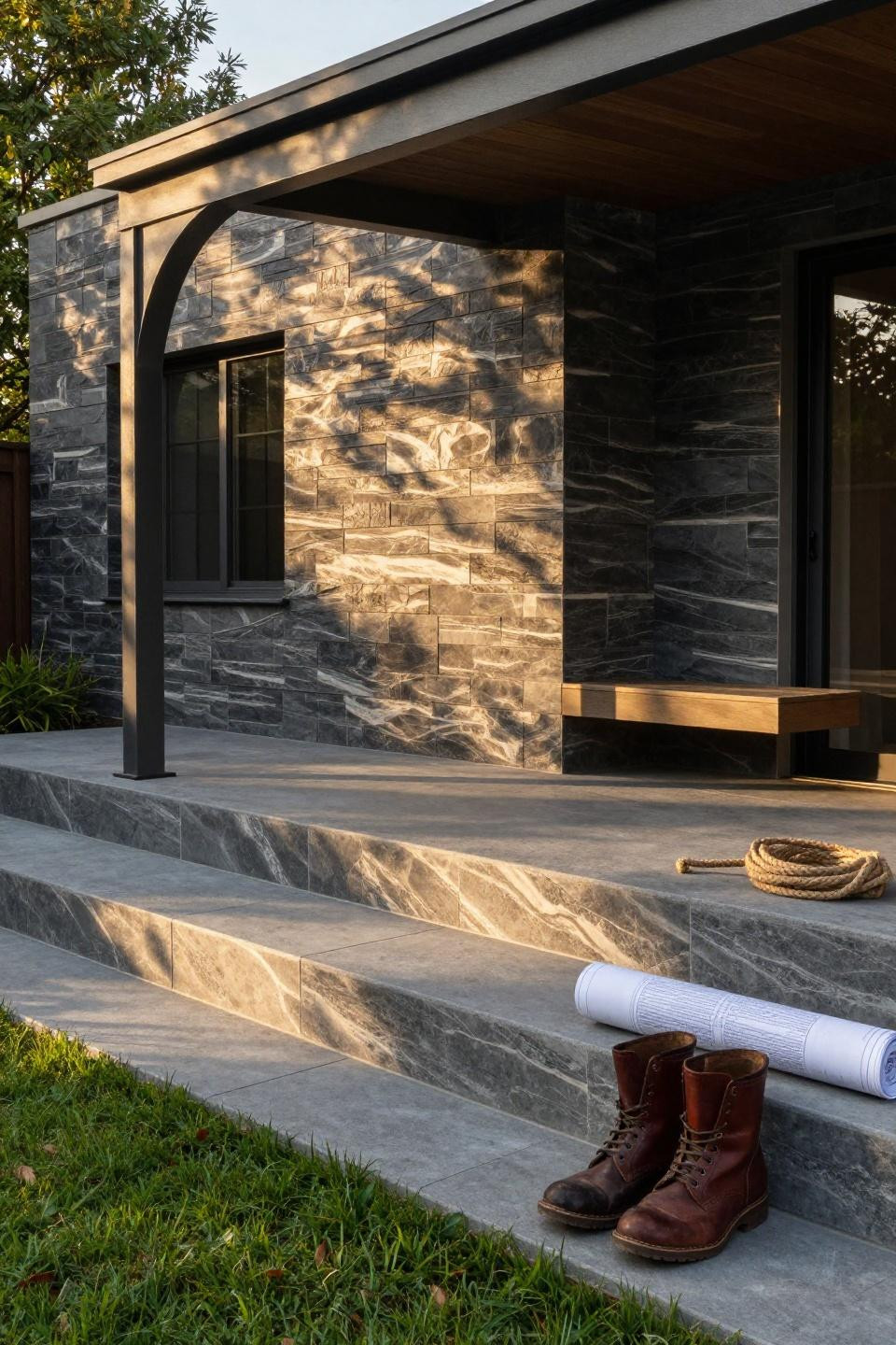
Deep charcoal with ivory veining in a large-format ashlar pattern. Those tiered steel-coped planter boxes stepping down to the lawn? Architectural. The single metal arch pergola casting that curved shadow is doing a lot of visual work without cluttering the space. Golden morning light raking horizontally reveals every texture ridge. The 3/16 inch heave at the control joint is just seasonal movement.
Warm Grey with Horizontal Wood Pergola
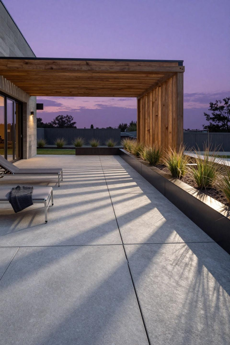
Ashlar slate in warm grey with a modern horizontal wood pergola creating linear shadow stripes. The integrated steel-edge planter beds with native grasses soften the geometry without overwhelming it. That hairline vertical crack in the third control joint? Concrete shrinks as it cures. The cool grey-blue undertones come alive during twilight—totally different vibe than midday.
Terracotta Running Bond from Above
Running bond brick texture in warm terracotta and cream, shot from overhead. That vintage wrought-iron bistro table with peeling paint? Intentional patina. Morning dew glistening on the surface shows you the texture relief. The 1/8 inch lippage seam where pours meet is barely noticeable unless you’re looking for it. Those embedded brass pathway lights are a nice touch—function meeting design.
Slate Grey with Recessed Fire Pit Zone
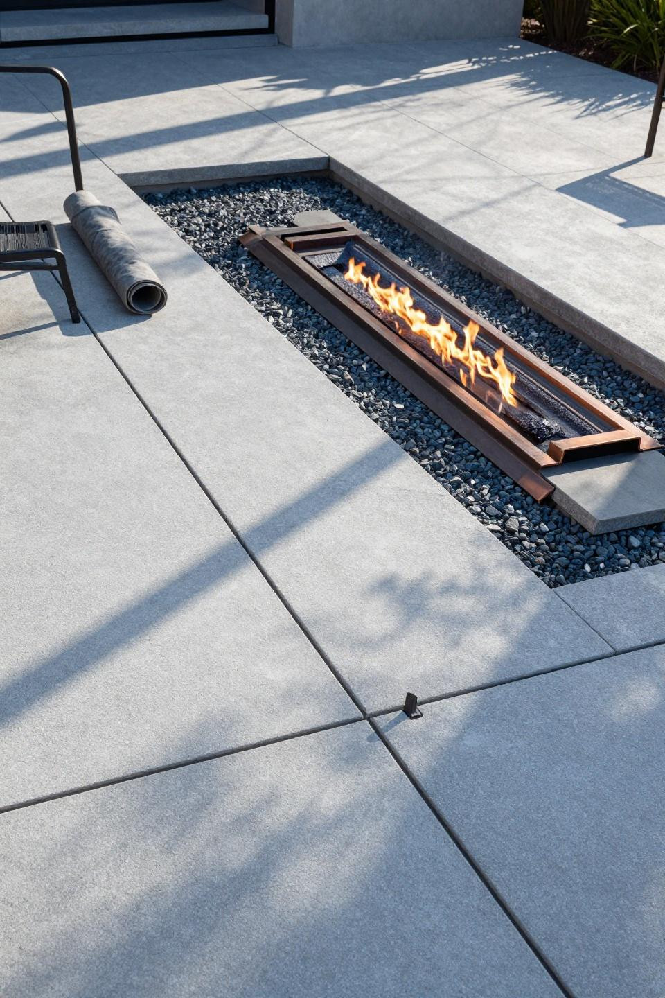
Cool grey slate texture with a recessed fire pit zone carved right into the surface. Those precision-scored control joints forming a minimalist grid? That’s intentional design, not afterthought. Afternoon sun casting sharp geometric shadows across the stamped finish shows off the midnight blue undertones in the concrete. The slightly misaligned control joint showing tool slip is human error, but it reads authentic. Sometimes perfection looks fake.