
Small dark bathrooms intimidate people. But honestly? They’re the ones that photograph best. Dark walls make tiny spaces feel intentional instead of cramped—like a jewel box instead of a closet. Here’s what actually works when you commit to moody.
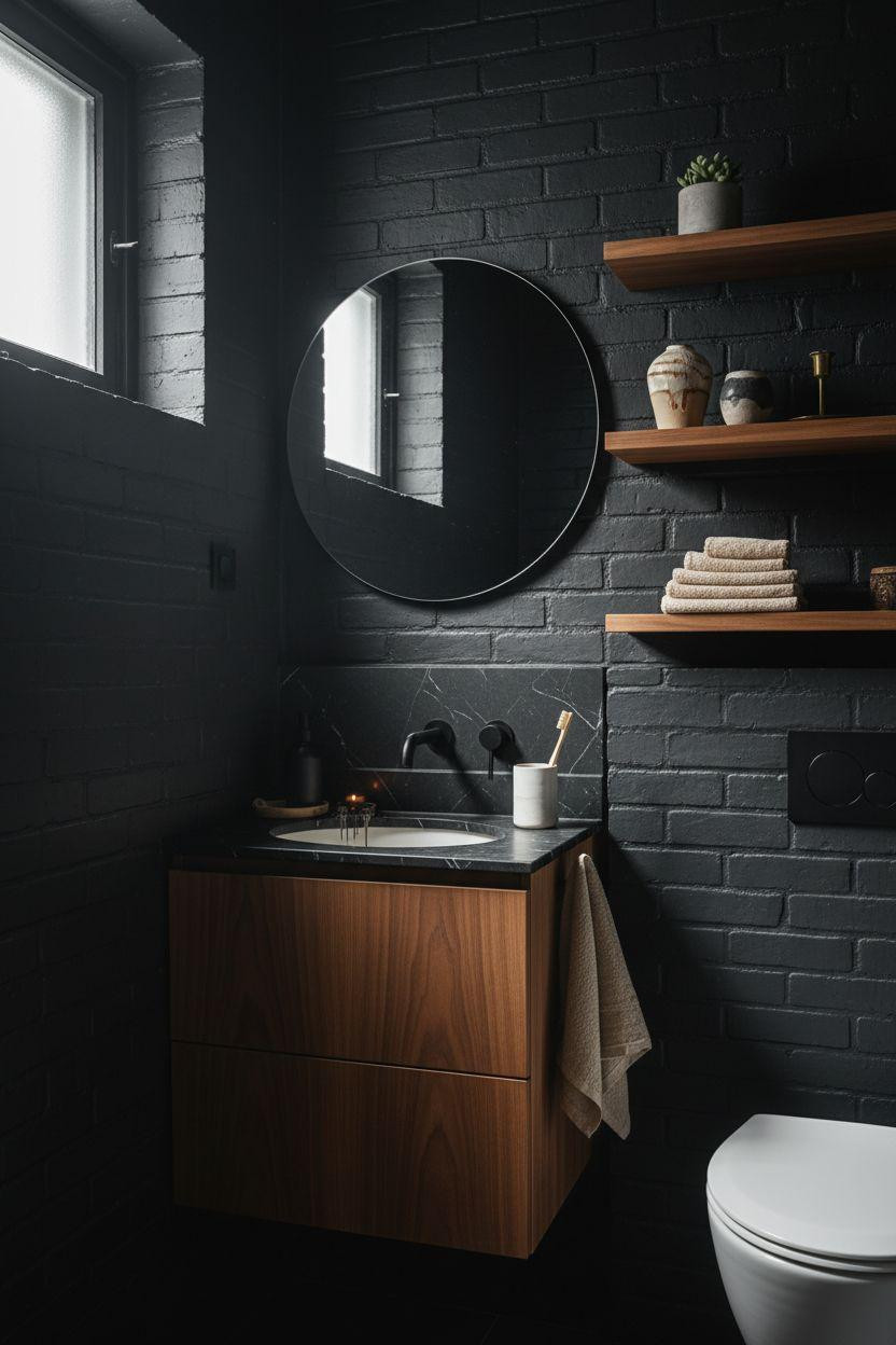
The Zellige Trick That Makes Black Walls Glow

Matte black zellige tiles do something flat paint can’t—they catch light differently on every surface. The handmade irregularities create subtle dimension that keeps charcoal walls from feeling flat. Pair them with a teak vanity (the warm honey tones are crucial) and aged brass fixtures. The brass doesn’t need to match perfectly. Actually better if it doesn’t. One piece with more patina than the others makes the whole thing feel collected instead of bought in a set.
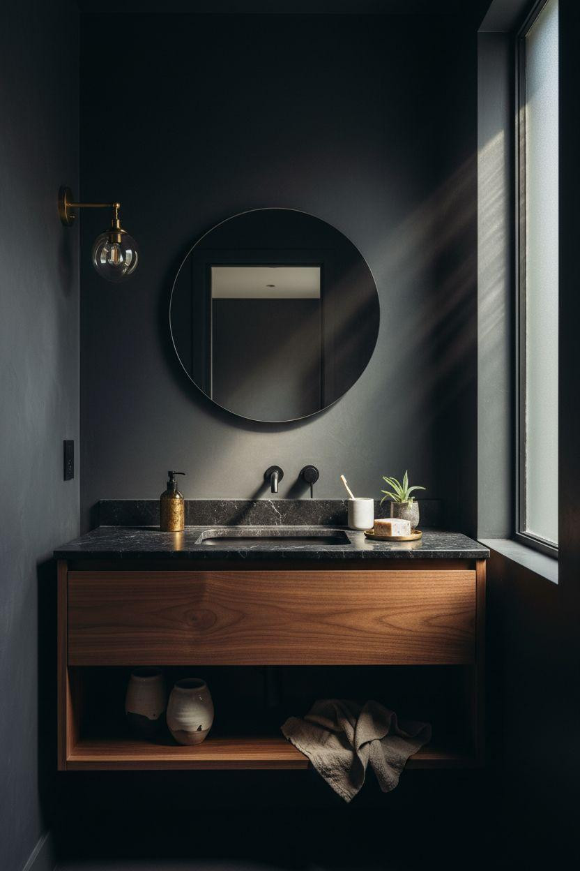
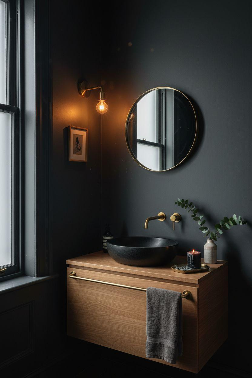
Charcoal Gray That Doesn’t Read Black

If full black scares you, deep charcoal gray gives you 90% of the drama with less commitment. This works when you have a small frosted window—the filtered light creates this gradient effect from lit wall to shadow corner that’s basically free architecture. White oak vanity, honed black marble counter. The contrast matters more in dark spaces. Also, that brass sconce isn’t optional. You need the warm metal to bounce light around or everything just sits there.
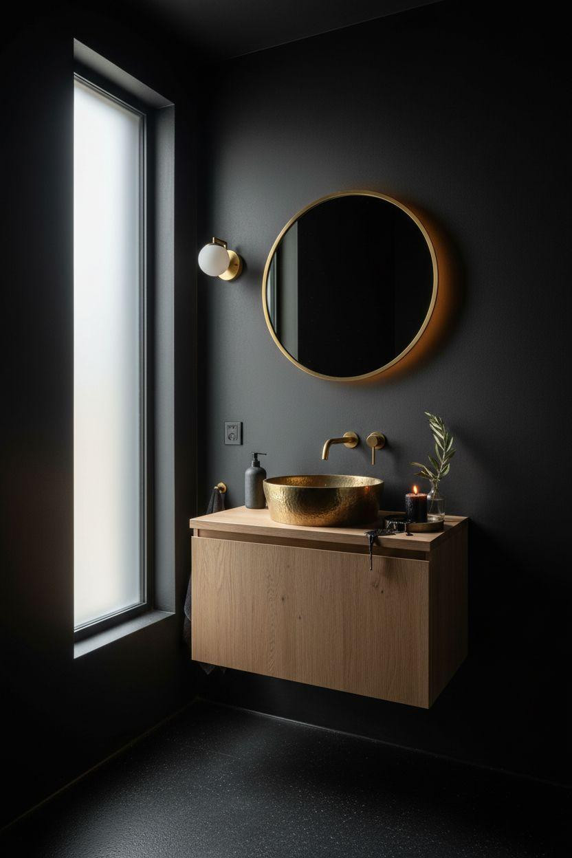
When to Use Hammered Brass (and When Not To)
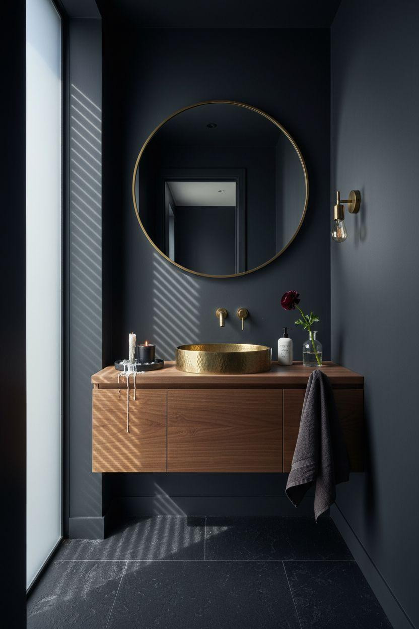
A hammered brass vessel sink is a lot of texture for a small powder room. But against deep charcoal walls and walnut? It becomes the focal point instead of fighting for attention. The textured surface catches side light in a way smooth brass doesn’t. I’d skip this if your walls are busy (like if you did that zellige). The hammered brass needs a matte backdrop to really pop. And yes, it will patina. That’s the point.
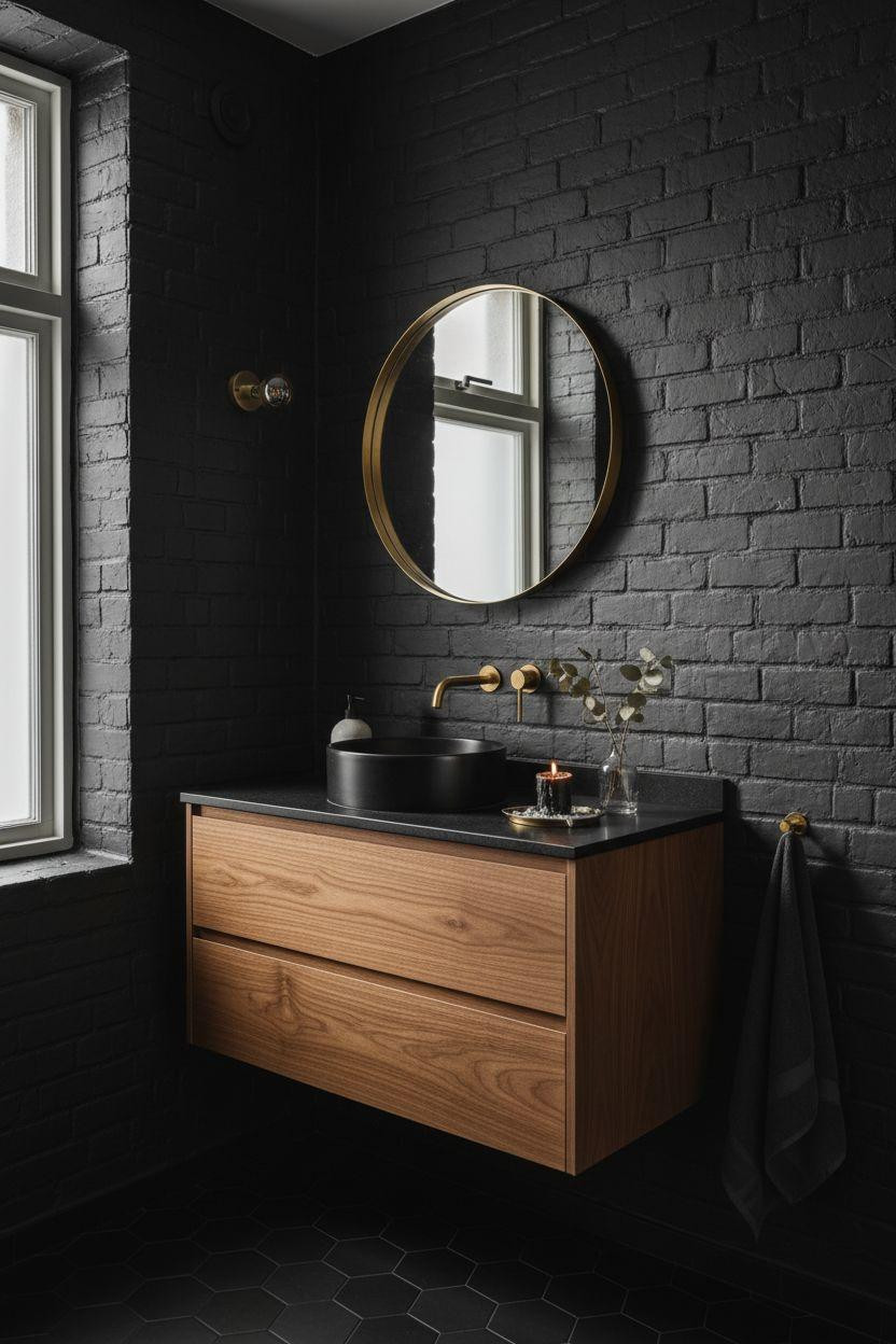
The Floating Vanity Move Everyone’s Copying
Floating vanities make dark bathrooms feel less claustrophobic because you see floor. That continuous sightline matters when you’re working with 40 square feet. Walnut with a thin edge profile, honed black marble top, open shelving underneath styled with actual things you use (not just decorative objects from West Elm). One folded towel, some hand-thrown ceramics, maybe a small plant. The styling has to look accidental or it reads staged.
Why Botanical Wallpaper Works Here
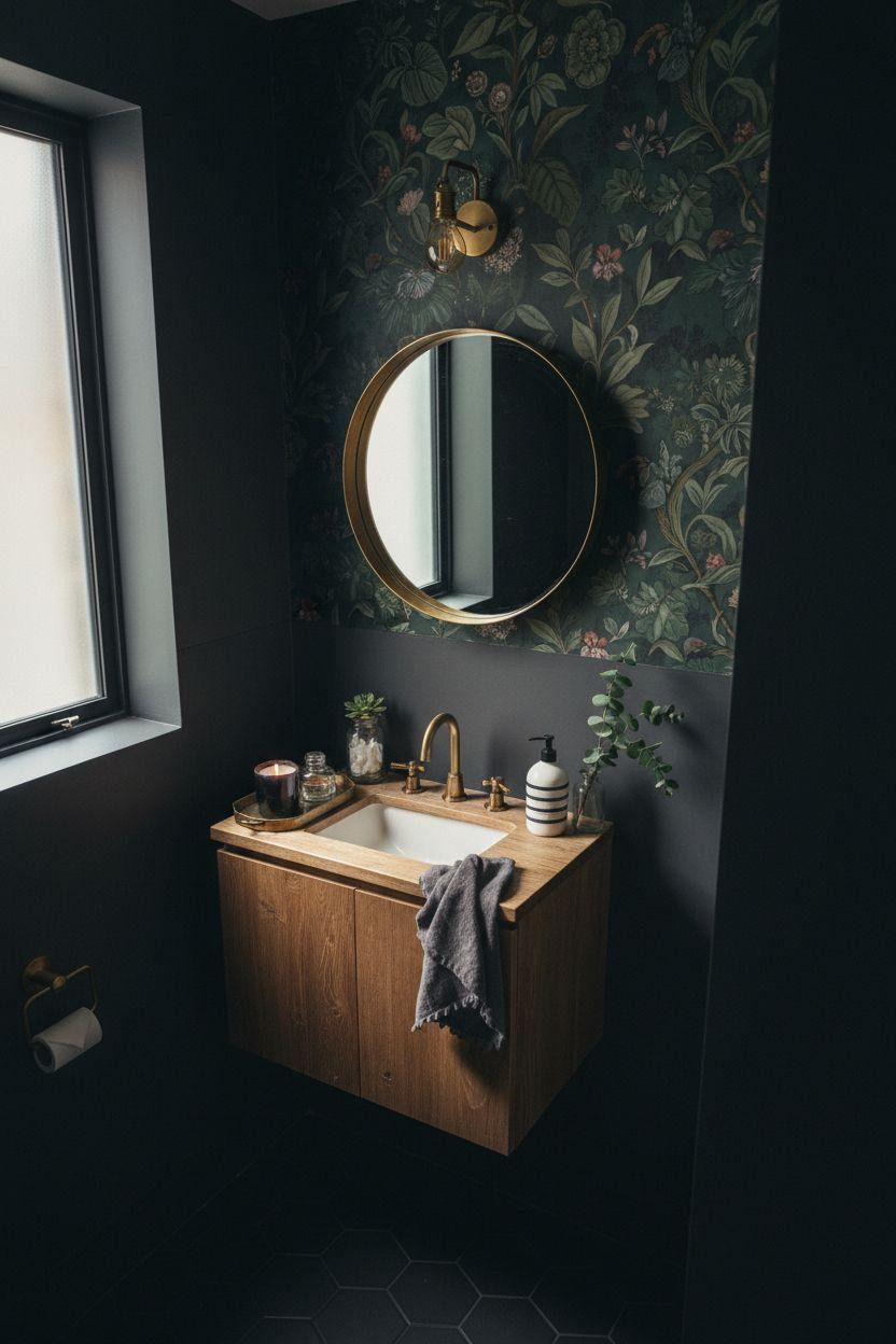
One wall of dark green botanical wallpaper against three charcoal walls sounds like too much pattern. It’s not. The trick is picking wallpaper that’s almost the same value as your paint—so the pattern reads as texture, not contrast. This works if you need visual interest but don’t want to tile an entire wall. The aged brass fixtures and weathered oak vanity keep it from feeling too precious. Also notice the hexagonal floor tiles aren’t perfectly aligned. Good.
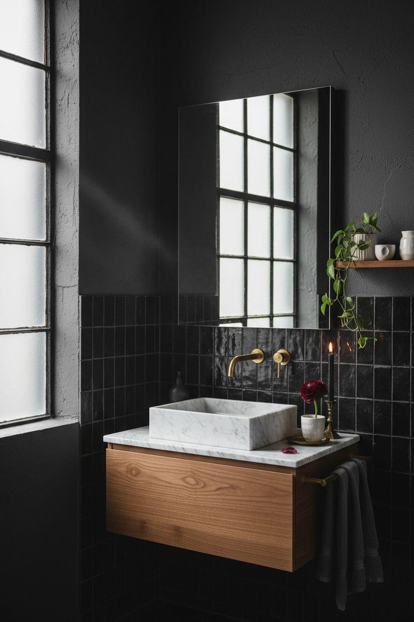
Geometric Tile That Doesn’t Scream Renovation
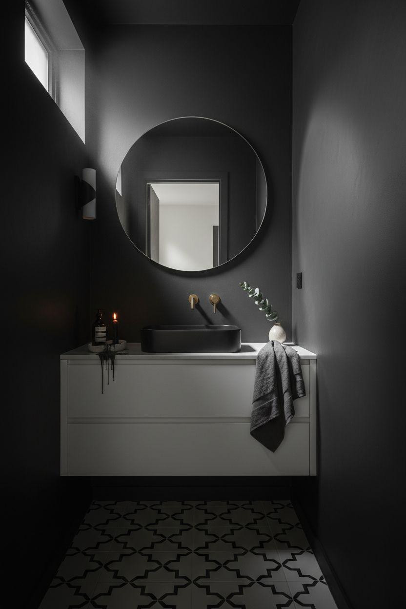
Black and white geometric cement tiles on the floor, charcoal plaster walls, white oak floating vanity. The floor pattern adds interest without competing with the dark walls because it’s all happening at foot level. Your eye goes there, then up to the brass mirror. I’d avoid this pattern if your vanity has a lot going on. This layout needs clean lines everywhere else to work.
The Exposed Brick Move (When You Have It)
Painting original brick charcoal instead of leaving it red adds texture without the “industrial loft” cliché. The mortar lines create natural dimension. Pair it with a walnut vanity and honed black granite—the warm wood against cool stone against textured brick gives you three different tactile moments in 6 feet. One brass sconce, minimal styling. This is what you do when the architecture is already interesting.
Victorian Molding Painted Dark (Controversial but Correct)
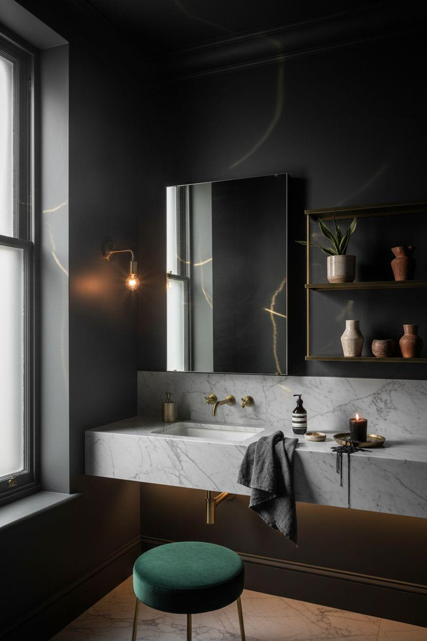
Painting Victorian crown molding the same deep charcoal as your walls instead of traditional white is a move. The molding detail still reads because of shadows, but now it’s subtle instead of shouty. This works when you have decent ceiling height (8 feet minimum). Carrara marble floating vanity, brass shelving, an emerald velvet stool for a punch of saturated color. The stool’s the only bright thing in the room and it earns that spotlight.
Open Shelving That Doesn’t Look Cluttered
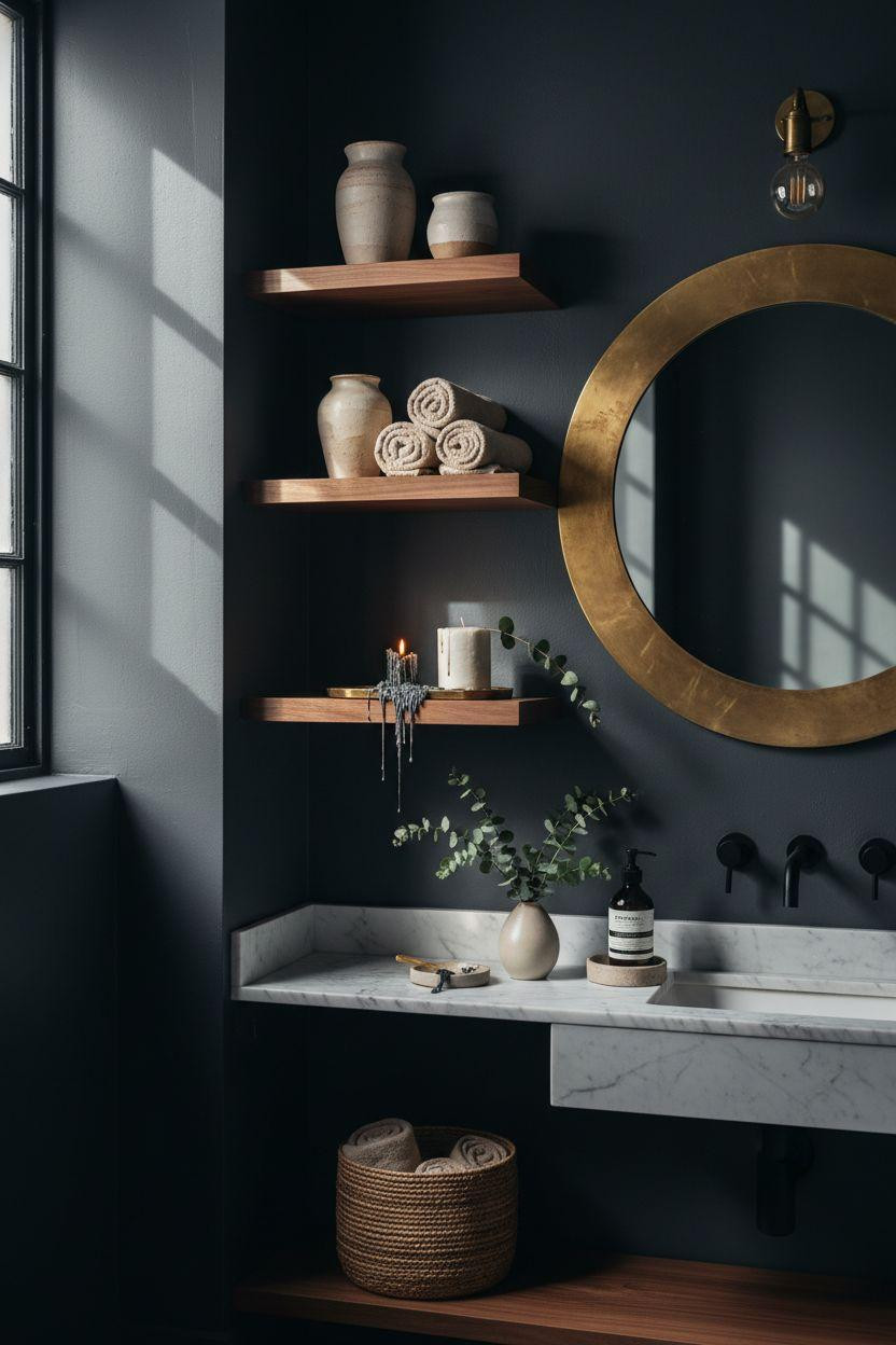
Walnut floating shelves against charcoal walls, styled with cream ceramics and rolled linen towels. The key is keeping everything in the same neutral family—cream, ivory, natural linen, maybe some brass. No color chaos. And you need negative space. One shelf should be 40% empty or it reads as storage, not design. The marble wall-mounted shelf below adds a second material without fighting the walnut.
The Concrete + Zellige Combo
Exposed concrete walls painted charcoal, floor-to-ceiling matte black zellige behind the vanity. The zellige adds warmth that flat black tile can’t. Walnut floating vanity, Carrara marble vessel sink, aged brass fixtures. That single burgundy ranunculus is doing a lot of work—it’s the only saturated color and it makes everything else feel more intentional. Without it, this reads cold. With it, dramatic.
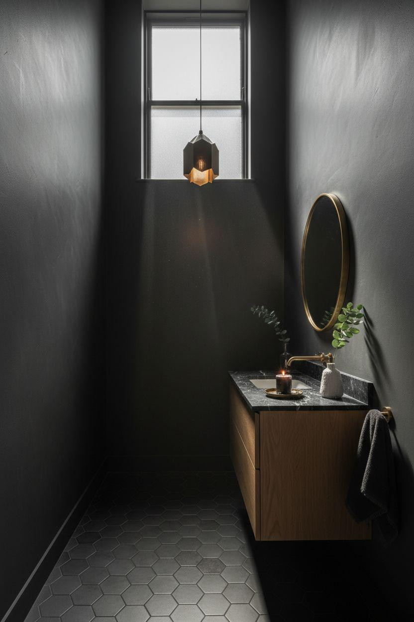
When Side Lighting Matters More Than Overhead
A frosted side window does more for a dark bathroom than any overhead light. The way it rakes across surfaces—highlighting the oak grain, creating rim lighting on the brass, casting shadows in corners—that’s what makes the space feel cinematic instead of just dim. The black vessel sink and polished concrete floor absorb light. The brass and oak reflect it. That contrast is the whole thing.
Black Hardware on Dark Walls (Yes, Really)
Matte black fixtures on charcoal walls sounds like they’d disappear. They don’t. The slight sheen difference between matte paint and matte metal creates separation. And the brass mirror frame and tray provide just enough warm metal to keep it from feeling monotone. This is what you do if brass feels too traditional for your taste but you still want drama.
The Doorway Frame Trick
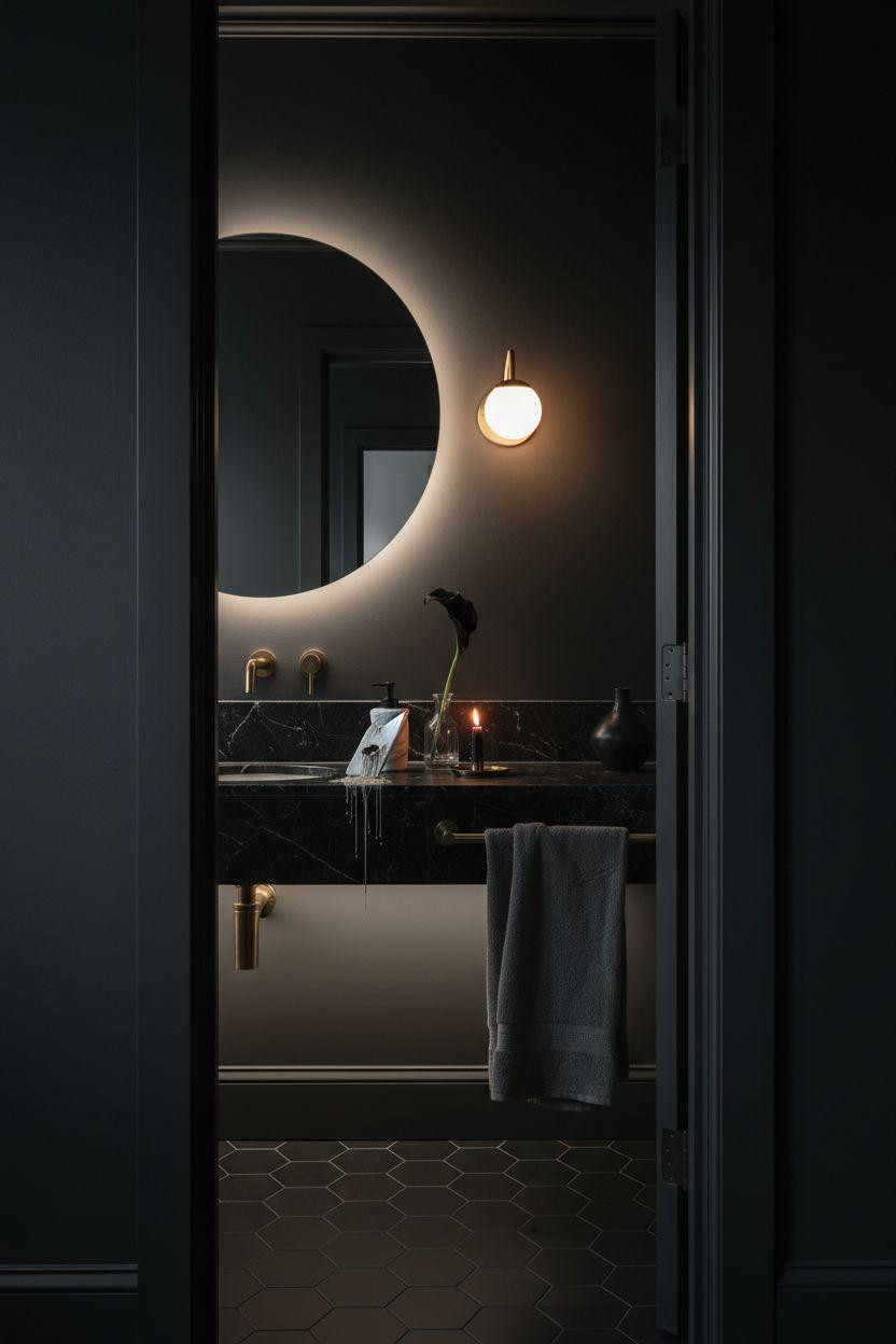
Painting your doorway frame the same deep charcoal as the bathroom interior creates this jewel-box reveal when you walk past. The dark frame makes the lit interior glow. It’s a theatrical move that costs zero dollars. Black marble countertop, charcoal linen towel, minimal brass accents. The LED strip under the floating vanity is subtle but crucial—it keeps the dark walls from feeling like a cave.
Art Deco Brass in a Georgian Space
An oversized Art Deco brass pendant in a tiny powder room is a risk. But when your walls are this dark and your ceiling is high enough, it becomes the focal point. White oak vanity, honed black marble, charcoal hexagonal floor tiles. The pendant’s geometric form stands out against the soft materials everywhere else. This is what you do when you have one architectural detail (like that crown molding) and want the lighting to match its drama.
The Walnut Shiplap Alternative
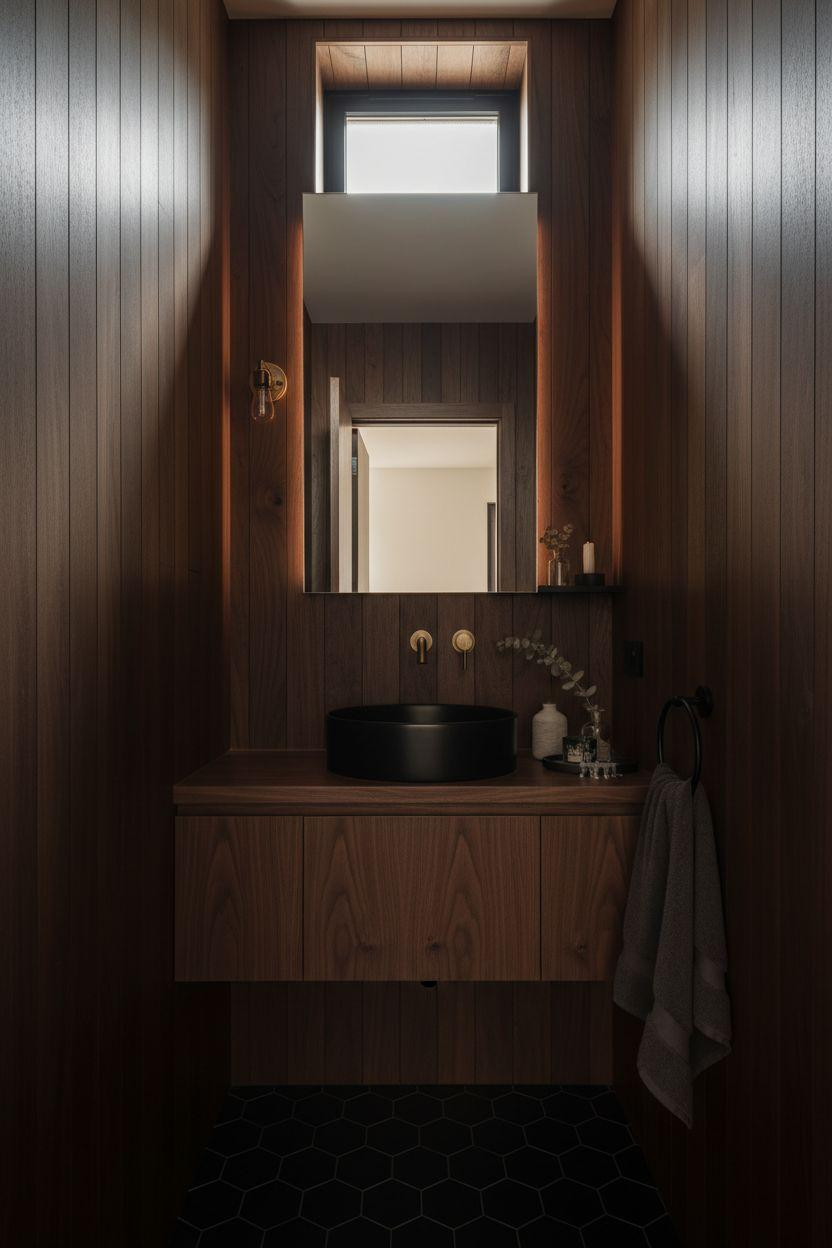
Vertical dark walnut shiplap instead of painted walls adds warmth that paint can’t. The wood grain catches light differently throughout the day. Black vessel sink, aged brass faucet with exposed pipes, hexagonal floor tiles. The exposed plumbing is intentional—it adds an industrial edge that keeps all the warm wood from feeling too soft. This works if you’re renovating anyway and can commit to real wood, not peel-and-stick.
The Floating Walnut Vanity Everyone Wants
Concrete walls painted charcoal, floating walnut vanity, slate floor with natural cleft texture. The rough slate against smooth walnut against matte walls—three textures, all in the same dark value range. That’s how you keep a small dark space interesting without adding pattern. The brass sconce and stacked towels on the open shelf below are the only styling. Sometimes less is just better.