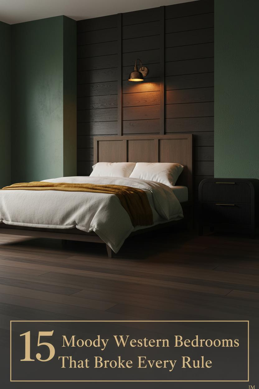
The first time I saw a moody western bedroom done right, it stopped me cold. Dark and heavy, but somehow still warm enough to sleep in.
That balance is the whole game. Raw materials, iron hardware, and walls that hold the light instead of bouncing it back.
Blackened Oak Planks That Drink the Light
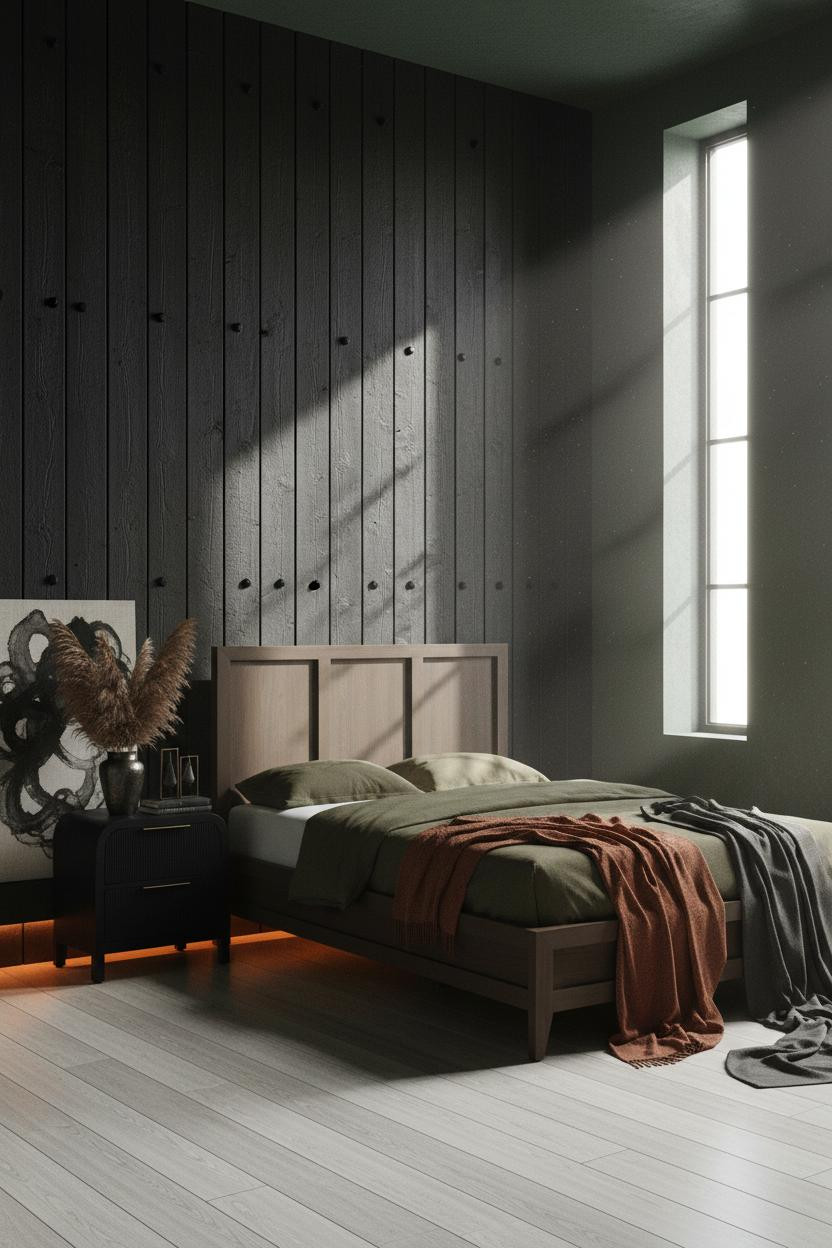


Dark rooms rarely feel this grounded. But the right wall treatment changes everything.
The rough-sawn blackened oak planks absorb light instead of reflecting it, which is why the forest green plaster flanking them reads warm rather than cold. Each shadow gap between the slats adds depth that paint simply can’t replicate.
What to borrow: Pair a blackened wood feature wall with earthy flanking plaster. The contrast keeps the darkness from feeling like a cave.
Stacked Slate and a Single Iron Sconce
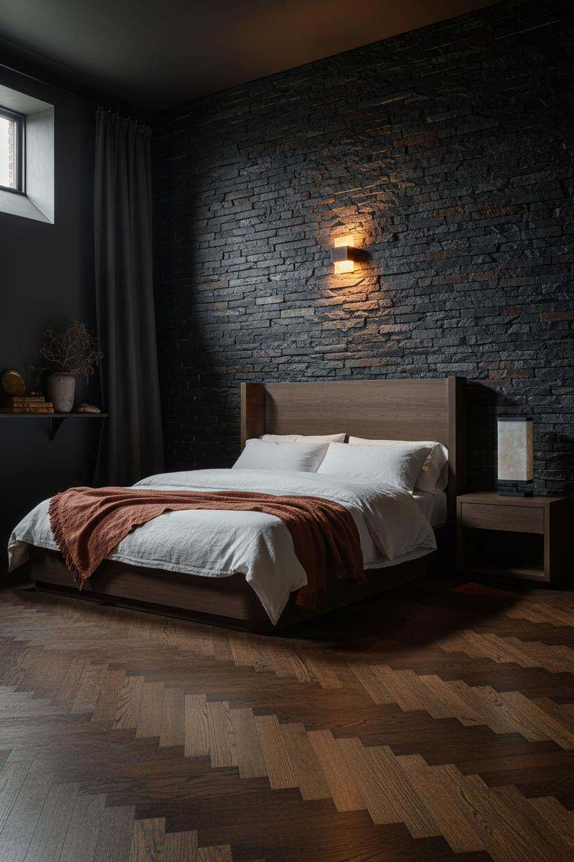


I keep coming back to this one. Honestly, it shouldn’t feel cozy. But it does.
Why it holds together: Charcoal slate with deep mortar joints catches warm amber from the sconce at every rough edge, which turns a cold mineral surface into something almost fire-lit. The recessed chisel-mark courses do more work than any lighting plan could on its own.
The easy win: One hammered iron sconce placed low on a stone wall gives you more atmosphere than any overhead fixture in this style.
Hand-Pressed Adobe and Amber Stillness
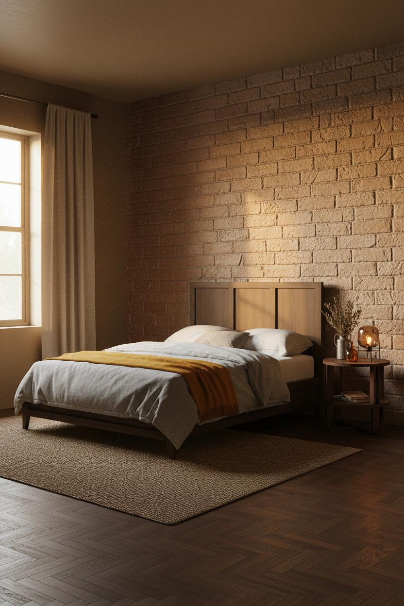

There’s a slowness to this room I find genuinely hard to scroll past.
What gives it presence: Hand-pressed adobe blocks with visible thumb marks catch sidelight in a way that poured concrete never could. Each horizontal shadow line between courses makes the wall feel like it was built by hand. Because it was.
The finishing layer: A mustard wool blanket draped across grey cotton bedding keeps the palette warm without adding pattern noise.
Raw Adobe Brick With Iron and Sienna Walls

This is the version of the dark western aesthetic that actually works for people who aren’t sure they can commit.
Why the palette works: Sienna adobe brick with deep ochre tones pulls all the warmth that stone-grey plaster flanking walls provide as cool relief. It’s a small material contrast, but the room feels resolved because of it.
A burnt orange mohair throw layered over oatmeal cotton is the easiest way to nail the color without repainting anything. Start there.
Canyon Adobe With Smoked-Plum Plaster

Smoked-plum walls sounds like a risky call. It isn’t, when the featured wall earns the drama.
What carries the look: The irregular adobe brick courses in pale ochre and ash-white give the feature wall enough tonal movement that the plum flanking walls read as a shadow rather than a paint color. They support the brick instead of competing with it.
Skip this: Don’t add a patterned rug here. The floor needs to stay quiet so the walls can do the talking.
Dark Terracotta Plaster and an Iron-Frame Window
The dark herringbone floor and the deep terracotta-brown troweled plaster should fight each other. They don’t, because the iron-frame window breaks the wall up before it gets too heavy.
Why it feels intentional: Visible trowel drag on matte plaster means the wall has surface variation even in low light, which helps balance the strong grid shadows the window throws across the floor.
In a room this earthy, the smarter choice for bedding is always oatmeal or cream. Keep it simple and let the walls earn the attention.
Charred Espresso Herringbone That Runs the Full Wall
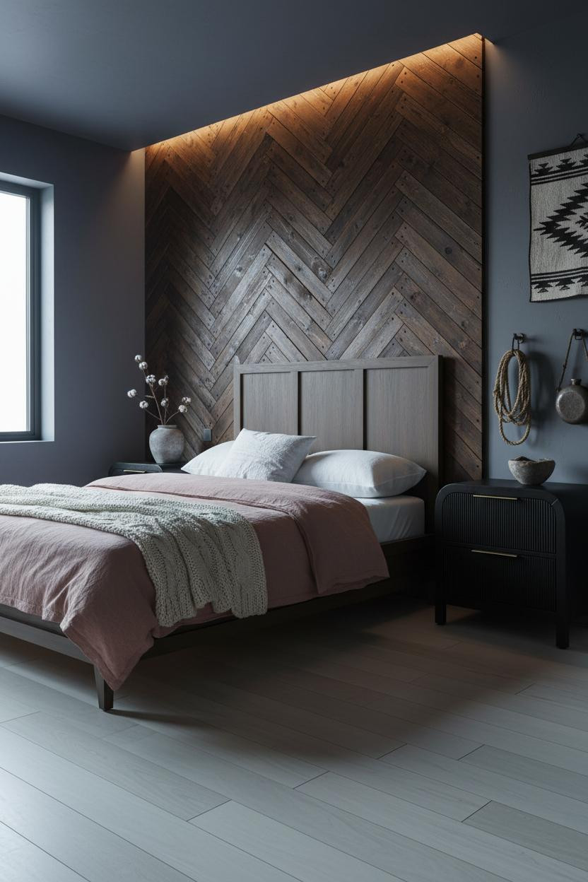
This one is divisive. But I think it’s the most interesting wall treatment in this entire roundup.
The charred espresso herringbone planks create geometric tension that a flat wall color never could, especially when the iron nail heads catch the ceiling strip light. And the indigo-slate flanking plaster keeps it from feeling like a hunting lodge.
Where people go wrong: They soften it with a rug. Don’t. Pale birch floors left bare make the geometry hit harder.
Cowhide Leather Panels on an Iron-Black Wall
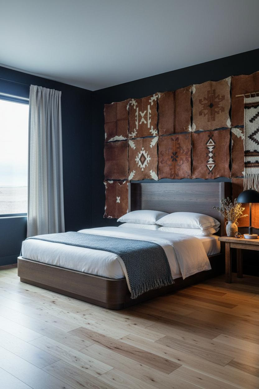

Nothing fancy about the concept. That’s the point.
What makes this one different: Hand-stamped cowhide panels with raw stitched edges catch cross-light in a way framed prints never could. Against iron-black matte walls, each hide reads as its own object. The room feels collected rather than decorated.
One smart swap: Replace a traditional headboard with large-format leather panels hung at varying heights. The depth you get is worth it.
Reclaimed Douglas Fir Archway as Headboard Wall
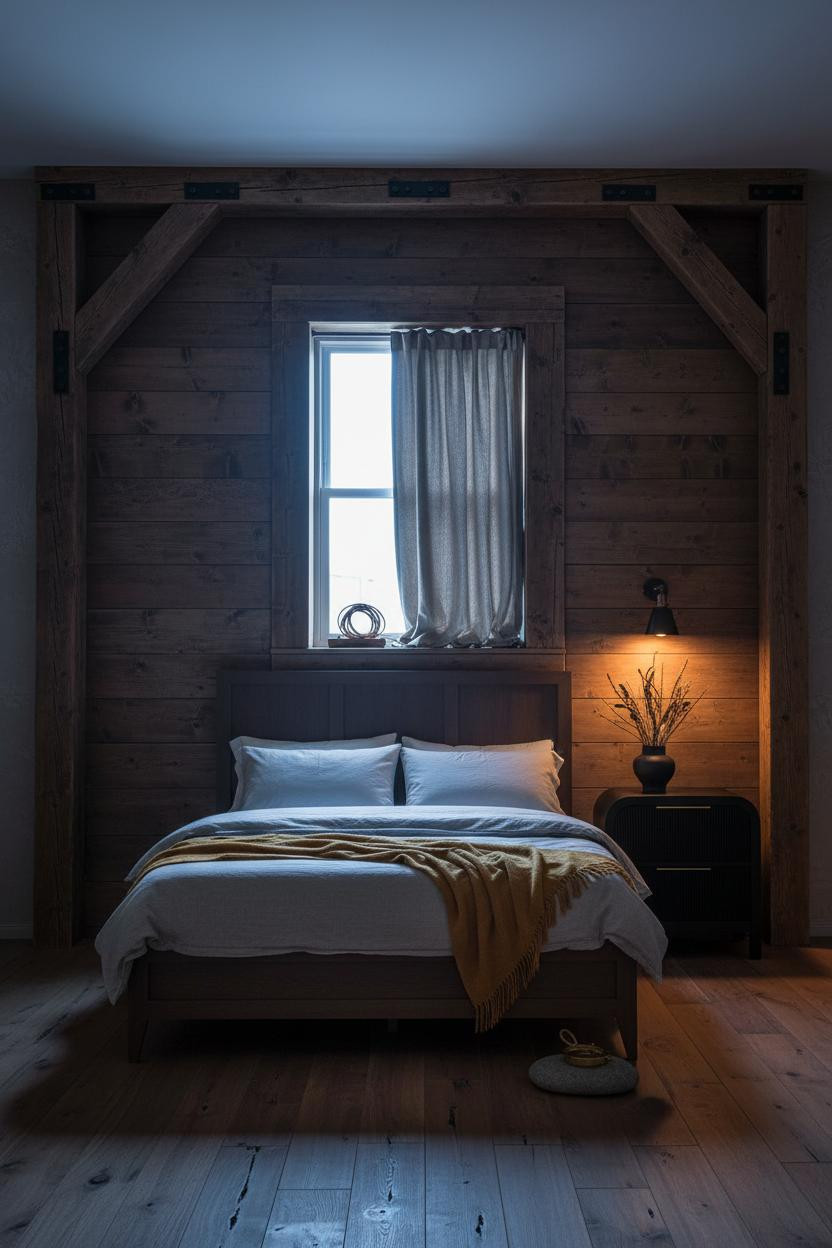
I’ve seen this done badly with new lumber. It looks fake. But reclaimed Douglas fir with actual mortise joinery and iron strap hardware bolted at every joint is a completely different thing.
Why it looks custom: The visible hardware and deep wood grain catch raking sidelight in crisp geometric lines, which makes mushroom-grey plaster flanking walls feel intentional rather than plain.
Pro move: Let the reclaimed walnut floor run bare at the bedside. No rug. The floor grain echoes the wall and the room stays cohesive.
Silver-Grey Juniper Shiplap Against Ochre-Rust Plaster
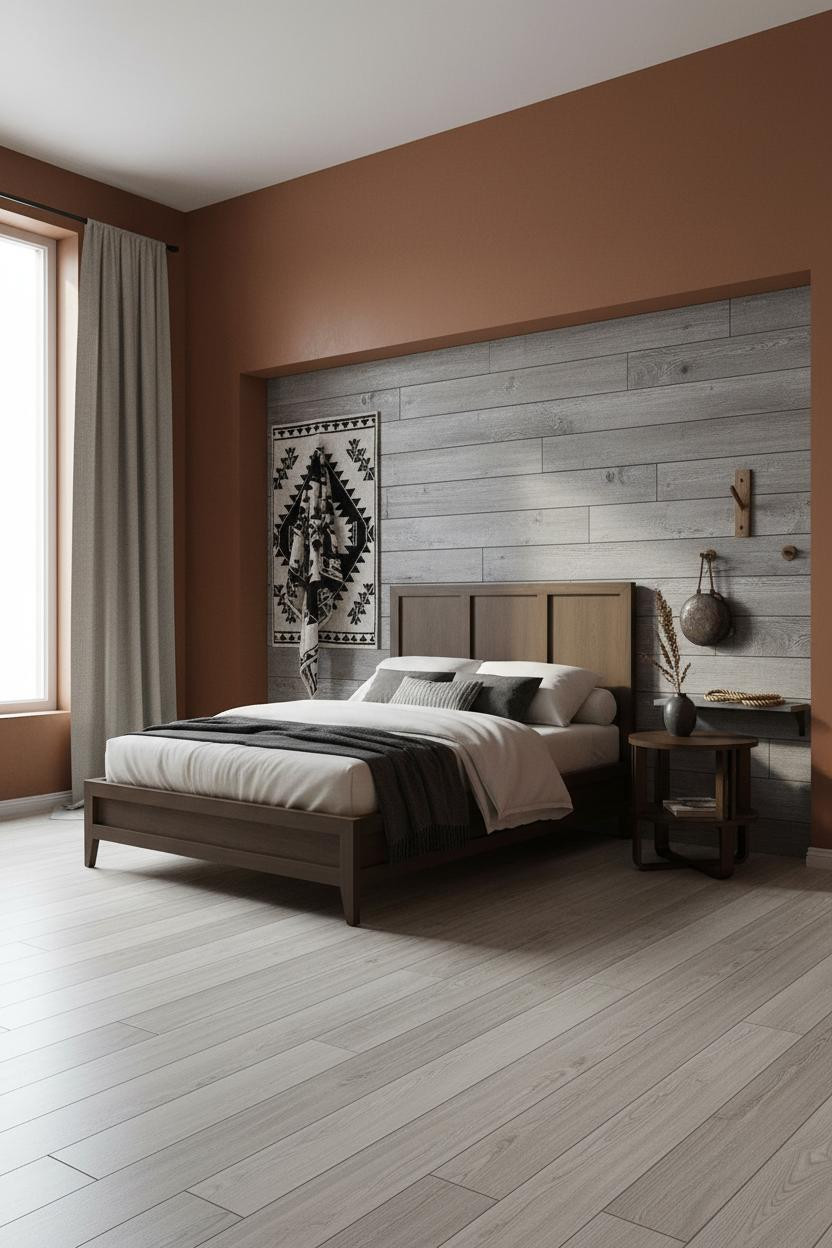
The color tension here is what I’d steal first. Cool silver-grey juniper shiplap against deep ochre-rust plaster is a temperature contrast that feels genuinely western, not just rustic.
Design logic: Weathered juniper planks with deep knots and natural fissures stay light enough to keep the feature wall from going fully dark, while still feeling rough enough to ground the whole room.
Steal this move: Hang a Navajo-pattern textile as wall art on a plain flanking wall. One graphic piece, kept dry and flat, is worth more than three smaller frames.
Grey Sandstone With Sage-Grey Walls and Linen Drapes
This is the most restrained version of the dark western aesthetic on this list. And honestly, that’s why it works for more people.
Rough-hewn grey sandstone with iron-oxide veining along the upper courses pulls texture from the wall in a way that sage-grey plaster can’t. The deep mortar joints shadow hard under the cove light, keeping the stone from feeling flat. Room feels calm and mineral, which is exactly the point.
The part to get right: Floor-to-ceiling cream linen drapes soften a stone wall that would otherwise feel like a canyon face. Don’t skip the length.
Mesquite Shiplap and a Rust-Burgundy Accent Wall

Sun-bleached mesquite shiplap on the feature wall and iron-oxide rust-burgundy plaster to the side. It’s a combination that reads as genuinely frontier-dark, not just farmhouse with a Pinterest filter.
What creates the mood: The silver-grey board grain lines pull cool light across the feature wall while the flanking rust plaster holds warm light. Two temperatures, one room. That tension is what makes it feel alive.
Avoid this mistake: Don’t match your throw to the wall color exactly. Navy sateen bedding against rust walls works because the contrast is doing something.
Board-and-Batten Pine With Iron-Black Battens

This is the lodge version. And I think it’s underrated as a western bedroom idea for people who want darkness without committing to raw stone or charred timber.
Why it holds together: Iron-black painted battens against pale raw pine create bold vertical rhythm that ceiling spots rake down dramatically, making the wall feel architectural rather than just wood-paneled.
Warm clay flanking walls anchor the room, while undyed linen drapes floor-to-ceiling keep it from reading as a ski chalet. The balance matters here.
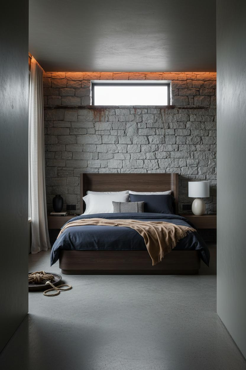
Sandstone Arched Alcove With Paired Iron Sconces
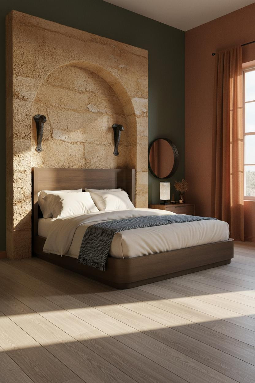
A recessed sandstone arch above the bed is the kind of architectural detail that you either have or you don’t. But the dark rustic bedroom principle it demonstrates is completely copyable.
What changes the room: Iron corbels flanking the arch throw hard shadows under warm sconce light, which makes the weathered ochre sandstone surface look like it was carved from a canyon wall. Burnt sienna plaster keeps the warmth going past the arch.
The key piece: Rust linen floor-to-ceiling curtains frame the window here. That vertical line stops the room from feeling wide and low, even with such a heavy feature wall.
Exposed Timber Beams at Dusk With a Navajo Wool Rug
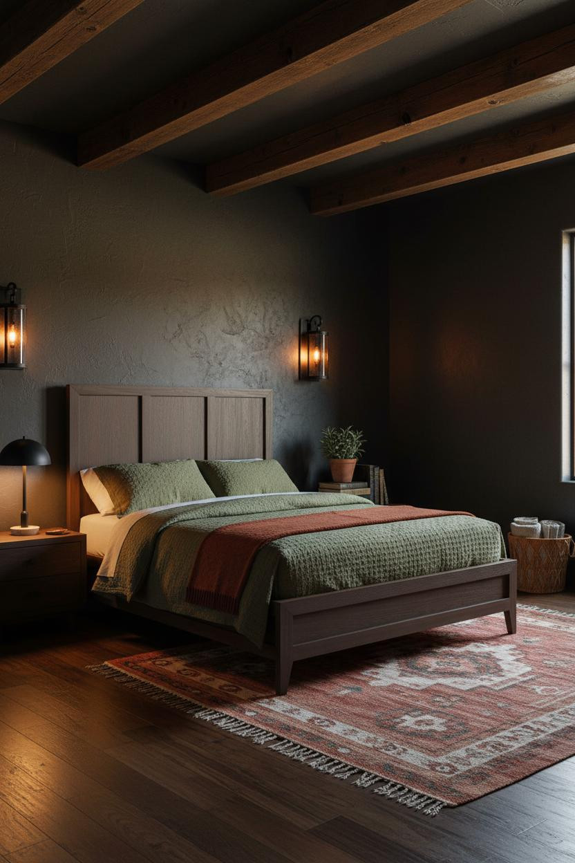
Deep charcoal plaster and exposed chocolate-brown timber beams at dusk. This is the version of western gothic bedroom design that feels genuinely lived-in rather than styled.
Where the luxury comes from: Rough beam knots and grain catch the warm amber lamp glow from below, casting parallel shadows that make the ceiling feel lower and more sheltered, while still feeling like the room has real height.
A rust and cream Navajo wool rug on dark walnut floors keeps the color story grounded at eye level. And the olive waffle-weave duvet pulls it all together without trying too hard. This is the room that gets saved.

Our #1 Pick
Saatva Classic Mattress
America’s best-selling online luxury innerspring. 365-night trial, lifetime warranty, free white glove delivery.
Shop Saatva Classic
The Foundation Of Every Beautiful Bedroom
Every room on this list earns its mood through walls, light, and materials. But none of it matters if you’re sleeping on a mattress that doesn’t hold up.
The Saatva Classic is what belongs under all of it. Dual-coil support that actually holds its shape over years (not months), a breathable organic cotton cover that doesn’t trap heat in a room this dark and warm, and a Euro pillow top that feels substantial without going soft in the middle. It’s the kind of mattress that makes a moody western bedroom feel like the retreat it’s supposed to be.
Good design ages well because it’s made well. Moody farmhouse bedroom or full gothic western, the bed is where it starts.

The rooms that get saved are the ones where nothing looks accidental. Start with the bed. The rest figures itself out.