The first thing you notice in the best moody mid-century modern bedroom is that darkness isn’t the point. The point is what the darkness does.
It makes the warm wood glow. It makes the lamp feel like company. These 15 rooms prove that going dark is actually the most welcoming thing you can do.
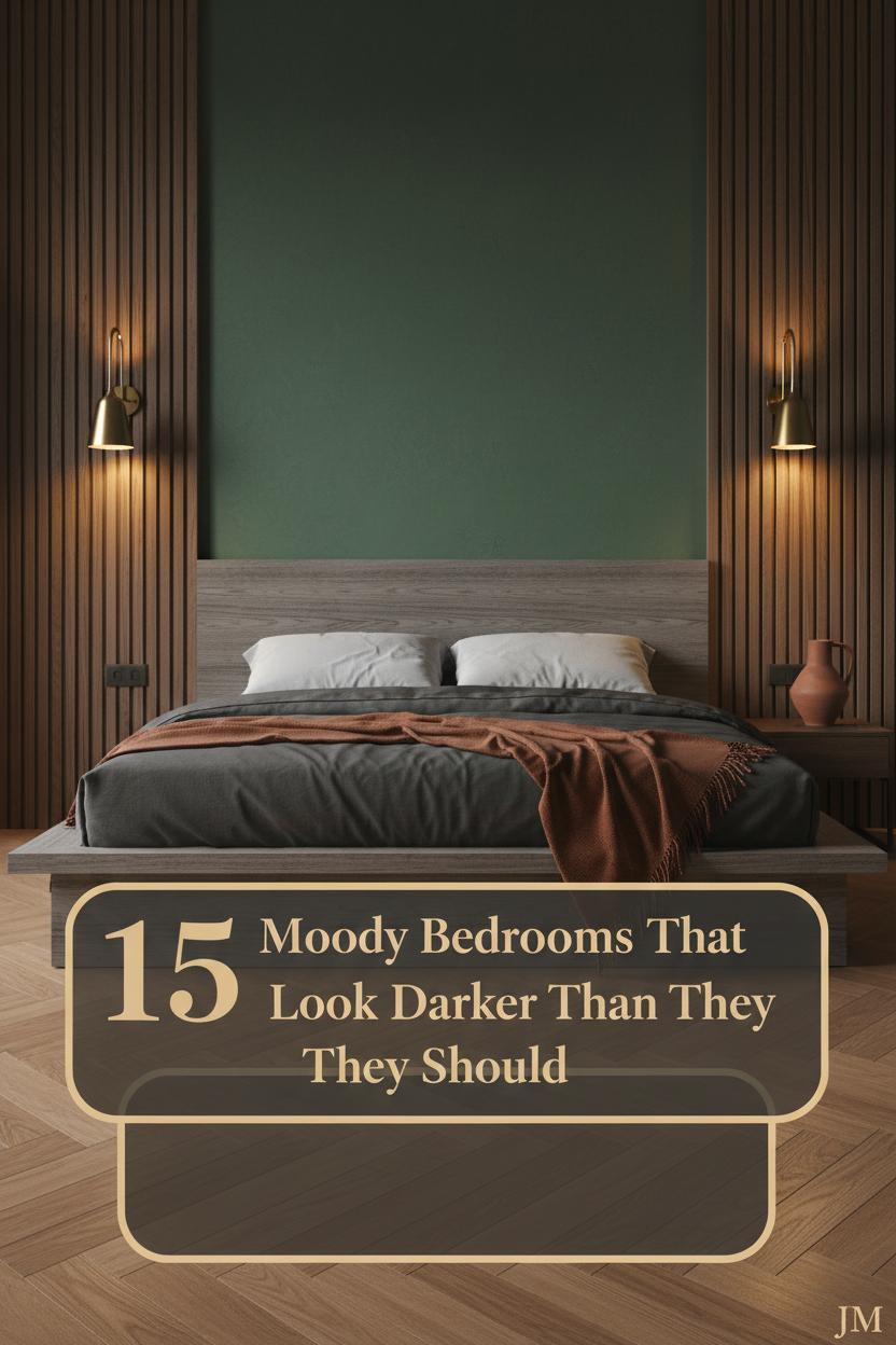
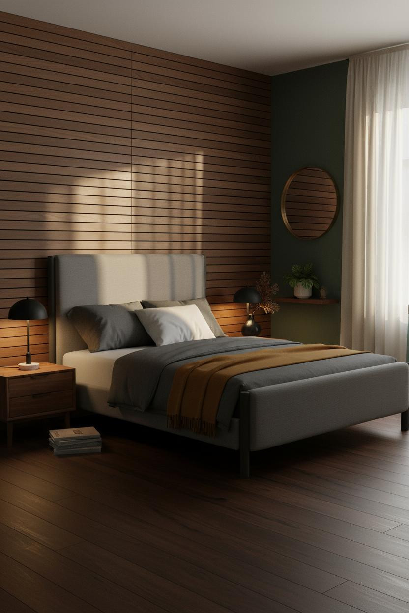
Forest Green Walls That Make Walnut Look Expensive


I keep coming back to this one. Something about the combination just locks in.
Why the materials matter: The herringbone walnut veneer panel behind the bed catches amber light along every mitered seam, turning a flat wall into something that almost looks architectural.
Steal this move: Pair forest green plaster with walnut grain and a warm lamp, and the room feels expensive without a single additional purchase.
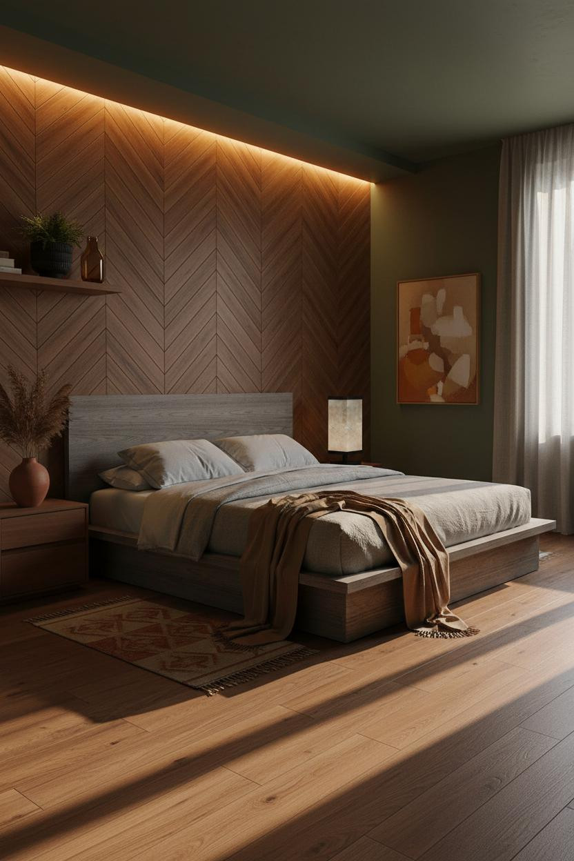
Amber Dusk and Ebonized Wood Done Right

Restrained and warm. This is the version of moody I’d actually live in.
The ebonized walnut wainscoting runs wall to wall at 36 inches high, and each horizontal edge catches the amber light just enough to create layered shadow lines. Above it, mustard plaster keeps the whole thing from feeling like a library.
Worth copying: Stack olive waffle-weave bedding with a rust linen throw. The palette stays warm without repeating itself.
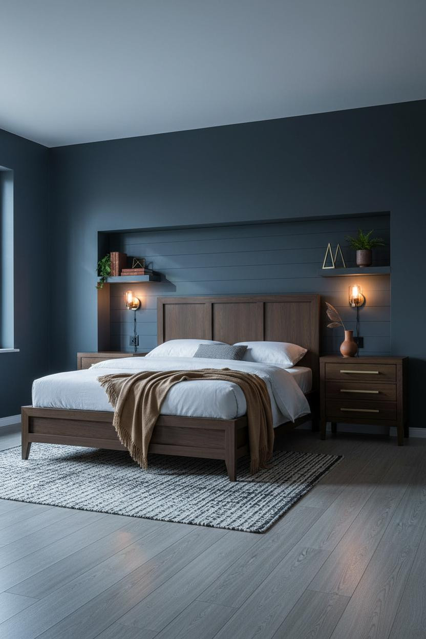
The Backlit Headboard Wall Nobody Talks About


Most people put a light in front of the wall. This one puts it behind, and the difference is immediate.
Why it looks custom: A hidden LED strip behind a reeded glass border bleeds warm amber onto smoked walnut veneer, making the grain glow from within while the plaster walls stay calm.
In a small bedroom, the smarter choice is a backlit feature wall instead of overhead lighting. It lowers the visual ceiling without shrinking the room.
Deep Olive Plaster With a Linen Curtain Statement
I was skeptical of the hand-troweled plaster here at first. Then I noticed what happens when light hits it from the side.
What changes the room: The pale stone aggregate in deep olive matte plaster catches raking daylight along every striation, so the texture reads as shadow geometry rather than just texture for texture’s sake.
The easy win: Hang floor-to-ceiling cream linen curtains from a brushed brass rod. The vertical drop makes a low ceiling feel taller while the fabric softens everything else.
Dark Rust Walls and Vertical Board-and-Batten
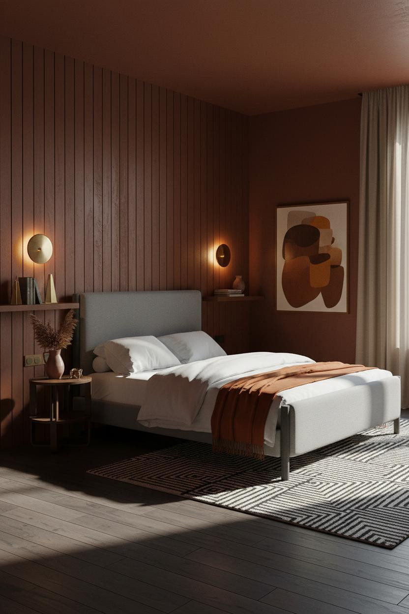

This one is divisive. Deep rust walls feel aggressive on a paint chip. In a real room with raking afternoon light, they feel alive.
Why it holds together: Floor-to-ceiling ebonized oak board-and-batten behind the bed shifts between warm amber and deep shadow as the light moves, giving the wall rhythm that flat paint never could.
Pro move: Pair brushed brass sconces low on either side of the bed. The upward amber pools keep the dark walls from closing in.
A Sage Green Room Built Around One Arch
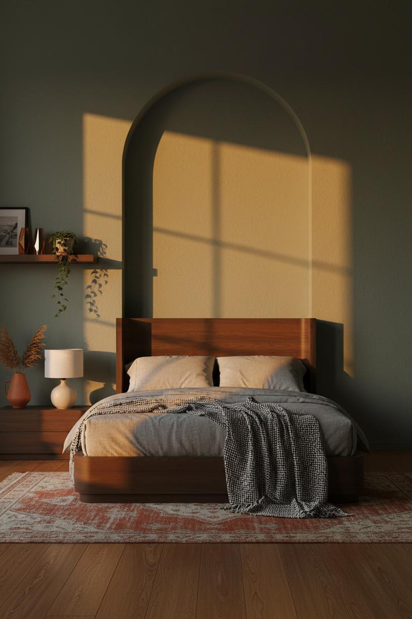

It shouldn’t work. A full-height arched plaster niche on a deep sage wall sounds heavy. But the room feels hushed, not crowded.
What creates the mood: The arch edges catch raking sunset light while the deep recess pools into soft charcoal shadow, which is why the silhouette reads as sculptural geometry rather than just decoration.
Avoid this mistake: Don’t fill the niche with too many objects. One terracotta vase, one lamp. The recess needs room to breathe or you lose the whole effect.
Charcoal Walls and the Walnut Slat Divider Trick
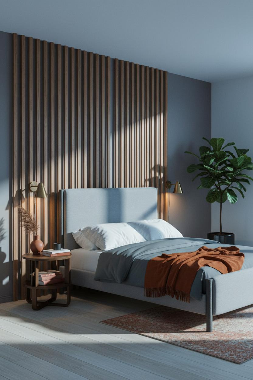
Having a vertical walnut slat divider in the corner changes how the whole room reads. It adds architecture without adding walls.
Design logic: Thin parallel slats spaced two inches apart cast precise linear shadow striations across the charcoal plaster behind them, which gives the room a geometric backbone that furniture alone can’t provide.
Where to start: A floor-to-ceiling slat panel in natural walnut against warm charcoal is honestly the fastest way to get that collected, lived-in mid-century feel in a small bedroom.
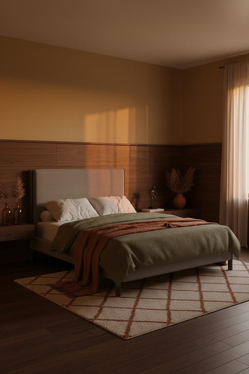
Deep Plum Walls That Make Dusty Pink Work
I almost skipped this combination. Plum and dusty pink sounds like a mistake. It isn’t.
Why it feels intentional: The recessed horizontal walnut slat panel across the headboard zone acts as a neutral bridge between the two tones, giving the eye somewhere to land while the deep plum walls pull everything inward.
Dusty pink linen bedding against a dark plum wall works because the slat wall keeps the warmth grounded. Skip the walnut and the palette tips precious.
Ochre Walls and the Sunburst Panel You Actually Want
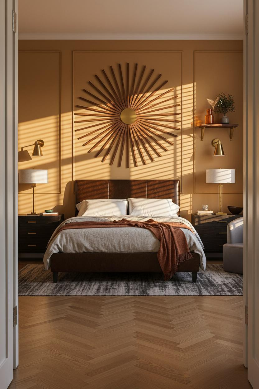

Fair warning. A sunburst panel is the kind of detail that commits you to a direction. But this one earns it.
What carries the look: Precision-cut slats radiating from a central brass hub throw angular shadow lines across warm ochre plaster behind them, which makes the wall feel alive as the light shifts through the afternoon.
The part to get right: The floor. Herringbone parquet in amber oak echoes the radiating pattern overhead, and that repetition is what makes the room feel designed rather than decorated.
The Jazz-Record Room: Charcoal and Curved Walnut
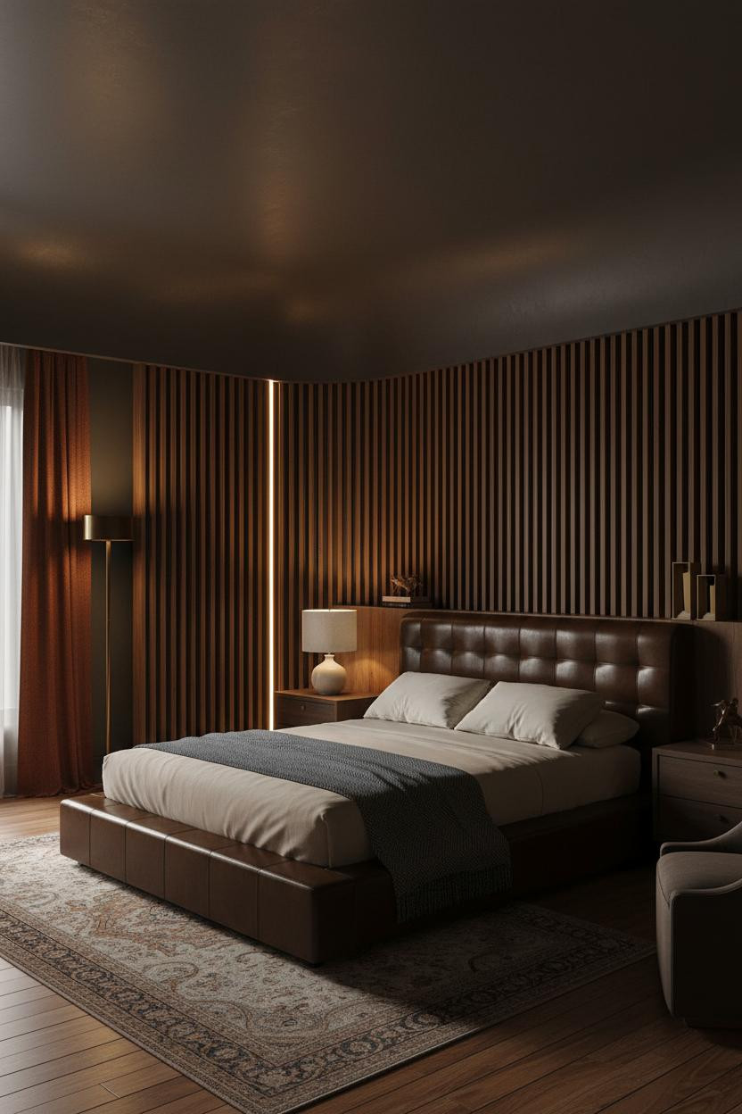

This room is almost entirely in shadow. And somehow that’s exactly right.
What gives it presence: A floor-to-ceiling curved walnut room divider with slatted organic veneer throws precise vertical shadow striations across charcoal plaster while a single torchiere pools amber light upward, creating a glow that feels more like candlelight than a lamp.
What not to do: Don’t add overhead lighting to a room like this. The single warm source is the whole point. More light kills the mood.
Painted Brick in Burgundy Is a Different Kind of Dark
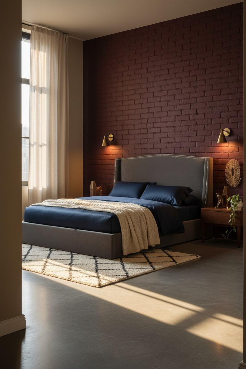

Painted brick is one of those moves that sounds irreversible but actually works harder than any smooth wall finish.
The real strength: Matte deep burgundy paint on raw brick lets raking sidelight amplify every ridge and mortar line, so the texture reads as deliberate shadow geometry, not just an accent wall.
One smart swap: Switch the flooring to polished concrete. The cool grey surface keeps burgundy brick from tipping heavy, while still feeling warm at night under brass sconces.
Indigo Walls and Floor-to-Ceiling Walnut Built-Ins
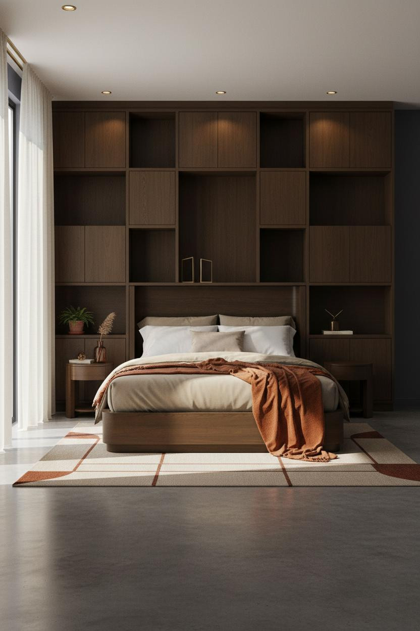

I’ve seen a lot of built-in shelving. Most of it looks like IKEA with ambition. This is the version that actually delivers.
What makes this one different: Dark walnut open cubbies alternating with closed cabinet bases against deep indigo create geometric shadow lines that carve real visual depth into the headboard wall, in a way that feels permanent and considered.
Best for rooms where you actually want to keep books and objects visible. The deep indigo behind the shelves makes everything you display look curated without trying.
Walnut Coffered Ceiling Over Terracotta Walls
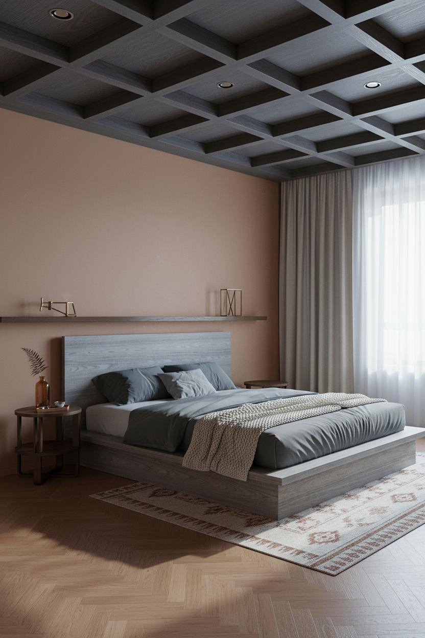
Nobody looks up enough. And rooms like this are why they should.
But this is admittedly a commitment. A dark walnut coffered ceiling grid against warm clay terracotta walls is the kind of combination that looks considered in person and completely mad on a mood board.
Why it lands: The recessed squares drop clean geometric shadow into the grid overhead, which draws the eye up and makes the ceiling feel taller, not heavier. The terracotta keeps it from going cold.
Pair with herringbone parquet flooring in amber oak below and the room reads as completely intentional from floor to ceiling.
Slate Blue Walls and the Charcoal Shiplap Niche

The reason this room feels cave-like in the best possible way is the niche. And the slate blue-grey walls seal it.
What softens the room: Aged brass trim edging the charcoal shiplap niche creates just enough warmth against the cool slate walls, while the bleached oak flooring keeps the contrast from feeling too stark. Warm sconces do the rest.
This works best in a small moody bedroom where the cave-like quality is actually an asset. Lean into the intimacy.
Forest Green Walls With Low Walnut Slat Paneling
This one pulls together quietly. The room feels collected rather than decorated, which is honestly the hardest thing to achieve.
Why it feels balanced: Low-profile horizontal walnut slat paneling across the headboard wall grounds the dark forest green above it, giving the composition a visual anchor that keeps the deep color from floating.
And the mid-century bedroom design detail worth copying: an oversized vintage brass-rimmed round mirror leaning against the far wall. Not hung. Leaning. The casualness of it keeps everything from tipping too formal.

Our #1 Pick
Saatva Classic Mattress
America’s best-selling online luxury innerspring. 365-night trial, lifetime warranty, free white glove delivery.
Shop Saatva Classic
The Foundation Of Every Beautiful Bedroom
Walls get repainted. Linen gets swapped out. The mattress stays. And if the mattress is wrong, none of the rest of it matters.
The Saatva Classic is what I’d put under every room on this list. Dual-coil support means it holds its shape year after year, the breathable organic cotton cover doesn’t trap heat the way foam does, and the Euro pillow top has the kind of softness that still feels right at 3 a.m.
It’s not a statement piece. But it’s the reason the room actually works.

The rooms people save are the ones where nothing looks accidental. Start with what you sleep on. The rest figures itself out from there.