
The first thing you notice in the best French Cottage Bedroom is that nothing looks bought all at once. It feels slow. Gathered over years, not styled in an afternoon.
These 15 rooms lean into that. Worn plaster, aged oak, washed linen. The kind of French Cottage Interiors that feel like someone actually slept there.
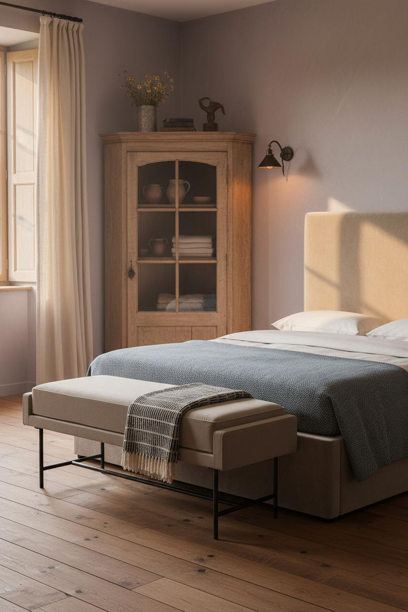
When The Cupboard Holds The Whole Room Together


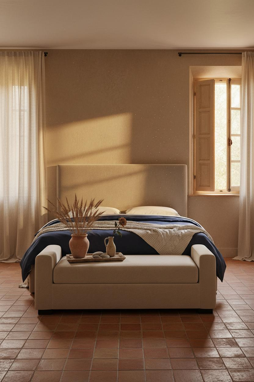
I keep coming back to this one. The room feels amber-drenched and completely still.
Why it holds together: A floor-to-ceiling cupboard in weathered chestnut gives the wall something to do, while the wavy glass front keeps it from feeling too heavy.
Steal this move: Display folded ivory linens and old pottery inside a glass-front armoire. It looks collected, not staged.
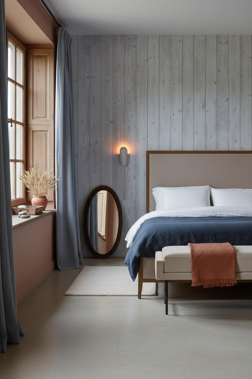
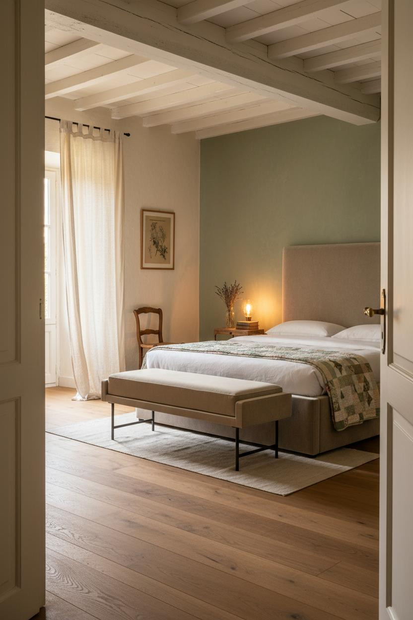
What A Lavender Plaster Wall Actually Does To A Room


Honestly, lavender-grey limewash sounds risky. But against reclaimed chestnut planks and a patinated oak cupboard, it just works.
Why it lands: The muted wall tone makes the warm wood tones feel richer without turning the room dark.
What to borrow: A steel blue herringbone blanket layered over cream percale gives you contrast while still feeling cohesive. Nothing too matchy.
This Is What A Provençal Stone Wall Actually Feels Like
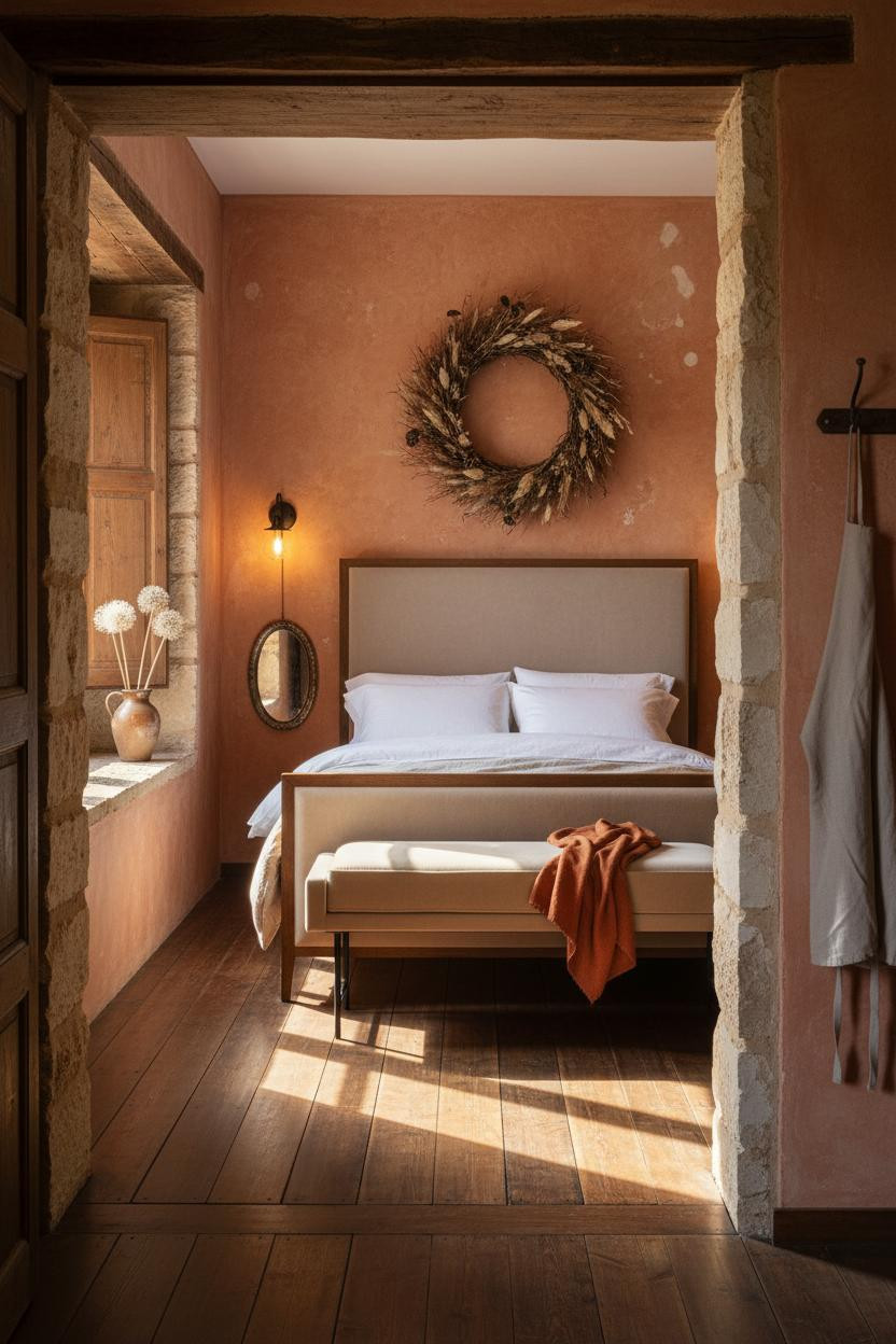

Sun-warmed. Quietly ancient. This is the kind of room that changes how you think about decoration.
The thick rough-hewn limestone embrasure around the window does more than frame the light. It makes the light feel like it belongs there, pooling across dark walnut planks in a wide golden trapeze.
Pro move: Hang a large dried botanical wreath above the bed instead of art. It’s the scale most people are too cautious to try.
Avoid this mistake: Don’t use a rug here. The flooring is the feature. Cover it and you lose the whole room.
The Coastal Version Nobody Talks About
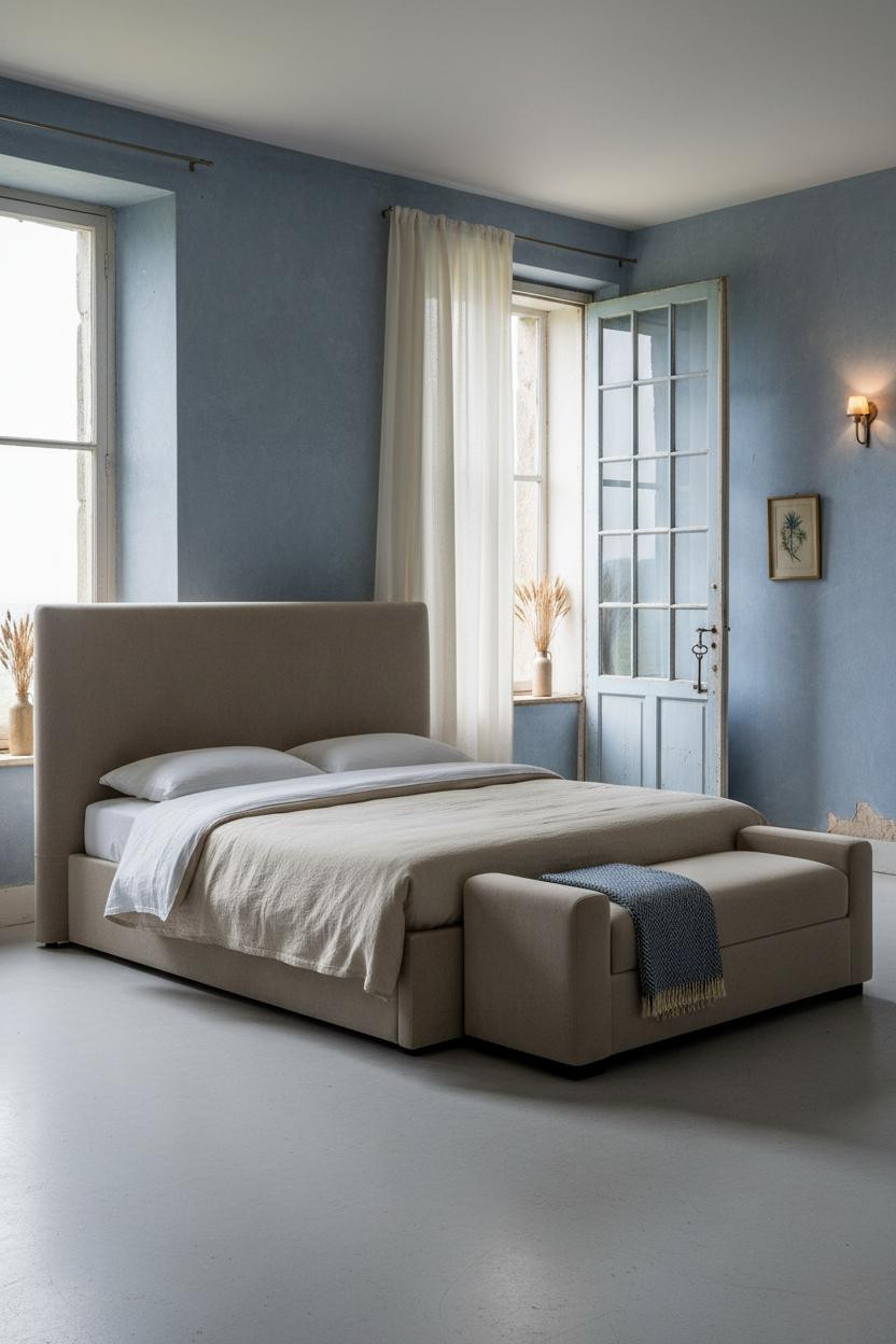
Faded denim-blue limewash and a pale grey concrete floor. It shouldn’t feel romantic. But it does.
What creates the mood: The original wrought-iron door hardware and wavy glass panes make the room feel found rather than finished, in a way that feels genuinely French.
Let ivory linen curtains pool unevenly at the base. The smarter choice: skip hemming them to exact length. The excess is part of it.
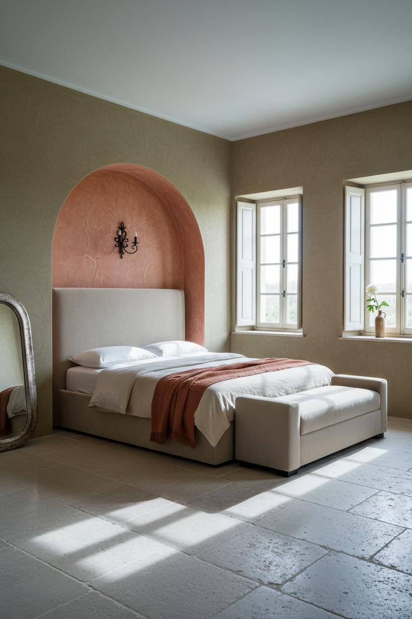
I Would Not Have Thought To Try A Blush Plaster Arch
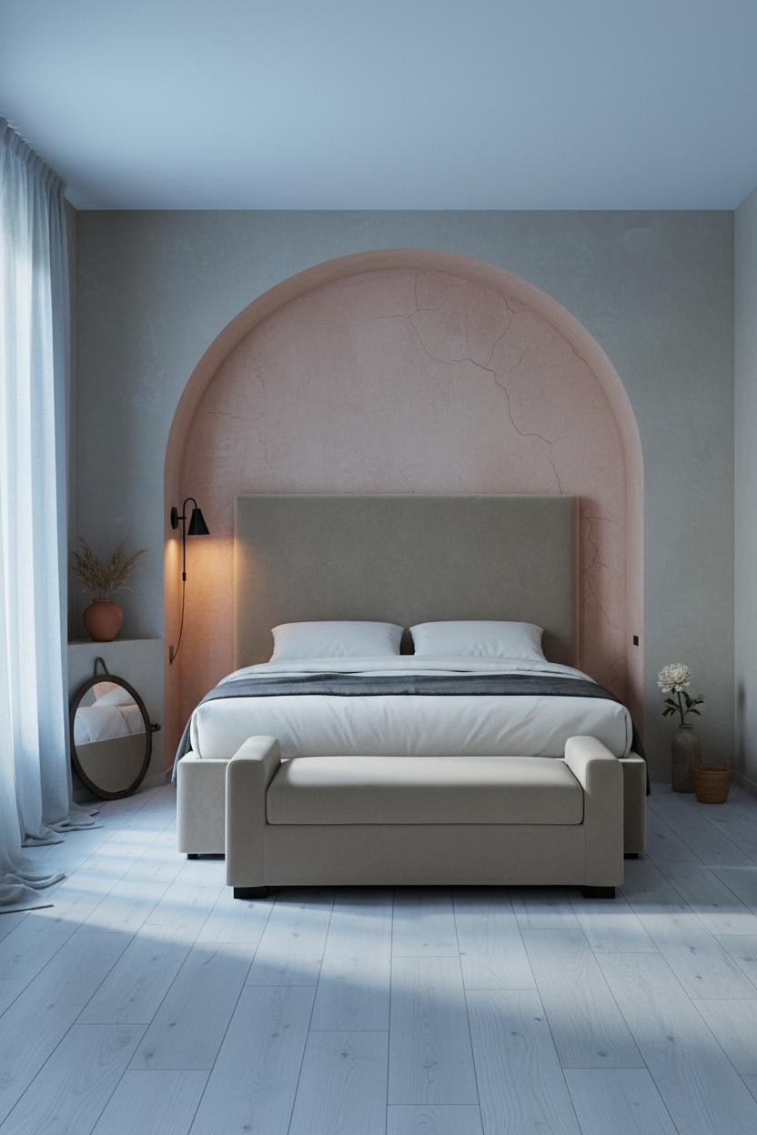
The curved blush-rose limewash arch with visible tool marks and hairline cracks looks like it grew from the wall. That’s the whole point.
Why it feels intentional: The arch frames the bed without the room needing a headboard, which keeps things calm and cohesive on bleached oak floors.
Worth copying: Prop an oversized hammered iron mirror at the arch base instead of hanging it. Leaning is always more French than mounted.
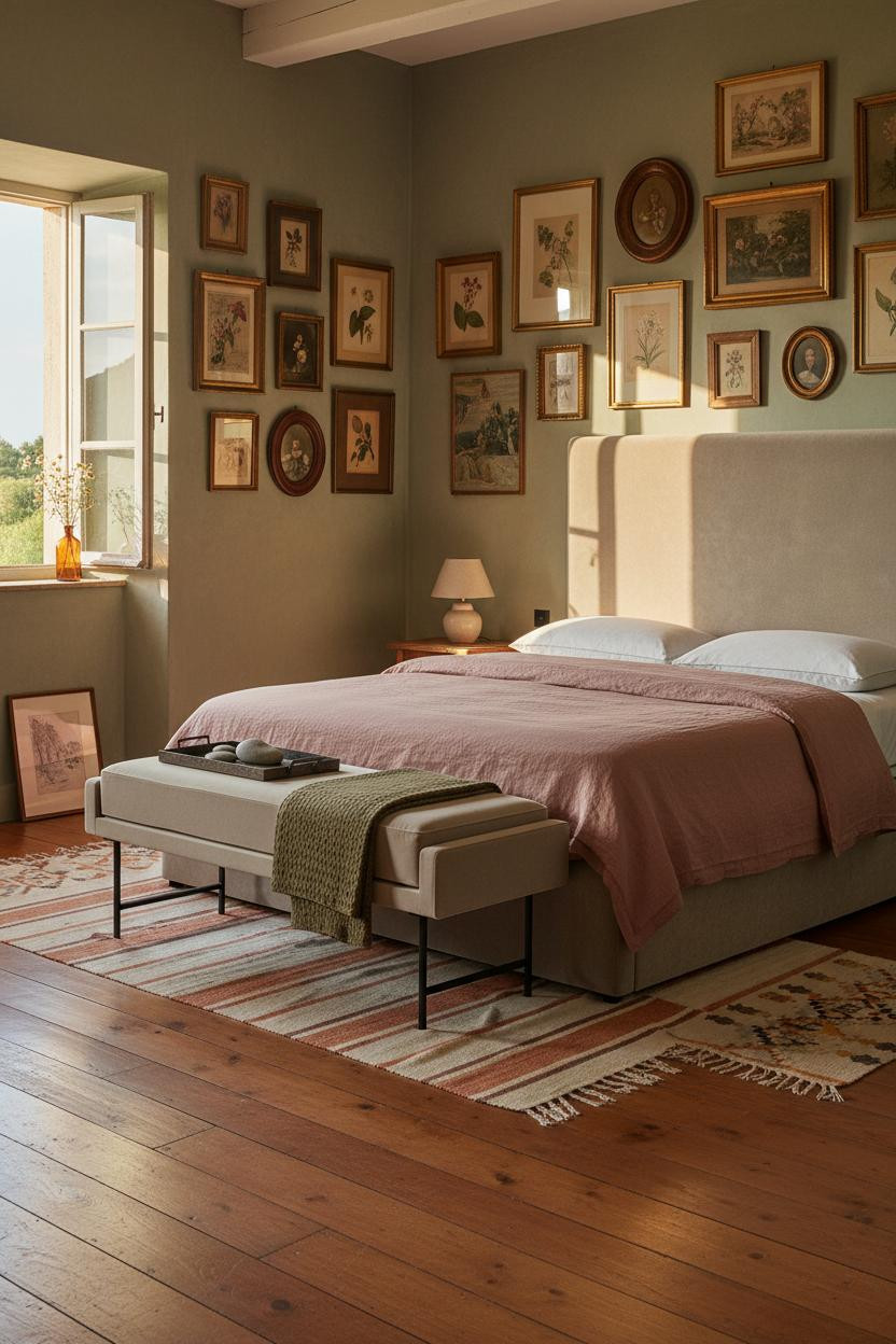
Gallery Walls That Look Collected, Not Decorated
This is the room people screenshot and can never quite replicate. And I think I know why.
What makes this work: Mismatched gilded and painted frames layered floor to ceiling on a sage limewash wall read as personal history, not Pinterest project. One slightly tilted frame helps more than you’d think.
The detail to keep: Mix botanical prints with faded watercolors and small oval portraits. Same subject matter throughout and it starts to feel like a theme shop.
The Plaster Wall That Does All The Work
Fair warning. This look only works if you commit to the imperfection. Deep indigo-grey troweled plaster with raw linen patches and crumbling edges is not for the cautious decorator.
Why it feels expensive: The texture catches raking light the way smooth walls never can, making the room feel lived-in and intimate without a single extra accessory.
Pair it with faded sage linen curtains pooling at limestone floors. The finishing layer: a mustard wool blanket folded at the foot bench, just enough warmth to cut the cool grey tones.
What An Atelier Iron Window Frame Gets Right
A Crittall-style slender iron glazing frame with wavy original glass is one of those details that costs real money to replicate, but the effect is immediate.
Why it looks custom: The thin black bars cast geometric grid shadows across pale blush limewash, giving the wall a graphic quality that no art piece could match.
One smart swap: Hang faded blush linen curtains in a gathered panel rather than flat. The softness against that iron frame is the whole contrast.
Wainscoting Is Underrated In Bedrooms
Most people put wainscoting in hallways. But in a bedroom, against pale terracotta hexagonal tiles, it feels quietly old-world in a way that works.
What gives it presence: The chalky aged grey-blue boards with exposed chipwork catch horizontal raking light, throwing thin parallel shadows that add rhythm without any art needed above.
Where to start: A weathered comb-back chair in the corner holding a folded linen cloth. That’s the detail that makes the whole room feel like it has a past.
The Shutter Move That Works Every Time
Cream-painted wooden shutters with hand-planed grain showing through, left at an uneven angle. Simple. And somehow that’s the whole look.
The real strength: Sharp diagonal shadows across mushroom limewash plaster do more than any wall treatment you could buy. The window becomes the feature instead of a problem to dress.
Navy sateen duvet with a cable-knit cream throw draped across the bench. What to copy first: The contrast in fabric weight, not the color. That’s what makes the bed feel layered.
Vertical Plank Paneling Is Quieter Than You Think
Floor-to-ceiling chalky white-grey plank paneling flanked by warm terracotta walls. The pairing shouldn’t feel balanced, but it does.
Why it feels balanced: Cool paint on the paneling and warm terracotta on the flanking walls act as a neutral zone in the middle, which helps the eye settle without anything feeling stark.
The easy win: Prop an oval hammered iron mirror on the floor against the planks rather than mounting art. Just enough texture while still feeling relaxed.
An Arched Niche Is Worth The Plastering Bill
I’ve seen a lot of arched niches. This one is different because the interior is painted in faded terracotta with hairline cracking, which makes it feel excavated rather than built.
What carries the look: The curved plaster arch softened by age and filtered morning light creates a natural frame for the bed, so the room feels considered from the moment you walk in. Dusty olive walls keep it grounded.
The practical move: Lean a tarnished oval mirror against the olive wall rather than adding a second light source. The reflection does the heavy lifting.
Butter Yellow Board And Batten. Go On Then.


Divisive. But the people who commit to hand-painted butter yellow board-and-batten rising ceiling-height never look back.
Why the palette works: The aged brush direction and gentle spotting on the boards give the color depth that flat paint can’t offer, while the reclaimed chestnut flooring anchors it so the yellow reads warm instead of loud.
What not to do: Don’t add printed bedding. A slate jersey duvet with a cream faux fur throw at the foot is enough contrast. Let the walls talk.
Exposed Limestone Makes Everything Else Look Better
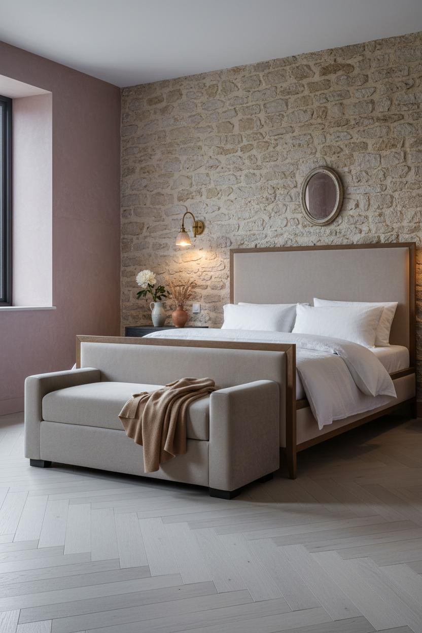
Rough-hewn pale limestone blocks with darkened mortar joints behind the bed, flanked by dusty rose aged plaster. The contrast is immediate and real.
Why it feels authentic: The matte stone surface absorbs diffused light rather than reflecting it, making the room feel warm without being heavy, especially against herringbone bleached oak floors.
The part to get right: Paired sconces flanking the bed, not one centered above. Symmetry here makes the stone wall feel intentional rather than accidental.
The Beam Ceiling That Earns Its Romanticism
Whitewashed hand-planed ceiling beams with exposed cross-bracing spanning overhead. That’s not decoration. That’s architecture doing the decorating for you.
Why it looks custom: The pale beam surfaces catch golden afternoon light and cast soft rhythmic shadows across the walls, giving the room vertical and horizontal movement at the same time. And a sage-green feature wall with aged brush marks grounds it without competing.
Try this: Drape a vintage patchwork quilt in soft greens across the bench at the foot. It pulls from the wall color in a way that feels found, not forced.

Our #1 Pick
Saatva Classic Mattress
America’s best-selling online luxury innerspring. 365-night trial, lifetime warranty, free white glove delivery.
Shop Saatva Classic
The Foundation Of Every Beautiful Bedroom
Walls get repainted. Linen gets swapped. The mattress stays. And honestly, it’s the one thing most people get wrong when they’re obsessing over plaster finishes and vintage frames.
The Saatva Classic is built around dual-coil support that holds its shape over years, not seasons. The breathable organic cotton cover means the room stays cool even when it looks warm and heavy with throws. And the Euro pillow top has that soft-but-structured feel you get in the kind of French countryside hotel that ruins you for regular beds.
Start with the bed. The rest figures itself out.

The rooms worth saving are the ones where every detail looks like it was always there. Pick one surface to make interesting (the plaster, the paneling, the ceiling), build the rest quietly around it, and let time do the styling.