
Plant pot painting ideas turn boring terracotta into showstopping art pieces you’ll actually want to display. You’re about to discover how a few brushstrokes transform basic pots into custom designer pieces that look straight out of a boutique.
From bold geometric patterns to delicate botanical motifs, these 15 ideas show you exactly how to create magazine-worthy painted pots without fancy art skills or expensive supplies.
Mediterranean Studio Pots With Botanical Gold Leaf Accents

This emerald and gold combo feels like something you’d find in a Tuscan artist’s studio. The deep green botanical designs paired with real gold leaf accents create this luxe handmade vibe that screams expensive but costs maybe twenty bucks to make.
Perfect if you’re into that Mediterranean aesthetic or want your plant corner to look less Target and more collected-over-years. The warm terracotta base keeps it grounded and earthy instead of trying too hard.
You can use regular acrylic paint for the base designs and add gold leaf sheets from any craft store. Press them on while the paint’s still tacky and they stick like magic.
The beauty is in the imperfect brushstrokes and slightly uneven gold application. That’s what makes these look artisan instead of mass-produced.
Copenhagen Workshop Collection With Geometric Paint Patterns
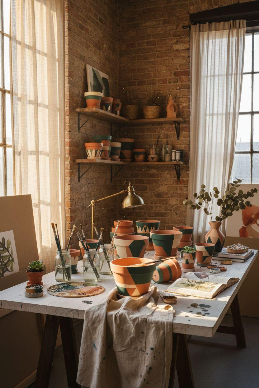
These pots show the actual creative process mid-paint, which honestly makes them cooler. You see the half-finished abstract designs, the brushes still resting on the rim, the paint palette with wet colors mixing together.
Great for anyone who wants that lived-in creative studio vibe instead of everything looking Pinterest-perfect. The emerald, sage, and cream geometric patterns work in basically any plant setup from modern minimal to cozy bohemian.
Paint one pot at a time so you’re not stressed about finishing everything in one session. Let each layer dry completely before adding the next pattern or you’ll get muddy colors.
Stack your finished and in-progress pots together on open shelving. The mix of raw terracotta and painted pieces adds way more visual interest than matching everything.
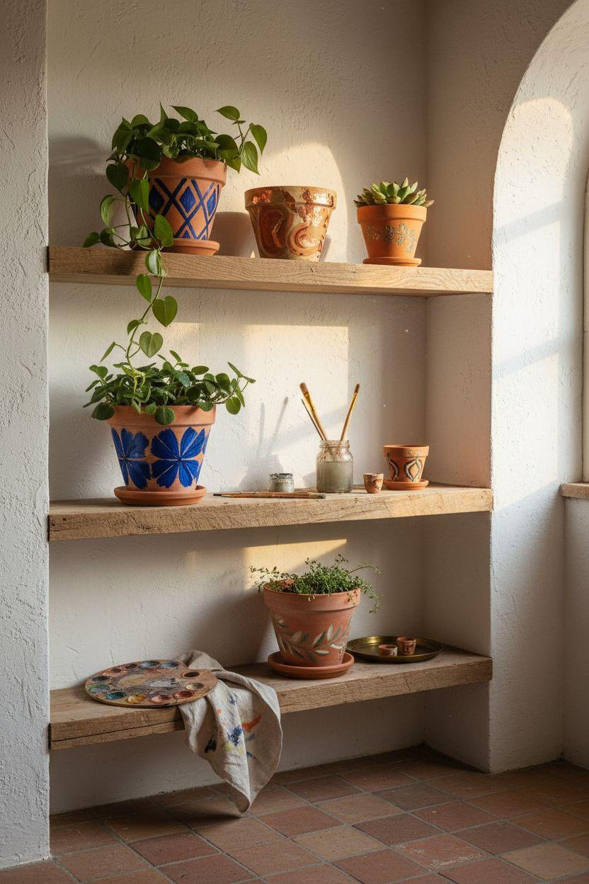
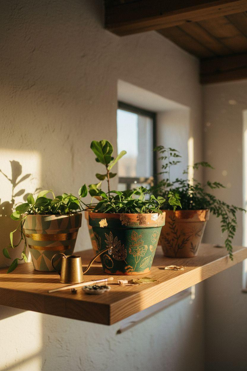
Minimal Floating Shelf Display With Hand Painted Greenery
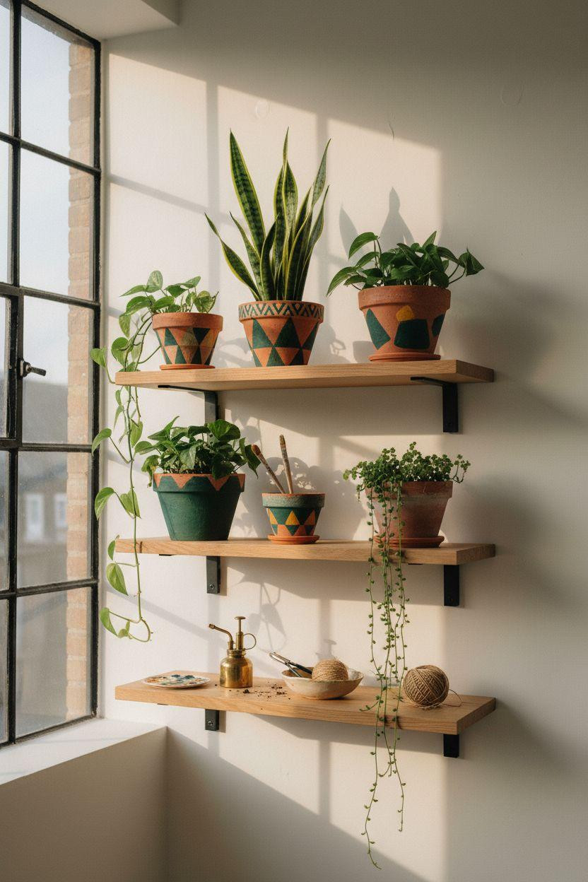
This setup proves you don’t need a ton of pots to make an impact. Five painted pots on white oak floating shelves with trailing plants creates this clean Scandinavian moment that feels both zen and creative.
Ideal for small apartments or anyone working with limited wall space. The deep emerald geometric designs pop against the honey oak wood without overwhelming your room.
Use matte finish paint so the pots have that chalky artisan texture instead of looking plastic and glossy. Mix your greens with a tiny bit of black to get that rich emerald depth.
Let your plants trail naturally over the pot edges. That organic drape softens the geometric patterns and makes the whole setup feel less staged.
Warm Ivory Pots With Abstract Sage Brushstrokes
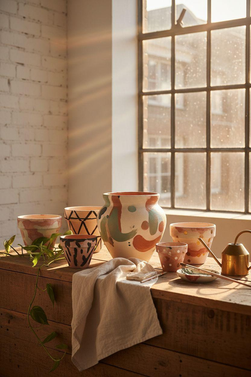
The large ivory pot with loose sage and charcoal brushstrokes feels like modern art you’d pay hundreds for. But you’re literally just swiping paint on clay in organic shapes.
Perfect for anyone scared of painting because there’s no “right” way to do abstract. Messy brushstrokes and drips actually make it look more intentional and artistic.
Start with a cream or ivory base coat and let it dry overnight. Then use a big brush loaded with watered-down paint to create those flowing gestural marks in one confident motion.
Don’t overthink the composition. The best abstract designs happen when you stop trying to control every stroke and just let the paint move naturally.
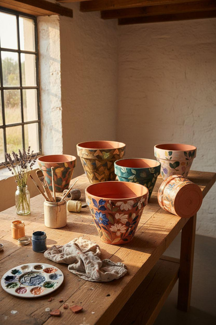
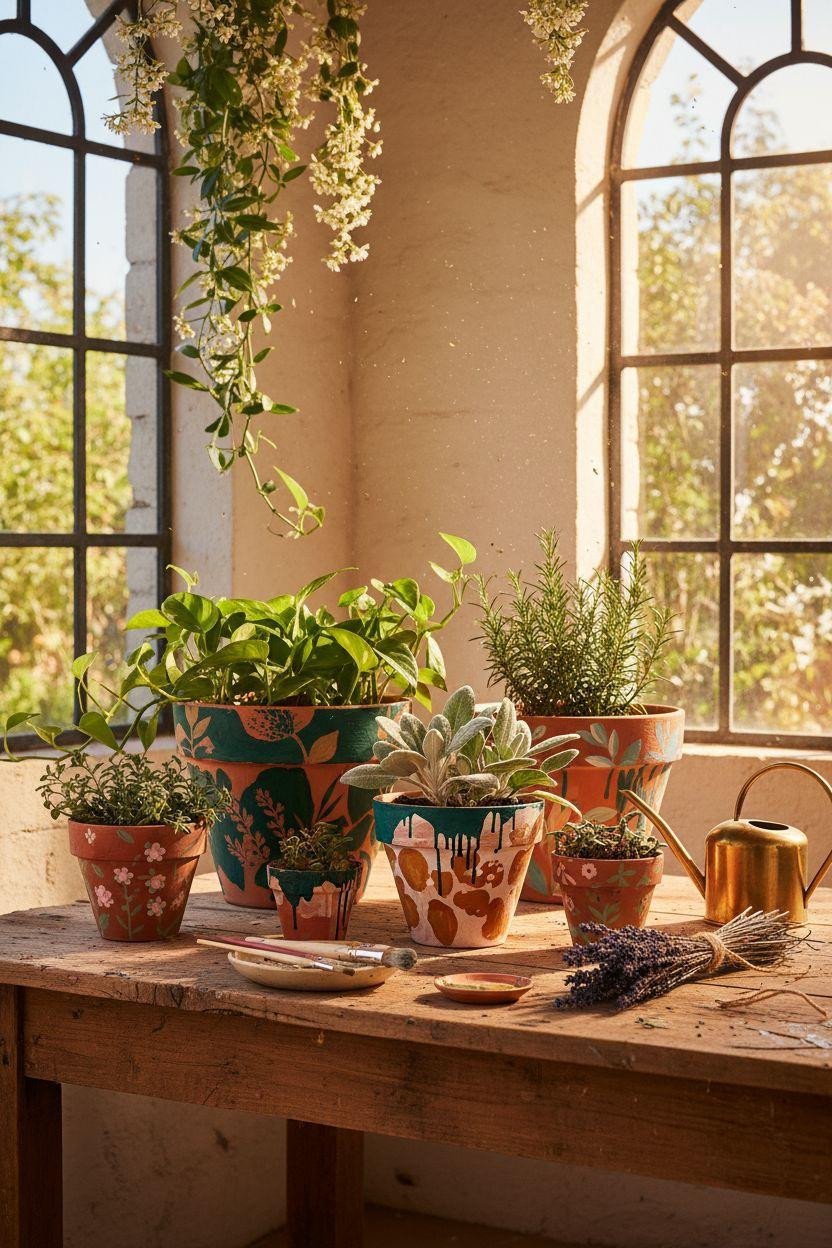
Tuscan Garden Workspace With Bold Mediterranean Designs
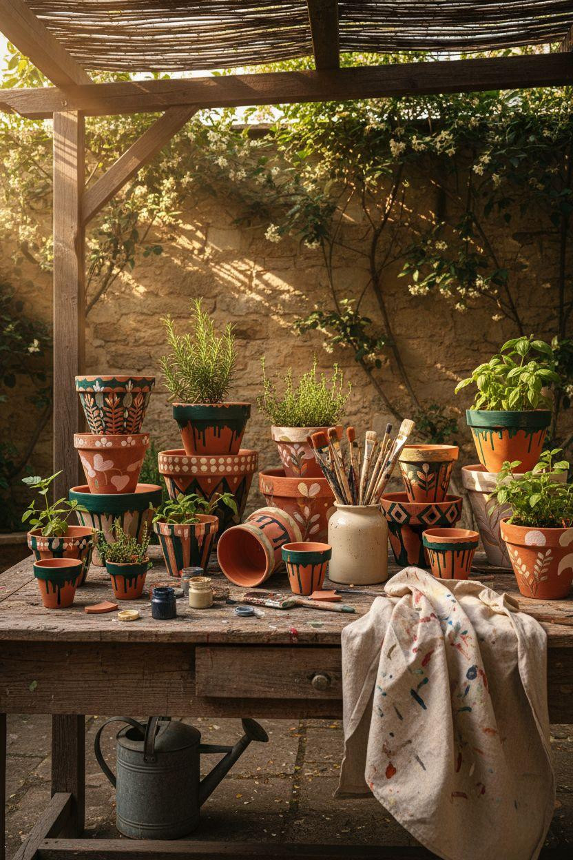
This massive collection shows how mixing different painting styles creates way more visual interest than matching everything. Geometric patterns, watercolor florals, dotted mandalas, bohemian stripes all together feels curated instead of cookie-cutter.
Great if you’re making pots for an outdoor garden space or filling a large potting bench. The variety means you can experiment with different techniques without committing to one aesthetic.
Paint a few pots in each style so they balance each other out instead of one random pot looking lost. Group similar color palettes together even if the patterns differ.
Use outdoor acrylic paint if these pots are living outside permanently. Regular craft acrylics fade fast in direct sun and rain.
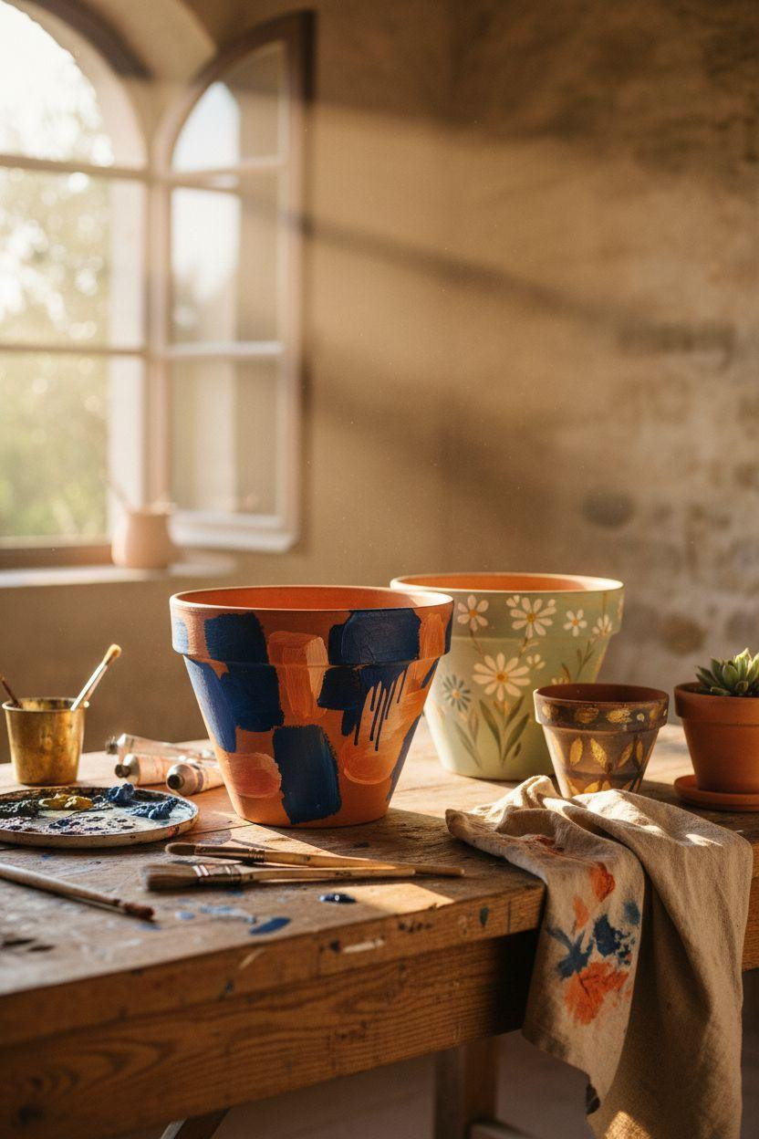
Provençal Potting Bench With Cobalt Blue Botanicals
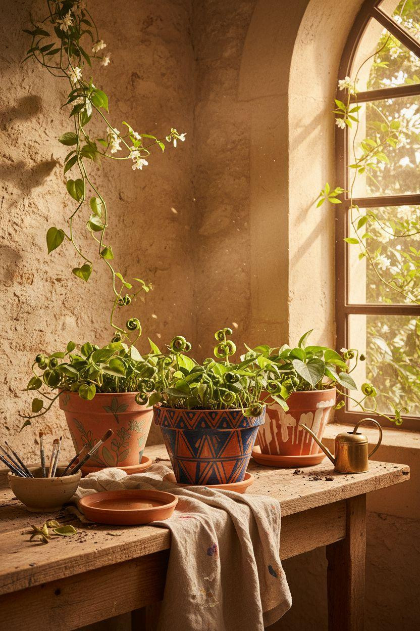
The cobalt blue botanical motifs on warm terracotta feel straight out of the French countryside. These look expensive and time-consuming but you’re just painting simple leaf shapes and vine tendrils.
Ideal if you’re planting herbs like rosemary, thyme, and basil. The blue and terracotta combo gives off that European kitchen garden vibe without being too precious.
Use a thin round brush for the delicate botanical line work. Paint slowly and let each section dry before adding overlapping details so the lines stay crisp.
These pots look incredible clustered together on a wooden surface with the actual herbs growing out of them. Function meets art in the best way.
Overhead Studio Layout With Wildflower Hand Painting
This bird’s eye view shows how pretty your painting setup can look mid-project. The scattered brushes, paint palette, and half-finished wildflower designs create this aspirational creative moment.
Perfect for anyone who wants to document their DIY process for social media. The overhead angle makes even messy workspaces look editorial and intentional.
Keep your paint palette and brushes in the frame when photographing your work. Those tools add context and make the finished pots feel more handmade.
Paint your florals loosely instead of trying to make them photorealistic. Impressionistic flowers with visible brushstrokes look way more artistic and unique.
Industrial Loft Workspace With Bold Navy Chevrons
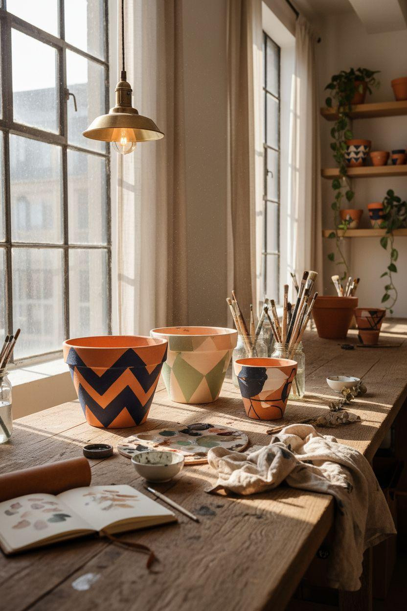
These navy and terracotta chevron pots bring serious graphic punch without feeling juvenile. The bold geometric pattern works in modern spaces where softer florals might feel too sweet.
Great for college students, studio apartments, or anyone with a more masculine or industrial aesthetic. The dark navy grounds the space instead of adding more visual clutter.
Use painter’s tape to create crisp chevron lines. Press the edges down hard so paint doesn’t bleed underneath and ruin your clean geometric vibe.
Peel the tape while the paint’s still slightly wet. If you wait until it’s fully dry, the tape can pull up your base coat and leave rough edges.
Side Profile Collection With Abstract Color Blocking
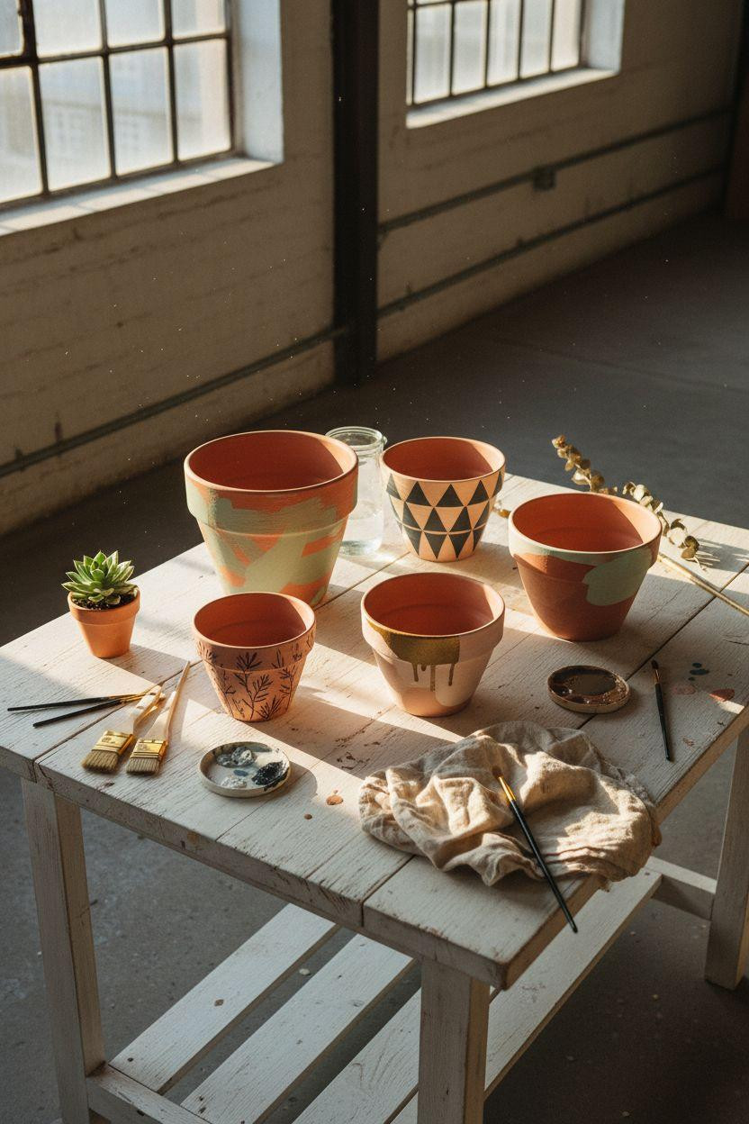
The color-blocked triangles and abstract shapes feel super modern and approachable. You’re literally just painting geometric sections in different colors with intentionally imperfect edges.
Perfect if you’re nervous about detailed painting. Color blocking is forgiving because wobbly lines and organic shapes are part of the aesthetic.
Mix your paint colors right on the pot surface to create those blended transition areas. The color mixing that happens where sections meet looks intentional and adds depth.
Use a flat brush for sharp edges and a round brush for softer transitions. Having both brush types in your hand lets you switch techniques mid-section.
Tuscan Window Display With Folk Art Olive Branches
The hand-painted olive branches in sage green feel like something you’d find at an Italian artisan market. The folk art style is simple enough for beginners but looks genuinely special.
Ideal if you’re into that European countryside aesthetic or want your plants to feel like part of a bigger design story. These pots make even basic pothos look fancy.
Paint your branches in loose gestural strokes instead of trying to make perfect leaves. The charm is in the slightly wonky hand-drawn quality.
Add tiny dots of metallic copper or gold at the base of each leaf cluster. That subtle shine elevates the folk art vibe without making it look costume-y.
Close Up Workshop Details With Mediterranean Blue Patterns
This tight shot shows the actual paint texture and brushwork details that make handmade pots special. You see every drip, every brushstroke, every perfectly imperfect line.
Great for understanding that “flaws” are actually what make painted pots look artisan instead of factory-made. Paint drips and visible brush marks add character.
Don’t stress about perfect lines or matching patterns across multiple pots. Slight variations between pots make your collection look collected over time instead of bought as a set.
Let happy accidents stay. That unexpected drip or wonky circle often becomes the most interesting part of your design.
Garden Room Arrangement With Botanical Motifs And Plants
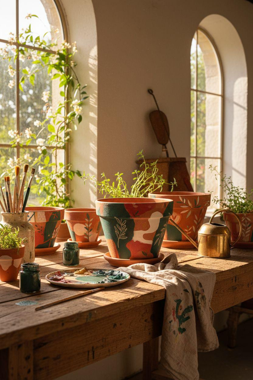
These emerald botanical designs paired with actual growing plants create this layered garden moment where the painted and real greenery play off each other. Super satisfying visually.
Perfect for a potting table or garden room where function matters as much as aesthetics. The painted pots hold up outdoors if you seal them properly.
Use a clear acrylic sealer spray after your paint fully dries. Two light coats protect the design from water damage and UV fading better than one heavy coat.
Plant herbs or flowers that echo your painted colors. Sage plants in pots with sage green designs or lavender in purple-painted pots creates this cohesive garden vibe.
Geometric Workshop Setup With Bold Cobalt Triangles
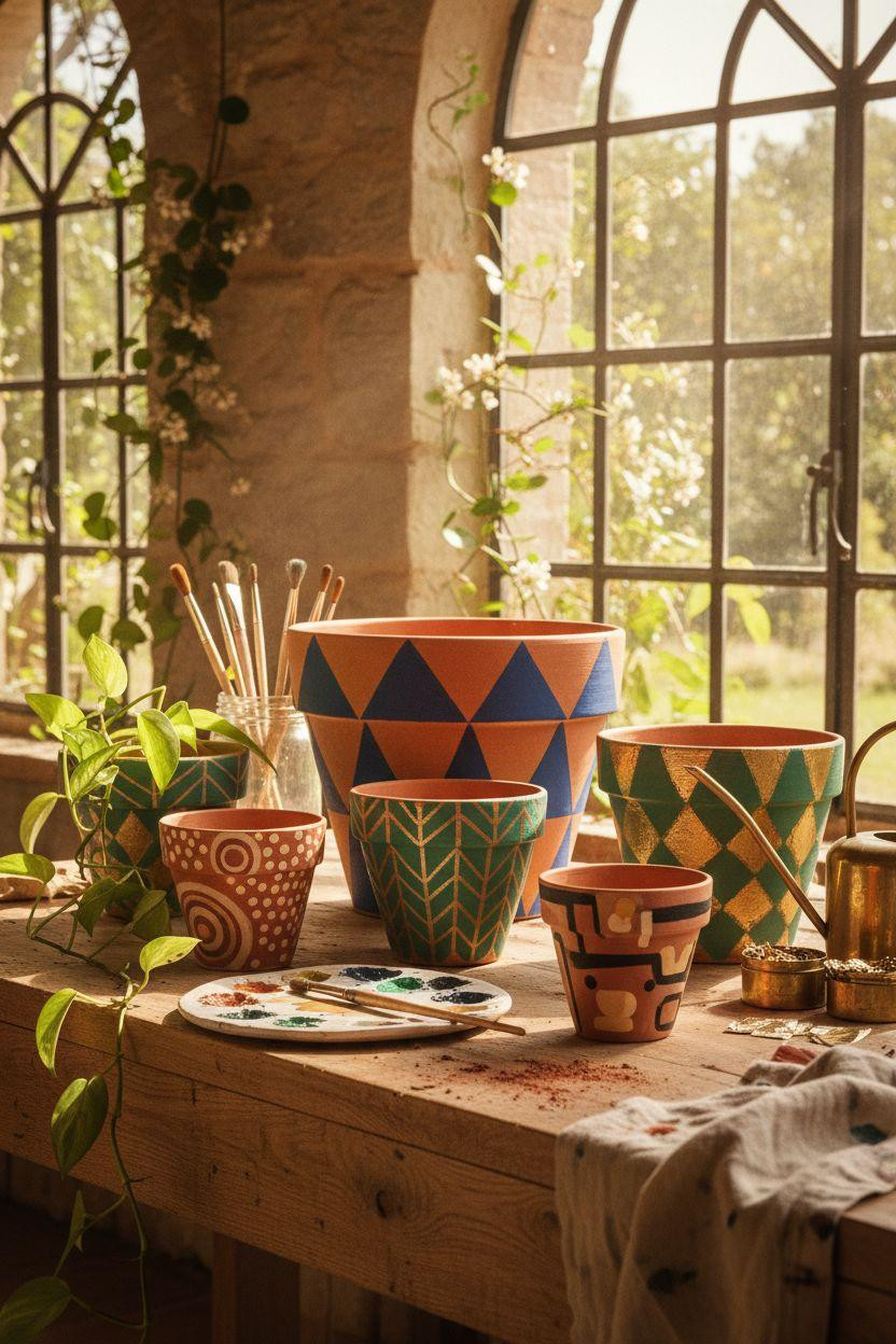
The cobalt triangles with metallic gold accents feel like high-end ceramics you’d find in design stores for eighty bucks each. But you’re making them for the cost of a pot and some paint.
Great if you want a more graphic modern look instead of soft botanicals. The strong geometric shapes work in minimal spaces where patterns need to make a statement.
Paint your base triangles in solid cobalt first, let them dry, then add the gold leaf details last. Layering the metallic on top makes it pop instead of getting muddy.
Use different sized triangles across multiple pots so they feel related but not identical. Matching patterns can look mass-produced instead of handmade.
Provençal Potting Bench With Abstract Emerald Shapes
The abstract emerald shapes feel artistic without requiring any actual painting skills. You’re just making organic blob shapes and letting them overlap naturally.
Perfect for beginners who want impressive results fast. Abstract designs are way more forgiving than geometric patterns where wonky lines really show.
Thin your paint slightly with water so it flows smoothly and creates those organic drips and bleeds at the edges. That watercolor effect adds movement to your design.
Layer multiple shades of green from deep emerald to soft sage. The color variation makes simple shapes look more complex and professional.
Botanical Studio Focus With Metallic Gold Leaf Details
The emerald botanical designs with delicate gold leaf application create this luxe artisan vibe that’s surprisingly easy to achieve. The metallic accents catch light and make your pots look expensive and collected.
Ideal if you want your plant shelf to feel more gallery and less dorm room. The deep emerald against warm terracotta with gold hits all those rich jewel tone notes.
Apply gold leaf in small organic sections instead of covering large areas. Little touches of metallic go further and look more intentional than going overboard.
Press the gold leaf on with your finger or a soft brush. The imperfect application with gaps and wrinkles looks way better than trying to make it perfectly smooth.
Your Pots, Your Way
You just saw how basic terracotta transforms into custom art pieces with paint, brushes, and zero fancy skills required. Each style works whether you’re into bold graphics, soft botanicals, or abstract free-form designs that let you experiment without rules.
Grab some pots and acrylic paint this weekend and start with one simple design. Save your favorites to Pinterest so you can try different techniques as your plant collection grows and your creative confidence builds.