Think your apartment is too small to feel like anything? 500 sq ft studio apartment ideas prove otherwise. The best ones don’t fake space. They just stop wasting it.
I’ve pulled 14 layouts that actually work. Different zones, different dividers, same principle: every square foot earns its place.
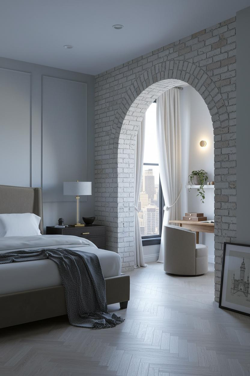
The Arched Brick Divider That Earns Its Square Footage


Bold choice. Not every studio can pull off a permanent architectural divide. But this one does.
The raw pale brick arch surround does something drywall can’t: it frames the boundary between sleeping and living with actual weight, so the zones feel intentional instead of just hoped for.
Worth copying: Nine feet of arch height draws the eye up and makes the footprint feel bigger. Pair it with herringbone parquet on the floor and the whole room reads as considered.
How a Low Shelf Unit Zones a Studio Without Walls
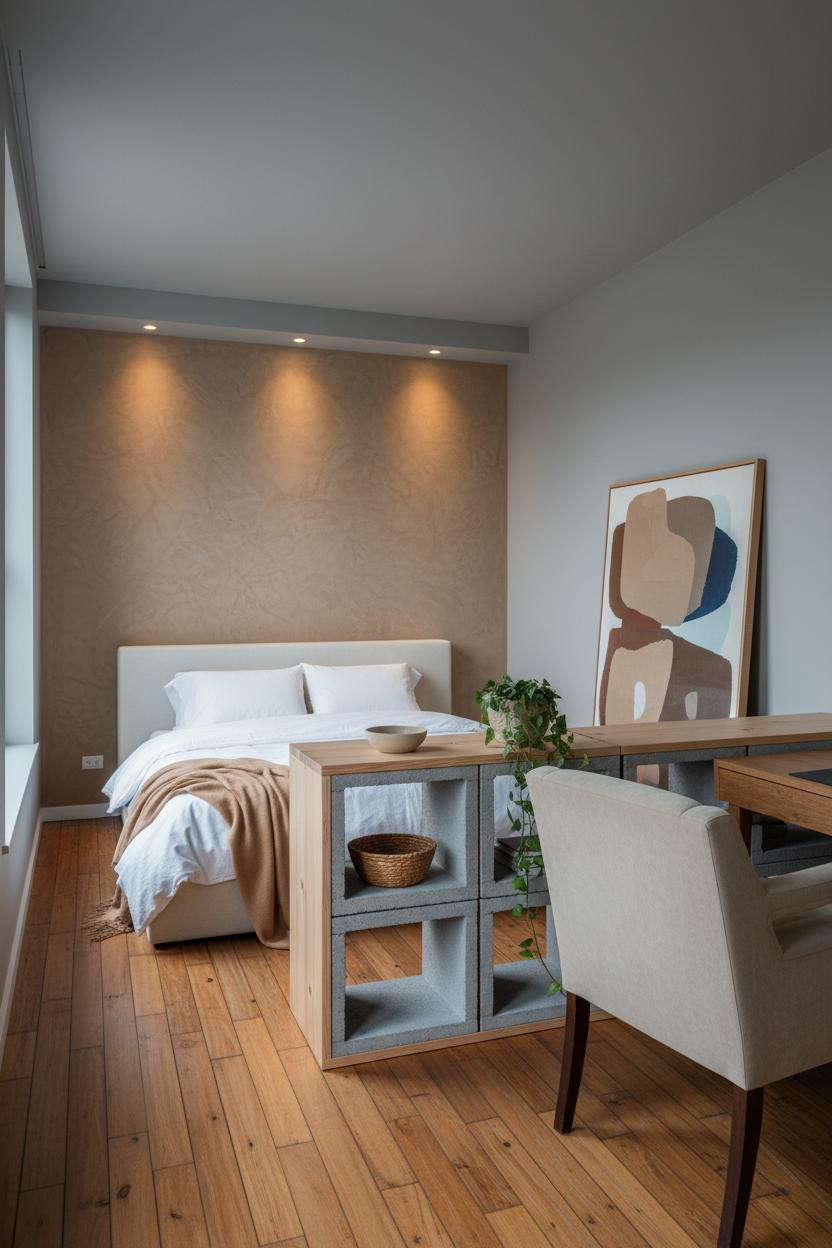

I keep coming back to this one. It’s proof that you don’t need a wall to create two separate rooms.
What makes it work: A waist-height concrete block and natural pine shelf unit defines the boundary while keeping sightlines open, so neither zone feels cut off or boxed in.
The smarter choice: Keep the floor consistent throughout. One material underfoot unifies both zones and makes the whole apartment read as a single, cohesive space.
The Crittall Window Wall That Stands In for a Room Divider

Honestly, the geometry here does most of the work.
A steel-frame Crittall window wall spanning the far edge gives the living zone a strong visual anchor, which keeps furniture placement from feeling arbitrary. The black mullion grid reads as architecture, not just windows, and that’s the whole difference.
In a small footprint, the practical move is giving each zone one dominant feature that signals its purpose. The window wall does that for the living area. Let the bed do it for the sleeping zone.
Full-Height Walnut Slats That Create Rhythm Without Weight
This is the kind of divider I’d actually commit to. MCM-inspired and genuinely functional.
Why it looks custom: Vertical slatted walnut panels cast rhythmic bar shadows across the floor, creating zone separation that feels designed rather than improvised, while still keeping light traveling through the whole apartment.
Avoid this mistake: Don’t fill the rest of the room with warm wood tones. Let the slats be the hero. Keep surrounding furniture lighter so the grain doesn’t compete with itself.
Why a Boho Oak Divider Works Better Than You’d Expect

It shouldn’t work. A half-height open-cubby divider sounds more like a bookcase than a zone boundary. But it does, because the natural oak frame on matte black steel gives it enough visual mass to read as architectural without blocking light from either side.
Try this: Use the cubby shelves for objects, not storage. A rattan planter and a pair of brass bookends signal that the space is curated, not just divided. (The terracotta wall behind the sleeping zone does a lot of heavy lifting too.)
I Wasn’t Expecting the Arched Niche to Do This Much Work
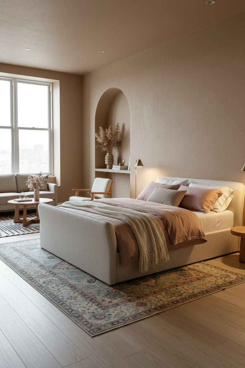

This one surprised me. A built-in arched niche carved into the partition wall sounds like a renovation-budget move, but the payoff is real: the room feels like it has a spine.
Why it holds together: The deep curved plaster reveal draws the eye upward through the compact footprint and anchors the zone division with architectural weight that furniture alone can’t provide.
The finishing layer: Style the niche with dried botanicals in a ribbed stone vessel. Nothing too precious. Just enough texture to keep the eye interested without competing with the arch itself.
A Glass Partition That Keeps Both Zones Feeling Open
Fair warning: this is the most commitment-heavy option on this list. But the couples who go with a full-height frosted glass sliding partition never look back.
What gives it presence: The brushed steel frame acts as the visual spine of the whole apartment, and the frosted lower panels let light pass through in soft horizontal bands that make both zones feel bigger than they measure. The room feels calm and cohesive in a way that curtain dividers just don’t achieve.
Where people go wrong: Pairing a statement partition with busy flooring. Keep the herringbone parquet pale and the walls consistent across both zones. The partition earns the attention. Let it have it.
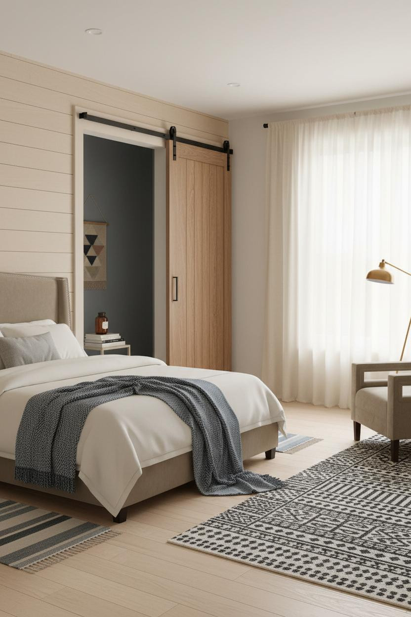
The Walnut Barn Door Move I Keep Recommending
Nothing fancy. That’s the point.
A natural walnut sliding barn door on matte black rail hardware is genuinely the most practical zone divider for a small studio, because it disappears flush against the wall when you don’t need it and creates a full visual boundary when you do.
One smart swap: Replace the shiplap panel it slides across with a textured plaster surface so the warm wood grain has something with real material contrast to play against.
What a Board-and-Batten Partition Does to Scale


I almost dismissed this as too simple. But the proportions are exactly right.
Design logic: A half-height matte white board-and-batten partition at 48 inches draws the eye upward through its crisp vertical lines, creating architectural definition without consuming floor space, which helps balance the deep walnut plank flooring underneath.
The easy win: Keep the cap rail in natural wood. That single material detail makes the partition feel built-in rather than assembled.
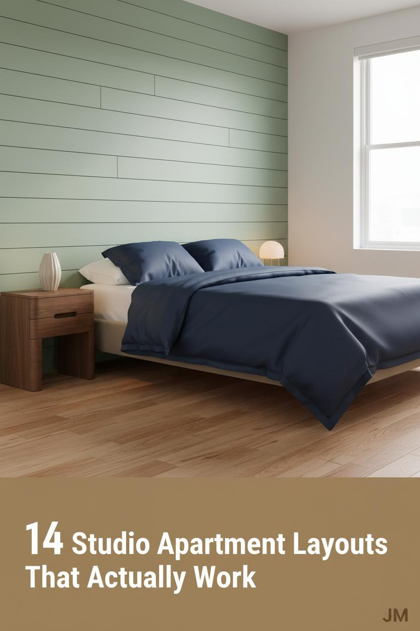
The Japandi Shiplap Wall That Changes How Big the Room Feels
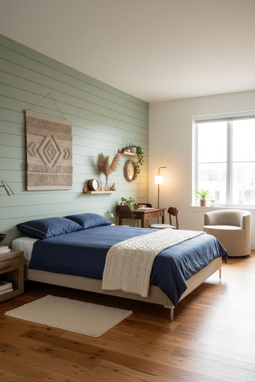
The sage green shiplap accent wall running floor to ceiling behind the sleeping zone is doing more than adding color. Horizontal boards catch diffused light and create strong linear texture that pulls the eye across the full width of the room, making 500 square feet feel generous.
What to borrow: Navy sateen bedding against that sage wall. The contrast is the whole palette. Bring in a warm maple floor and the room feels lived-in and intimate without adding a single extra piece of furniture.
Raw Concrete Walls and Why They Work in Small Spaces
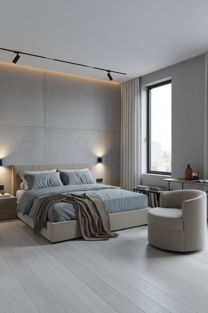
Divisive. Some people see exposed poured concrete and think cold. But in a small studio with warm bedding and pale flooring, it lands somewhere else entirely.
Why it feels balanced: The matte aggregate texture catches light differently than paint, which means the wall reads as warm at some angles and cool at others. A camel wool throw at the foot of the bed pulls the whole palette toward warmth without fighting the material.
Best for: Studios with tall ceilings or large windows. The rawness needs natural light to stop feeling heavy.
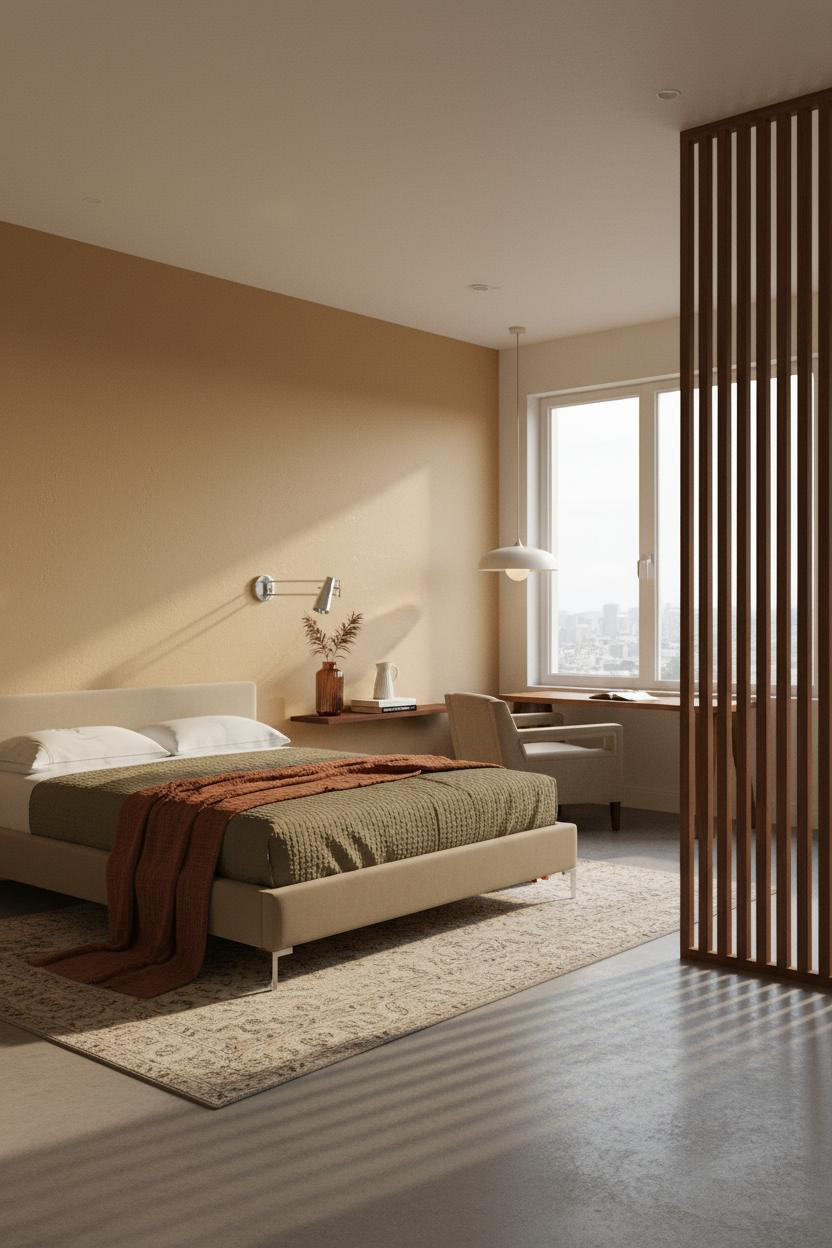
A Floating Desk Setup That Actually Solves the Work-From-Home Problem
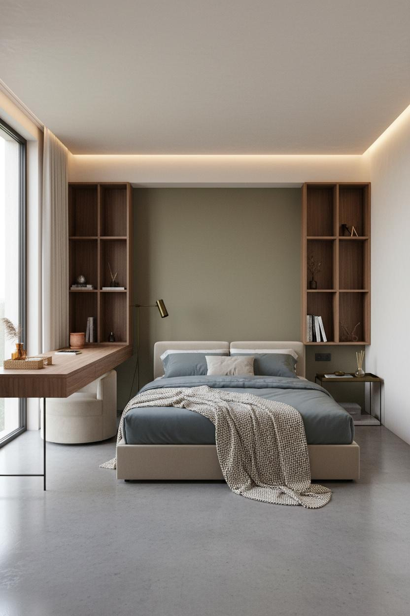
Having a dedicated work zone changes how you actually use the rest of the apartment.
The real strength: A full-width floating walnut desk platform on slim black metal brackets keeps the floor clear underneath, which is honestly the only reason the polished concrete floor reads as a feature instead of just a surface. Vertical open cubbies above create storage rhythm in a way that feels organized, not cluttered.
Pair it with a soft olive accent wall behind the sleeping zone to separate the mood of each area without needing a physical divider.
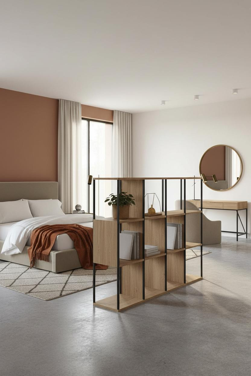
The Built-In Bookshelf Wall That Earns Back the Floor Space
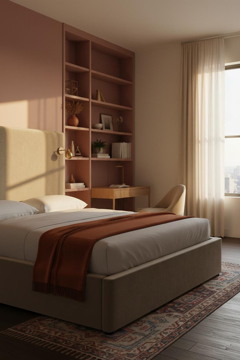
This one is a study in proportion. Floor-to-ceiling built-in shelving along the partition wall reads as furniture and architecture at once, which means it earns back the square footage it uses in vertical storage, visual rhythm, and zone definition all together.
What creates the mood: Painting the shelving unit in dusty rose makes it feel intentional rather than improvised, and the warm amber pooling from paired sconces at the bed keeps the sleeping corner from feeling swallowed by storage. Skip this: Filling every shelf. Leave gaps between objects so the wall breathes.
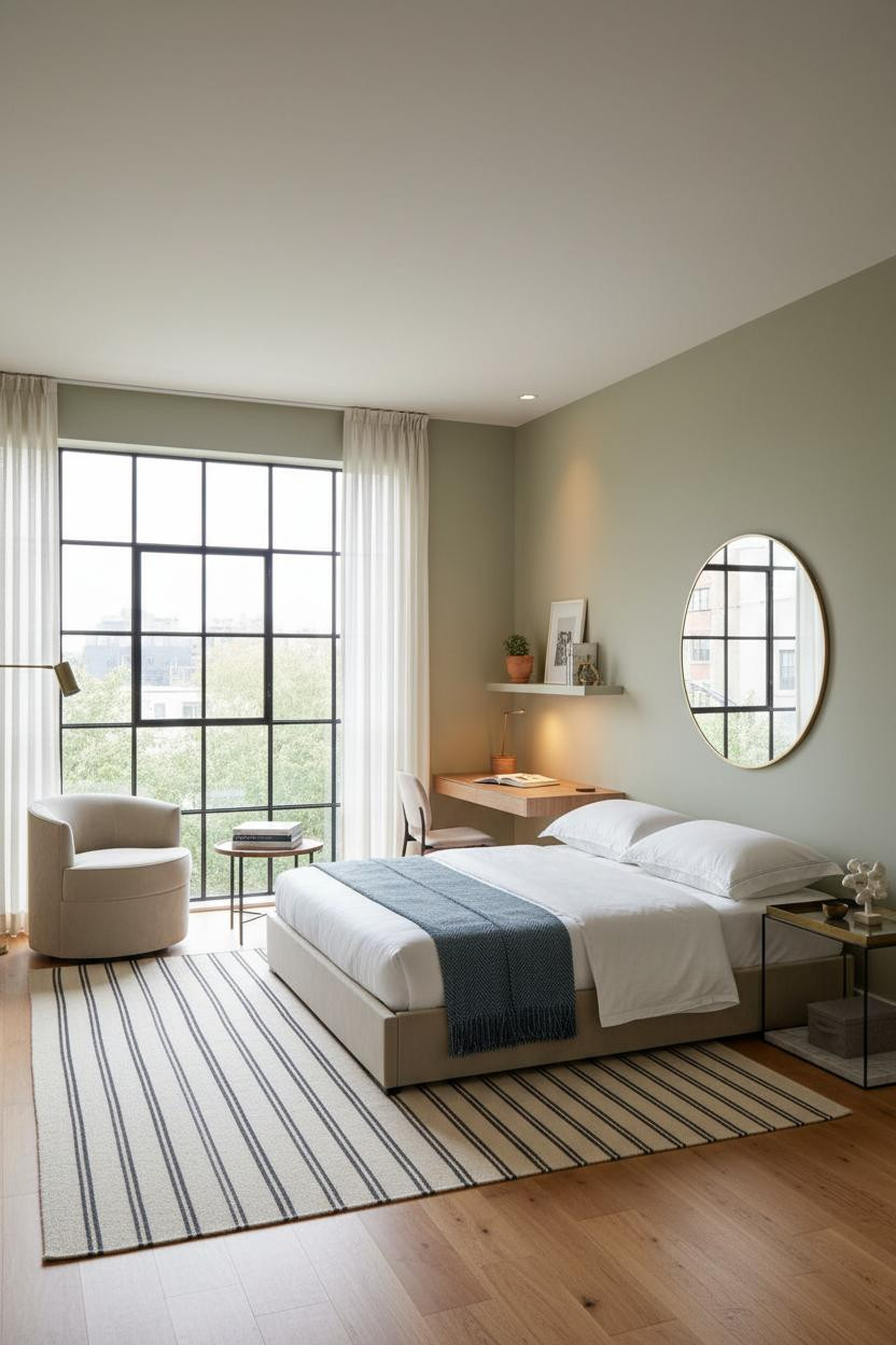
Scandi Floating Shelves That Add Height Without Adding Clutter
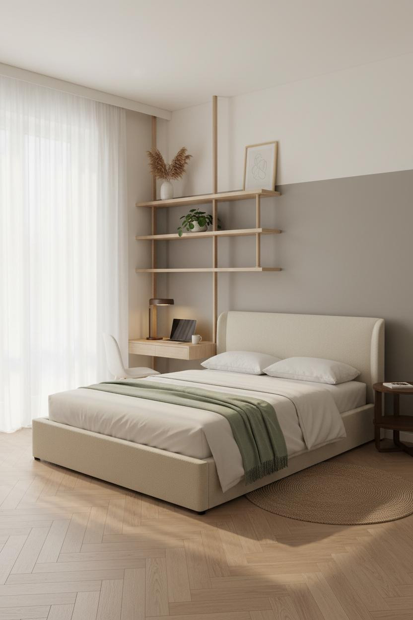


Simple. And actually the right call for a Scandi-influenced studio layout.
Why the palette works: A greige accent wall behind the bed anchors the sleeping zone without adding color drama, while the natural oak floating shelf unit spanning the desk wall draws the eye upward and makes the ceiling feel higher than it is. The room feels calm and cohesive in a way that heavier furniture wouldn’t allow.
Keep the shelf styling sparse: dried pampas grass in a single ceramic vase, one small plant, a framed line drawing. Just enough to feel collected rather than decorated.

Our #1 Pick
Saatva Classic Mattress
America’s best-selling online luxury innerspring. 365-night trial, lifetime warranty, free white glove delivery.
Shop Saatva Classic
The Foundation Of Every Beautiful Bedroom
All of this design work, all of the zoning and material choices and careful furniture placement, ends at the bed. And a bed that looks right but sleeps wrong defeats the whole point.
The Saatva Classic is the mattress I keep recommending for small studios because it doesn’t fight the room. The dual-coil support system holds up without needing a bulky frame, the breathable organic cotton cover keeps things comfortable year-round, and the Euro pillow top feels genuinely soft without losing structure over time. It works as hard as the rest of the layout does.

Good design ages well because it’s made well. Start with the bed. The rest figures itself out.