
Think your studio apartment design is too limited to feel intentional? Think again. The best small spaces I’ve seen don’t fake square footage. They commit to a point of view.
What follows are 13 layouts that actually work, each one solving a real problem without pretending the room is something it’s not.
The Arched Niche That Makes a Studio Feel Like a Home
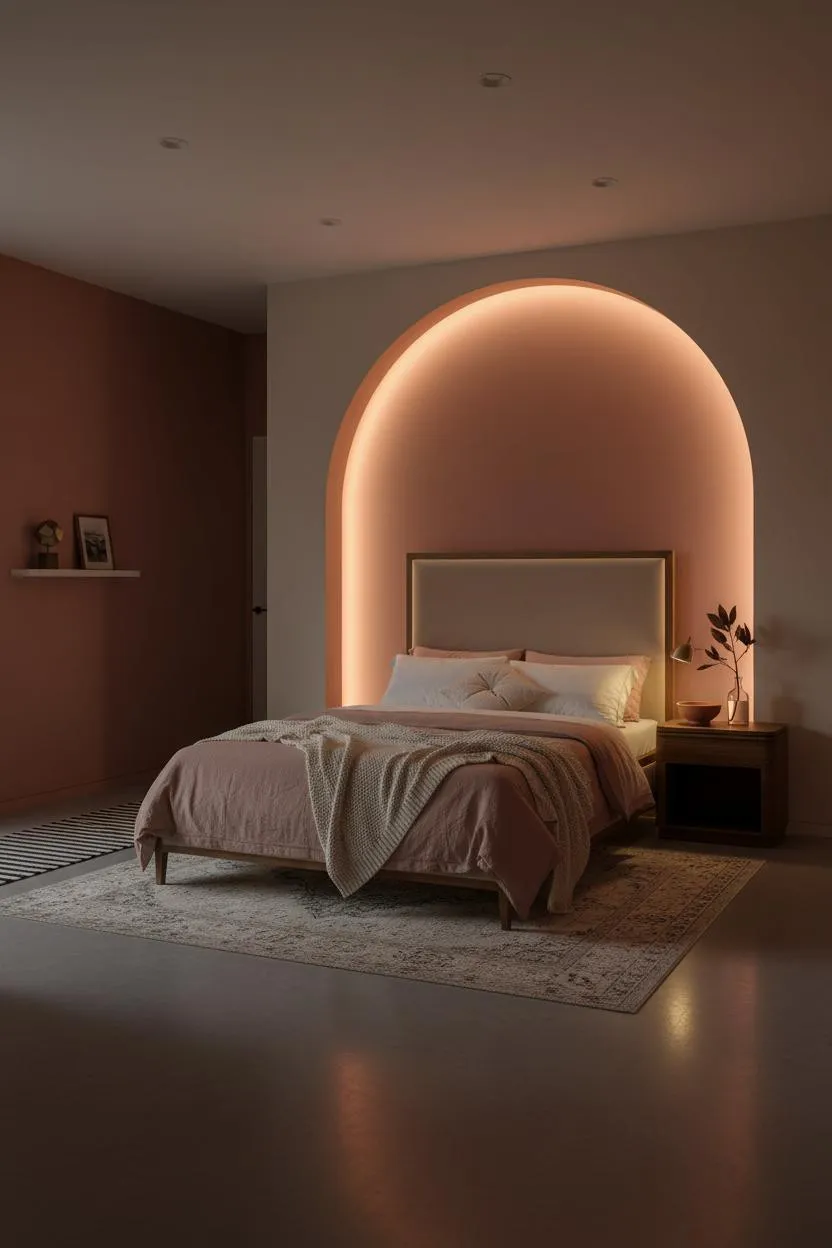

Bold choice. But a single arched niche cut into the wall behind the bed does something no room divider can: it makes the sleeping zone feel permanent.
Why it holds together: The matte plaster arch throws a soft shadow crescent that frames the bed without borrowing any floor space, which keeps the rest of the studio open and livable.
The part to get right: Let the arch crown hit close to ceiling height. A shallow arch reads decorative. A tall one reads architectural.
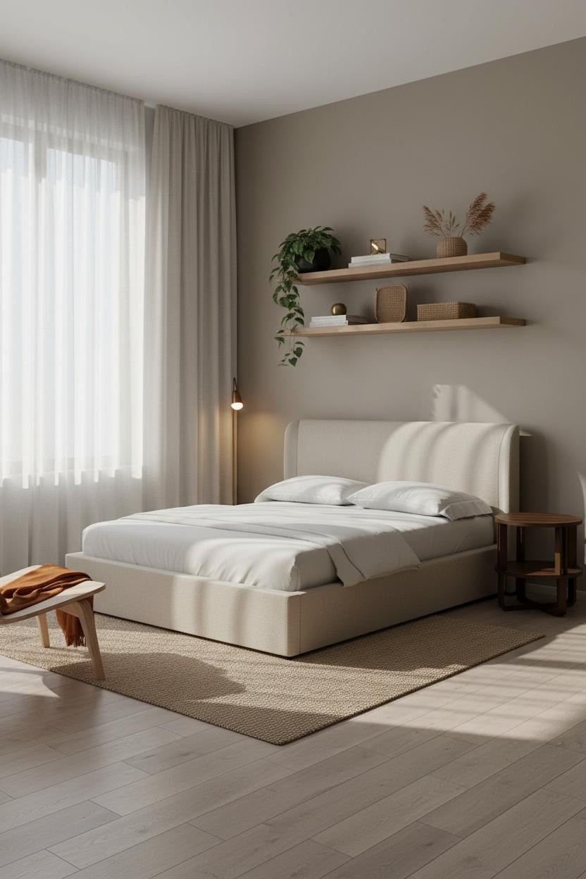
Built-In Shelving That Earns Every Inch
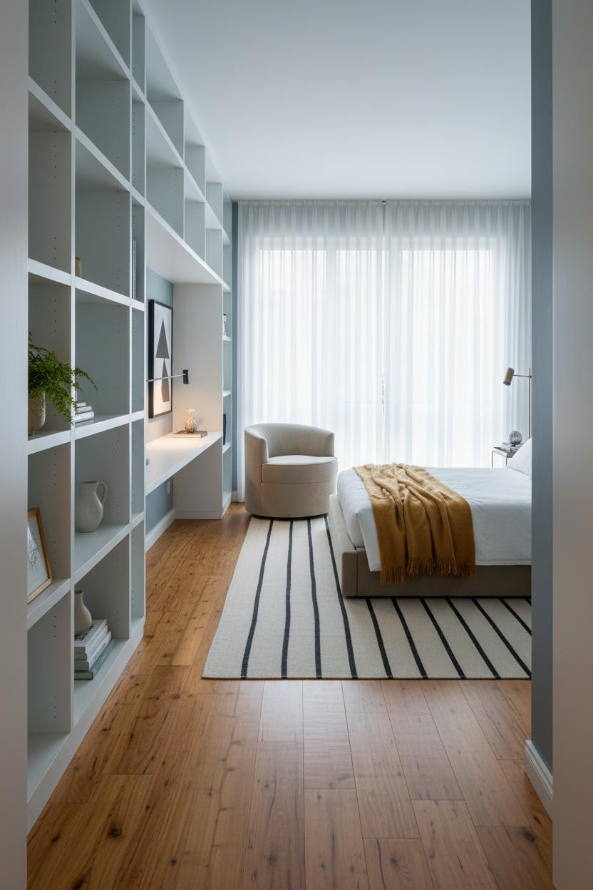


In a space this small, storage has to work harder than furniture.
What makes it work: Floor-to-ceiling corner shelving in white-painted MDF creates vertical rhythm that makes the room feel organized rather than crammed, while the integrated desk nook carves out a work zone without claiming a single extra square foot.
Steal this move: Keep the shelves open and give each one breathing room. A tightly packed shelf reads cluttered. A spaced one reads curated.
The Japandi Layout That Feels Twice as Big
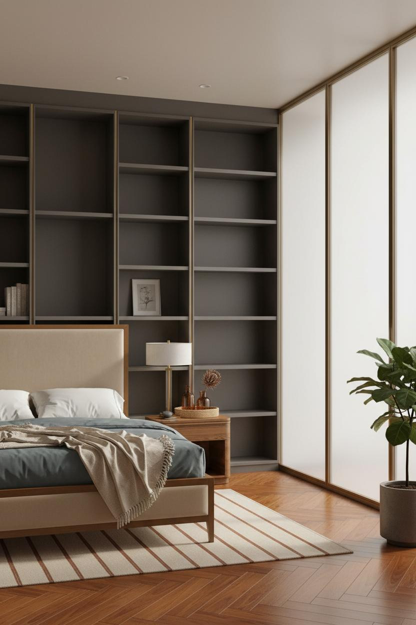
I keep coming back to this one. The restraint is almost aggressive.
Full-height built-ins in matte charcoal lacquer anchor the accent wall, and the thin brass rail detail keeps the whole thing from reading too heavy. The room feels still and grounded, which is honestly hard to pull off in under 500 square feet.
What to borrow: Pair dark built-ins with warm mushroom walls to keep the contrast from feeling cold. The mushroom absorbs the charcoal’s weight.
Why Walnut Slatted Walls Work So Hard in a Studio
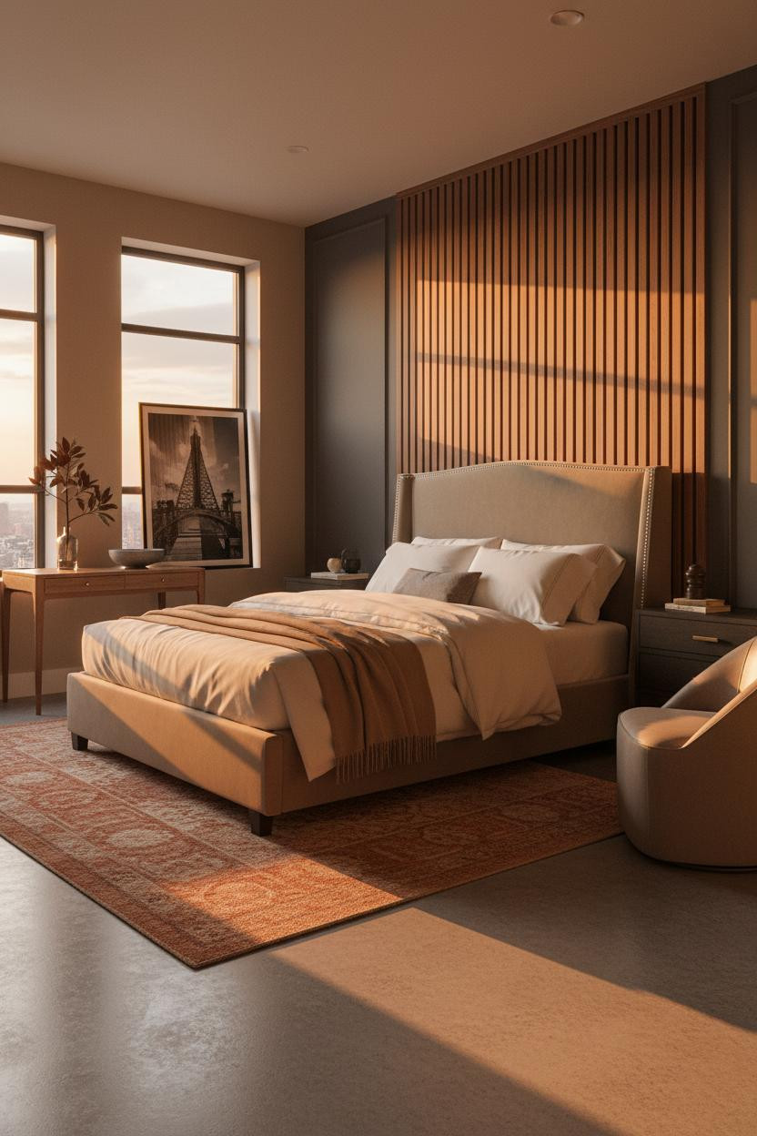


This is the kind of room that makes you stop scrolling.
Design logic: A floor-to-ceiling vertical walnut slat panel divides the sleeping zone from the living side with grain and shadow instead of drywall. Each slat catches raking evening light differently, so the wall has movement without any furniture doing the work.
Avoid this mistake: Don’t use light-toned slats here. The warm walnut grain is what grounds the polished concrete floor. Go pale and it floats.
What Terracotta Wainscoting Does for a Tiny Room
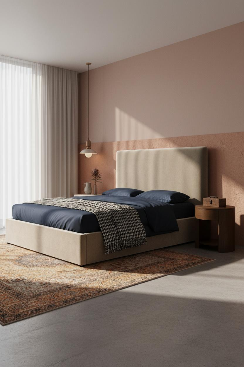


Nothing fancy. That’s the point.
What gives it presence: A half-height band of hand-troweled terracotta plaster wraps the lower third of the wall, giving the compact room a tactile horizontal anchor that paint alone can’t replicate. The dusty rose wall above keeps it soft rather than rustic.
The smarter choice: Stop the wainscoting at a consistent height across the room, not just behind the bed. It reads more intentional when the band travels the full perimeter.
How a Slate Blue Accent Wall Lifts a Short Ceiling
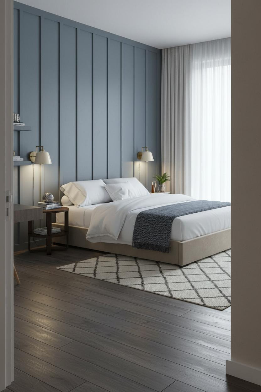


This one is divisive. But I think it’s one of the smartest moves in the list.
Full-height board-and-batten in slate blue draws the eye upward in a way that flat color never quite manages. The vertical grooves create low-relief shadow lines that give the wall depth and make the ceiling feel farther away, which is the main thing a tight studio needs.
Where people go wrong: Stopping the treatment at chair rail height. The whole point is the vertical lift. Half-height kills it.
I Didn’t Expect Sage Walls to Do This Much Work
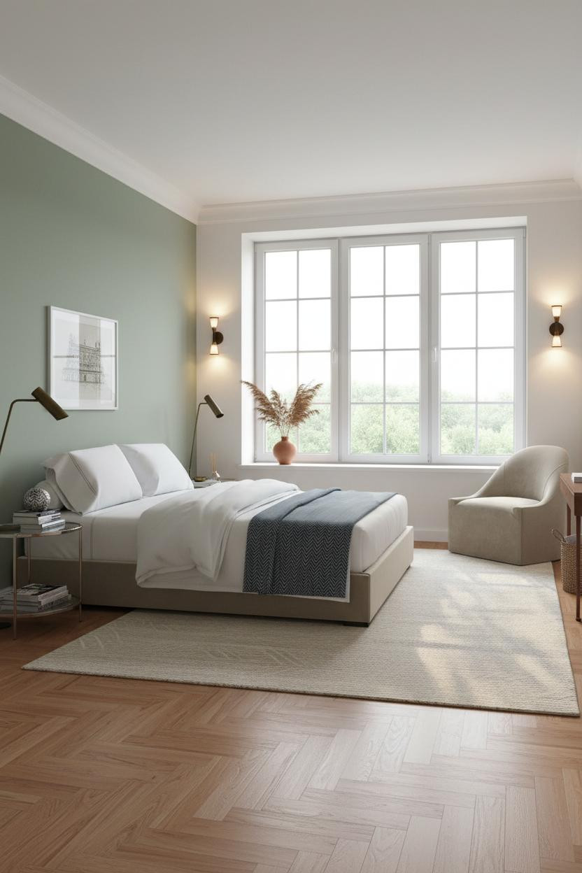
A soft sage accent wall behind the sleeping zone does something that a bold color can’t: it holds without dominating. The room feels calm and cohesive, even when the rest of the layout is working hard to separate zones.
The easy win: Pair sage with warm honey parquet and a chunky cream wool rug at the bed. The contrast is immediate, and it reads warmer than it has any right to in a compact space.
The Floating Desk That Zones a Studio Without Walls


Having a dedicated work surface changes how you actually use a studio. Without one, the bed becomes the desk, and the room never fully shuts off.
What carries the look: A low-profile floating walnut desk spanning the full window wall creates a strong horizontal line that splits the room into two readable zones. It’s a small move. Big difference.
Pro move: Keep the desk surface clear except for one or two objects. The negative space is what makes the zoning legible.
Why Negative Space Is the Real Furniture in a Scandi Studio
I almost scrolled past this. Glad I didn’t.
The floating natural oak shelf runs eight feet across the accent wall, and what makes it work isn’t the storage. It’s the breathing room between objects. Each gap is as intentional as each piece, which is why the room feels collected rather than decorated.
What not to do: Don’t fill every shelf. The empty space is load-bearing here.
This Exposed Concrete Studio Is Smarter Than It Looks
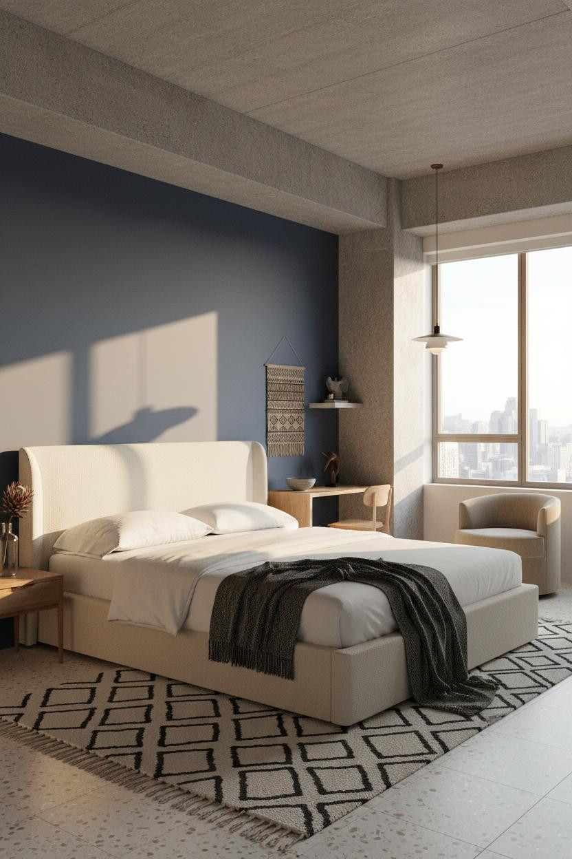
It might seem risky to lean into structural bones as a design feature, but an exposed concrete column and beam does something a rug or bookshelf can’t: it creates a zone boundary that feels architectural rather than staged. The room stays open while still feeling divided.
Worth copying: Place the sleeping zone against the indigo matte wall and the living corner on the other side of the beam. The column does the zoning. You don’t need anything else.
A Terracotta Floating Desk Layout That Actually Lives in
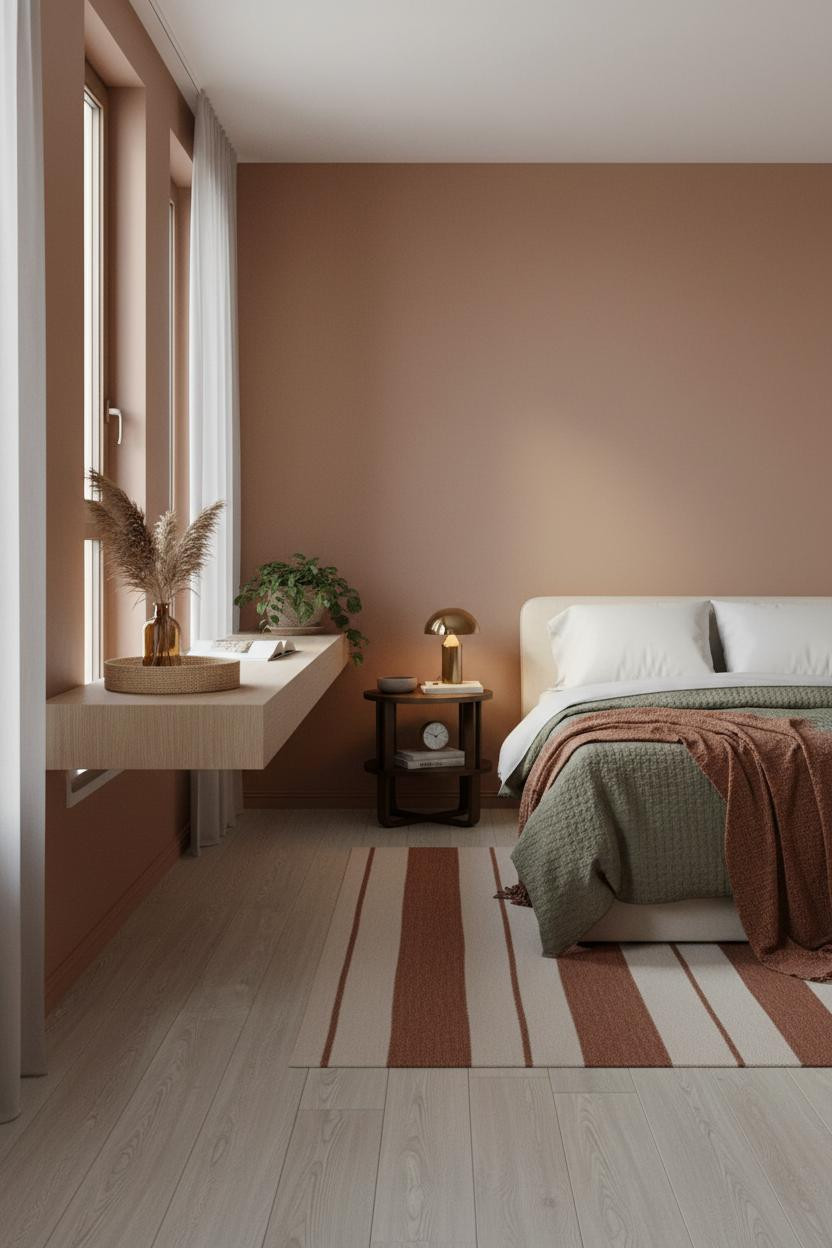

Fair warning. Terracotta walls feel risky on paper and obvious in person.
Why the palette works: The matte terracotta absorbs warm afternoon light instead of reflecting it, which makes the room feel settled rather than small. Pair it with pale birch flooring and the contrast stays lively in a way that feels natural.
The finishing layer: A rust linen throw draped asymmetrically at the foot ties the wall color back to the bedding. Nothing too matchy. Just enough to keep it cohesive.
Built-In Alcove Storage That Makes a Studio Feel Designed
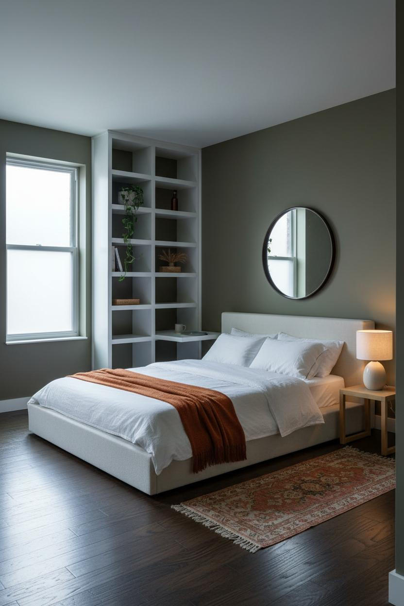

This is the layout I’d actually live in. No fuss. Every inch accounted for.
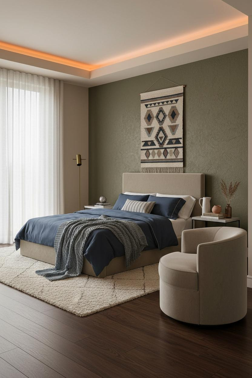
What creates the mood: A floor-to-ceiling built-in alcove in soft white-painted plywood against deep olive walls creates a contrast that somehow feels grounded rather than graphic. The olive absorbs the light; the alcove bounces it back. The room feels warm and cohesive without a single accent piece doing heavy lifting.
The key piece: Add a warm bedside task lamp to the sleeping side. The overcast light from the frosted window is beautiful but flat. A warm amber pool at the nightstand level is what makes it feel lived-in.
The Olive Plaster Wall That Changes Everything in a Small Space
Admittedly, deep olive is a commitment. But it’s the right one.
A full-height hand-troweled olive plaster wall behind the sleeping zone adds twelve feet of vertical texture that flat paint can’t come close to matching. The irregular grain catches raking light differently throughout the day, so the wall does the decorating. And the camel walls on the remaining three sides keep it from tipping into something heavy.
What to copy first: Bring in navy sateen bedding. The contrast with deep olive is immediate, and it’s the kind of combination that looks considered without being precious.

Our #1 Pick
Saatva Classic Mattress
America’s best-selling online luxury innerspring. 365-night trial, lifetime warranty, free white glove delivery.
Shop Saatva Classic
The Foundation Of Every Beautiful Bedroom
Every studio on this list works because the sleeping zone is treated as the room’s main event. And a beautiful sleeping zone starts with what’s actually under the bedding.
The Saatva Classic is what I’d put under all of it. Dual-coil support that holds up whether you’re a back sleeper or a side switcher, a breathable organic cotton cover that doesn’t trap heat, and a Euro pillow top with enough structure to feel like it actually cost what it costs.
Walls get repainted. Bedding gets swapped out. The mattress is the one thing that stays.

The best studio apartments don’t look small. They look deliberate. Pick one idea from this list, commit to it fully, and the rest figures itself out.