
The first thing you notice in the best Parisian style bedroom is what’s missing. No matching sets. No perfectly coordinated palettes. Just a room that looks like it happened slowly, over time.
These 13 rooms lean into that. Stone walls, worn parquet, gallery sketches, plaster arches. Collected rather than decorated.
The Limestone Wall That Makes Everything Else Feel Easy
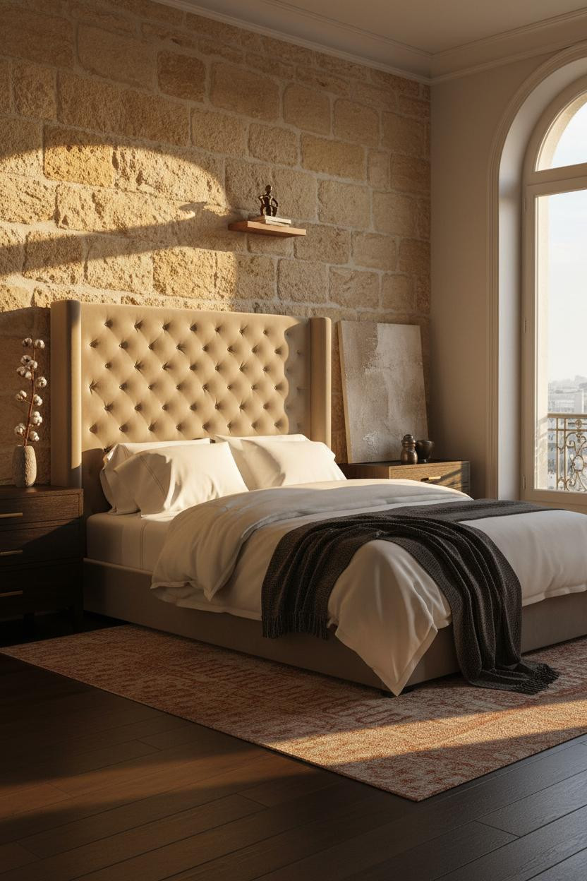

Stone does something to afternoon light that paint simply can’t.
Why it feels old in the best way: Rough-hewn limestone blocks in honey and sand tones catch directional light along every mortar ridge, which gives the room a warmth that arrives without you having to think about it.
Steal this move: Keep every other surface quiet. Warm greige plaster, a kilim runner, ivory bedding. The stone is doing the work.
A Gallery Wall That Actually Has a Point of View
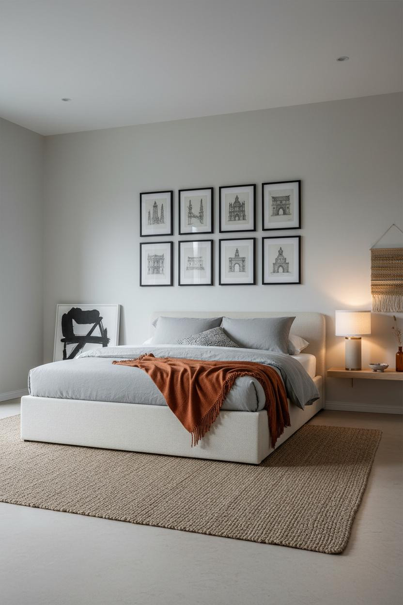

Most gallery walls are a mess. This one isn’t.
The reason it feels composed instead of chaotic is discipline. Six identically matted charcoal sketches in slim black frames, arranged in two precise columns, floor to ceiling. Same subject matter. Same margins. The repetition is what makes it bold.
The smarter choice: Pick one subject, one frame style, one mat color. Edit down to those three constraints and the arrangement almost solves itself.
What Brass and Terracotta Do Together
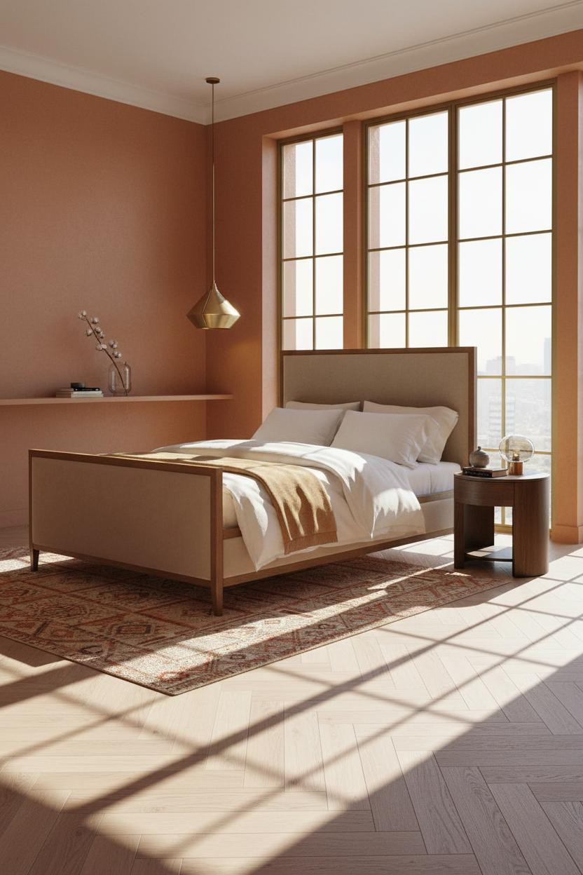


I didn’t expect terracotta walls to feel this restrained. But with the right partners, they do.
Why the palette works: Slim brass-framed panes on tall French doors pull the gold notes out of warm terracotta plaster, so the whole room reads as one deliberate color family rather than two competing ones.
The key piece: The nightstand matters here. A warm wood tone keeps it grounded while still feeling light.
Herringbone Wood That Reads as Architecture
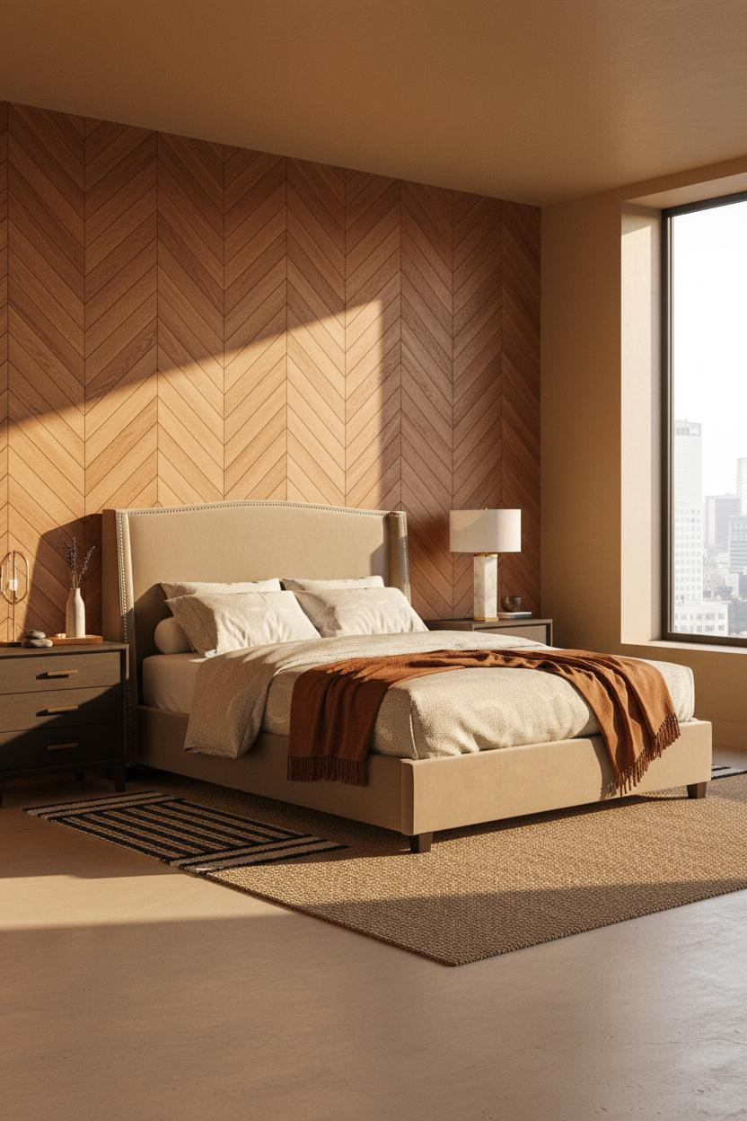

This is the kind of move that sounds risky on paper. It never looks risky in the room.
In a space like this, the design logic is proportion. A full-height chestnut herringbone wall behind the bed zone has enough geometric rhythm to replace art, which means you don’t need much else competing with it.
Avoid this mistake: Don’t bring in a busy rug. Oatmeal bedding, a rust throw, one simple lamp. That’s the ceiling.
Coffered Ceilings Are Having a Moment And Deserve It
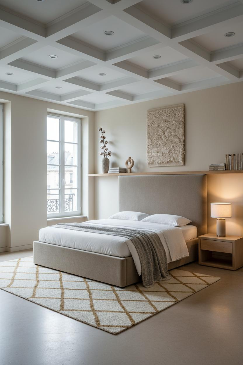

The room feels calm and cohesive even before your eye lands on anything specific. That’s the ceiling doing its job.
What gives it presence: White-painted plaster coffers cast just enough inward shadow to read as architecture, not decoration. The grid overhead grounds a room of ivory walls and pale concrete floors that might otherwise feel a little flat.
The foundation: Keep the walls warm ivory and the bedding simple. Let the architectural detail be the only thing competing for attention.
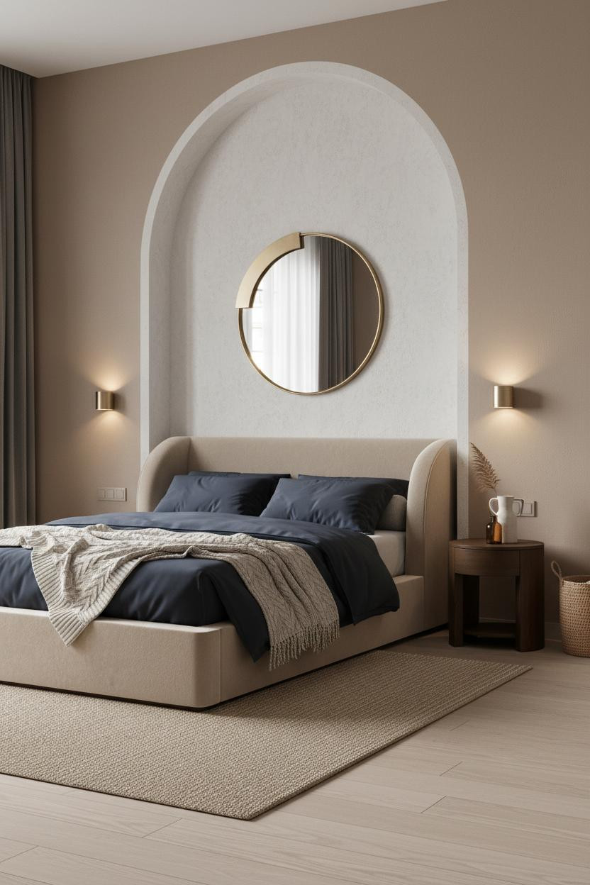
The Plaster Arch That Changes the Whole Energy
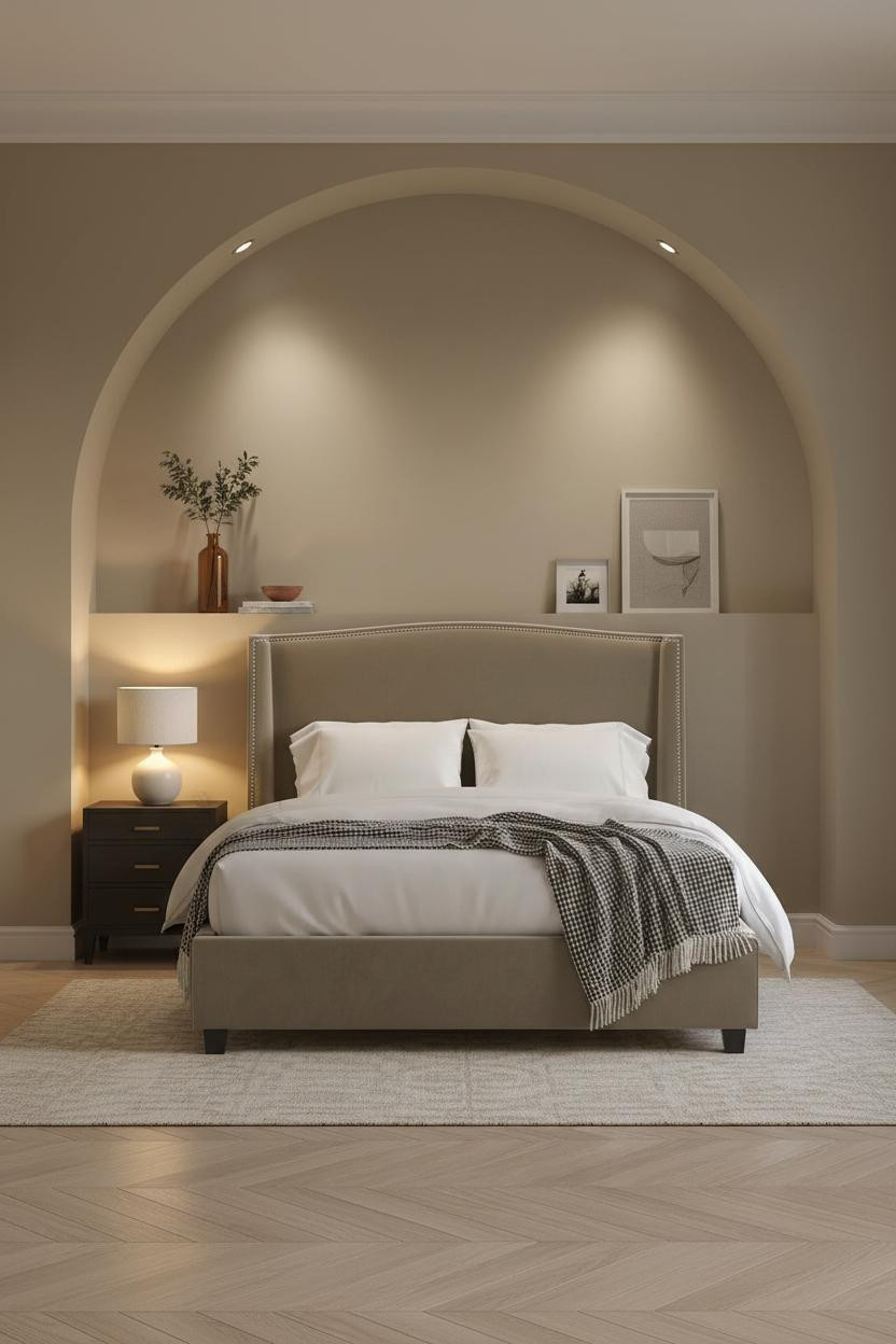
Nothing fancy here. Just a curved line of pale plaster. And somehow it’s the most Parisian thing in the room.
A smooth arched plaster alcove rising floor to ceiling frames the sleeping zone without enclosing it, which keeps the room feeling open while still giving the bed a sense of place. Paired with bleached herringbone parquet, the contrast between curved softness and geometric floor is quietly alive.
Pro move: Recess a warm lamp behind or beside the arch so amber light pools against the curve. That glow at dusk is worth planning for.
Blue-Grey Board-and-Batten Done the French Way
I keep coming back to this one. The color shouldn’t work this well with warm honey maple floors.
Why it holds together: Slim white-painted battens against muted blue-grey plaster catch raking morning light along every vertical edge, creating just enough shadow rhythm to make a flat wall feel designed, in a way that feels effortless rather than labored.
What to borrow: Pair with ivory percale and a camel wool throw. The warm floor needs something to bridge the cool wall, and those two do it without asking.
Steel Windows Belong in Bedrooms Too
Fair warning. Black steel mullions against stone grey plaster is a more opinionated choice than it looks at first glance.
What creates the mood: The Crittall-style window grid casts crisp dark shadow lines across reclaimed chestnut flooring at midday, which pulls an industrial French character into a room that might otherwise read as just another neutral bedroom. The contrast is the whole point.
Soften it with dusty pink linen bedding and a chunky knit throw. The tension between hard and soft is what makes it interesting.
Wainscoting With Brass Sconces Is a Combination I Trust
The room feels warm without being heavy, which is honestly harder to achieve than it looks.
Why it feels intentional: Half-height white-painted raised panel wainscoting creates a shadow grid that anchors the lower wall, so the warm cream plaster above it can stay completely unadorned while still feeling finished.
One smart swap: Replace a table lamp with flanking brass wall sconces. Freeing the nightstand surface changes how the whole room breathes at evening light.
The Plaster Alcove Version I’d Actually Build

I almost scrolled past this one. Glad I didn’t.
It’s a small move, but a chalky textured plaster alcove framing the bed zone on mushroom walls turns a generic layout into something that feels genuinely considered. The navy sateen bedding against that pale curved surround creates contrast that flat headboards can’t replicate. Add paired sconces flanking the opening and the symmetry lands.
Sage Walls Plus Books Is Practically a Philosophy
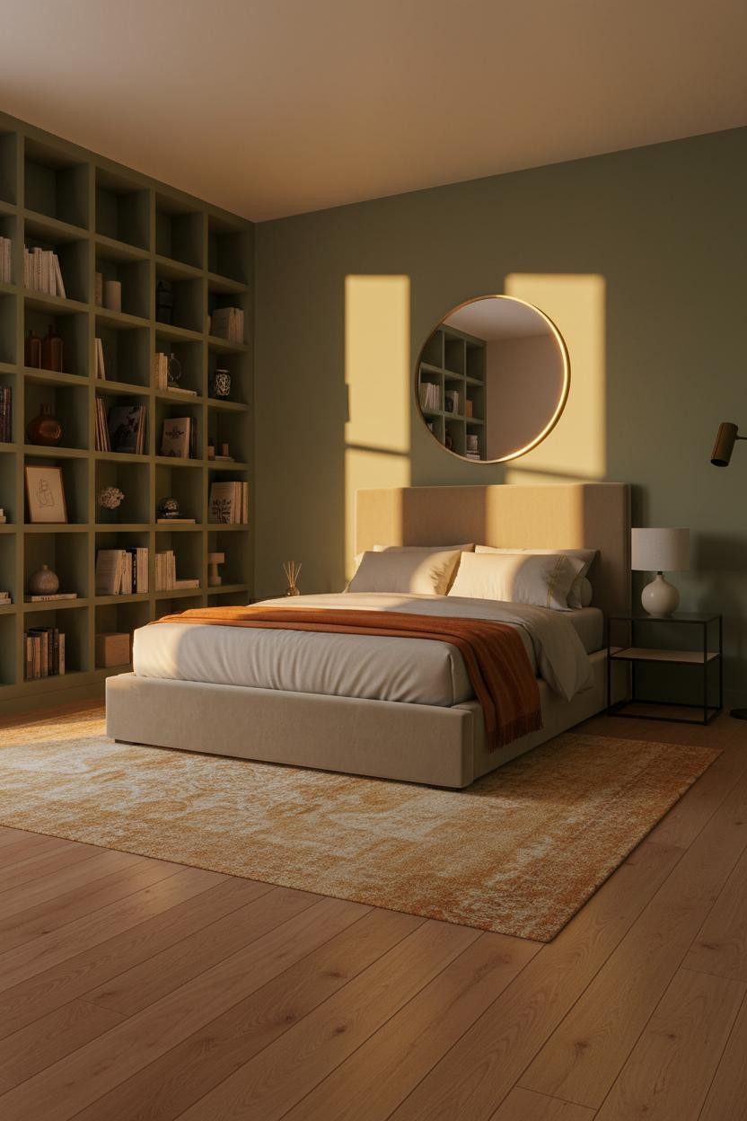

This is the room that makes you want to spend Sunday morning in bed. And I mean that as the highest possible compliment.
What carries the look: A full-width built-in shelf wall painted the same sage green as the surrounding plaster makes the storage disappear into the architecture, so the room reads as lived-in rather than cluttered. Amber dusk light raking across the shelf edges does the rest.
Where to start: Paint the shelves the same tone as the walls before you put anything on them. The unity is what makes the objects on top feel considered rather than accumulated.
Dove Grey Paneling Is the Quiet Move That Pays Off

Dove grey. Dark walnut floors. The combination is almost unfair.
Why it looks custom: Floor-to-ceiling rectangular panel molding in warm dove grey catches afternoon light along every recessed edge, which gives the wall a dimensional quality that flat paint can’t touch. The dark walnut underneath makes the grey read warmer than it actually is.
What not to do: Don’t lean abstract art against it and then add a busy rug too. Pick one statement. The paneling is already one.
Soft Rose and Herringbone for When You Want Something Gentle
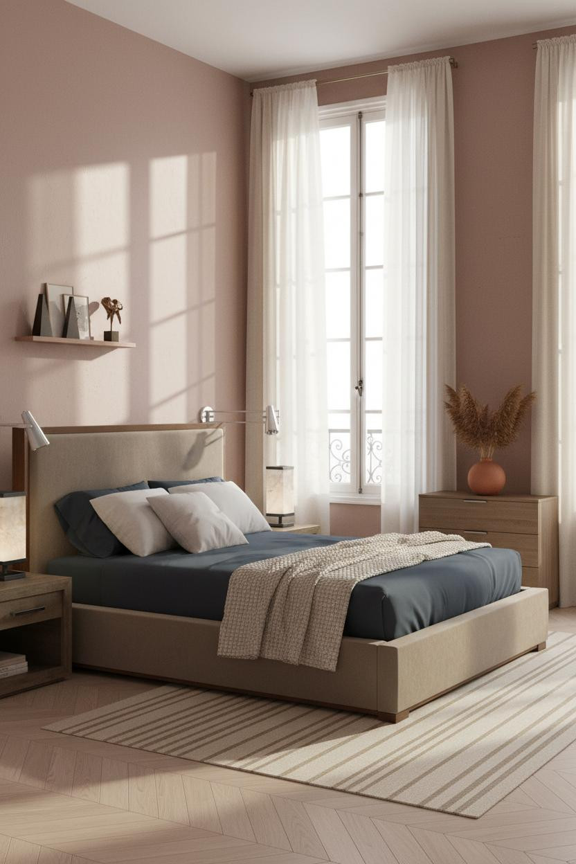

This one is for anyone who said they’d never do a pink room. It’s not a pink room. It’s a dusty rose room. The difference is real.
Why it feels balanced: Pale birch herringbone parquet beneath dusty rose plaster keeps the whole palette in the same warm, muted register, which means nothing pulls too hard in any direction while still feeling alive. Floor-to-ceiling ivory linen curtains frame the windows without competing.
The finishing layer: Slate bedding with a cream chunky knit at the foot. The cool slate is the one note that keeps the rose from feeling precious.

Our #1 Pick
Saatva Classic Mattress
America’s best-selling online luxury innerspring. 365-night trial, lifetime warranty, free white glove delivery.
Shop Saatva Classic
Why Luxury Bedrooms Always Feel Better
Walls get repainted. Parquet gets refinished. The mattress stays. And honestly, it’s the first thing that determines whether a beautiful room actually feels good to be in.
The Saatva Classic holds up to that standard. Dual-coil support that doesn’t compress over years, a breathable organic cotton cover that doesn’t trap heat through the night, and a Euro pillow top with the kind of softness that still has structure underneath. It feels like the good hotel version. Not the business hotel version.
Start with the bed. The rest figures itself out.

The rooms people save to their boards are the ones where nothing looks purchased all at once. Limestone, plaster, parquet, washed linen. Materials that feel like they’ve been there a while. That’s the whole Parisian bedroom idea, and it’s more achievable than it looks. Good design ages well because it’s made well.