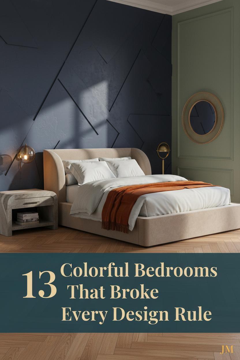
The first thing you notice in a great colorful maximalist bedroom is that nothing apologizes. Every color earns its place. Every layer has a reason, even if that reason is just joy.
These 13 rooms prove that more can mean more. Not chaos. Not clutter. Just a room that feels completely, unapologetically alive.
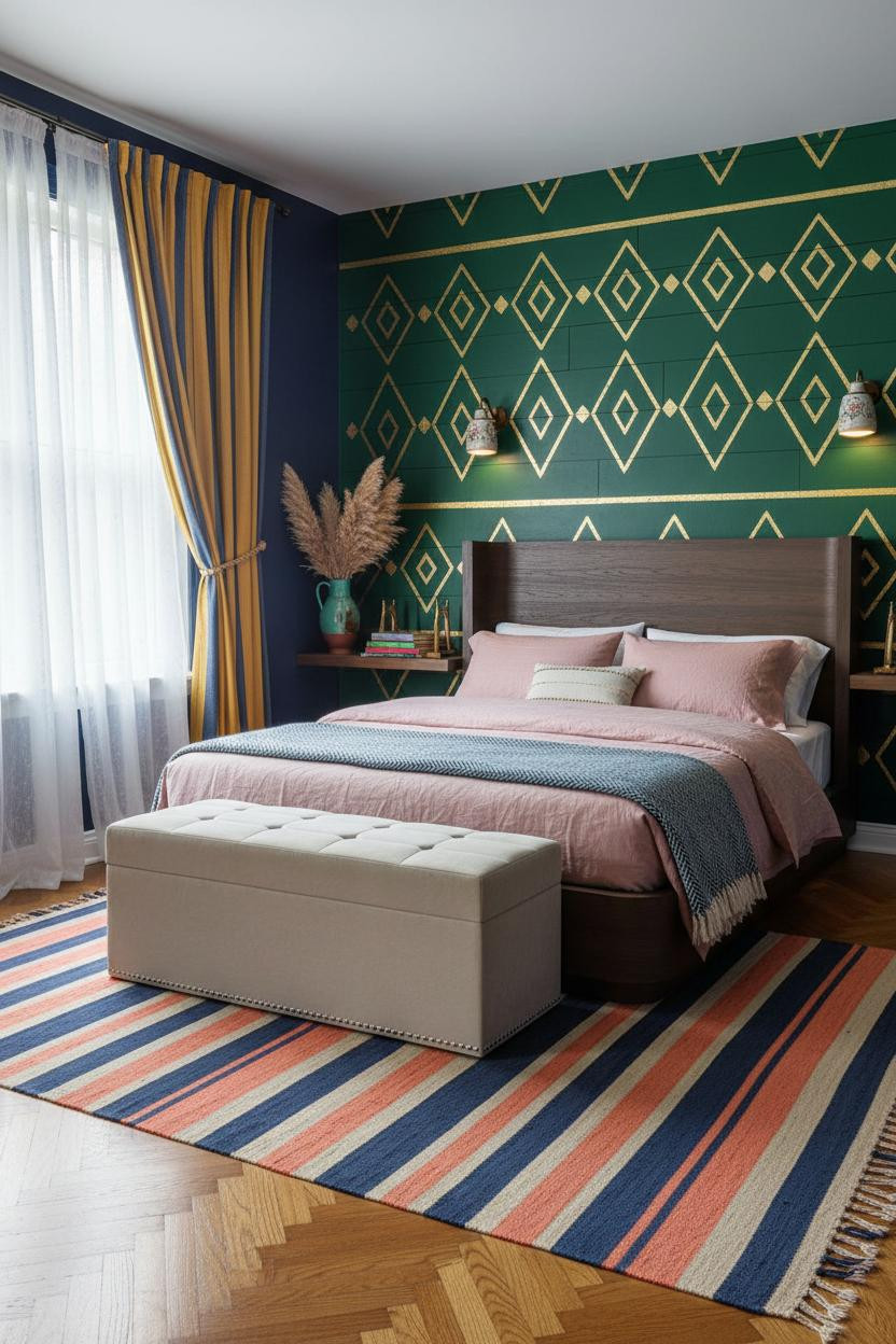
The Indigo Wall That Makes Every Other Color Look Better
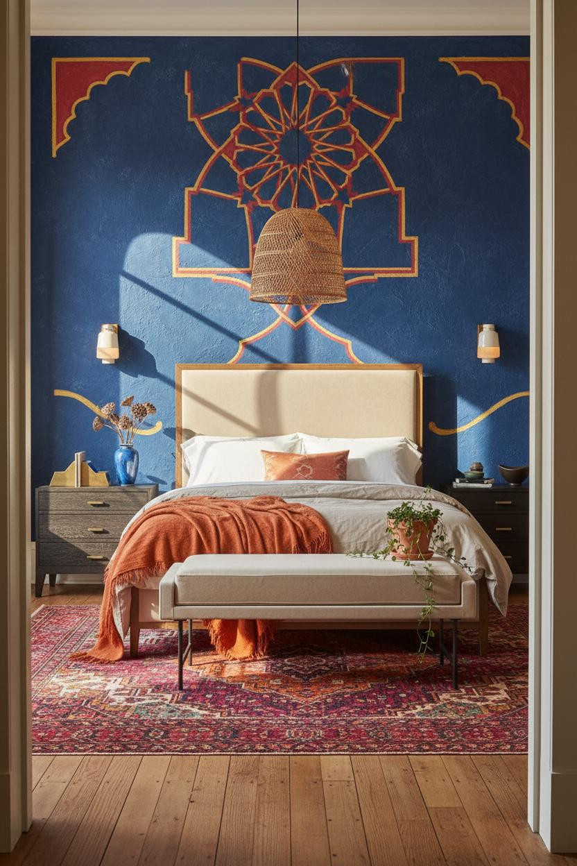


I keep coming back to this one. The indigo wall shouldn’t be this easy to live with, but somehow it is.
Why it holds together: The hand-painted plaster with raised geometric relief catches light at every angle, so the wall reads as texture first and color second. That’s why it doesn’t feel heavy.
Steal this move: Layer a burnt orange mohair throw over cream bedding against deep indigo. The contrast does the rest.
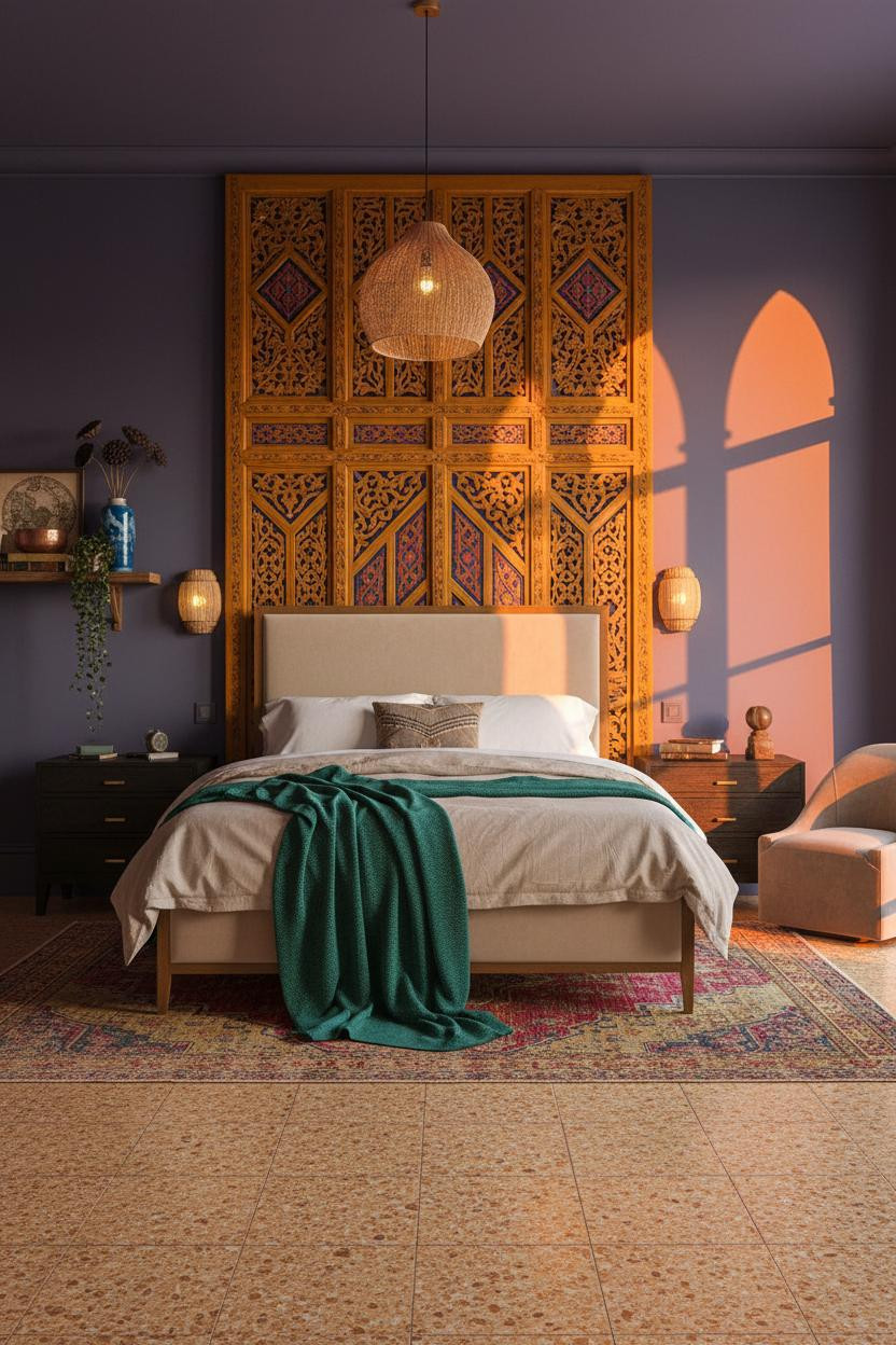
A Carved Lattice Wall Worth Committing To
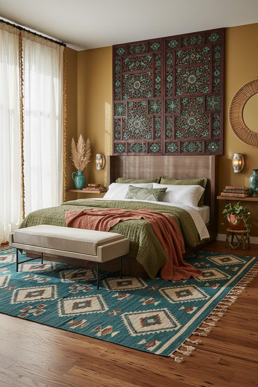

Bold choice. Not for every renter. But if you own your walls, this is the move.
And once you commit to a floor-to-ceiling carved mahogany lattice screen, the whole room has a reason to exist around it.
Why it looks custom: The inlaid turquoise fretwork bounces morning light across the opposite wall, so you get pattern on two surfaces from one installation.
The easy win: Pull the lattice stain color into the rug. Deep teal and mahogany together look collected, not accidental.
Stenciled Plaster That Changes How Gold Reads
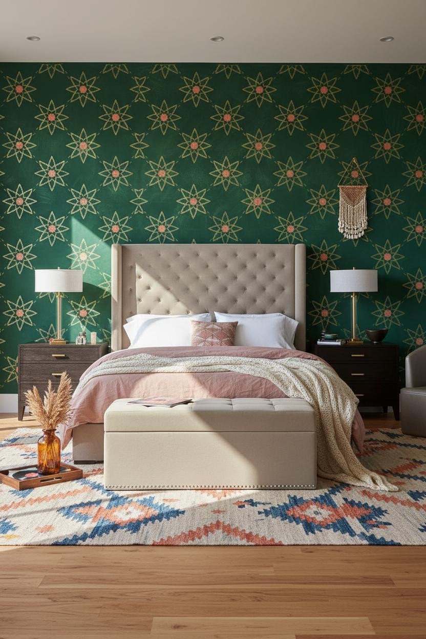


The room feels alive without being loud. That balance is harder than it looks.
What gives it depth: Hand-stenciled Moorish star motifs in hammered gold on a forest green lime plaster ground are different from painted gold. The raised ridges catch overhead light and glow. Flat paint never does that.
Worth copying: Use a cobalt kilim to pull the cool tones from the wall down to floor level. Keeps the whole palette grounded.
Saffron Fretwork That Earns Every Inch of Attention

This is the kind of room that makes you want to never leave. Sunset light through the arched window does a lot of the work, honestly.
But the lacquered saffron screen wall with indigo and vermilion geometric fretwork is what actually carries the look. The carved diamonds throw lattice shadows across the ceiling when the light rakes sideways, so the pattern travels.
The smarter choice: A swivel chair in the corner gives you a reading spot that faces the wall instead of hiding it.
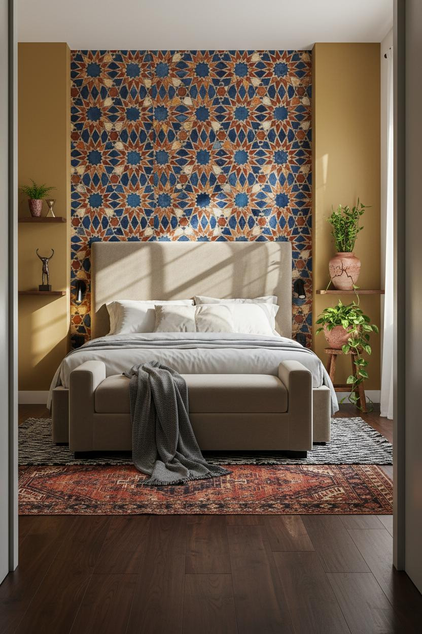
Zellige Tile That Turns a Wall Into a Living Surface


I almost scrolled past this. Glad I didn’t.
What makes this one different: Each hand-painted zellige facet catches midday light at a slightly different angle, so the wall shimmers rather than just sitting there flat. That visual movement is what stops a maximalist room from feeling static. Pair it with warm mustard flanking walls and the whole thing glows. And if you want to ground it fast, a charcoal cashmere throw over ivory bedding keeps the richness without tipping into restless.
Ochre Plaster Relief That Makes Light Do the Decorating
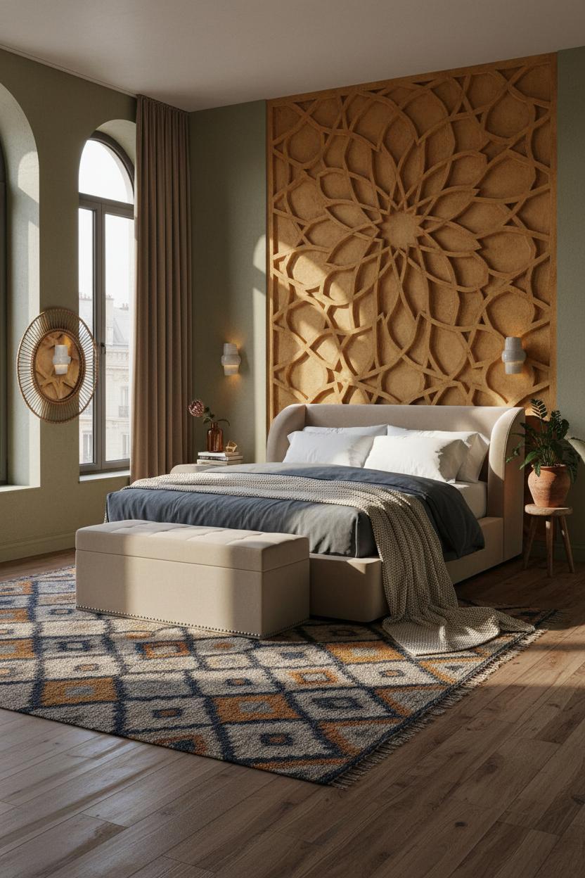

Nothing fancy about the color palette here. That’s actually the point.
Design logic: Deep-relief muqarnas carved into ochre plaster means the wall changes all day as light rakes across the grooves at different angles. The material is the decoration. You don’t need much else on the walls.
Avoid this mistake: Don’t fill every surface around it. A sage-olive flanking wall and one round rattan mirror is enough. Let the plaster breathe.
Plum Venetian Plaster With Gold That Actually Shimmers
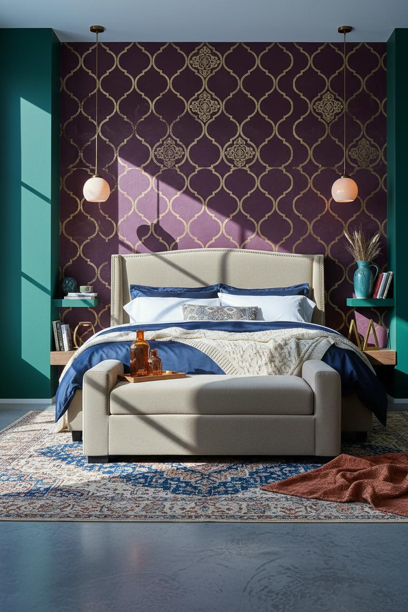

This is the most divisive room in this roundup. I love it. Not everyone will.
Where the luxury comes from: Embedded gold-leaf medallions on a deep plum Venetian plaster wall catch directional morning light and shift from matte to luminous. That’s a material effect. No amount of gold paint does the same thing.
In a room this jewel-toned, the smarter choice is a navy sateen duvet rather than another pattern. Let the wall lead.
The Botanical Mural That Makes Every Morning Interesting

Fair warning: you don’t get this look by accident and you can’t half-commit.
What carries the look: The hand-painted tropical mural on warm burgundy plaster works because the brushwork is loose, not precise. Expressive leaf edges catch cool morning sidelight in a way a printed wallpaper never does. The room feels lived-in and intentional at the same time.
What not to do: Don’t add a second pattern-heavy textile. A steel blue herringbone throw keeps it grounded while still feeling collected.
A Teal Arched Niche That Reframes the Whole Bed
Having a dedicated architectural frame around the bed changes how you actually use the room. Everything orients differently.
Why it feels expensive: The mirrored mosaic tile lining inside the teal arch soffit scatters pinpoints of light across the ceiling all day. It’s a small material choice with an outsized effect, especially when paired with mustard gold flanking walls.
Pro move: Hang floor-to-ceiling rust linen curtains beside the arch rather than inside the niche. The contrast grounds the drama without competing with it.
Jewel-Tone Zellige That Glows From Across the Room
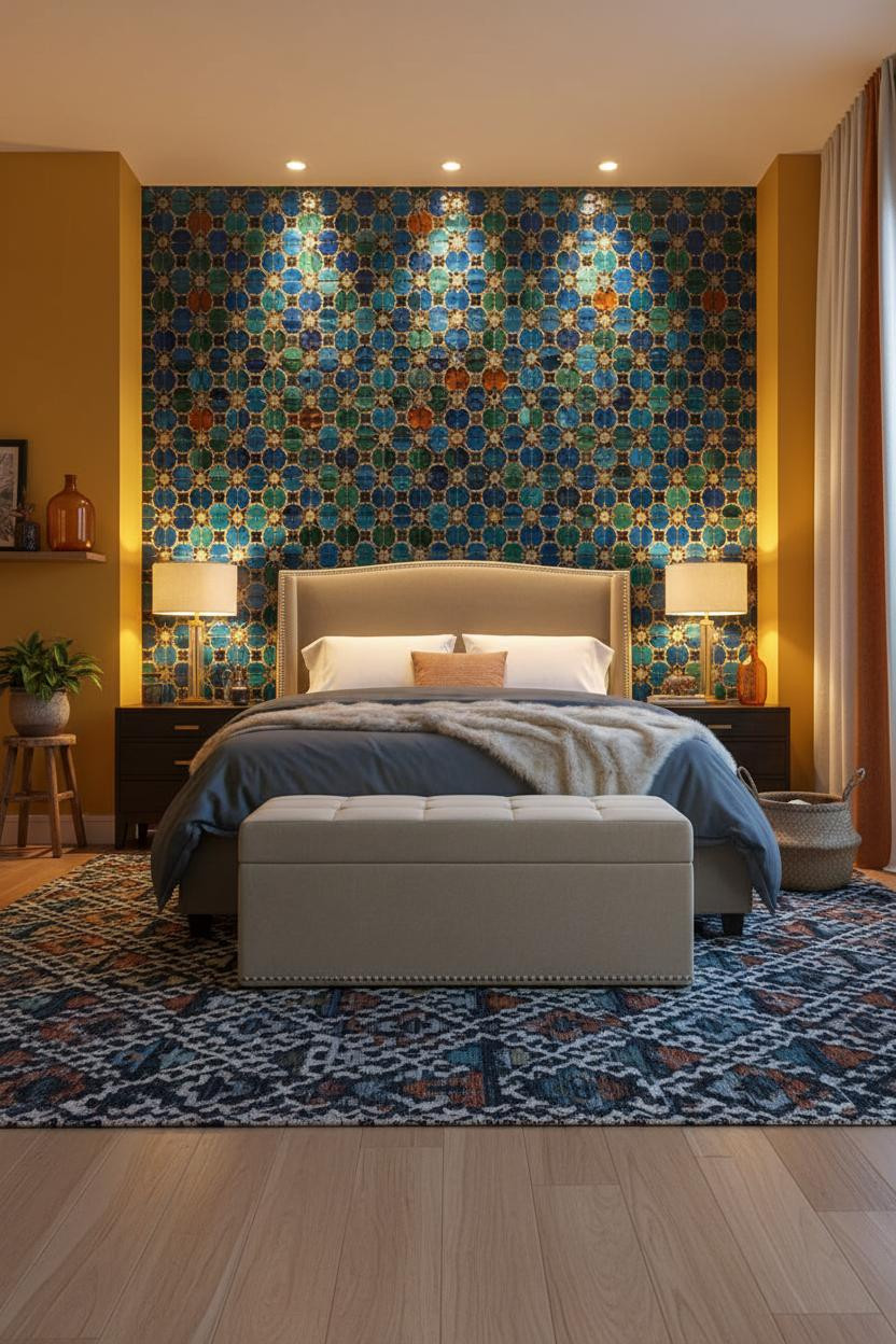
This room is what happens when someone commits to color all the way through and doesn’t flinch.
Why the palette works: Sapphire, emerald, and amber hand-painted zellige tiles against warm saffron walls sounds like too much on paper. But the tile’s faceted surface keeps shifting, so your eye stays interested rather than overwhelmed. Add a Moroccan kilim in deep indigo and rust underfoot and the whole room reads collected rather than decorated.
Where to start: Floor-to-ceiling cream curtains with a saffron stripe frame the tile wall while still feeling light.
Cobalt Tile That Needs Almost Nothing Else
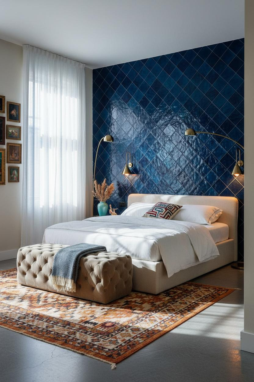


Admittedly, deep cobalt diamond-grid tile floor to ceiling is not a timid choice. But the restraint around it is what makes it work.
The real strength: Cool north daylight hitting cobalt zellige-style tile pulls out the indigo and teal variations in each facet, so the wall reads midnight blue in shadow and almost electric in bright light. That shift is what gives the room its energy.
A gallery of mismatched vintage frames on the cream flanking wall adds personality without touching the focal point. Smart.
Emerald Shiplap With Gold Stencil That Earns the Drama
I think this one surprises people because the boho maximalism is so well-edited for a room with this many competing patterns.
Why it holds together: The deep emerald shiplap gives the gold-leaf geometric stenciling a textured surface to sit against. Flat painted drywall would flatten the gold. The grooves between planks pool shadow, which makes the stencil pattern pop in contrast. And the herringbone parquet floor in warm honey ties the whole room to something warm and grounded.
What not to do: Don’t match the curtain color to the wall. The saffron and indigo stripe is what keeps the emerald from going too serious.
Exposed Brick That Makes Everything Else Look Found
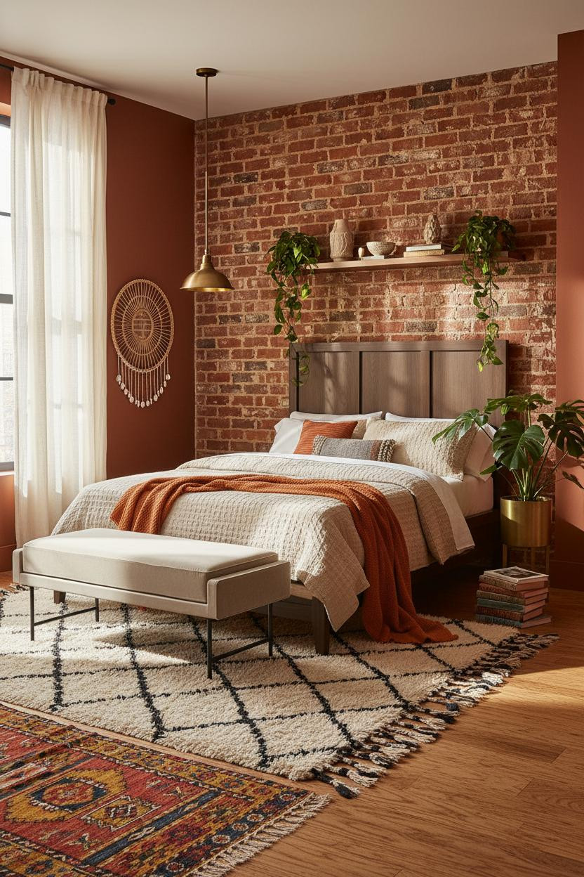

This is the most approachable room in this entire list, and it’s the one I’d actually replicate in a rental.
What creates the mood: Raw exposed brick with irregular rust-patina mortar lines makes every object on the floating shelf look genuinely collected rather than staged. The imperfection does the work that styling usually has to. Afternoon light raking across the surface deepens every mortar shadow and warms the whole room without a single lamp switched on.
Layer a vintage Turkish kilim over natural wood planks and the room feels instantly like something you built over years, not a weekend.

Our #1 Pick
Saatva Classic Mattress
America’s best-selling online luxury innerspring. 365-night trial, lifetime warranty, free white glove delivery.
Shop Saatva Classic
Why Luxury Bedrooms Always Feel Better
Every room in this list earns its energy through surfaces and layers. But the one thing that doesn’t show in a photo is how a bedroom actually feels at the end of the day, when all the color fades to dark and it’s just you and the mattress.
Walls get repainted. Kilims get rotated out. The mattress stays. And that’s exactly why I’d put the Saatva Classic at the center of any bedroom worth this much care. The dual-coil support system holds up through years of use without going soft on you, the cotton cover breathes through warm nights, and the Euro pillow top has that give-without-collapse quality that good hotel beds get right.
Start with what you sleep on. The rest of the room builds around it.

The rooms people save are the ones where nothing looks like it was bought in an afternoon. Good design ages well because it’s made well. And that applies to the mattress just as much as the plaster wall behind it.