
Kitchen cabinet color ideas have gotten smarter. The days of all-white-everything are over, and honestly? The new combinations actually make sense.
The Two-Tone Move That Finally Works

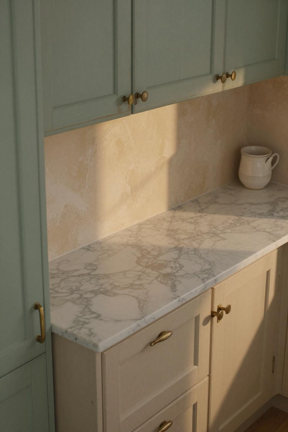
Sage green lowers with cream uppers. It’s the cabinet color combo that doesn’t feel forced. The green grounds everything while the cream keeps it from getting heavy. That Calacatta marble? It pulls both colors together without trying too hard. Best for people who want something different but not weird.
When Terracotta Actually Makes Sense in a Kitchen

Clay-terracotta uppers with ivory lowers. Sounds bold, but it reads warm instead of loud. The trick is keeping the terracotta on top—it draws your eye up and makes the ceiling feel higher. Golden hour light makes this combo absolutely sing. I’d do this in a kitchen that gets afternoon sun.
The Brass Hardware Detail Nobody Notices (Until They Do)
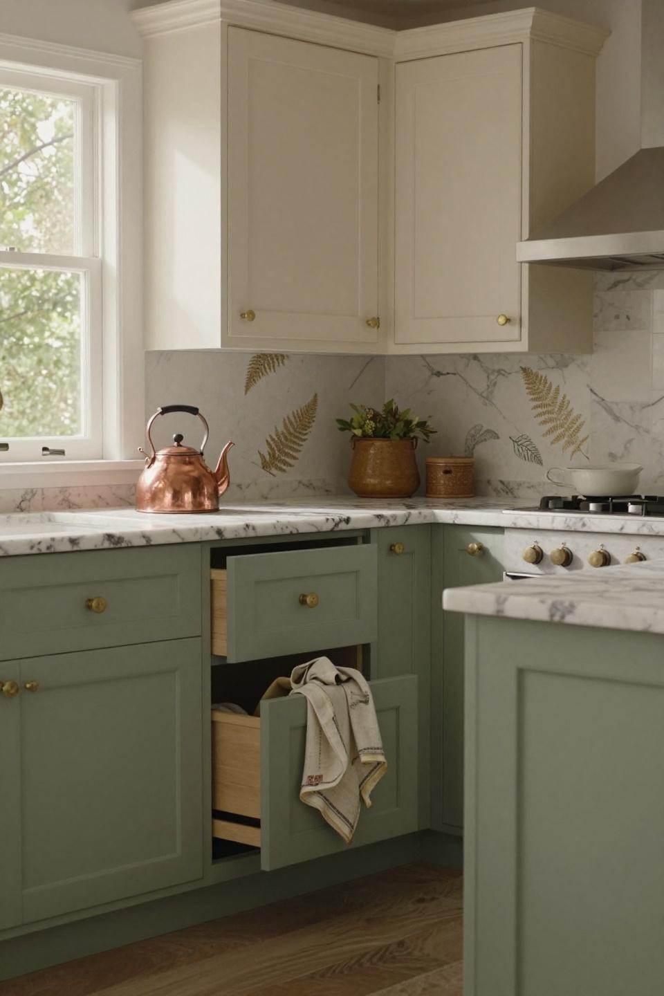
Unlacquered brass on sage and cream cabinets. It’s not about being shiny—it’s about developing patina over time. That whistle-ready copper kettle? Chef’s kiss. The vanilla uppers keep everything light while the sage adds just enough color to feel intentional. This works if you want a kitchen that looks lived-in from day one.
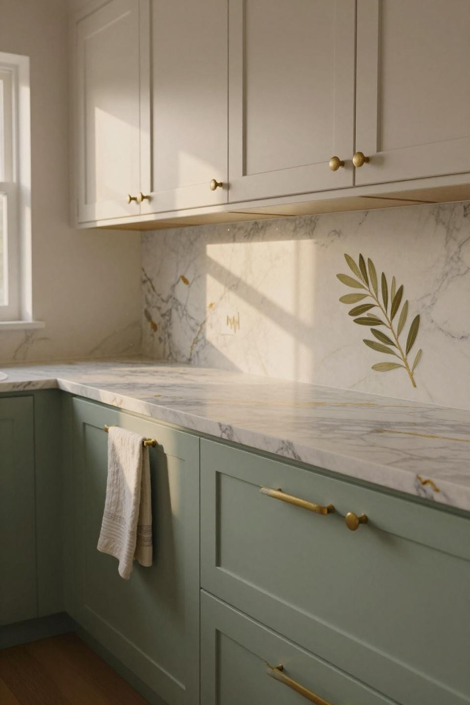
Why This Color Rhythm Thing Actually Matters
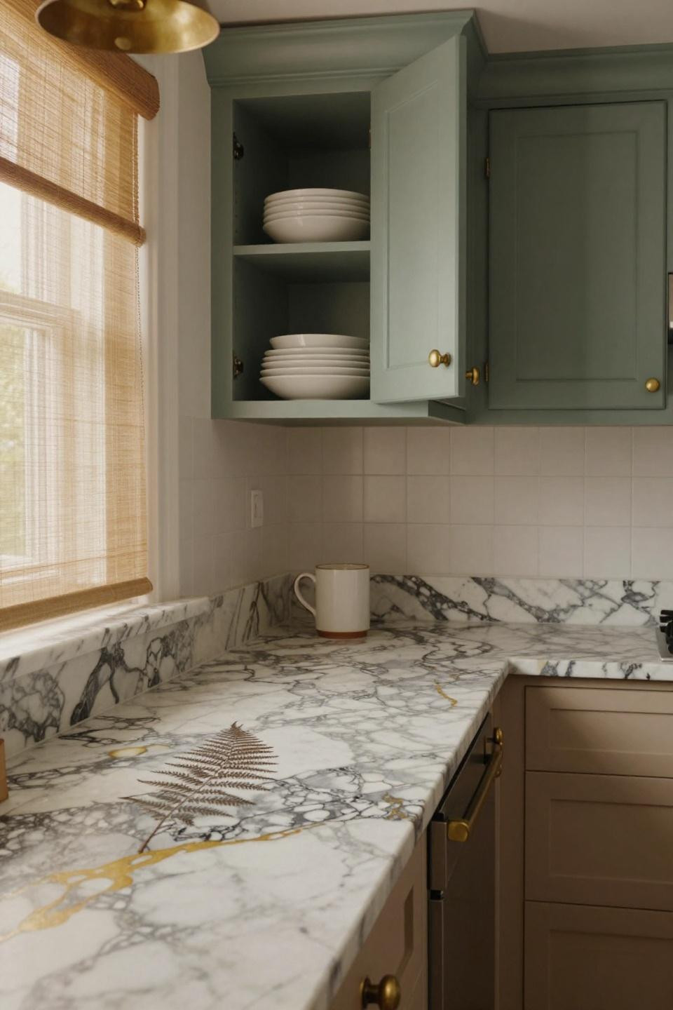
Sage uppers, cream lowers—reverse of the usual setup. It creates this visual rhythm that makes the whole space feel more deliberate. The brass hardware is developing that natural patina everyone pretends to hate but secretly loves. And that fossil in the marble veining? Pure luck, but it’s the kind of detail that makes a kitchen memorable.
The Venetian Plaster Trick That Changes Everything
Hand-applied Venetian plaster behind sage and cream cabinets. The trowel marks catch light differently throughout the day, which sounds fancy but really just means your kitchen doesn’t look flat. Those reclaimed French roof tiles embedded in the plaster? That’s the move that takes it from nice to “wait, tell me about this.”
For Kitchens That Are Basically Hallways
Galley kitchens get claustrophobic fast. Hand-glazed sage on the lowers with cream uppers opens everything up. The Calacatta marble peninsula extending off-frame? It visually expands the space. And that terrazzo floor with oversized walnut chips pulls your eye down and makes the room feel wider than it is.
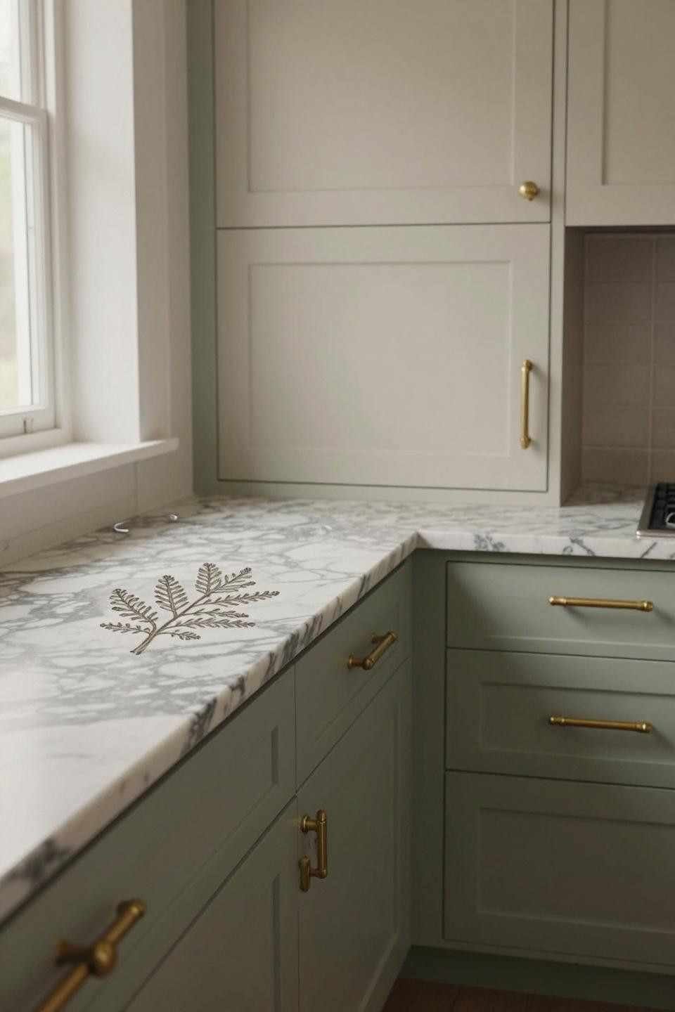
The Fossil Detail You’ll Stare at Every Morning
That 1940s olive leaf preserved in the marble veining. It’s the kind of thing you can’t plan for—you either get lucky with your slab or you don’t. But it’s proof that natural materials beat manufactured every time. The sage and cream cabinet combo just gives it space to be the star.
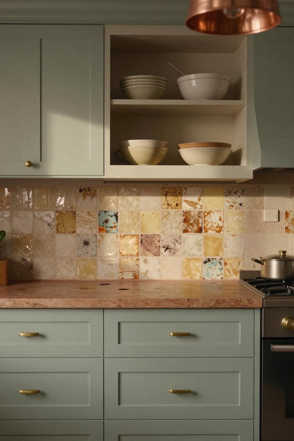
When Three Colors Don’t Feel Like Too Many
Sage green, terracotta accents, bleached oak shelving. It shouldn’t work but it does. The key is keeping proportions right—sage as the dominant color, terracotta as the accent, oak as the neutral bridge. Those reclaimed gondola wood veneers with 14th-century lagoon sediment? Completely extra. Also completely worth it.
The Patina Move That Gets Better With Time
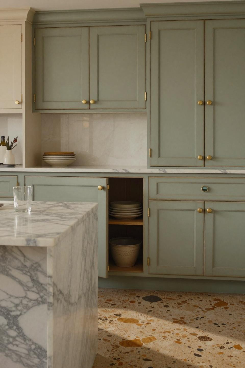
Unlacquered brass developing first patina marks on sage and cream cabinets. Most people polish it off. Don’t. That tarnish is what makes it feel real. The Carrara marble with the prehistoric herb leaf fossil? Just a reminder that the best kitchens have stories baked in, not staged on top.
Why Overhead Views Suddenly Make Sense
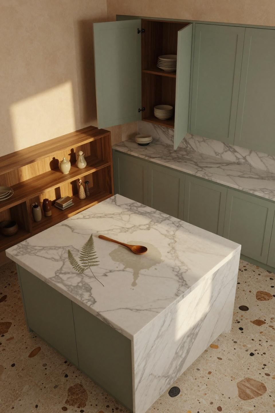
From above, you see how the sage and cream cabinets frame that massive Calacatta island. The walnut open shelving adds warmth without competing. And that fossilized fern visible in the marble when afternoon light hits? It’s the kind of detail that makes you actually enjoy making coffee in the morning.
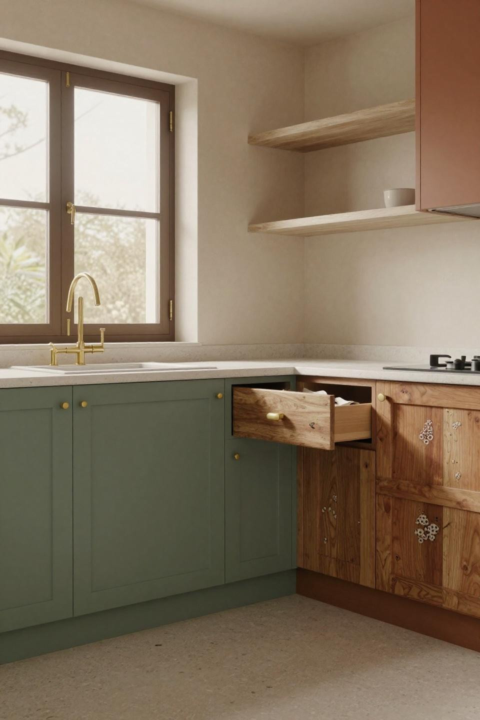
The Backwards-Stamped Date That Tells a Story
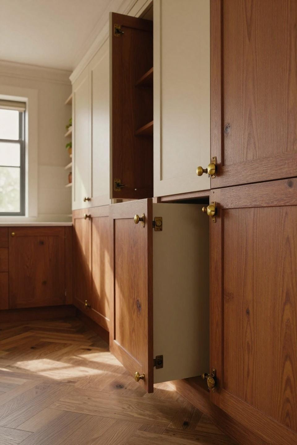
Cream uppers, rust-oxide terracotta lowers in book-matched oak. The grain pattern mirrors itself across the center, which is weirdly satisfying. But those hand-forged hinges with the backwards 1952 stamp? That’s architectural salvage done right. It gives the whole kitchen this sense of history that IKEA just can’t fake.
When Weathered Beats Fresh Every Time
Weathered sage green uppers with vanilla lowers. The hand-applied Venetian plaster catches light unevenly on purpose. That single tarnished cabinet handle from daily use? It’s the realest detail in the room. This is what happens when you stop trying to make everything look brand-new and just let materials age the way they’re supposed to.