
The first thing you notice in a well-designed bedroom is usually not the bed. It’s the modern nightstand sitting beside it, doing quiet architectural work the rest of the room depends on.
I’ve pulled together 11 of the best versions I’ve found. Floating shelves, matte metal frames, warm wood surfaces. Each one earns its place.
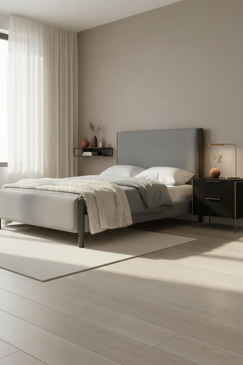
The Floating Shelf That Makes the Wall Look Intentional


This is the kind of room that makes you want to slow down on a Tuesday morning.
Why it works: A powder-coated steel frame with a pale ash veneer top keeps the wall plane visible, so the nightstand reads as a graphic line rather than a piece of furniture.
Steal this move: Mount it lower than you think. The lower the shelf, the longer the room feels.
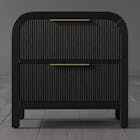
Why Dark Walnut Belongs Against a Charcoal Wall
Dark rooms done right. Not dramatic for drama’s sake.
But when you put matte walnut grain against charcoal plaster, the contrast does something flat colors can’t. The grain catches the light. The wall recedes. The shelf floats.
The smarter choice: Keep the shelf objects minimal. Two items max. The wood is already the moment.
The Bronze and Smoked Glass Combination I Keep Coming Back To
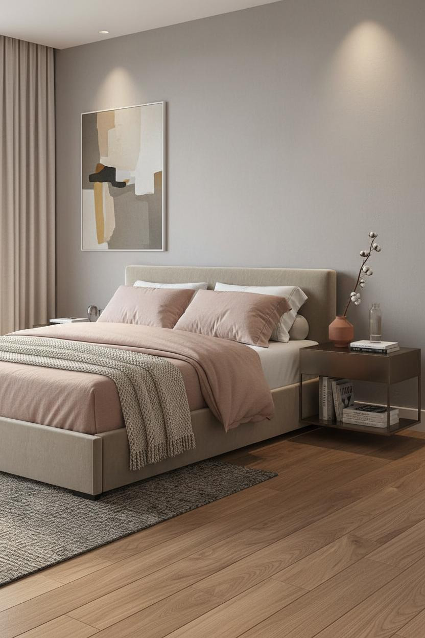
I keep coming back to this one. Honestly, the material pairing is harder to pull off than it looks.
A brushed bronze steel frame with a smoked glass top works here because neither material is trying to be warm or cool. They split the difference, which helps balance the dusty pink linen without making the whole room feel blush.
Worth copying: Pair with terracotta objects on the lower shelf. The earthy clay reads as a third material without fighting the bronze.
What a Textured Plaster Wall Actually Does for the Nightstand
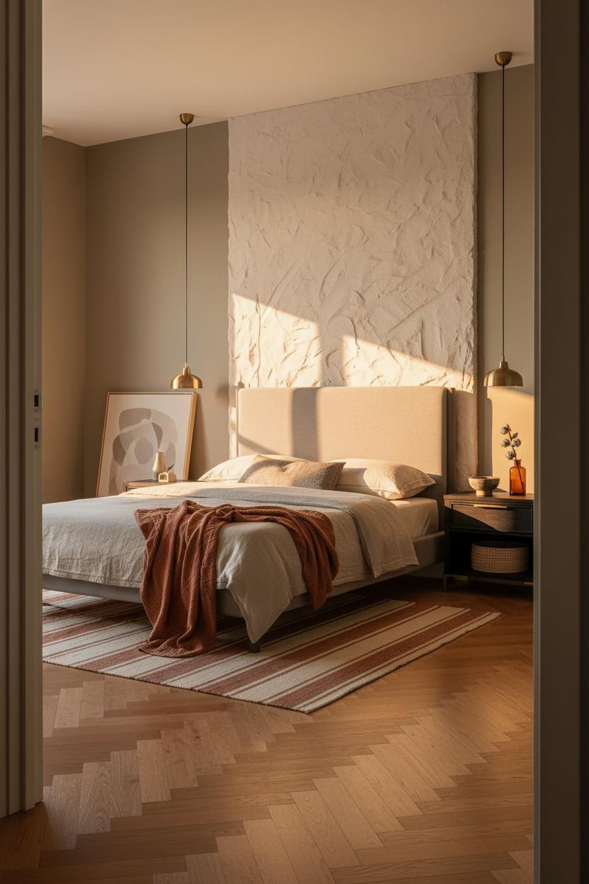
The room feels collected rather than decorated. And the wall is doing most of that work.
What creates the mood: A floor-to-ceiling sand-cast plaster panel behind the bed turns raking morning light into a texture event. The nightstand benefits because it’s mounted directly against that surface, so its shadow becomes part of the wall’s own geometry.
Place a woven basket on the lower shelf. A quiet nod to craft in a room that’s otherwise pretty architectural.
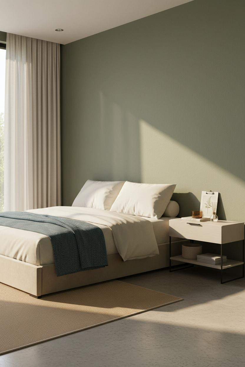
Sage Walls and Matte Black Steel: A Combination That Holds
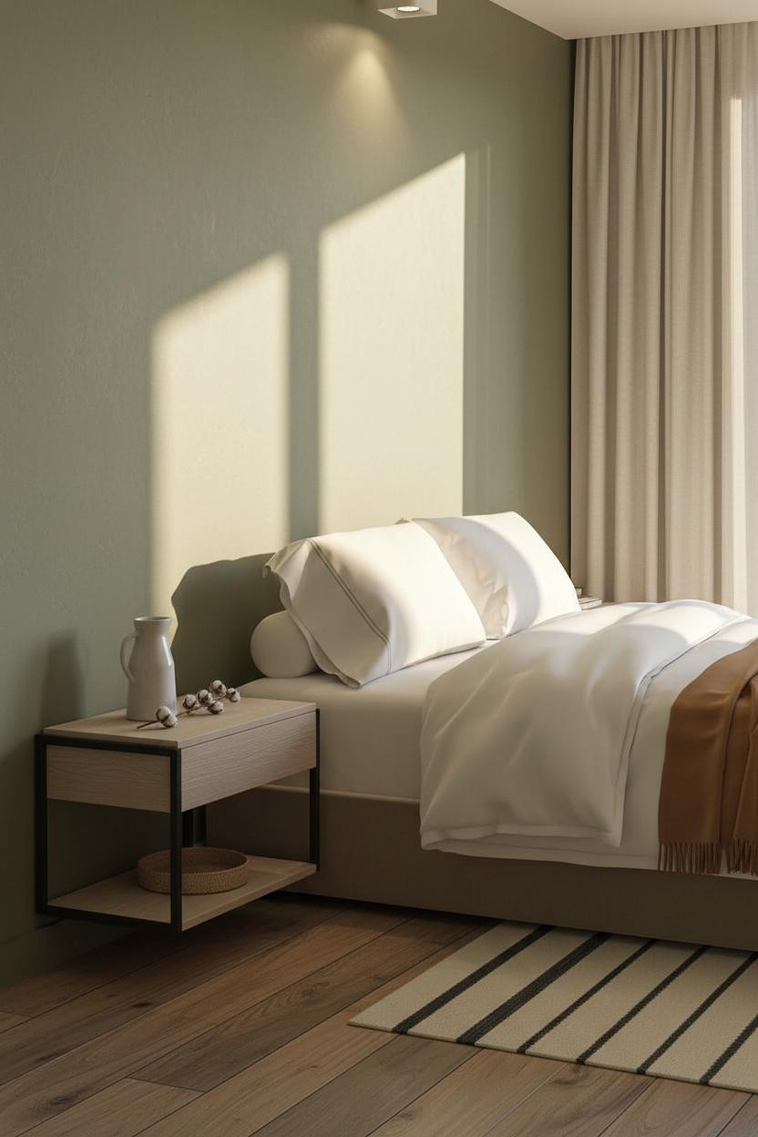
It might seem risky pairing a matte black frame with sage green walls. It isn’t.
Why it holds together: Matte black steel is quiet enough not to fight a muted wall color. The pale ash wood top bridges the two, pulling warmth into what could otherwise feel flat. The room feels warm without being heavy.
The easy win: Add a camel or mustard throw. That warm third tone ties the whole palette together faster than anything else.
Terracotta Walls Are Having a Moment. Here’s the Right Nightstand for Them.
Terracotta walls are tricky. The wrong nightstand makes the room feel like a vacation rental.
What saves it here is a matte graphite metal frame with a pale ash top. Graphite is cool enough to offset all that warmth in the walls, while the ash keeps things from going too cold. Just enough contrast to feel intentional.
Avoid this mistake: Don’t put brass hardware in this room. It’ll read as too matchy with the terracotta and lose the tension that makes the palette work.
Moss Green Is Underrated. This Room Proves It.
I’ve seen this combination dismissed as too dark. I’d push back on that.
Why the palette works: Moss green matte plaster holds natural morning light differently than painted drywall. It shifts. A matte black steel frame against that surface creates a shadow line that feels architectural, not decorative.
Finish the shelf with a woven basket and one amber glass object. Nothing too precious. That restraint is the whole point.
The Japandi Room Where Walnut Does All the Heavy Lifting
This one is quieter than most Japandi rooms I’ve seen. And it’s better for it.
What makes it work: The walnut veneer top on a charcoal metal frame is a classic warm-cool pairing, but the clay walls keep it from feeling too Scandinavian. The room feels lived-in and intimate, while still feeling considered.
Pro move: Add a small trailing plant on the lower shelf. Organic material in a room this geometric grounds it fast.
How to Make an Open-Frame Nightstand Feel Expensive
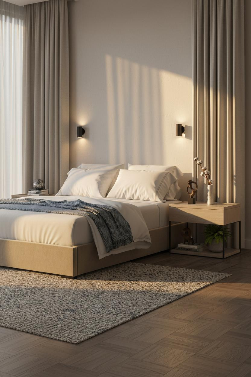
Open-frame nightstands can look cheap or custom. The difference is proportion.
Where the luxury comes from: Matte black legs with a pale oak floating surface keep the frame visually light while the negative space below makes the room feel longer. Paired sconces at either side of the headboard (rather than a single overhead) pull the whole wall into balance.
What not to do: Don’t overload the lower shelf. One sculptural object and one dried stem. That visual breathing room is exactly what makes the nightstand read as intentional rather than forgotten.
The Dusty Blue Room That Gets Floating Nightstands Right
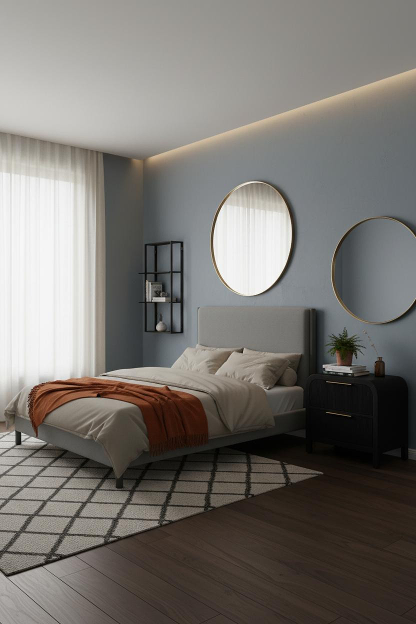
Admittedly, dusty blue walls can go wrong fast. This one doesn’t.
What keeps it elevated: A matte black open frame mounted against soft blue plaster works because black isn’t warm or cool. It just draws a line. The oversized round mirror leaning above the shelf adds a curve that stops the whole composition from feeling rigid.
An amber glass bottle and a small potted fern on the shelf add just enough organic texture to keep the room from feeling too editorial. Ideal if you want polish without the magazine-set stiffness.
The Minimalist Setup That’s Easier to Copy Than It Looks
Nothing fancy. That’s the point.
A floating shelf with brushed metal legs against warm greige plaster works in almost any bedroom because there’s nothing specific to clash with. The slim bedside lamp pooling light across the surface at night is what gives it the hotel quality (that single warm glow does more than a chandelier in a room this spare).
The finishing layer: A terracotta matte vase with dried grass and one small geometric brass object. Three items, placed with intention, reads collected rather than styled.

Our #1 Pick
Saatva Classic Mattress
America’s best-selling online luxury innerspring. 365-night trial, lifetime warranty, free white glove delivery.
Shop Saatva Classic
Why Luxury Bedrooms Always Feel Better
Every room in this list gets the nightstand right. But the best ones also get the bed right, and that starts underneath the sheets.
The Saatva Classic is what I’d put in every single one of these rooms. Dual-coil support that actually holds its shape over years, a breathable organic cotton cover that doesn’t trap heat, and a Euro pillow top that feels genuinely soft without going mushy. It’s the kind of mattress that makes a beautifully designed room feel complete rather than just photographed.
Walls get repainted. Nightstands get swapped. The mattress stays. Start there.

The rooms people save are the ones where nothing looks accidental. Good design ages well because it’s made well.