
The first thing you notice in a well-designed mens bedroom colors scheme is how settled everything feels. Not styled. Settled.
These 11 rooms prove that the right wall color does more work than any piece of furniture. I keep coming back to that idea every time I see one that actually lands.
Burnt Sienna Shiplap That Warms the Whole Room


Burnt sienna is divisive. But when it lands on horizontal shiplap boards, the shadow lines between each plank give it a depth that flat paint simply can’t replicate.
Why it holds together: Keeping the remaining three walls in warm white stops the color from feeling heavy, while the pale birch floor bounces morning light back up.
Steal this move: Use the shiplap only on the headboard wall. Full-room burnt sienna is a commitment most people regret.
Pale Limestone Blocks That Ground a Modern Room
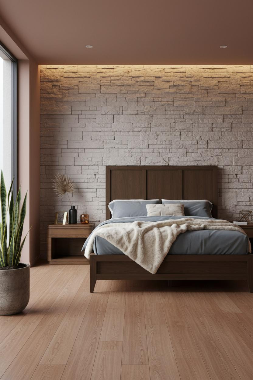


Honest reaction: raw stone in a bedroom sounds cold. It isn’t.
The rough-hewn limestone blocks absorb diffused light in a way that makes the wall feel tactile and warm, not clinical. Pair it with terracotta on the remaining walls and the mineral palette holds together naturally.
The practical move: A large potted snake plant in a stone pot keeps the room from tipping into a showroom. Something living matters here.
Charcoal Grey Wainscoting With a Warm Ceiling
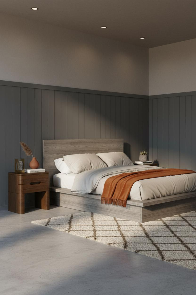


I’ve seen this combination in apartments that cost twice as much as they should, and every time I think the same thing: it’s the wainscoting that does it.
Why it looks custom: Matte charcoal vertical paneling at four feet high creates geometric rhythm that the warm greige plaster above can’t compete with (and shouldn’t try to).
A burnt orange mohair throw draped over the footboard gives the grey something to push against. Without that contrast, the whole room reads flat.
Herringbone Walnut and Cool Grey: A Pairing That Actually Works
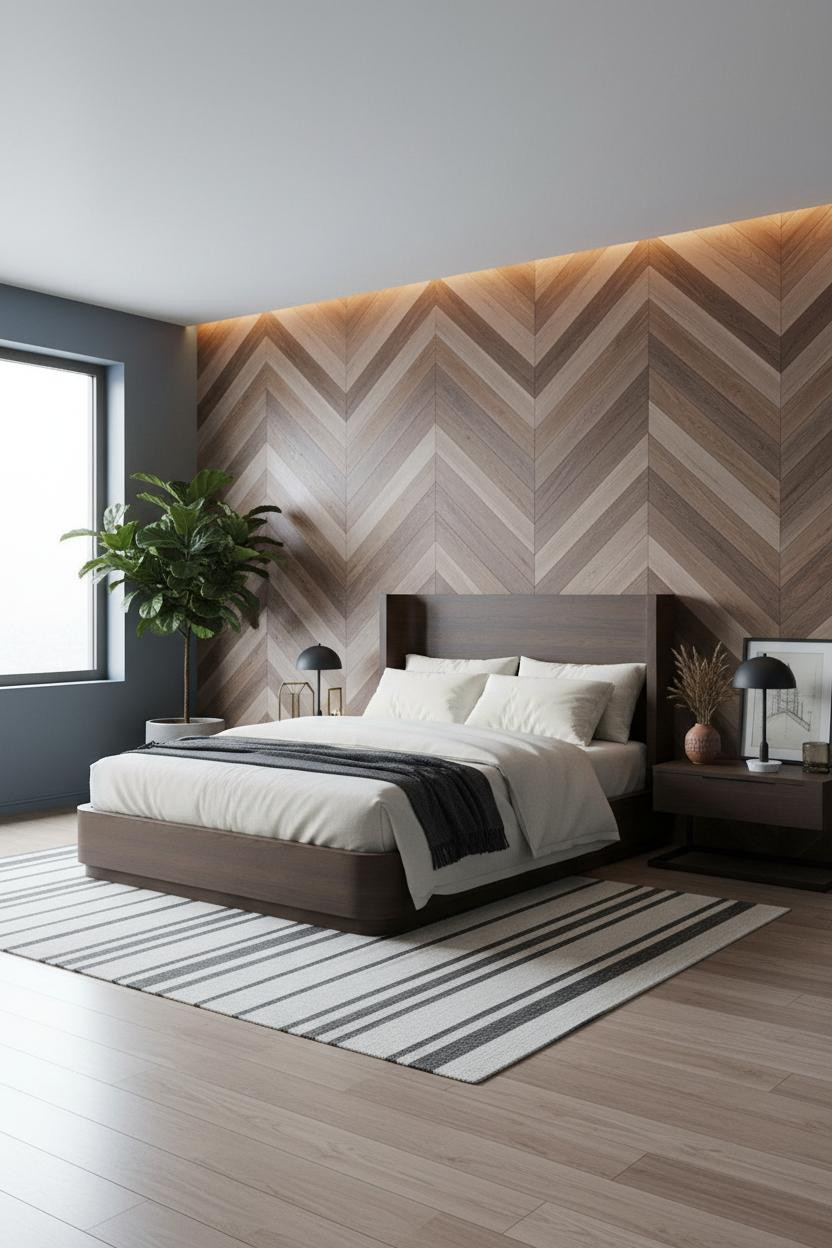
Cool grey walls and warm walnut shouldn’t be this easy together. But the herringbone walnut and pale ash accent wall creates enough movement to make the muted blue-grey feel intentional instead of indecisive.
What carries the look: The chevron pattern catches diffused light across its ridges, giving the wall a textural quality that a solid color can’t replicate in a way that feels this grounded.
Where to start: Keep bedding in ivory percale. Anything warmer and the grey loses its edge.
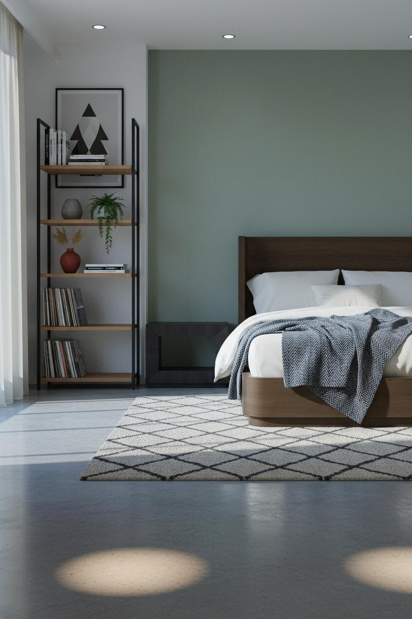
Olive Walls With Built-In Walnut Shelving
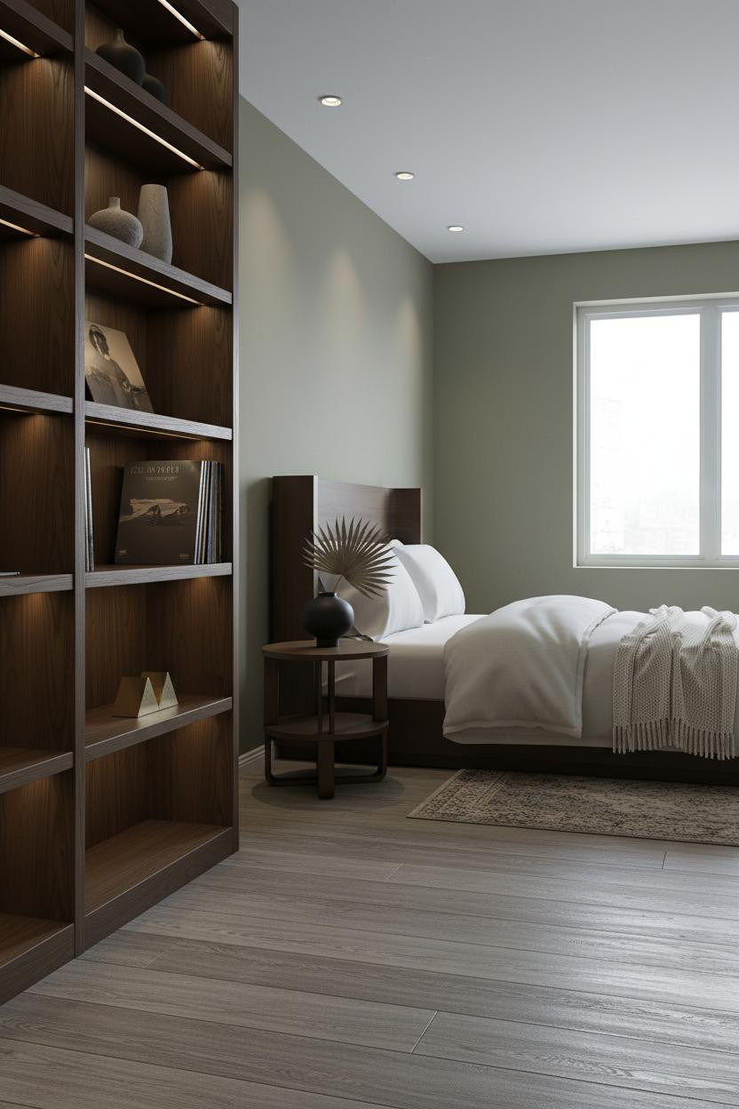

Nothing fancy. That’s the point.
What makes this one different: The floor-to-ceiling dark walnut shelving with an integrated brass rail pulls so much visual weight that the olive walls become the quiet part, which is exactly what you want from a color that confident. Negative space between the vinyl records and ceramic vessels is what keeps it from feeling cluttered.
Warm Clay Plaster Over Matte Stone Grey
The room feels warm without a single warm-toned light source. That’s what hand-applied clay plaster does: it catches raking light in organic ridges that shift through the day, so the wall reads differently at 7am than at 7pm.
Design logic: Stone grey plaster on the remaining walls cools the palette just enough to keep the clay from pulling too rustic.
In a room like this, the smarter choice for bedding is navy sateen. It holds its own against the clay without competing with it.
Forest Green Board-and-Batten With Honey Parquet
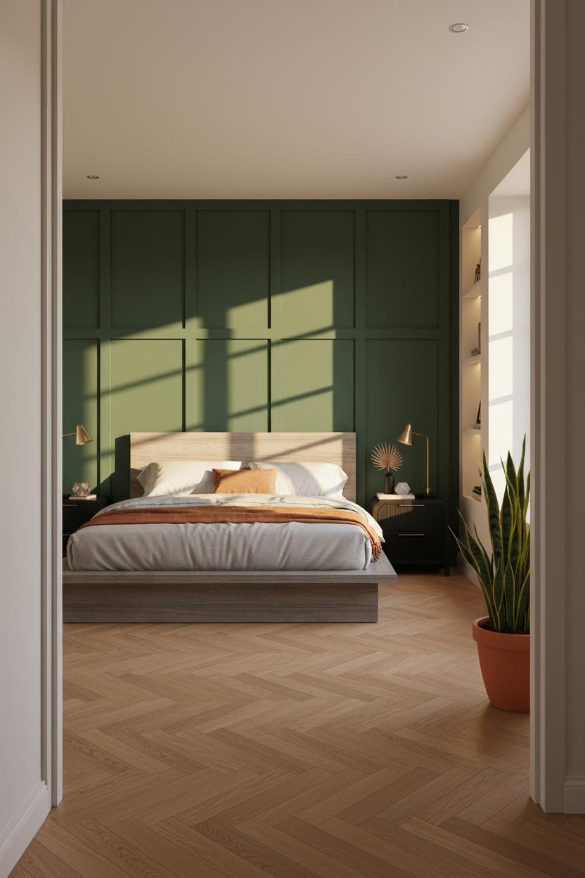
This is the one I send people when they ask about green. Not sage. Not olive. Deep forest green, matte, full-wall.
And the reason the room doesn’t feel suffocating is the warm honey parquet floor: all that amber grain underneath a dark wall pulls light back up from below, which keeps things feeling alive rather than heavy.
Avoid this mistake: Don’t pair this with cool white walls on the remaining sides. Warm white only, or it falls apart.
Sage Green That Actually Reads Masculine

Sage gets a bad reputation in men’s bedrooms. Admittedly, most of the time it deserves it. But pair a sage green headboard wall with a floor-to-ceiling matte black metal shelving unit and a polished concrete floor, and the whole tone shifts.
Why the palette works: The black metal frame grounds the softness of the sage, while the charcoal and cream wool rug keeps the floor from disappearing into the walls.
What not to do: Skip the warm beige bedding. Cream percale only.
Rust Walls in a Young Man’s Room Done Right
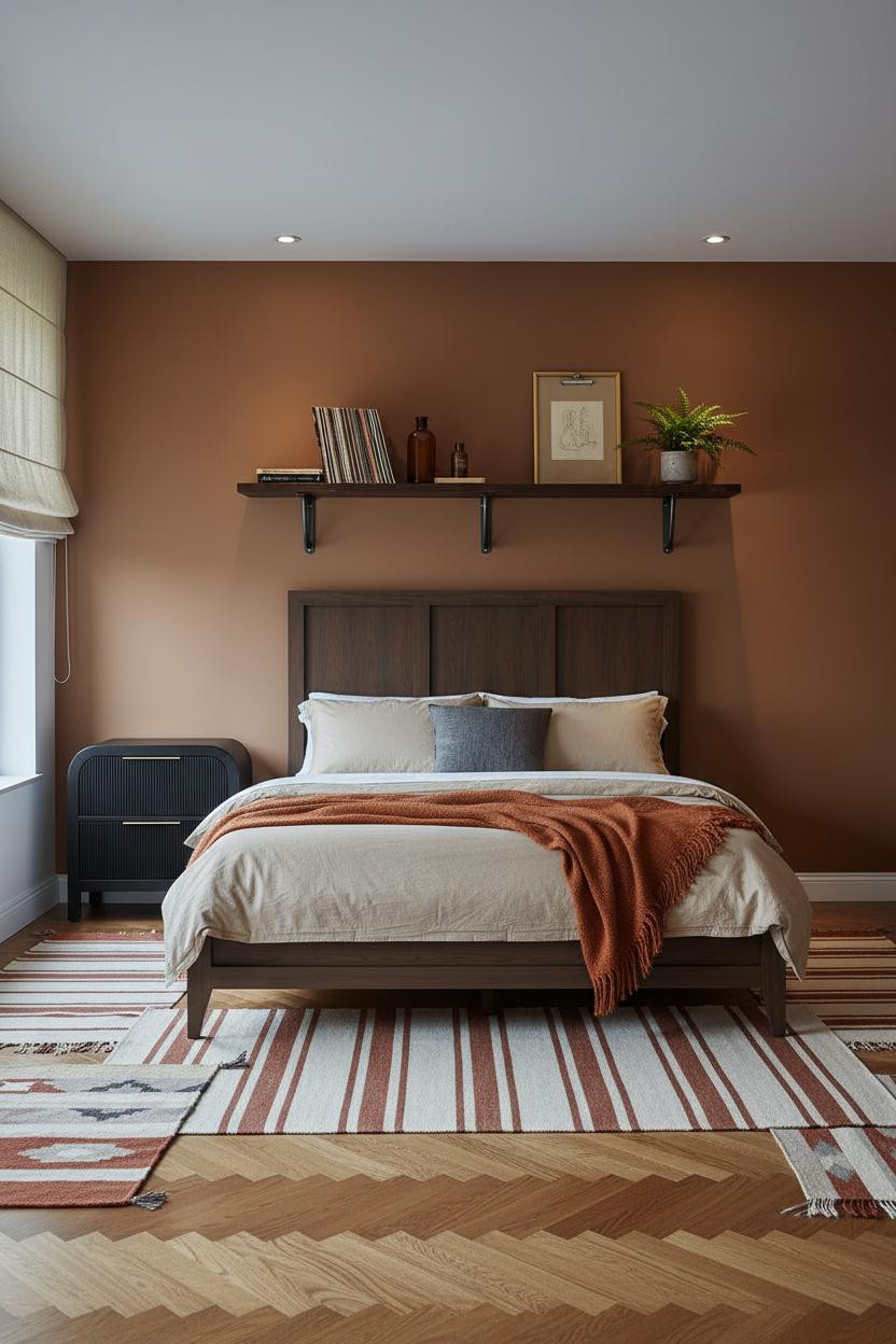
Rust walls in a young man’s bedroom work when the furniture stays low and unprecious. This version gets it right.
The real strength: A floating dark walnut shelf on industrial steel brackets carries the room’s personality upward, so the rust-brown walls become background rather than statement.
A burnt orange mohair throw and oatmeal cotton bedding keep the color story consistent. Nothing too matchy. That’s the whole point.
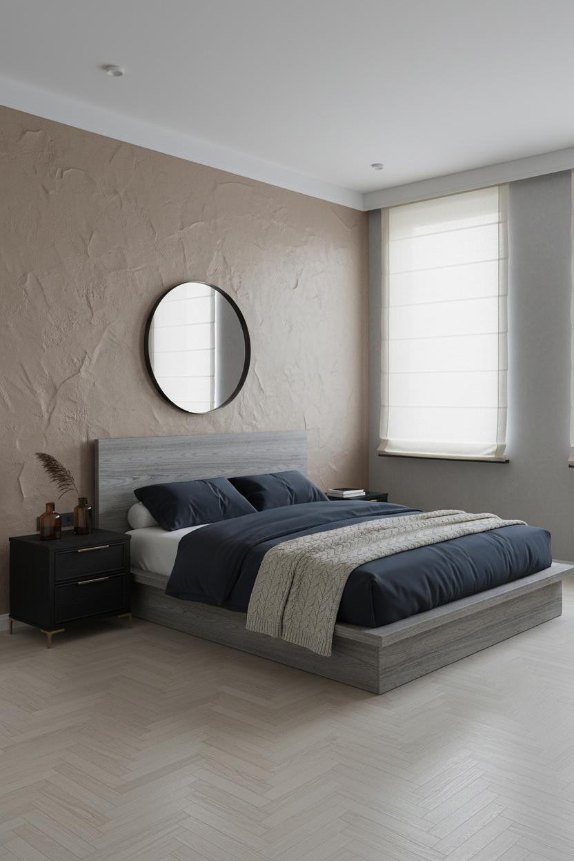
Navy and Dark Walnut for an Industrial-Minimal Bedroom
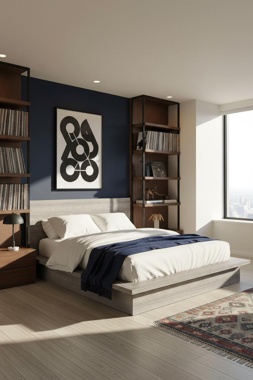
Deep navy is one of those grey bedroom alternatives worth taking seriously, especially when the shelving does this much work.
Where the luxury comes from: Floor-to-ceiling dark walnut shelving with a black metal frame creates a wall of material contrast that makes the navy feel considered rather than heavy, in a way that feels entirely deliberate.
The easy win: Pull the kilim runner color into the bedding. Navy throw over ivory cotton. Done.
Warm Charcoal and Cream in a Japandi-Influenced Room
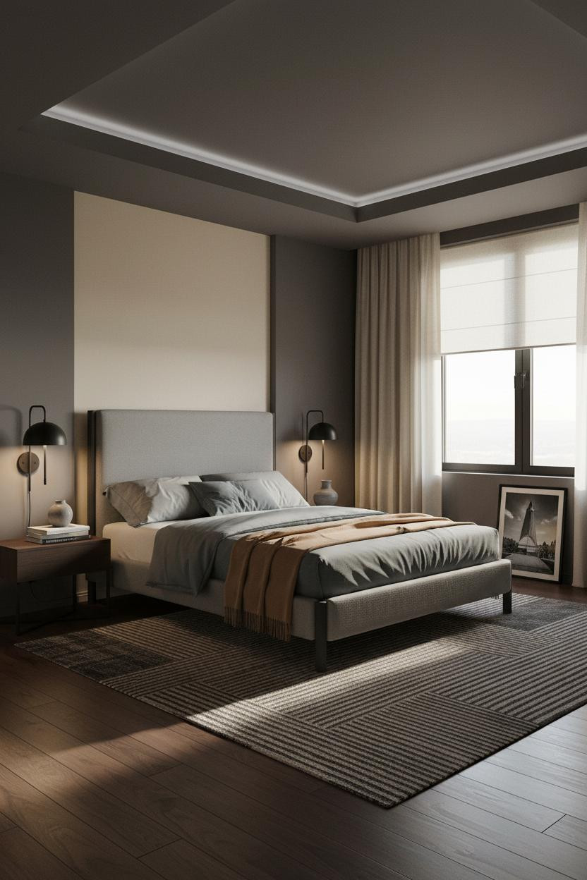

This one is the quietest room in the list. And honestly, it’s the one I keep coming back to.
What gives it presence: The recessed ceiling detail in matte charcoal with an integrated LED strip draws the eye upward in a way that most bedrooms never think to do, making the warm grey walls feel like a considered backdrop rather than a default choice.
The finishing layer: Floor-to-ceiling cream linen curtains tie the cream accent wall to the window zone. The room feels calm and cohesive, collected rather than decorated.

Our #1 Pick
Saatva Classic Mattress
America’s best-selling online luxury innerspring. 365-night trial, lifetime warranty, free white glove delivery.
Shop Saatva Classic
The Foundation Of Every Beautiful Bedroom
Get the walls right and you’ll want to spend time in the room. But a great man’s bedroom still lives or dies by what’s under the sheets.
The Saatva Classic is what I’d put in every one of these rooms. Dual-coil support that holds up over years, a breathable organic cotton cover that doesn’t trap heat, and a Euro pillow top that stays soft without losing structure beneath you. It feels like the good hotel kind. Not the business hotel kind.
Walls get repainted. The mattress stays. Start there.

The rooms people save are the ones that feel like someone actually made a decision. Pick the color, commit to it, and build everything else around that one call. Good design ages well because it’s made well.