Basement studio apartment ideas get dismissed way too fast. People assume underground means dark, cramped, and depressing. But the rooms in this list prove otherwise.
With the right layout and a few smart moves, a basement studio can feel genuinely livable. Here’s what actually works.
The Shiplap Wall That Makes This Layout Feel Twice as Big


I keep coming back to this one. Something about the proportions just works.
Why it holds together: The warm white shiplap behind the bed creates a focal wall that reads as architecture, not decoration, which keeps the layout from feeling random.
Steal this move: A striped wool runner over dark walnut flooring defines the sleeping zone without needing a physical divider.
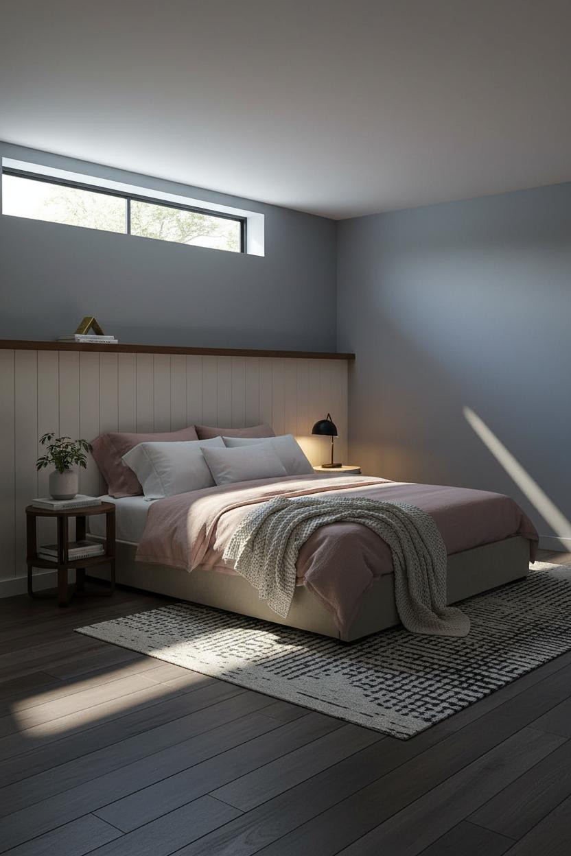
How a High Egress Window Changes Everything

Fair warning. Not every basement has an egress window this generous. But if yours does, treat it like the most valuable asset in the room.
The polished steel frame throws crisp geometric shadow bars across the floor, which does more for perceived ceiling height than any paint trick I’ve tried.
The smarter choice: Keep walls in a warm clay matte and let the window do the architectural heavy lifting. Don’t fight it with busy wallpaper or competing focal points.
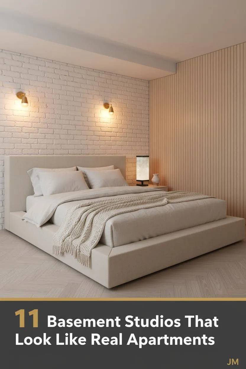
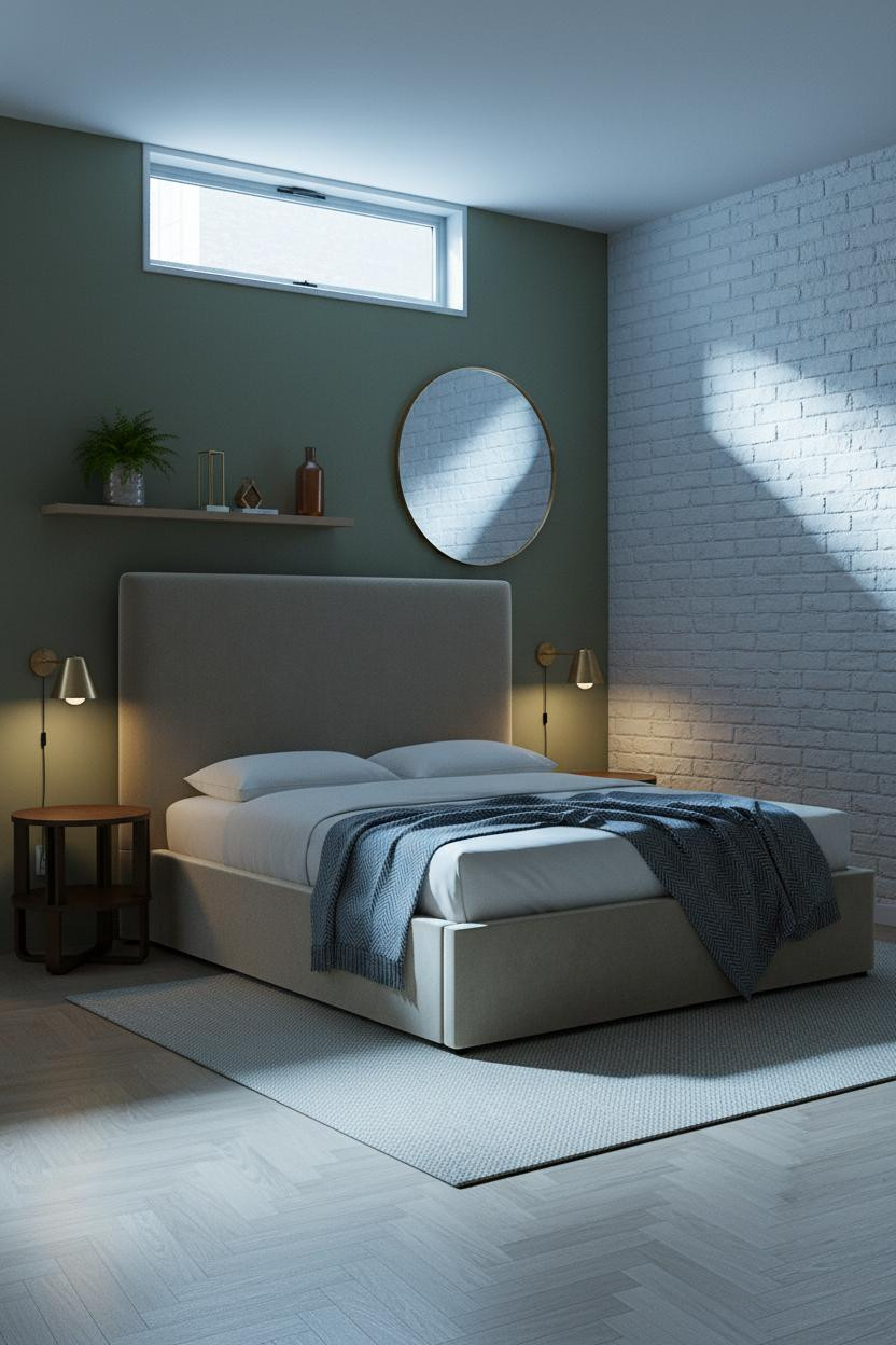
Why Whitewashed Brick Belongs in a Basement Studio
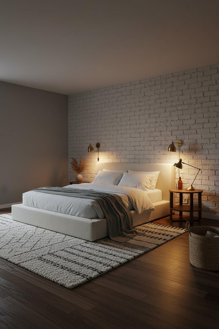


This is the layout I’d actually live in. The room feels grounded without feeling heavy.
What creates the mood: Raw whitewashed brick catches angled lamplight in a way smooth plaster never could, and the rough mortar joints add texture that reads as character, not roughness.
Pair brass sconces at either side of the bed. In a windowless wall situation, that’s the whole lighting strategy.
The Floor-to-Ceiling Shelf Trick That Pulls Eyes Upward
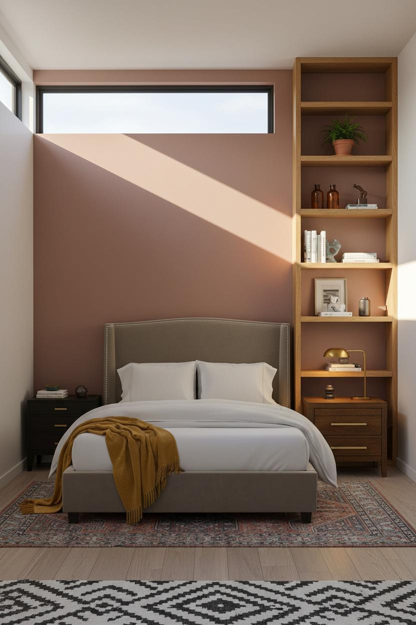


Vertical lines in a low-ceiling room are genuinely underrated. This shelf earns its place.
Why it feels custom: Open-frame honey-stained oak shelving rising floor to ceiling pulls the eye upward, which is exactly what a basement studio needs in a corner that might otherwise feel dead.
Pro move: A dusty rose accent wall behind the bed keeps the warm wood from going too heavy, while a kilim runner defines the sleeping zone without adding visual clutter at floor level.
Wood Slat Walls Actually Solve a Real Problem
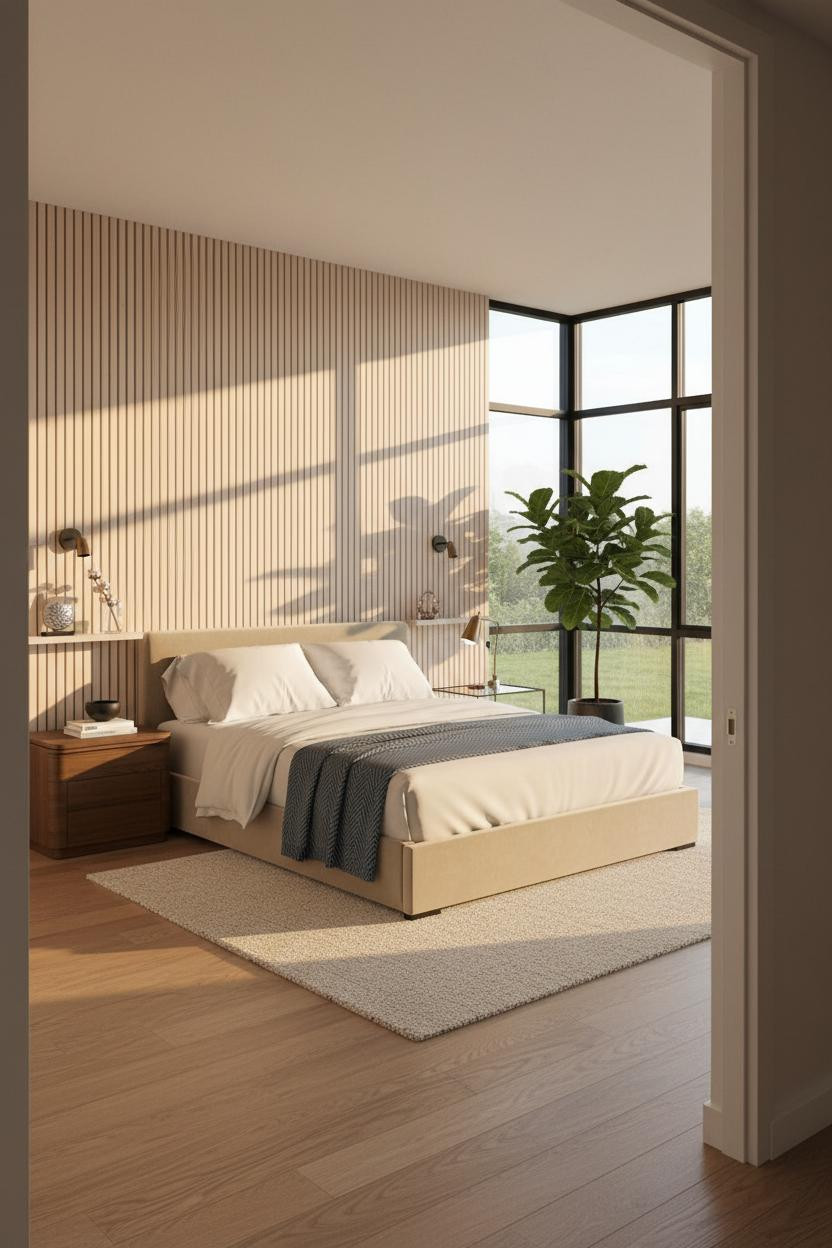


Nothing fancy. That’s the point.
A full-height pale birch slat panel along one wall defines the sleeping zone architecturally, in a way that feels intentional rather than like you just pushed a bed against drywall. The repeating shadow lines do the work.
The easy win: Pair with a chunky wool cream rug to anchor the zone and soften all that vertical geometry underfoot.
Board-and-Batten Above the Bed Without Overdoing It
I was skeptical about the floating shelf spanning the full wall. Honestly, it works better than I expected.
What makes this one different: The warm white board-and-batten behind the bed contrasts with muted blue-grey walls on three sides, giving the sleeping zone its own identity inside the open plan.
Avoid this mistake: Don’t style a full-width shelf with too many objects. Three things, some breathing room, and a trailing plant is all it needs.
Sage Green Board-and-Batten for a Basement That Feels Alive
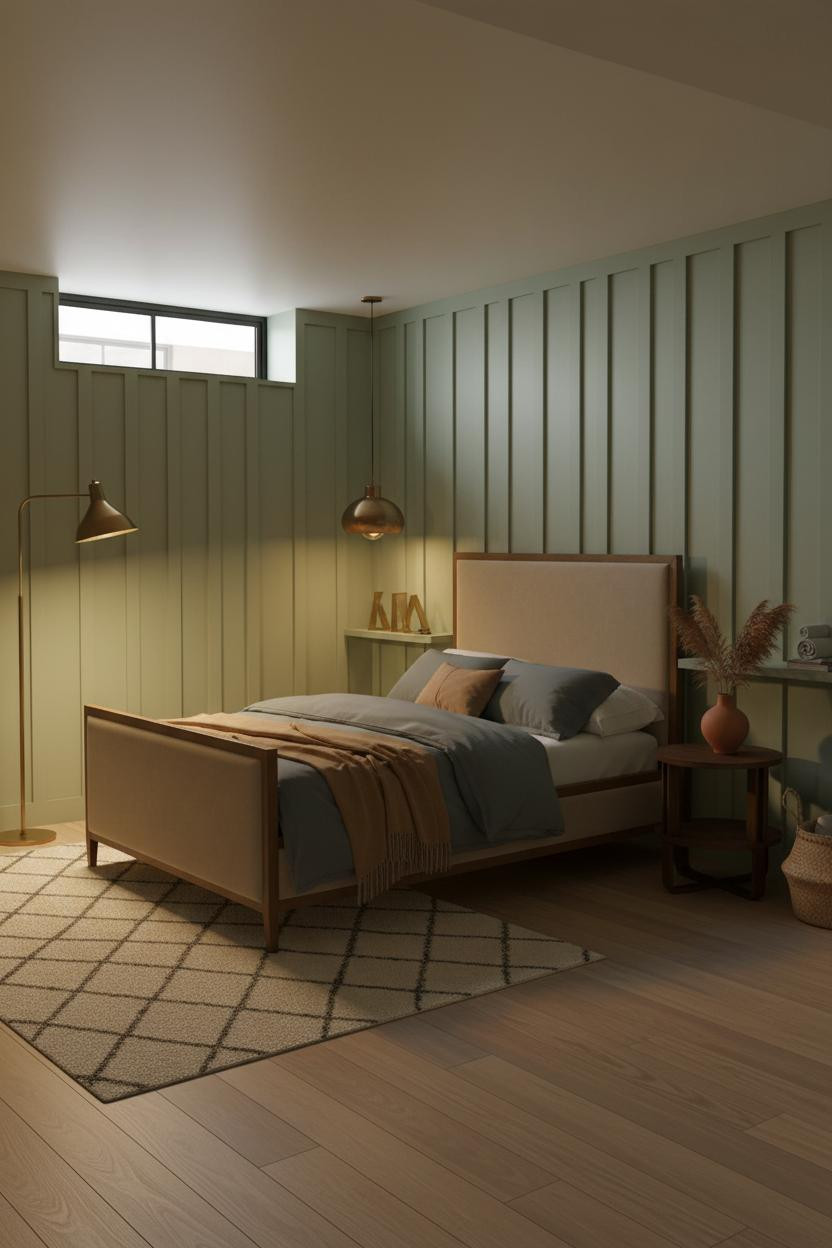

This one surprised me. Sage green reads richer underground than it does in an above-grade room.
The reason it feels warm instead of cold is the brass floor lamp casting amber light across the painted ridges. Each vertical batten catches that glow differently, which creates depth that a flat wall simply can’t.
Worth copying: A Moroccan diamond-pattern wool rug anchors the sleeping zone while still feeling collected rather than decorated.
When Exposed Timber Beams Are the Whole Personality
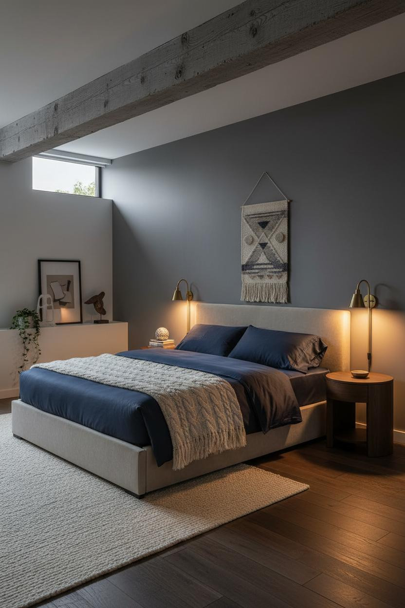

Most people hide structural elements in a basement. This approach does the opposite.
Where the luxury comes from: A single weathered grey timber beam running the full ceiling length acts as a linear anchor, making the low overhead feel intentional rather than cramped.
The part to get right: Keep the wall color in charcoal grey and let navy bedding with a cable-knit throw do the softening. The room needs that contrast to feel moody rather than just dark.
I Did Not Expect an Olive Wall to Work This Well Down Here

Soft olive green matte walls paired with pale ash herringbone parquet flooring is a combination that somehow keeps the basement character while feeling genuinely Scandi-calm.
The detail to keep: One wall left as raw whitewashed brick while the others go olive. That contrast is what makes the room feel collected rather than a single committed aesthetic, while still feeling cohesive.
How Whitewashed Concrete Becomes an Asset, Not a Problem
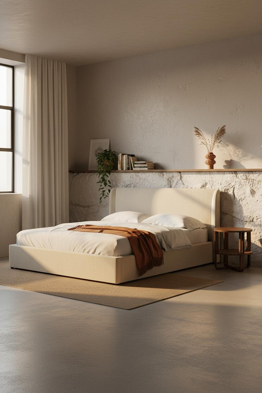

Bold choice. Most people skim-coat over a concrete foundation wall. This one got a pale wash instead, and the raw aggregate texture underneath is still visible.
And honestly, that’s exactly what gives this Japandi layout its identity. The whitewashed concrete doesn’t try to look polished. It grounds the whole room with real basement character, which makes the oatmeal linen bedding and burnt orange mohair throw feel earned rather than decorative.
What to copy first: A floor-to-ceiling cream linen curtain on one wall adds softness that balances the raw aggregate without covering it.

Our #1 Pick
Saatva Classic Mattress
America’s best-selling online luxury innerspring. 365-night trial, lifetime warranty, free white glove delivery.
Shop Saatva Classic
The Foundation Of Every Beautiful Bedroom
All these layouts share one thing. The sleeping zone is treated as the anchor, not an afterthought. And a room feels genuinely restful only when the bed itself is worth sleeping in.
The Saatva Classic is what I’d put in any of these studios. Dual-coil support means the mattress holds up over years, not just months. The organic cotton cover breathes instead of trapping heat, which matters more in a basement than anywhere else. And the Euro pillow top is soft without losing structure, the way a hotel bed feels when it’s actually good.
Walls get repainted. Linen gets swapped out. Start with the bed. The rest figures itself out.

The best basement studio apartment ideas aren’t about making underground feel like above-grade. They’re about making it feel like somewhere you’d actually choose to live. Good design ages well because it’s made well.